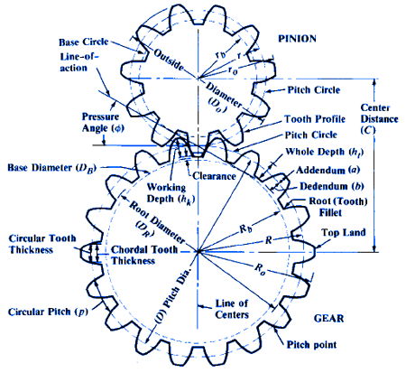
This diagram comes from https://www.engineersedge.com/gear_formula.htm Take a look at that site to see how all the numbers are calclated.

Also see the information at https://www.engineersedge.com/gear_menu.shtml
There are gear generator tools there where you can put in the numbers you want and it'll calculate the rest.
@jgb said in Any good tutorials on BEVEL gear design in SU?:
But now I need to make gears to very specific sizes and my foggy brain cannot interpret the dialog box to do it beyond a simple diameter and tooth count.
When you refer to diameter are you talking Outside Diameter (O.D.) or Pitch Diameter (D)?
@jgb said in Any good tutorials on BEVEL gear design in SU?:
it produces gears that will be difficult to print; too many overhangs equates to a lot of tiny supports to be removed
Where are you getting these overhangs? Maybe you just need to invert the object. I expect you're going to have to live with some overhangs somewhere.
@jgb said in Any good tutorials on BEVEL gear design in SU?:
many line lengths are smaller than the printers print resolution.
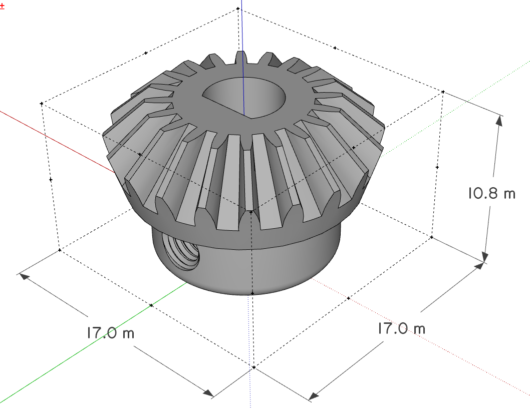
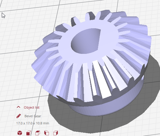
Are you doing your modeling in millimeters? As I wrote before, do the modeling in meters. That is, treat millimeters as meters. So your 25mm gear would be 25 meters. When you export the .stl with model units set to meters, and them import the .stl into your slicer in millimeters, the gear will be the right size. For example, here's the SketchUp model of the gear I showed.

And the resulting .stl in the slicer. Same dimension numbers but in millimeters, not meters.

@jgb said in Any good tutorials on BEVEL gear design in SU?:
and two sets where the diameter ratios are 50mm:280mm and 50mm:140mm. Those are the hard ones to get properly meshed teeth with SPGears.
I don't think that's specific to the extension. Look at standard gear charts. You'll see that there are only certain combinations that work together.
Is it really the gear diamter that is important? Normally the gear ratio would specify the number of teeth. 50:280 as a gear ratio would also be 1:5.6 so you could start with some number of teeth for the small gear and multiply it by 5.6 to get the number of teeth for the large gear. The actual diameters of the gears may not be exactly 50mm and 280mm

