@gaieus said:
...a "community tutorial" copied here from this topic.
Thanks DacaD!
Hi guys.
So it is 2 diferent tutorials for 2 ways to work with dofs, the first one is done in photoshop and follows the basic rules; the second one is done in NET.Paint because it's free and open source and it's much easier than GIMP to understand and pick up (think of it as a photoshop with just the basic tools you need). So let´s start:
Photoshop:
1- Open the base image and select all and copy/paste the all image again (ctrl+J) (never work on the base layer)
2- Open the depth map, select all, copy, close the image
3- Now in your top image layer add a layer mask (on the bottom of the layer bialog box you have a square button, or go to the menu Layer-LAyer Mask - Reveal all
4- In that image layer you now have 2 squares, one for the base image other empty, so select the first square (image) then go to the channels menu (top in the same layer dialog box) turn on the new empty square, and paste your depth map
5- when you go back ro the layers menu you'll see the image more red, it's normal, now seletc in the image laeyr the first square of the base image, and got o filter - blur - lens blur
6- In the new menu that shows choose has source the Layer Mask (so to blur things out in the image, the app will use the layer mask of this layer that has the detph map)
7- Now you just have to use 2 slides: The blur focal distance (does what the name says...lol) and the radius (controls the amount of blur). Keep in mind that you shouldn't use too much of this because the good DOF will be subtle most of the times.
8- After that press ok and delete just your layer mask of the image layer (it won't affect your image). Now redo the blur and save as much times as you need with diferents results, and then see in that order outside of PS the diferent images you've made and choose the bes for you (this will be the best way for you to see when overuse or don't use much blur, and will also gain experience controling the amount of blur needed)
BONUS TIP: Not beeing DOF related, you also have to keep in mind that 90% of the time you should postprocess your render images. Why? because in renders normally the colours will be washed out, shadows and lights without too much contrast, etc. So don't use your RAW renders.
9- To quickly push the colours of your image, beside doing the usual "auto tone", "auto colour", and "auto contrast" (of course sometime you can't use it but i used in this example), open your choosed final blur version, and duplicate the layer again (ctrl+J)
10- Now in the top layer put the blending for the layer in soft ligh, and play a bit with his oppacity but not too much (know the image will be darker but don't worry with that now because the colours will already look more alive and strong)
11- Go to image - adjustments - shadows/highlights
12- Put the shadows around 15-30 and the highlights around 40-50 (you can try this directly on the top layer or merge the 2 layers down before this last step)
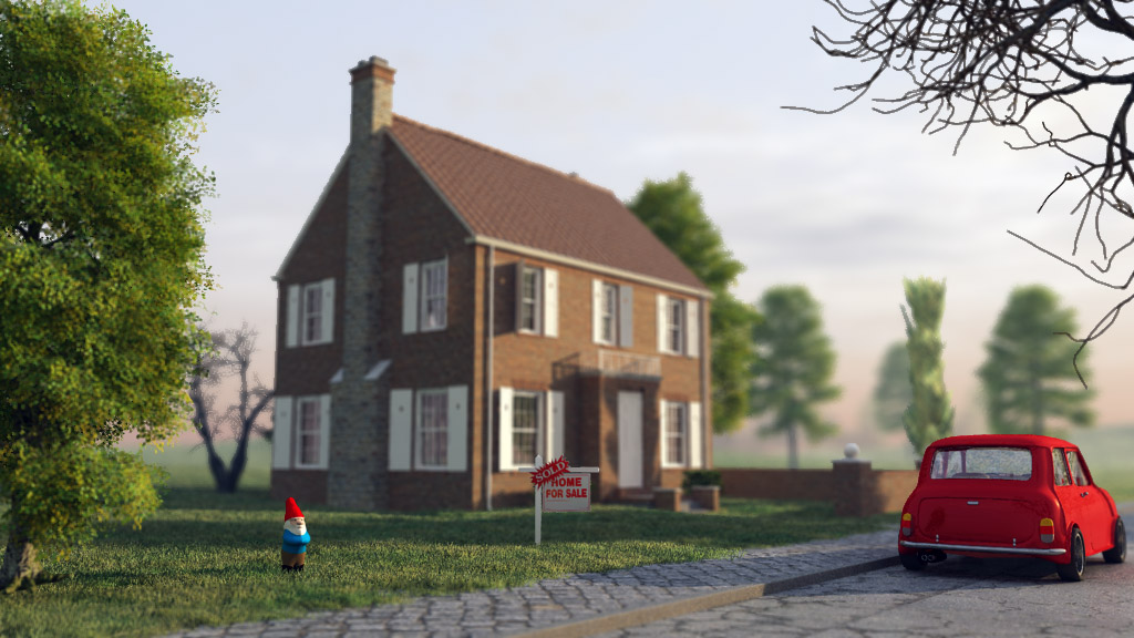
13- That's it. See the 1st picture above for comparison between the orignal image and the final (notice the colour tones and the blur, that here it's exagerated on purpuse, on normal use should be much softer)
The next Tutorial, doesn't follow these "normal" rules, and because i used NET.Paint for this i tryed to be more easy and also able to do in any other app.
1- Open the base image, and duplicate the base layer (again, because you shouldn't work on the base layer)
2- Create a new layer, open your depth map, select all, copy, close and paste in the new layer created (the net.paint doesn't do this automatacly...i think)
3- Now on your depth layer go to adjustments - Brightness/Contrast and raise both but more on contrast (this is to diferenciate better the diferent tones of grey)
4- In this tutorial i'll blur the house and focus on things near (but you can focus on anything), so with the help of the diferent grey tones select the dark grey from tree with the magic wand, and put the selection mode in "add (union)", and keep selection until most of the tree and the parts near to the camera are selected (this should include the dwarf too)
5- Go to Edit - Invert Selection
6- Hide the depth layer and select the image layer (you'll see that you'll keep the same selected parts in the image, so we're basic using the depth map as a alpha channel)
7- go to Effects - Blur - Unfocus and put a low value (between 1 and 5 should be enough)
8- And that's it, but for pushing the colours and a bit more contrast, merge all layers down and then duplicate this layer for the final blur image
9- with the top layer selected go to layer properties (f4) and put the blending mode to overlay) and play with the opacity (not much and don't worry about beeing to dark)
10- go to adjustments - levels , and push up a bit the output levels vertical slide.
11- save the final result and that's it
As you can see it's pretty simple doing this and there's not one only right way to do it. You don't really need a depth map but it helps a lot to select things or to use as source for the blur. Remember that doing the dof this way has two big advantges: more control, and much faster dof (render dof will allways raise your render time greatly and this will just take 5m to do).Ialso like more the final colours of PS tutorial image (more experience with PS) but the dof in the NET.Paint it's better (because i exagerated that on PS for exagerating greatly the diferences). The colour enhancement tip works better with images with trees or green parts. Feel free to correct any mistakes and share any more tips to enhance this tutorils. Hope it helps
David
")
")


")
")

 ) work but finally i have time to post here my opinion.
 , but i also think everyone needs to stop acting like with these released sketchup it's perfect now. It's far from this, and if sketchup 7.0 had been launched like 7.1 it would still be a weak release. The speed increase is great but we still need 64bits and multicore etc etc etc, and please for everyone saying that 64 bits it's just good for big textures that it's a (and i'm sorry about beeing really direct here) a LIE. You have to keep in mind that everything takes up memory including a line, a face, a polygon, everything, the diference is that it's easier to use more memory with textures than meshes, and that's why in software like mudbox, 3DS, Maya etc you can subdivide (or open) meshes to 12 million polygons and keep modeling in real time with 32 bits version, but the limit with the 64 bits it's just limited by your ram (there's people subdividing meshes to 32 milion!!)

")