WIP: European Back Alley
-
Good job with light and textures... waiting for more more more

-
Thanks for the comments! Here is another render, I tried to make it a bit brighter.
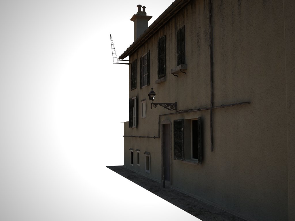
-
it looks real, nice texturing. I enjoy looking at this post. although I would reduce the opacity of your vignette layer

-
I agree, it's looking really promising! Fun thread to follow along with as more comes out

I'm with olishea on the rendering but then again I hate it when people start nitpicking my WIP so I won't say anything about that

-Brodie
-
nice model, I look forward to more progress.
-
Very nice model so far. But comparing your model with the real photo i can say:
- The proportion between the width of the alley and the height of the buildings is wrong and very improbable in a medieval city. The right side building has to be higher and the alley tighter;
- You have a strange, and quite impossible, floor join in the right side building: the backline of the door-window of the first floor is under the top edge of the door on the ground floor;
- The left side building has, in the reference photo, a crooked front that ideally converge towards the arch. The same for the building of the right side: his front is aligned with the arch;
- The real alley has no sidewalks.
I understand that your model in not intended to be “real”, but when you design a street or a square, proportions and relationships between the open spaces and buildings are really important to represent a place, even an imaginary one.
Sorry, i know, i’m a boring european architect
-
@massimo said:
Very nice model so far. But comparing your model with the real photo i can say:
- The proportion between the width of the alley and the height of the buildings is wrong and very improbable in a medieval city. The right side building has to be higher and the alley tighter;
- You have a strange, and quite impossible, floor join in the right side building: the backline of the door-window of the first floor is under the top edge of the door on the ground floor;
- The left side building has, in the reference photo, a crooked front that ideally converge towards the arch. The same for the building of the right side: his front is aligned with the arch;
- The real alley has no sidewalks.
I understand that your model in not intended to be “real”, but when you design a street or a square, proportions and relationships between the open spaces and buildings are really important to represent a place, even an imaginary one.
Sorry, i know, i’m a boring european architect
I appreciate the help, but I am not trying to exactly model the photo, It was just use as a basis for my model. As for the impossible floor join, I am hoping one in a thousand people will actually notice it. But thanks for the help

-
@solo said:
It's free:
have you played with that? i wonder how sketchup would deal with the polys involved in those ivies.
-
Edson, I certainly have and really like it, but I do not import the final .obj into SU as SU cannot handle the polys, I export my model and Ivy into a 3rd party render app instead.
-
@solo said:
Edson, I certainly have and really like it, but I do not import the final .obj into SU as SU cannot handle the polys, I export my model and Ivy into a 3rd party render app instead.
i imagined that. thanks for the info.
-
Update, this render is very experimental as you can tell from the lighting,( I probably need to add more photons) comments on textures and modeling welcome.
BTW- Does anyone know how to un smooth something after it has already been smoothed? I want to fix the infamous impossible arch.
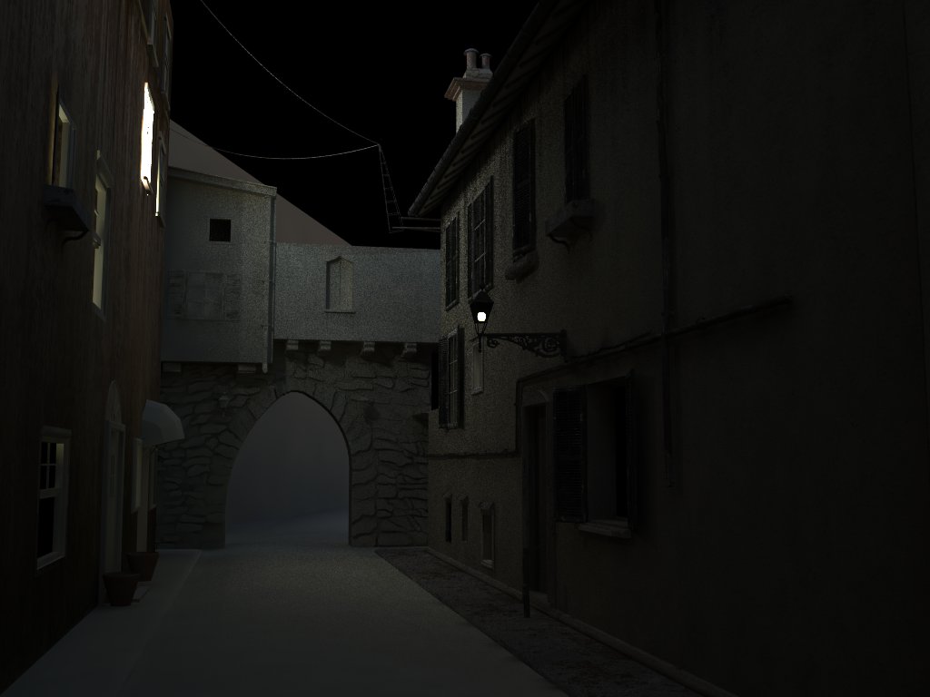
-
can't you triple click the arch/stones and then open the soften edges window and turn the soft edges off? or have u subsmoothed it?
looking awesome. the texturing looks fantastic. all u need now is a bit more dirt on the road/paving. I can imagine getting mugged in this back alley!
-
Oli: That is what I tried, but it is grayed out.
-
With Picasa tint
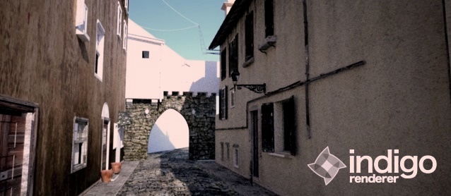
-
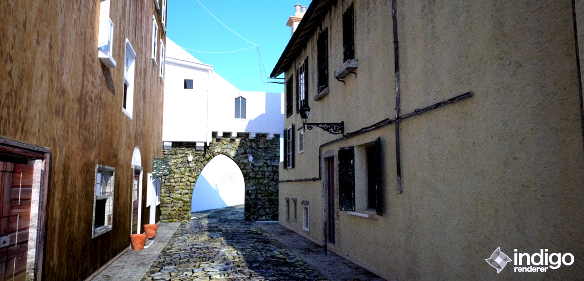
After a long break from this project, finally found some time to texture, also started in Indigo. I gave up on Indigo a while ago, but checking back proved to be a good choice as the new versions are a ton better, and if you have not tried them, you really need to.
Note: I will post a bigger version tomorrow.
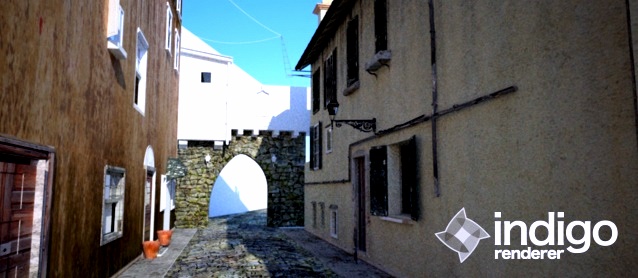
-
Bigger Version
Hello! It looks like you're interested in this conversation, but you don't have an account yet.
Getting fed up of having to scroll through the same posts each visit? When you register for an account, you'll always come back to exactly where you were before, and choose to be notified of new replies (either via email, or push notification). You'll also be able to save bookmarks and upvote posts to show your appreciation to other community members.
With your input, this post could be even better 💗
Register LoginAdvertisement


