Can you share the file you are working on?
Santiago
Can you share the file you are working on?
Santiago
This, from working a lot with layout lately:
Find and replace text. (same as on any word processor)
Make unique copy of a viewport (allow a copy of a viewport to link to an alternate version of the sketchup model)
More options for the style tool (match properties). In addition to styles, match layers.
An option to input measurements in different scales 1:1, 1:5, etc. Useful for drafting on top of ortho views.
Components!!!!
Improvements in snapping (object snapping and grid snapping do not always cooperate, layout will not snap to section cuts at times.)
A fix for the bug where a view is slightly shifted horizontally,but it's snapping points remain on the original location
A fix for vector pdf's becoming raster after updating some references. I can live with pdf, instead of linkable xls or doc files, as long as it works correctly.
Improvements to dwg export (all the ones previously mentioned)
Great tool, love working with it!!
For large projects, sketchup may be used only on the initial stage, just to get the general idea, and later on move it to revit, acad, archicad, etc. Also, sketchup is way better at creating non standard geometry. Creating these kind of shapes in BIM is awkward at best.
But, on small to medium sized projects, sketchup+layout can work very well. I'm developing 1 pilot project using these two tools exclusively, and even though layout could use some improvements, I believe it will be the way to go (for me at least), for these kind of projects. Check the layout subforum on sketchucation for some cool samples.
Also, you need to consider that sketchup is about $500 us, vs, revit, at about $7000, plus subscription costs, last time I checked. At this point, small practices such as mine, may only have 1 option!
Some work, some are rendered, others are sketchup.
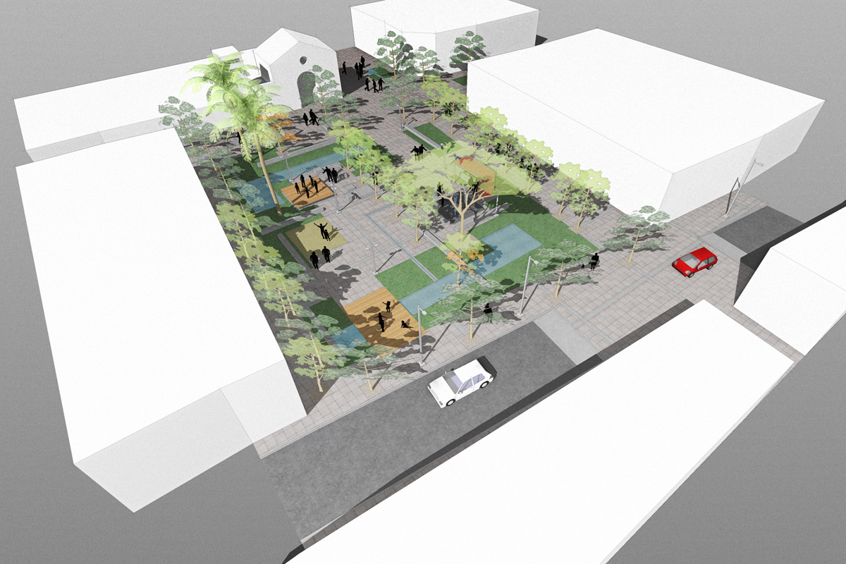
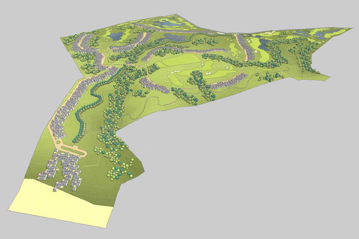
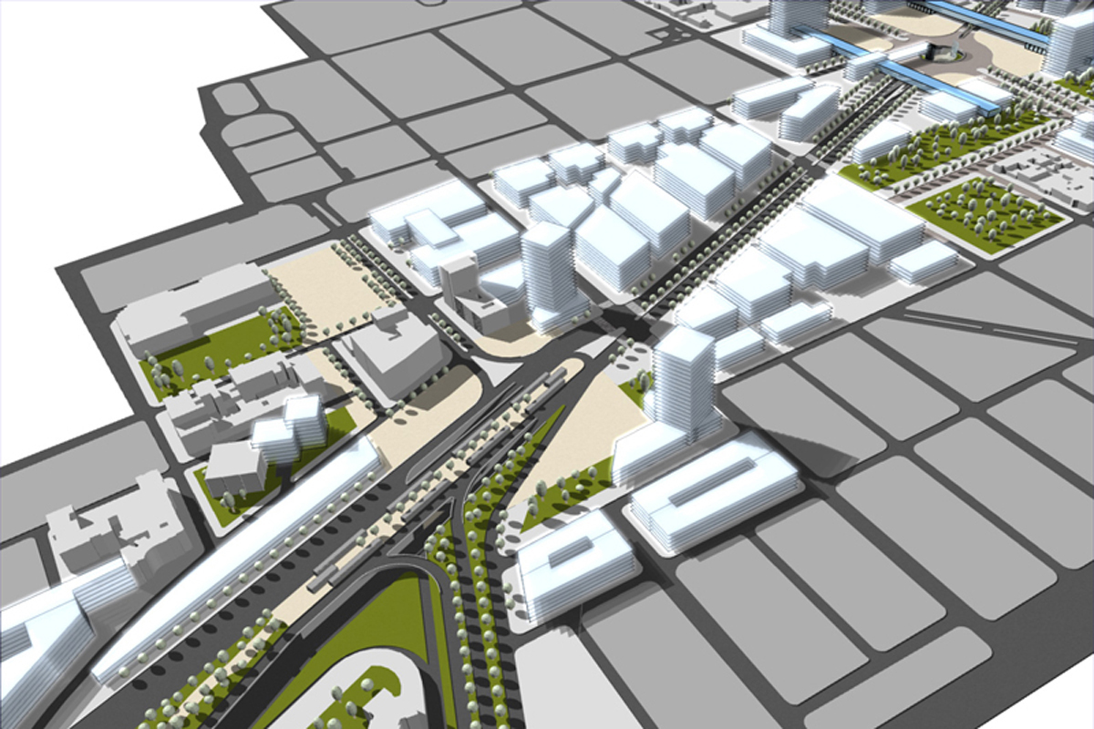
It's a known bug on the mac. editing a color using hsb, rgb or grayscale does not show the actual color at first. I usually go to the color wheel, move the color indicator just slightly, and then go back to rgb or hsb. It then shows the actual color, slightly modified. If there is a better way, i,ll be happy to learn!
++++++1 for layout improvements!
Some kind of component/block implementation.
Support for auto fields (auto date, page number, page name, scale, etc)
Improvements in dwg export (better handling of text styles, export layers from sketchup to dwg, convert layout dimensions to dwg dimensions.)
Vector and raster fills (currently limited to solid colors, and no, clipping does not count)
Pdf import in layout for windows
Better compatibility between layout mac and layout windows (currently, text does not render the same in both platforms)
Some kind of plugin/scripting support
A simple way to select items by kind, selection filters (dimensions, vieports, text, etc)
Array copy like in sketchup
Layout is the perfect companion tool for sketchup, if you need to generate some kind of dimensioned drawings out of your design.
Santiago
If you have photoshop, consider creating an action, and batch applying it to all the frames of your animation ( exprted as an image sequence). After that, use virtualdub to compile the result into an avi file
Hi Jeff
I think what you are experiencing may have to do with a bug I ran into recently. Apparently windows and mac versions of sketchup have different ways of measuring text height!
Simple test. Create a 3d object on the pc, using arial for example. Note the text height used. Save the file. Open that same file on a mac. Try and recreate the same text, using the previous parameters. Compare. ,!!! No matter what you try, they will not match.
HI Thomas, Thanks for the plugin. It's very useful.
One thing is that it does not work well with the "000_AdditionalPluginFolders" plugin. I use sketchup on two different computers, and use this to sync my plugins between machines. I finally placed yours on the native plugins folder and it worked.
Anyway, thanks, your work has saved me a lot of time.
Santiago
@richard said:
@caronte01 said:
Hey you checked tones in greyscale as this is always 99% of printing throughout the job!
I did print some elevations in greyscale, to see how they looked. I had to increase contrast a bit. In color, they appeared ok, in bw they looked a bit washed out. Also, elevations looked great with shadows on; sections, I turned them off.
Thanks guys! I´m now starting details, after that i will return to the main model and update/reference all the changes made.
Richard, I removed the sky from sections and elevations. I like them!
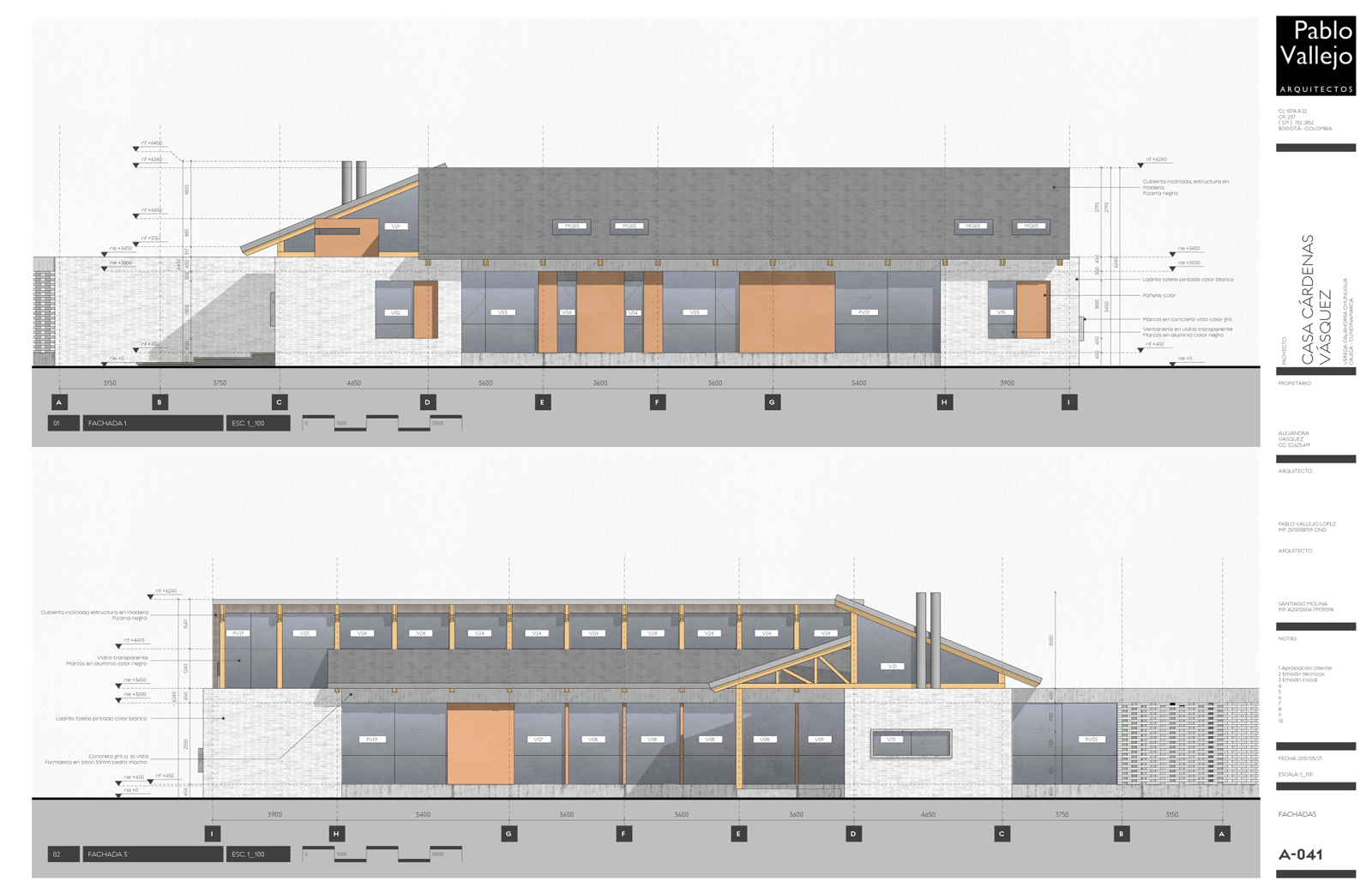
Quick update.
I´ve sent dwg´s to consultants already. They were not the prettiest dwg´s I´ve seen, but they worked.
So far, layout has done it´s job perfectly well. That does not mean i´d like to see some improvements.
Floorplans:
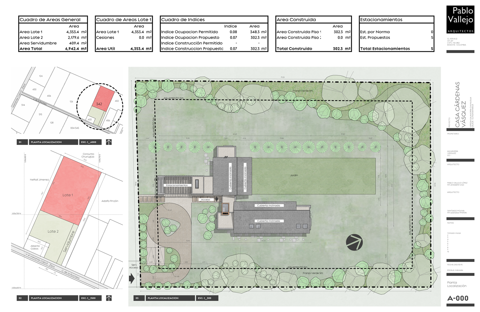
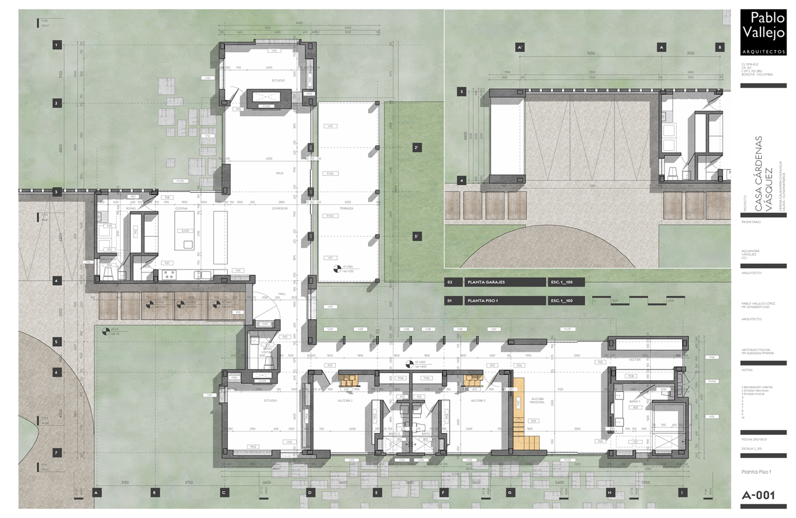
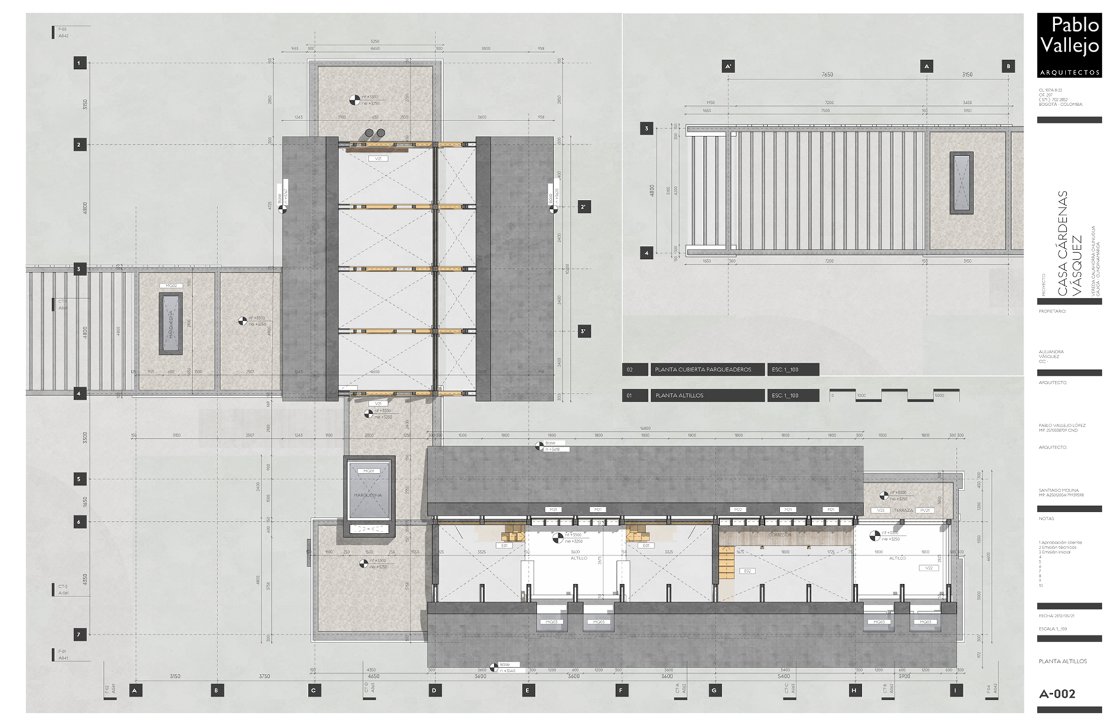
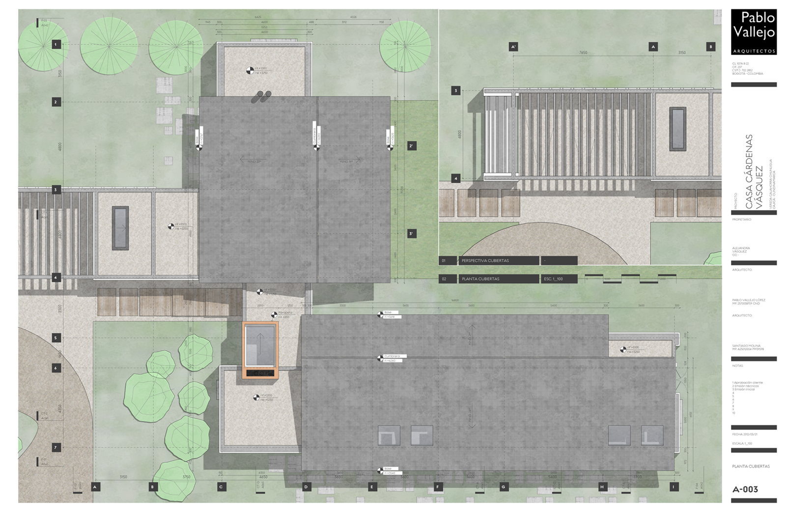
Hi Sonder,
Could you show us a screeshot of your layout layers, and of your model scenes? While in principle it seems as a good idea, I would imagine it has to be a very complicated setup. Correct me if I'm wrong.
Anyway, great work. I keep going to your posts for inspiration!
Cheers
s
These are great!
Thanks a lot richard!
Agreed, Layout is faster on a mac than on a pc. It also has a few extra features on the mac (pdf import). I use layout almost daily on a pc, and on an lower spec macbook. It feels faster on the mac.
Edit: I just read your signature. The mac you have/had is/was a very fast machine.
Hi Fredo;
Great plugin, very useful for people working on different machines
thanks!
Thanks Richard!
Here's some of the components used for furniture. I like them because they are very simple graphically.
BLOQUES.skp
Cheers
s