New project, Advise on layout
-
I am doing this same thing right now with three home projects. I really like it compared to utilizing sketchup only for design. It certainly eliminates the potential for errors between the formats. I have found that limiting layout files to single pages really increase the speed drastically.
-
Not a lot of progress so far. For now, I´m testing dwg exports from layout. I don´t need them to be perfect, but I do need to have readable files so that external consultants have something to work from. One thing i found is that text export is not perfect as far as formatting goes, so a couple of workarounds have to be used so that dwg output resembles the original pdf/lo file:
- text exported to dwg will always become an mtext, top left justified. The origin of this text is set to the left upper corner of the text box in layout. So, in layout, try and make the text box as small as possible, to avoid having the text in the wrong place.
- Text background colors are not exported. An additional box needs to be used to achieve the same effect.
- Borderless boxes and shapes in layout export as hatches with borders. The workaround is to set the outline the same color as the fill and use the thinnest profile possible.
This so far. Will keep you updated.
-
caronte01 those plans are really impressive! Amazing work! What style are you using?
Kind regards,
Tom -
-
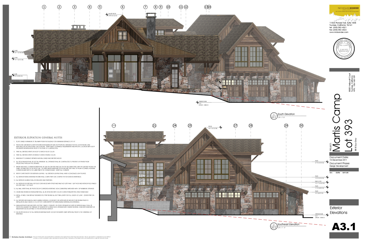
Hi Sonder. I really like those elevations! How are you achieving the fog effect? Section planes?
Are you using hybrid or raster for sketchup views?Thanks for sharing
-
@caronte01 said:
Hi Sonder. I really like those elevations! How are you achieving the fog effect? Section planes?
Are you using hybrid or raster for sketchup views?Thanks for sharing
The fog is in sketchup saved settings specific to the scene. I use raster rendering, edit quality low, export quality high.
-
@caronte01 said:
Hi Tom,
Thanks!
here you go...
[attachment=0:332x77z6]<!-- ia0 -->PRESENTACION.style<!-- ia0 -->[/attachment:332x77z6]
Thank you very much for the style! Keep posting up your work as it is inspiring!
Kind regards,
Tom
-
caronte01 - stunning use of Layout there mate!! VERY well done!
-
Thanks Richard!
Here's some of the components used for furniture. I like them because they are very simple graphically.
BLOQUES.skpCheers
s
-
Quick update.
I´ve sent dwg´s to consultants already. They were not the prettiest dwg´s I´ve seen, but they worked.
So far, layout has done it´s job perfectly well. That does not mean i´d like to see some improvements.
Floorplans:
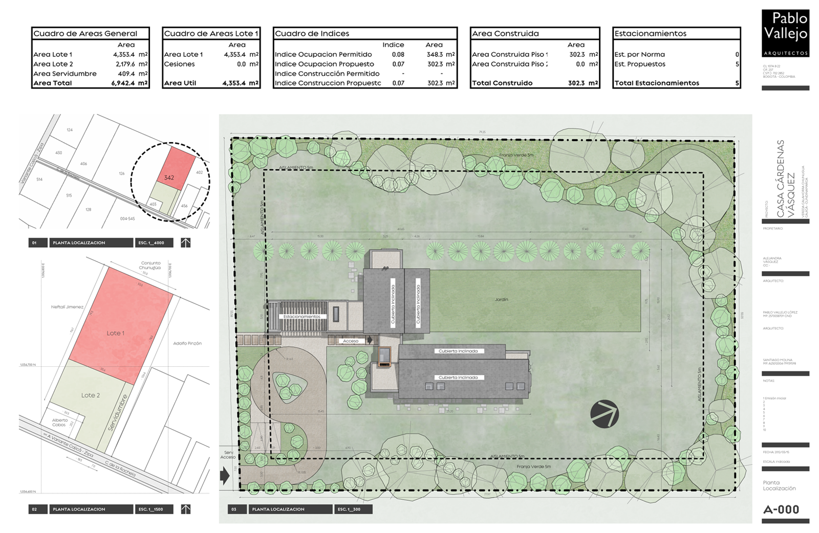
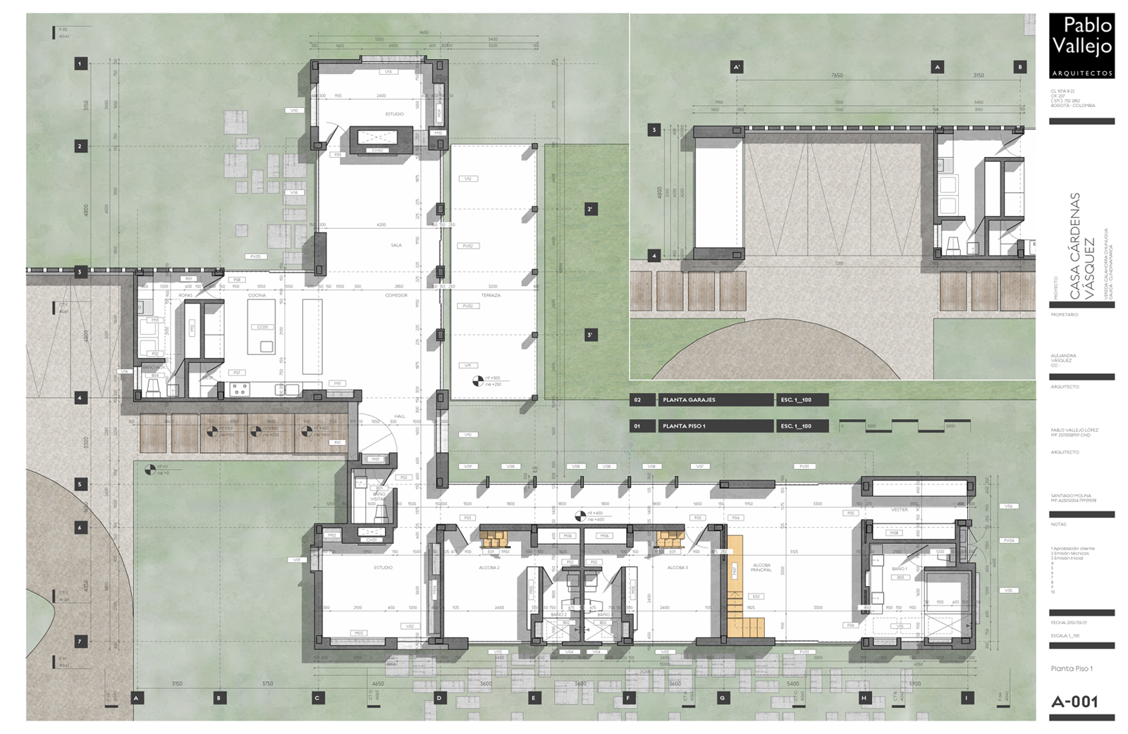
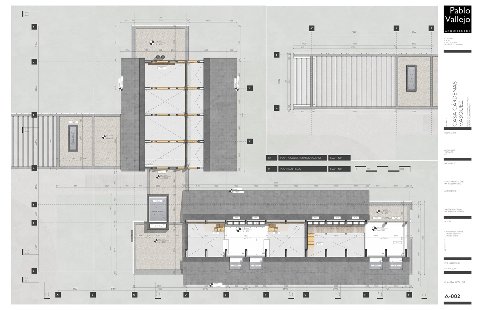
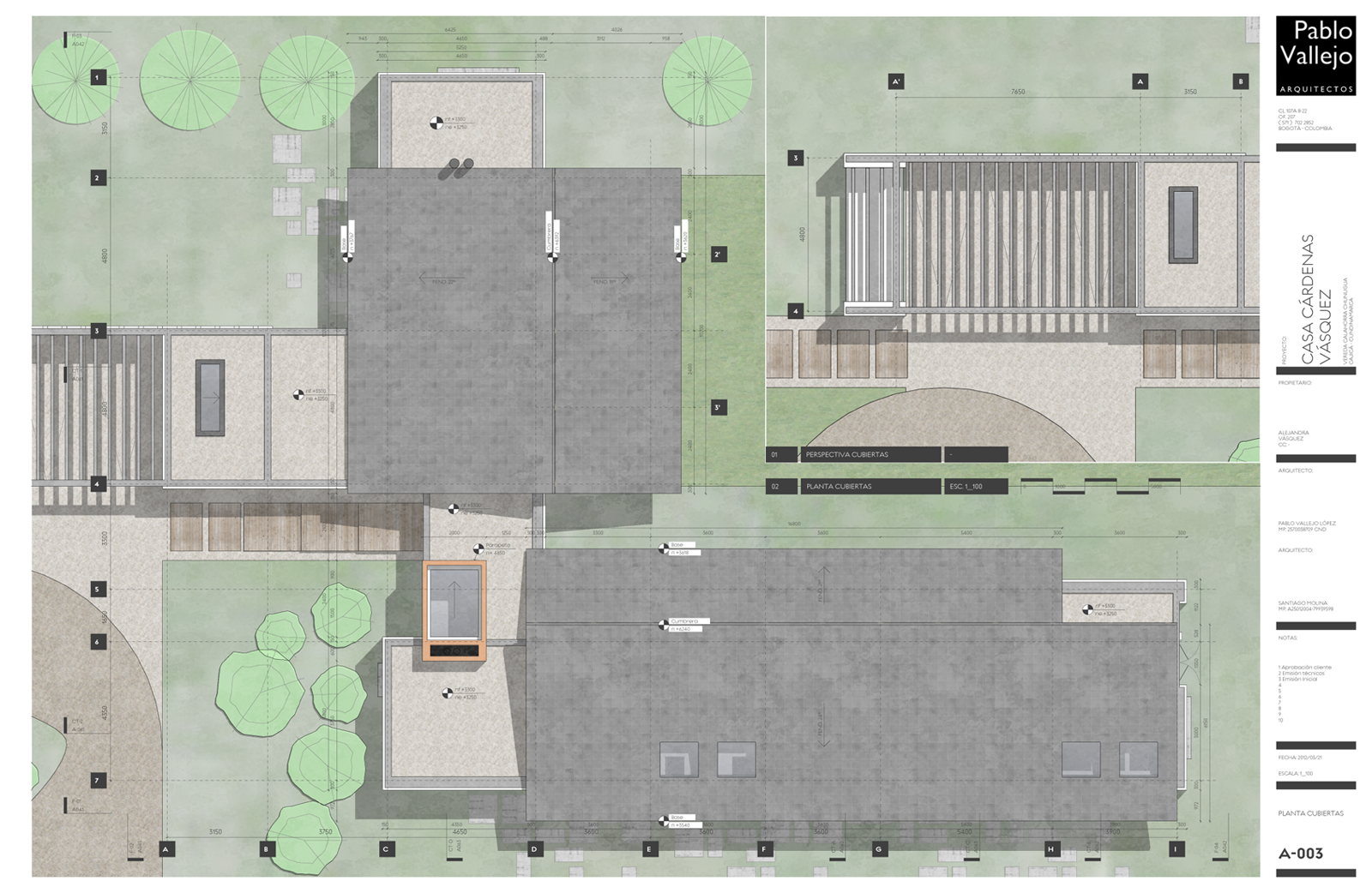
-
Elevations and sections:
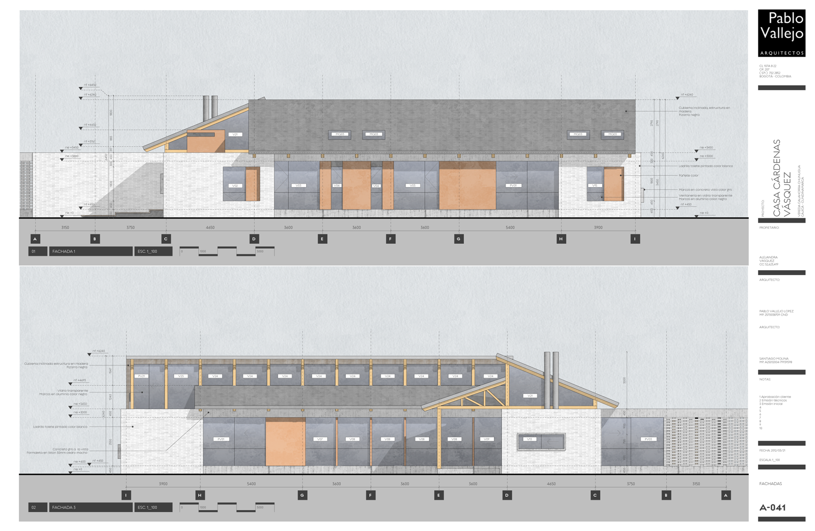
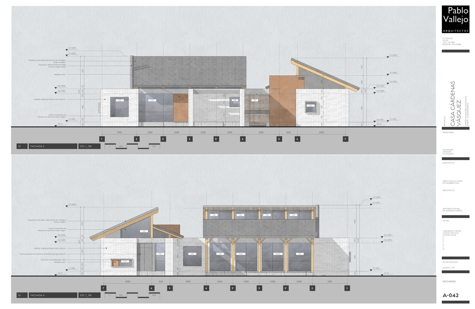
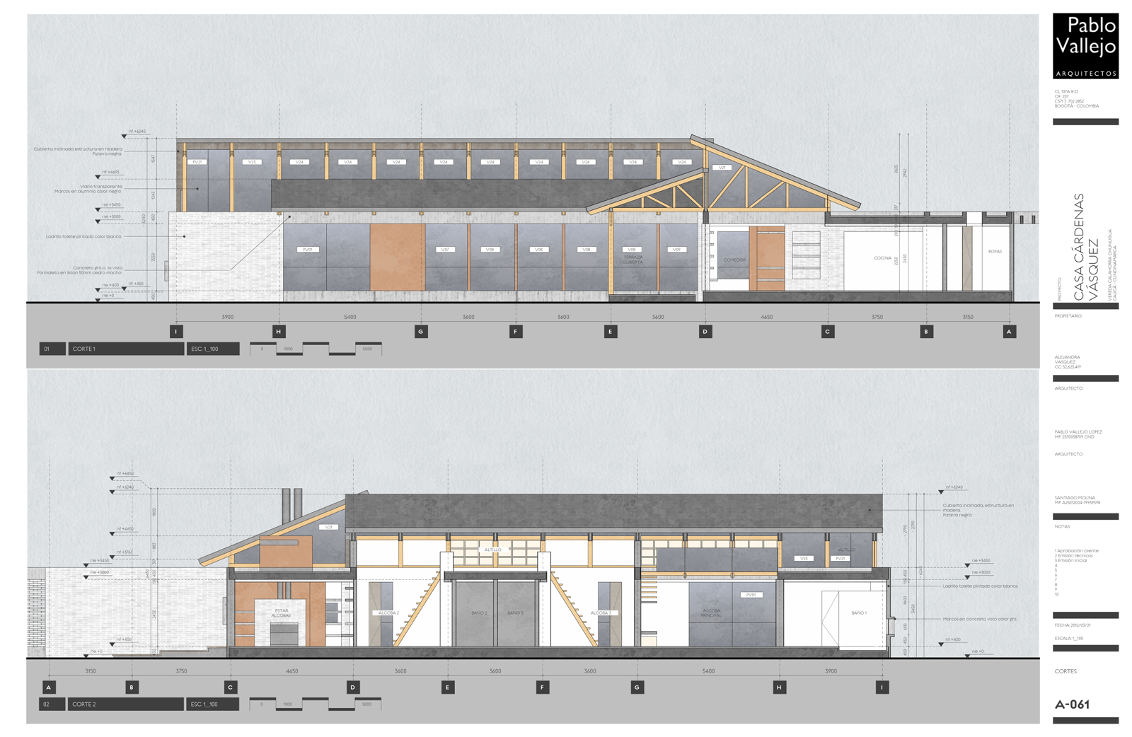
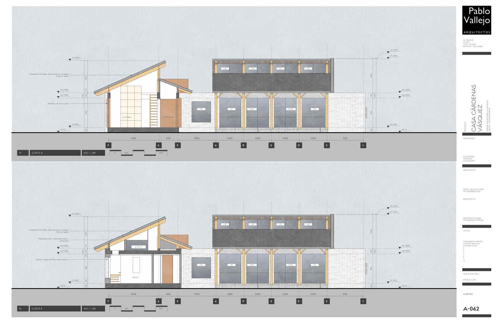
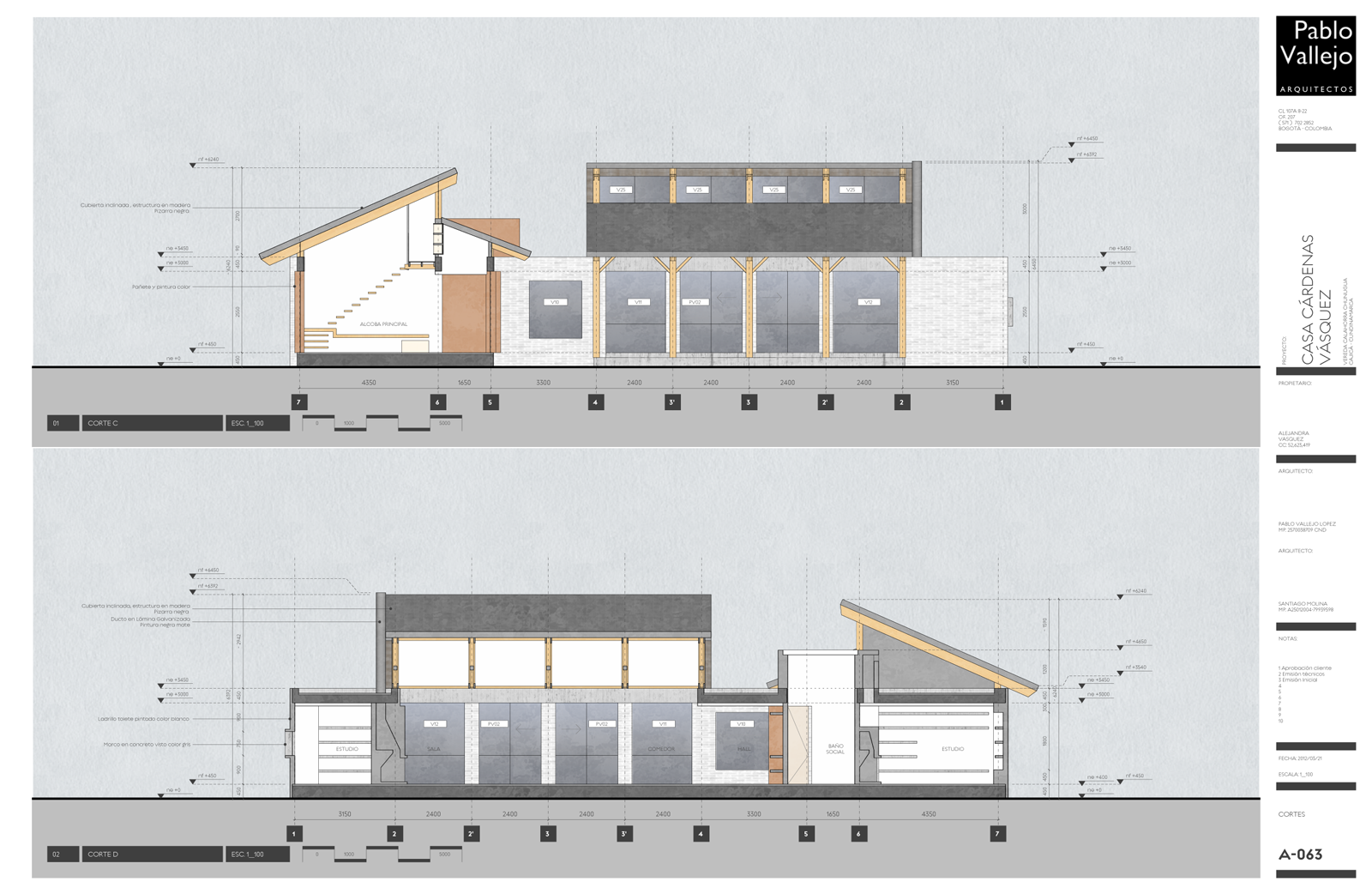
-
Looking beautiful Pablo! Very nice work.
-
Bellissimo! Go SU + LO! Peter
-
Mate these plans are stunning! Really GREAT WORK!
Mate the only thing that I wonder and would love to see a version of - without so much background! There is a relevant graphic term - "make white space your friend!".
-
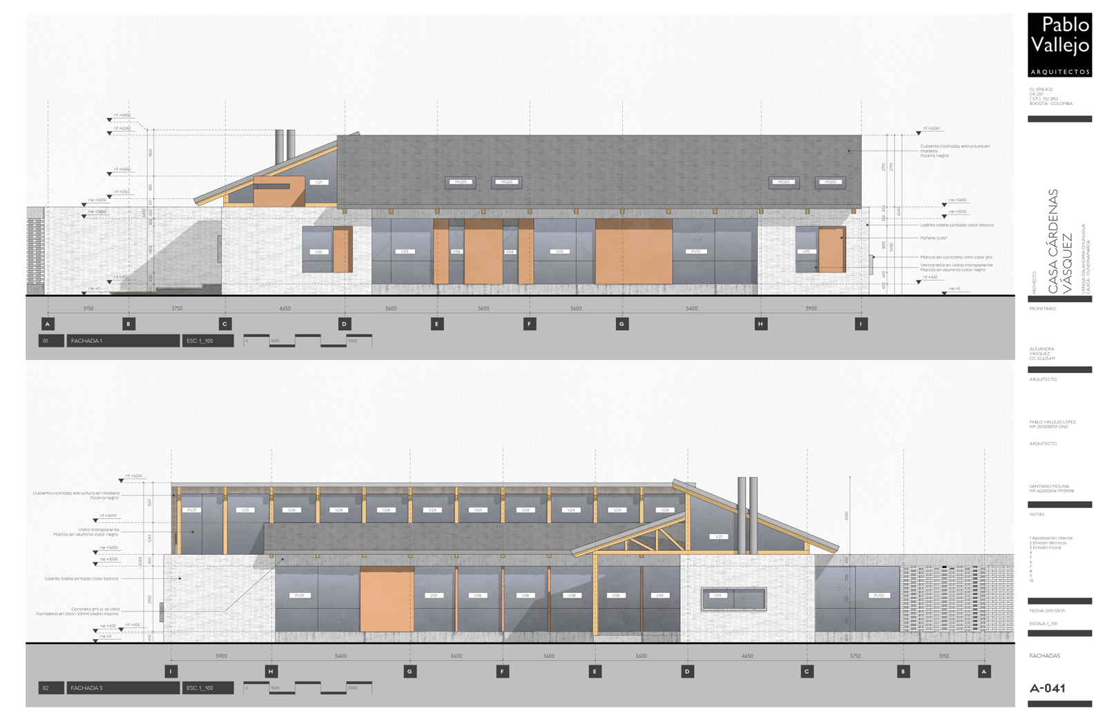
Thanks guys! I´m now starting details, after that i will return to the main model and update/reference all the changes made.
Richard, I removed the sky from sections and elevations. I like them!
-
@caronte01 said:
Richard, I removed the sky from sections and elevations. I like them!
Yeah me too mate - just cleaner! And more ESD - less ink!
 We have to be mindful of contractors writing notes on the plan, often some printers add such gloss to printed areas that the surface doesn't take a pen well. Looks like you still have a background.
Hey you checked tones in greyscale as this is always 99% of printing throughout the job!
-
@richard said:
@caronte01 said:
Hey you checked tones in greyscale as this is always 99% of printing throughout the job!
I did print some elevations in greyscale, to see how they looked. I had to increase contrast a bit. In color, they appeared ok, in bw they looked a bit washed out. Also, elevations looked great with shadows on; sections, I turned them off.
-
@caronte01 said:
@richard said:
@caronte01 said:
Hey you checked tones in greyscale as this is always 99% of printing throughout the job!
I did print some elevations in greyscale, to see how they looked. I had to increase contrast a bit. In color, they appeared ok, in bw they looked a bit washed out. Also, elevations looked great with shadows on; sections, I turned them off.
For BW increase brightness along with contrast at the printer level. I only print my color sets for the permit sets, 1 for the owner and 1 for the contractor. The rest are all BW and look really good with both fog and shadows on. Thankfully my printer has it down now, so I just send over the files and order at will. They are really good at making adjustments and testing before final printing.
-
@unknownuser said:
Thankfully my printer has it down now, so I just send over the files and order at will. They are really good at making adjustments and testing before final printing.
Look after that one mate! My printer hands me stuff with huge lines across it smiles and hands me the bill!
Hello! It looks like you're interested in this conversation, but you don't have an account yet.
Getting fed up of having to scroll through the same posts each visit? When you register for an account, you'll always come back to exactly where you were before, and choose to be notified of new replies (either via email, or push notification). You'll also be able to save bookmarks and upvote posts to show your appreciation to other community members.
With your input, this post could be even better 💗
Register LoginAdvertisement


