i have used cubicpanoout.rb in combination with gocubic to get a 3d tour from a point in the past
Posts
-
RE: VR app
-
RE: NPR canyon community center interiors
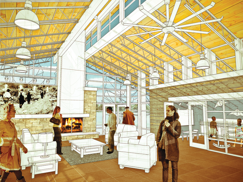
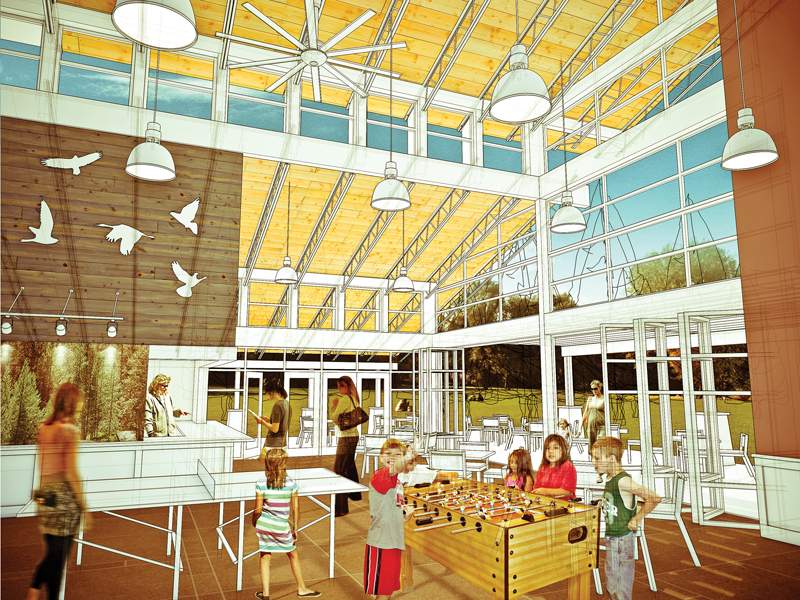
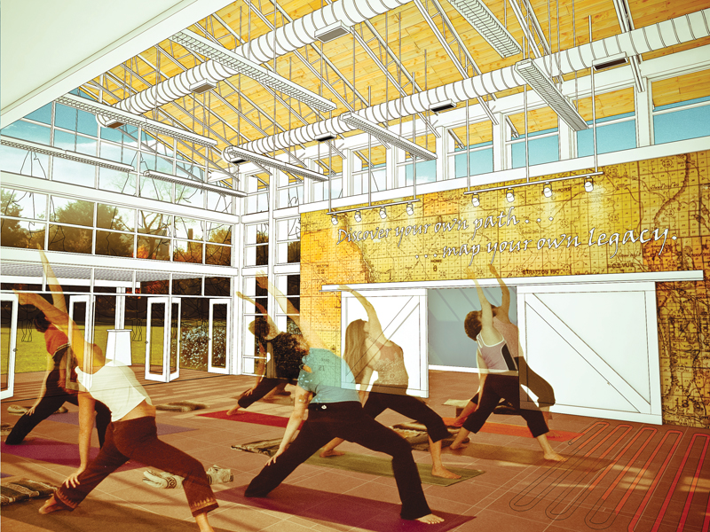
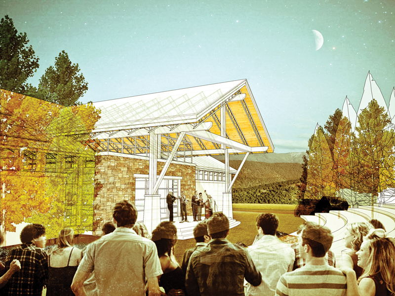
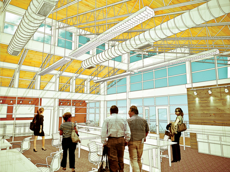
Thanks all for the positive comments! I agree the people are a little off - I'm not sure if it is the contrast or what. It was also hard to find good people cutouts that were not exterior shots - lots of people wearing sunglasses indoors, oh well!
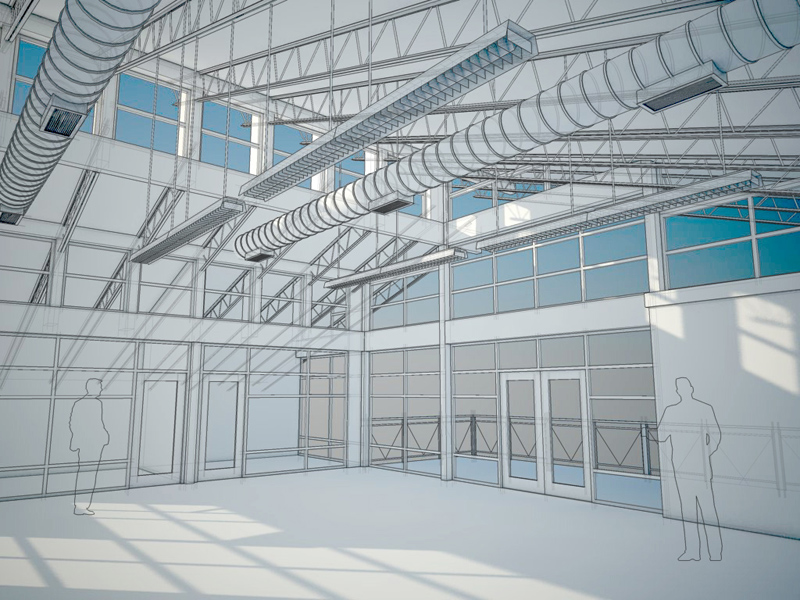
penumbradesign - almost everything is photoshop! I started off with a sketchup wireframe overlaid on a simple vray shadow render (see the last image posted above). I made a lot of use of the "vanishing point" filter to match up the textures, layered the people and vegetation, and in the end I applied a couple adjustments to warm up the hue and increase the contrast of the images to get the final look. I think a lot of the "look" is just the color palette. I tried to use a lot of warm yellows and browns in the interiors and contrast it with a blue/green sky.
-
RE: WIP and edge export question
Just wanted to follow up on the result of this thread for anyone following it. I tried a couple techniques to increase the edge thickness at high resolutions - I tried layout and also exporting as a .pdf, then opening it with illustrator to increase the line thicknesses. In both cases, I discovered there was no transparency allowed - anything past a pane of glass would be invisible, even if the glass opacity was 0. Since for this project, the connection to the outside was critical, this didn't work for me. The solution would have been to go in and delete all the glass before exporting, but I just didnt' have the time for it. I ended up beefing up the profile lines, and just accepting the puny edges for this project. In the end, I would still like to see a native style setting to increase edge thickness.
Thanks all for your quick support when I needed it most! Check out the finals here http://forums.sketchucation.com/viewtopic.php?f=81&t=39953
-
NPR canyon community center interiors
Hi everyone -
Our office recently completed a quick schematic design for a canyon community center, and presented it mostly through sketchup interior views. Thanks for all the help from the members about trying to get the lineweights right - I know it was a last minute question

Linework and shadows (vray) were exported from sketchup, the rest is photoshop.
-
RE: WIP and edge export question
awesome those lines came out a lot cleaner in the layout example. I'll take a stab at it and be back with the final product once we get this out!
-
RE: WIP and edge export question
@dave r said:
Took me longer to type this than it does to do it.
Haha. Thanks for all the feedback. Dave I think your strategy makes sense. The only problem I have with that is the larger the faces-only export gets, the more extreme your lines layer resizing has to be, which results in that jagged pixelated look. Might not be too bad for this project though since it has a rough look already.
@thomthom said:
Best solution I've found so far is using Layout.
any quick suggestions for a workflow outline? the ultimate goal is to get the edges out at a certain thickness and match it up with the faces back in photoshop at a specific image size and perspective. project is due soon and I have to admit I've never opened layout before - so sorry for the lazy-slacker sounding question
 I will probably be able to figure out the details quickly though.
It would be great to be able to vectorize the lines - i'm considering exporting to illustrator then importing into photoshop but it would be a real hassle to line everything back up
-
WIP and edge export question
Hi everyone -
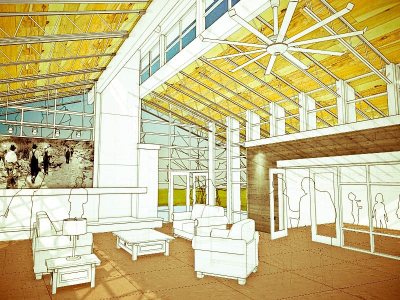
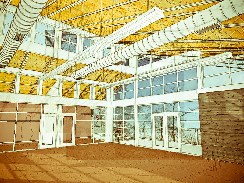
Haven't posted in a long time, but thought I would share the first trial image of a new project I am working on for a canyon community center. The attached images are basically sketchup wireframes with a lot of photoshop layered on top. The problem I am running into is that the small trial exports looks great, but when I try to scale up the resolution (exporting larger images out of SU), the ratio of the edge thicknesses decrease and become very spiderweb-like instead of nice and thick. I know you can change the width of profile lines through the style editor, but how about the normal "edges"? has anyone come up with a workaround that allows for a large export without losing the thick edges?
Any comments on the composition or rendering style that might improve the rustic look or give it a better feel are also highly welcome. There is still some modeling to do, but in general I think some of the elements will remain white as shown in the trials. The first image is the community center lobby which is envisioned as a community "living room". The second image shows the beginnings of a second story loft that is used as a coworking space - basically small rentable offices. There will be a large bullpen in the middle with private offices around the edges.
Thanks in advance!
-
RE: Inverted shadows??
Thanks guys! Very useful chain of replies! All good tips from changing the color, and I had to find the AO switch as suggested but I ended up with the right result.
-
Inverted shadows??
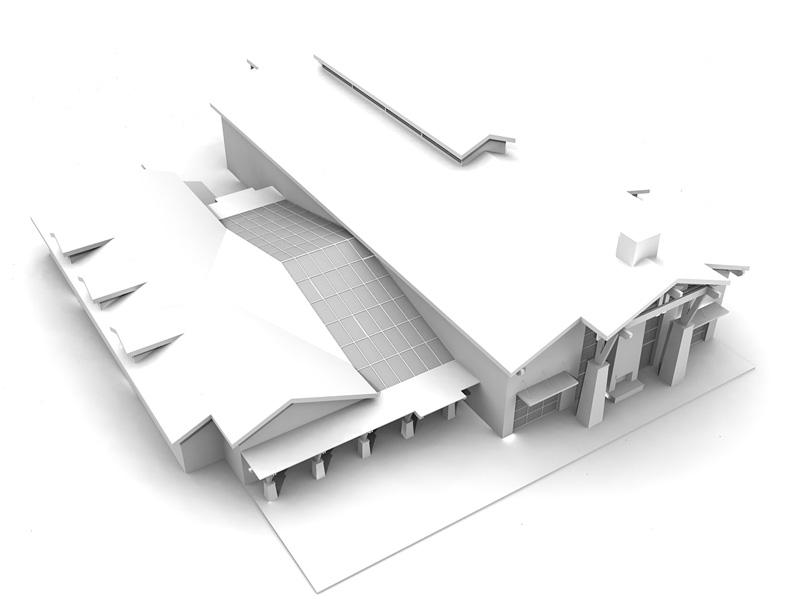
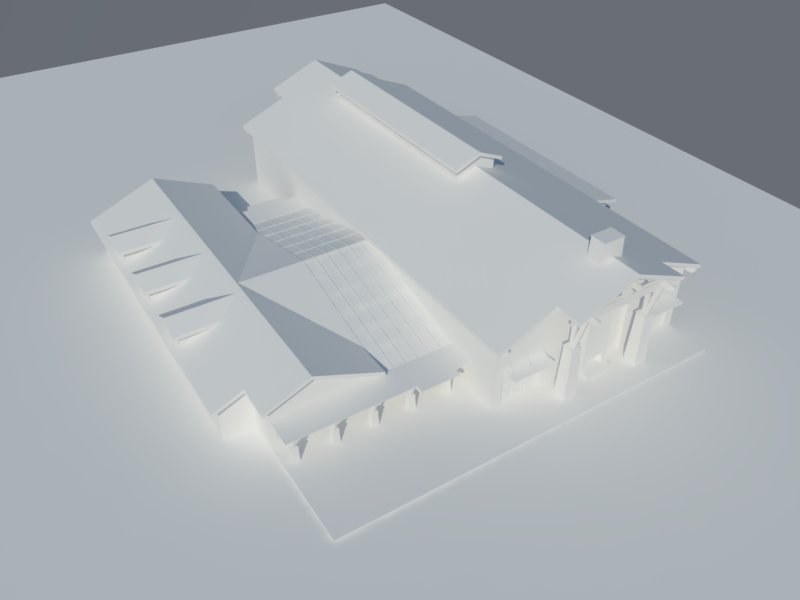
Hi everyone! I am trying to achieve a white paper model render with fairly soft light in vray. An example of what I am looking for is the first render I created using podium below. When I attempt this kind of render in vray, I get this strange effect where the shadows appear to be glowing light, see second image. What am I missing here? A couple points on how to get a nice white "studio" lighting setup would be helpful.
-
RE: Close faces
Hi folks - thanks for the replies. I have been giving the plugins some trials without much success. For the record, it will only work for the smallest selection areas but will crash otherwise. I had better luck going with a typical 'from contours' surface even though it was less accurate.
-
Close faces
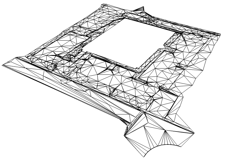
Hi folks! quick technique question: I have a file with lines representing the edges of a triangulated 3D surface and want to create the faces for the surface. Is there a quick way to close all of the triangles? create surface from contours tool is really struggling with this and will not match up. Seems simple, but I'm out of ideas.
Thanks in advance for any suggestions
-
Sketchup default search paths
Hi folks - I seem to remember this topic being covered already but can't find it though searching:
I am wondering if it is possible to change the default sketchup search path for plugins in order to create a standard network drive for the office that contained shared components, materials, styles, and plugins. Windows>preferences>files seems to contain paths to redirect everything but the plugins which would make it workstation depended. Any thoughts?
Thanks in advance!
-
RE: Color-Painting
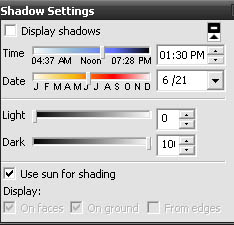
actually i think in the window>shadows palette you do want "use sun for shading" checked and set the "light" slider to 0 and the the "dark" slider to 100. This should prevent the color of a face from changing darkness based on angle of view
-
RE: My Images of the day
really great control of the camera paths in the animations - its hard to do interiors like that and control the speed and arc of the rotation and not run into anything!
-
RE: "Watercoloresque"
very playful - might check out a different view angle or rearrange the tents since they are all kind of lining up rigidly right now
-
RE: Sketchup 7.1 bugs
I get a bugsplat when trying to export a jpg at 9000x5700, shadows on, anti-alias off
I recall exporting large resolution images has been a problem for a while, has the reason for this error ever been formally addressed? It also seems to be sporadic.
-
RE: Displacement maps from Fog
how are you controlling the height of the displacement so that it matches real world units?
-
RE: SU to 3dsMax - My workflow (tutorial)
very generous of you! obviously this took you a while to put together even though it is probably second nature to you by now. Thanks for saving us a lot of future pain in guessing and checking!
-
RE: New Method for ArchViz site modeling
great work putting that together, and creative thinking to make it work as well.
at step 2, you might consider just raising each of the lines to their correct elevation and using "make contours" (skip connecting the lines from the survey drawing or closing the shapes to extrude) SU can fill in the gaps.
at step 4, have you considered using a style with black fog (SU fog window) to create the depth map? (bypasses color by z and might also give you more accurate displacement map)
I will have to give this a good shot when I have an appropriate project!!
-
RE: South wind #2
texturing on that first render is great.. you can really see where the rock interacted with the water, however the water seems to ignore the rock in both renders!! gives it the impression of a floating rock