WIP and edge export question
-
Hi everyone -
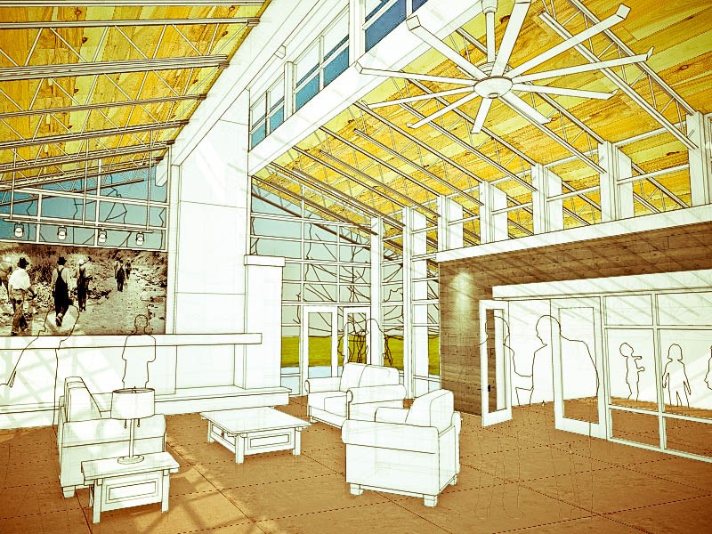
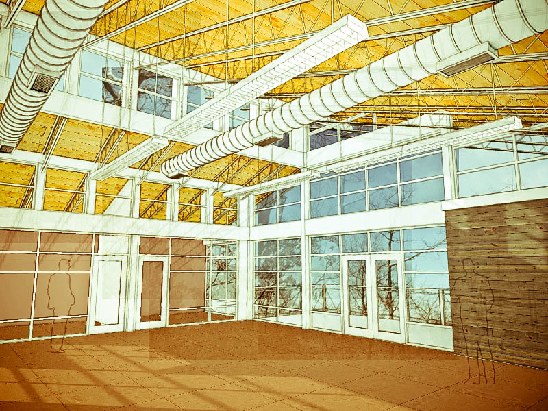
Haven't posted in a long time, but thought I would share the first trial image of a new project I am working on for a canyon community center. The attached images are basically sketchup wireframes with a lot of photoshop layered on top. The problem I am running into is that the small trial exports looks great, but when I try to scale up the resolution (exporting larger images out of SU), the ratio of the edge thicknesses decrease and become very spiderweb-like instead of nice and thick. I know you can change the width of profile lines through the style editor, but how about the normal "edges"? has anyone come up with a workaround that allows for a large export without losing the thick edges?
Any comments on the composition or rendering style that might improve the rustic look or give it a better feel are also highly welcome. There is still some modeling to do, but in general I think some of the elements will remain white as shown in the trials. The first image is the community center lobby which is envisioned as a community "living room". The second image shows the beginnings of a second story loft that is used as a coworking space - basically small rentable offices. There will be a large bullpen in the middle with private offices around the edges.
Thanks in advance!
-
I like that, the color palette is very pleasant. Helps that large open, hard lined space feel warm and comfy.
-
Nice work and nice to see you back here.
Your question about the lines is a good one. The default non-profile edges are 1 pixel wide. If you use a higher res export setting, the lines will still be 1 pixel wide and, when viewed at the same size as a lower res version, those lines will appear thinner. If you need the textures to be at a higher res but the image size will remain the same, you could export the edges separately at a lower resolution and combine with a higher res faces only export. Just turn off edges in the Styles editing tab and make the high res export. Then go to Hidden Line and readjust the resolution as needed for that export. Combine them in your image editor after resizing one of the images to match the other.
-
@mirjman said:
I know you can change the width of profile lines through the style editor, but how about the normal "edges"? has anyone come up with a workaround that allows for a large export without losing the thick edges?
Best solution I've found so far is using Layout.
-
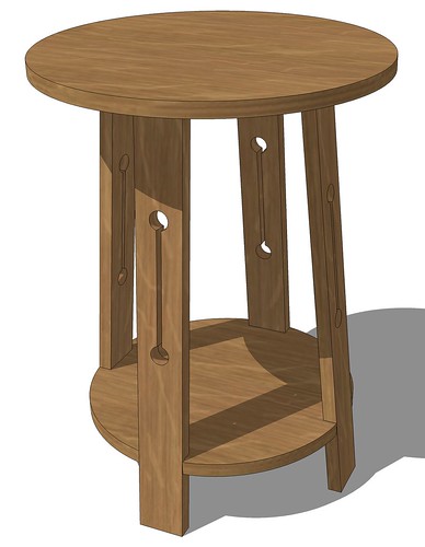
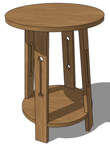
Here's a quick example of what I was describing.
This image is a PNG export at 3000 pixels wide with edges turned on. I cropped the image in PSE but that's all I did to it.
For this image, I turned off edges (and Profiles) and made a faces only export at 3000 pixels wide. Shadows were on for this export, too. Then I turned the edges on and shifted to Hidden Line so I had just the lines on a white background. No shadows, either. I exported that image at 1000 pixels wide.
In PSE I resized the lines image to 3000 pixels wide, copied and pasted it to a layer on the faces image which was set to Multiply. Then I cropped that image as well. Took me longer to type this than it does to do it.
-
@dave r said:
Took me longer to type this than it does to do it.
Haha. Thanks for all the feedback. Dave I think your strategy makes sense. The only problem I have with that is the larger the faces-only export gets, the more extreme your lines layer resizing has to be, which results in that jagged pixelated look. Might not be too bad for this project though since it has a rough look already.
@thomthom said:
Best solution I've found so far is using Layout.
any quick suggestions for a workflow outline? the ultimate goal is to get the edges out at a certain thickness and match it up with the faces back in photoshop at a specific image size and perspective. project is due soon and I have to admit I've never opened layout before - so sorry for the lazy-slacker sounding question
 I will probably be able to figure out the details quickly though.
It would be great to be able to vectorize the lines - i'm considering exporting to illustrator then importing into photoshop but it would be a real hassle to line everything back up
-
Looks great! Please summarize your workflow when you get it figured out, including SU settings etc. that give that distinctive look (if you wish to share your secrets). I think the white could be an off-white. It is so bright. But post pro may change that contrast. Interested in what you come up with for your linework question.
-
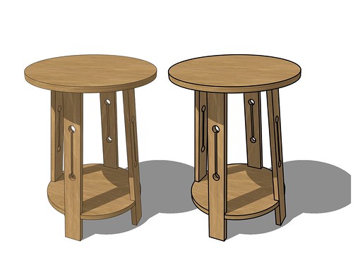
Here is an example of an image exported from LO. On the left, the lines are at the default setting of 0.50 and on the right, set to 2.0. Both viewports are rendered as Hybrid and under the Styles tab for the SU Model view on the right, line weight was changed. This is a JPG export at 3000 pixels wide from an 11" wide paper space.
-
awesome those lines came out a lot cleaner in the layout example. I'll take a stab at it and be back with the final product once we get this out!
-
I think you could also do some clean up on the enlarged lines. I just didn't take the time to do it.
With the LO thing, the line weight setting is a multiplier. So if you have Profiles set to 2 in SU and you use 2.0 for the line weight in LO, profile edges will be 4 pixels wide while the other edges will be two pixels wide.
-
Just wanted to follow up on the result of this thread for anyone following it. I tried a couple techniques to increase the edge thickness at high resolutions - I tried layout and also exporting as a .pdf, then opening it with illustrator to increase the line thicknesses. In both cases, I discovered there was no transparency allowed - anything past a pane of glass would be invisible, even if the glass opacity was 0. Since for this project, the connection to the outside was critical, this didn't work for me. The solution would have been to go in and delete all the glass before exporting, but I just didnt' have the time for it. I ended up beefing up the profile lines, and just accepting the puny edges for this project. In the end, I would still like to see a native style setting to increase edge thickness.
Thanks all for your quick support when I needed it most! Check out the finals here http://forums.sketchucation.com/viewtopic.php?f=81&t=39953
-
mirjman,
These are the nicest images i have seen in a while. i'd love to hear about your process to create these, a tut?
Hello! It looks like you're interested in this conversation, but you don't have an account yet.
Getting fed up of having to scroll through the same posts each visit? When you register for an account, you'll always come back to exactly where you were before, and choose to be notified of new replies (either via email, or push notification). You'll also be able to save bookmarks and upvote posts to show your appreciation to other community members.
With your input, this post could be even better 💗
Register LoginAdvertisement
