@dorfpunk said:
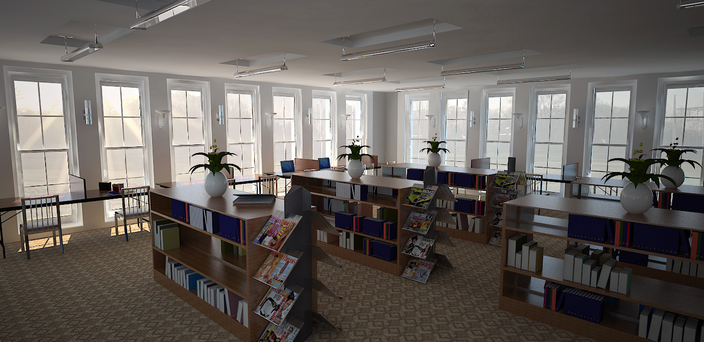
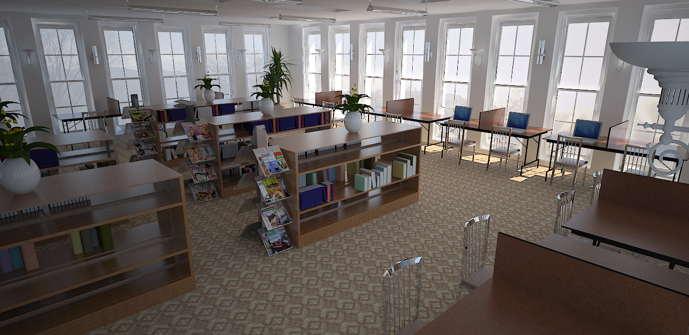
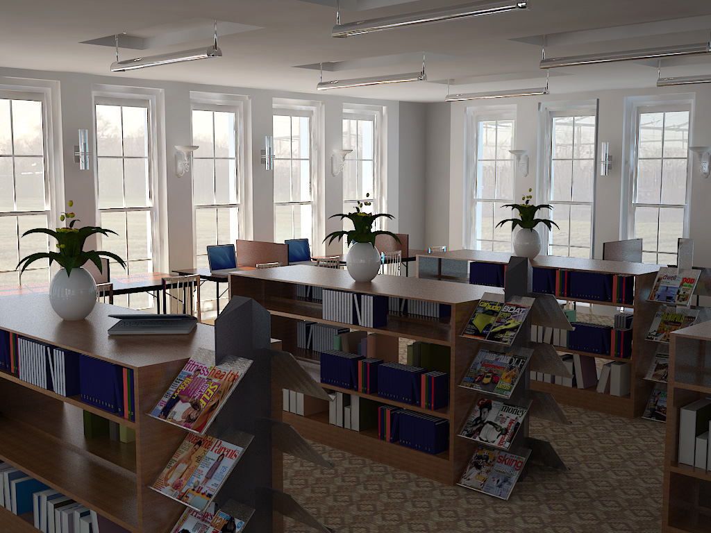
That looks really good. The sharpness point is well made. The chairs look a bit too intense in the foreground - too shiny for an indoor shot. The plants look a little bit too much the same. I really like the windows and relationship with outside. It reminds me of the little library I used to hang out in on cold days when I was living in Berlin. There are a couple of textures that are tiling a bit but then again carpet really does that, as does the wood vaneer used for most shelving so I don't know.
Anyway, that's my opinion - great stuff. 
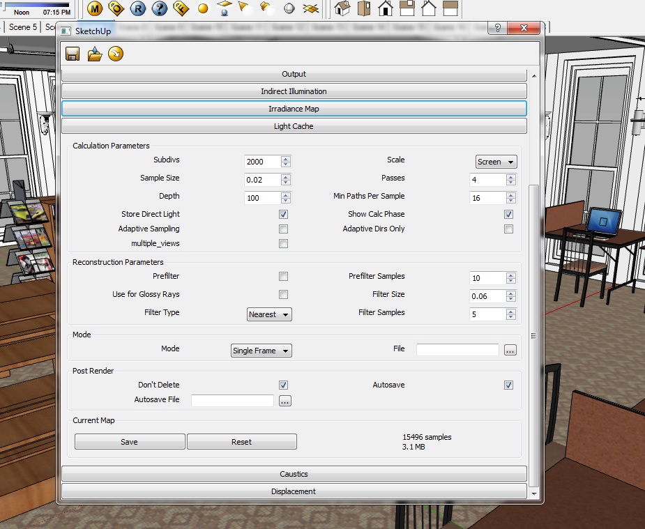
Thank you very much for your comment. The library is a full scale design with identical reading modules placed on different landings. I have noted the tiling issue and the chairs may just be a little too shiny for the interior shot...(still getting a hang of materials) the carpet...is a default sketchup material. Any help on making carpets look more in depth and realistic is welcomed.
The plants were rotated a bit to make them look uneven...maybe this view would help...
Thank you once again

 )
) (amazing criticism by the way)
 But a bit of variation would surely do no harm