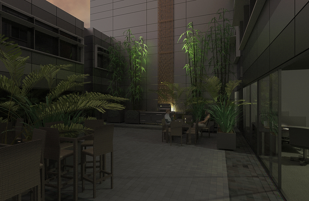
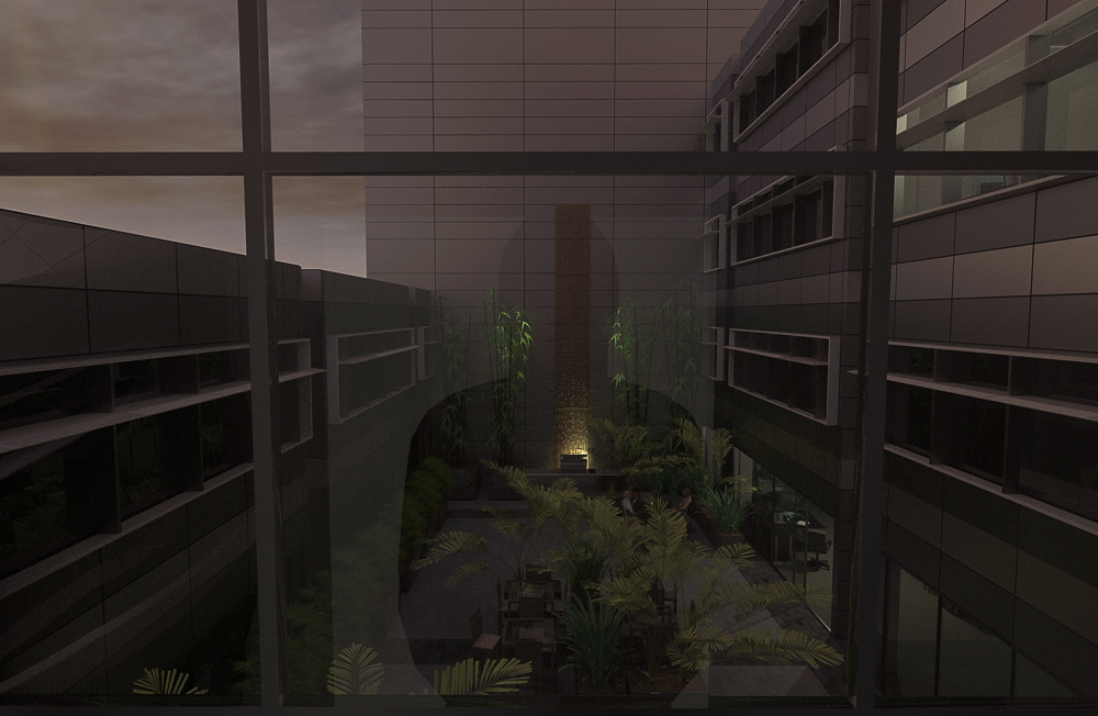
That looks awesome!
My only slightly negative comments are:
The bowl of fruit - looks great, awesomely real, but it really attracts the eye. It is quite difficult not to focus on it so I would think about toning it down (or selling fruit)
the scene outside the window doesn't quite work. Because of the cool colours used and the contrast between that and the muted, warm tones of the kitchen itself, again it stands out. It is probably a desired effect to emphasise the warmth and comfort of the kitchen but it draws the eye a little too much. Could either tone it down a little, use warmer colours so as not to contrast as much or maybe think about curtains or something.
Note: I do landscapes and would not even come close to this level of realism for an indoor scene. Looks great


