LIBRARY RENDER. PLEASE HAVE A LOOK
-
Hello Guys,
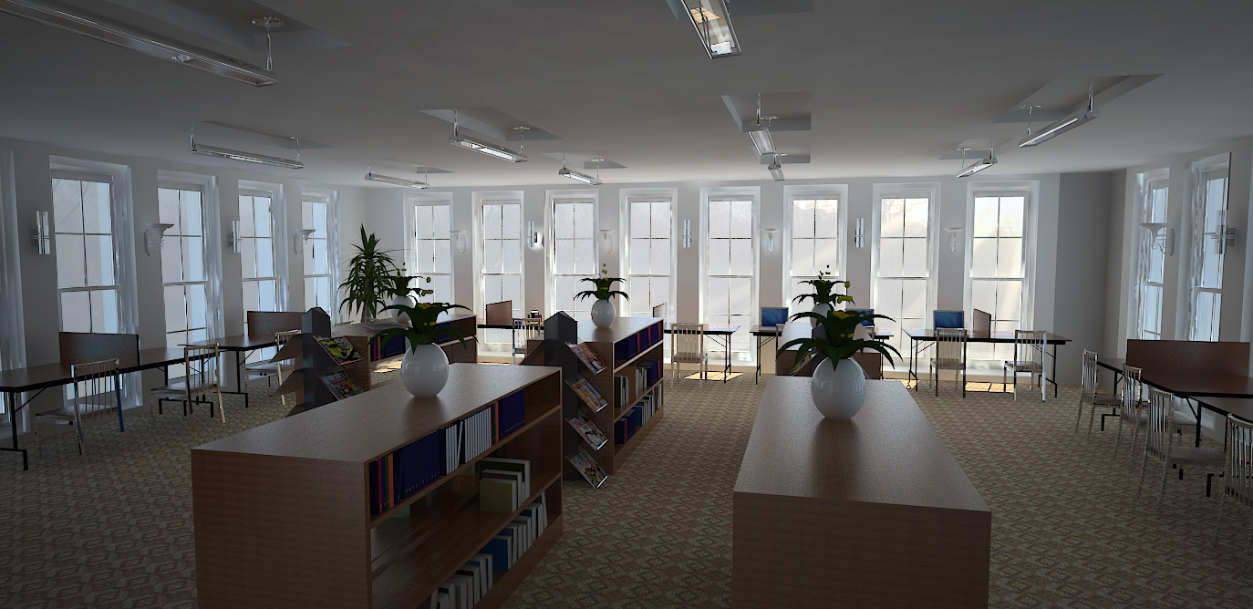
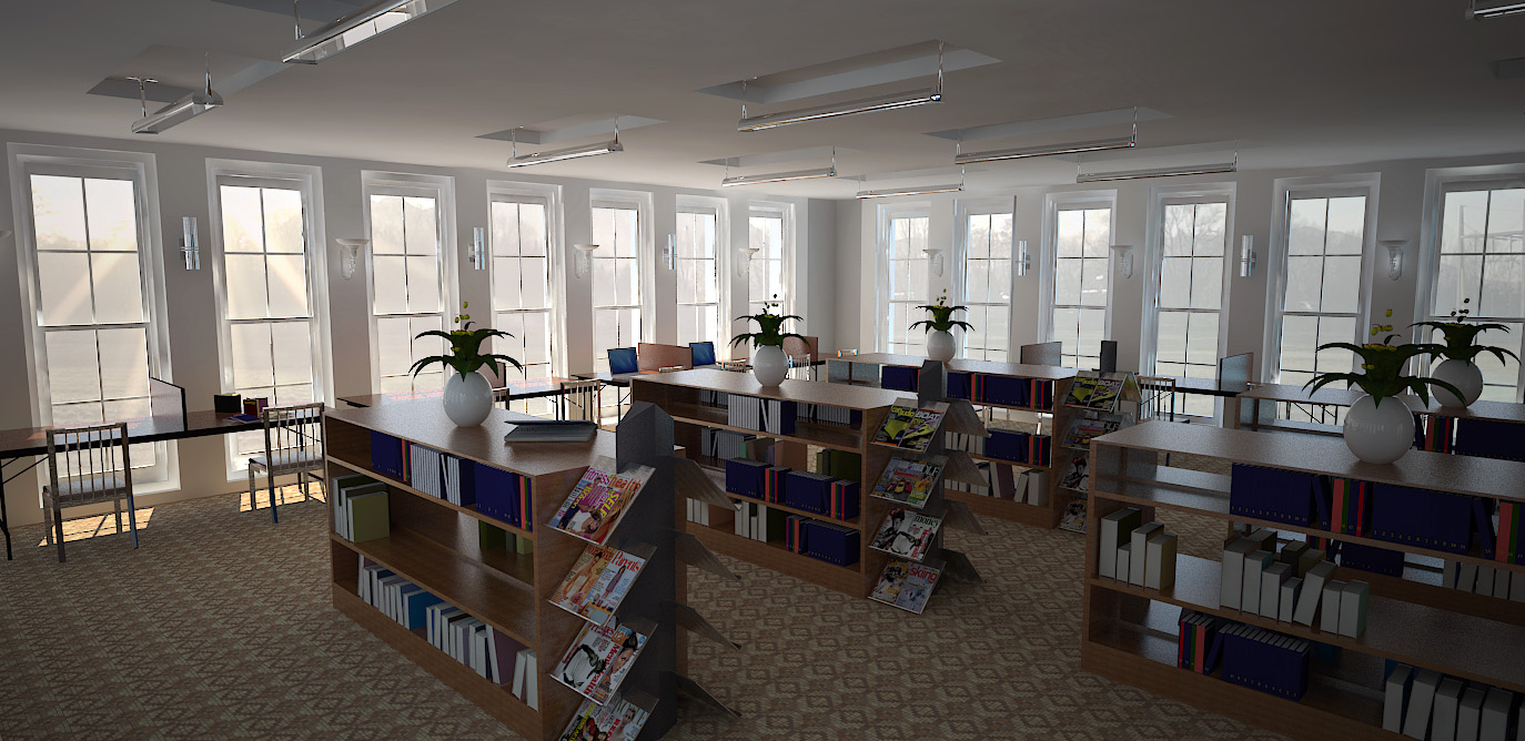
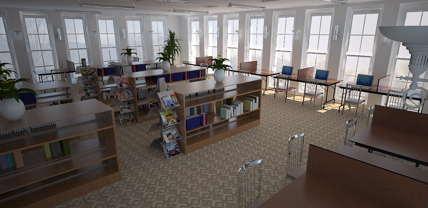
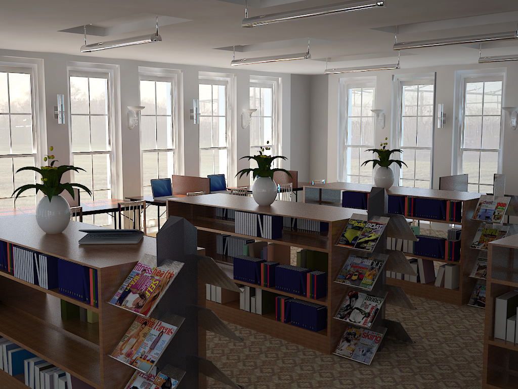
Here is a my library render using Vray 1.49. The model was done in sketchup and post production in Photoshop. I am new to vray and I was hoping to have your criticisms on this.
Thank you very much people. Look forward to posting more renders.


-
Wow...that looks great!
-
-
Great start!
 Maybe too much sharpness filter (or high pass)?
 -
That looks really good. The sharpness point is well made. The chairs look a bit too intense in the foreground - too shiny for an indoor shot. The plants look a little bit too much the same. I really like the windows and relationship with outside. It reminds me of the little library I used to hang out in on cold days when I was living in Berlin. There are a couple of textures that are tiling a bit but then again carpet really does that, as does the wood vaneer used for most shelving so I don't know.
Anyway, that's my opinion - great stuff.

-
@srx said:
Great start!
 Maybe too much sharpness filter (or high pass)?
Thanks for the criticism. I wasnt really sure how to bring out all the detail on the window (which i think i havent still understood).
I would try tweaking the high pass to see if that helps... thanks again!

-
@dorfpunk said:
That looks really good. The sharpness point is well made. The chairs look a bit too intense in the foreground - too shiny for an indoor shot. The plants look a little bit too much the same. I really like the windows and relationship with outside. It reminds me of the little library I used to hang out in on cold days when I was living in Berlin. There are a couple of textures that are tiling a bit but then again carpet really does that, as does the wood vaneer used for most shelving so I don't know.
Anyway, that's my opinion - great stuff.

Thank you very much for your comment. The library is a full scale design with identical reading modules placed on different landings. I have noted the tiling issue and the chairs may just be a little too shiny for the interior shot...(still getting a hang of materials) the carpet...is a default sketchup material. Any help on making carpets look more in depth and realistic is welcomed.
The plants were rotated a bit to make them look uneven...maybe this view would help...
Thank you once again

-
Very nice! I'd visit regularly.
-
-
i wouldn't even know it was rendered if you're not telling

-
In one of the magazines page 20 is missing
(hey, you wanted criticism )
)Really, very nice work
 although I agree that the plants need variety, maybe same pots but different kinds of plants. That what I noticed first.
 -
Things are far to orderly
The chairs are to perfectly pushed in and lined up
Turn the lights on
Add wall switches and outlets
The wall seem to have a bit too much specularityOverall these are really quite good it is just missing the details.
Scott
-
@unknownuser said:
The wall seem to have a bit too much specularity
That's bad GI, I think.
The texture on the bookshelves is way too small.
-
Very nice renders, but some of the books are facing the wrong way, the white pages should face in. Or am I seeing it wrong.
-
TLD, could you post your IR and LC settings?
-
very nice
-
@unknownuser said:
Things are far to orderly
The chairs are to perfectly pushed in and lined up
Turn the lights on
Add wall switches and outlets
The wall seem to have a bit too much specularityOverall these are really quite good it is just missing the details.
Scott
Wow did not really see into all those details...thanks so much for the observation. Appreciated

-
@hellnbak said:
In one of the magazines page 20 is missing
(hey, you wanted criticism )
)Really, very nice work
 although I agree that the plants need variety, maybe same pots but different kinds of plants. That what I noticed first.
Page 20 is missing???
 (amazing criticism by the way)
Thanks for the observation. Perhaps I have a key desire to make things a bit too orderly
 But a bit of variation would surely do no harm
  .
. -
@unknownuser said:
Very nice renders, but some of the books are facing the wrong way, the white pages should face in. Or am I seeing it wrong.
HMMMM...another interesting opinion. You do have a point. This forum is the best.

-
@unknownuser said:
TLD, could you post your IR and LC settings?
Sure i would. Been a while since I worked on this particular project. I would revisit it and attempt to recreate the view (hoping I get the same result or better) and put up the requested settings.

Hello! It looks like you're interested in this conversation, but you don't have an account yet.
Getting fed up of having to scroll through the same posts each visit? When you register for an account, you'll always come back to exactly where you were before, and choose to be notified of new replies (either via email, or push notification). You'll also be able to save bookmarks and upvote posts to show your appreciation to other community members.
With your input, this post could be even better 💗
Register LoginAdvertisement


