With all those great plugins, SketchUp's toolbars can get crowded quite quickly, reducing the size of the actual drawing window.
Also, hunting for those small icons across the screen takes time. Surely my cursor could use a break once in a while.
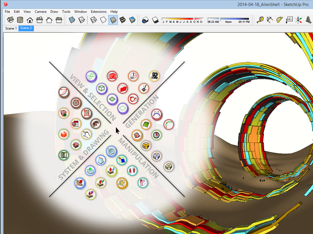
Why not make the tool icons come to the cursor instead? When holding down the space bar a set of tools appears around the cursor. You navigate with your mouse to the desired tool and either click it or release the space bar (while hovering over the tool icon) to activate it.

This tool set can be divided into different sections and labeled for better readability. The user can place any tool whereever he wants to get the perfect individual tool set.
Several tools can be combined to a group: Clicking once will activate the primary tool; clicking and holding your mouse down will open up an additional tool set with all the icons inside the group.
Icon-boundaries can be color-coded to make different icons from the same or a similar tool/plugin visually belong together.
Of course I would love those tool icons to be a bit bigger than SketchUp's native icons. That would make them easier to hit with the mouse, and also give the opportunity to display more information (like writing out the tool name or its assigned shortcut below the icon).
What do you think? That would be pretty cool, wouldn't it?
PS: I call it the Fingertips - Toolset... for obvious reasons...


