hello again!
i actually think I've finished at last! all modelling and texturing has been done, and the first "final" render is complete.
So thank you once again, you guys really motivated me with your comments!
hello again!
i actually think I've finished at last! all modelling and texturing has been done, and the first "final" render is complete.
So thank you once again, you guys really motivated me with your comments!
hi dave!
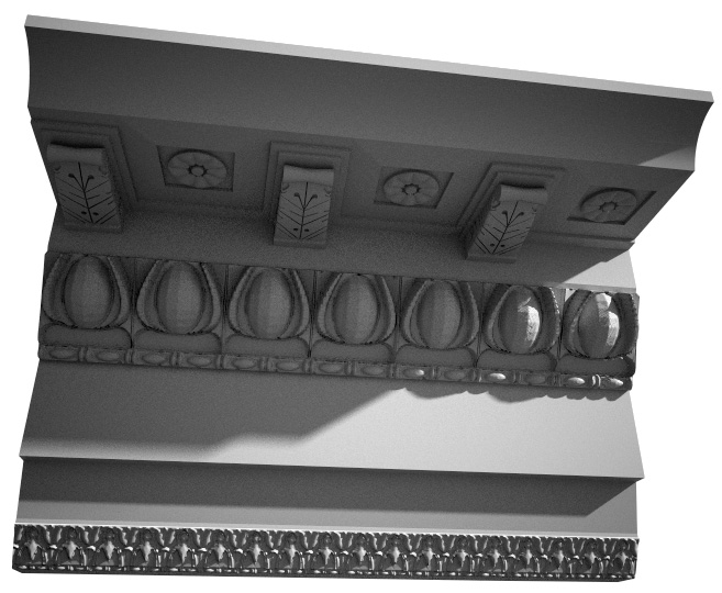
ive actually used Sketchup Fog in the past to export depth maps,kind of explained it in this thread:
http://forums.sketchucation.com/viewtopic.php?f=18&t=21987
but basically, switch of all edges, turn fog colour to black, and face colour to monochrome.
works best with objects that aren't too deep, here's an example:

@unknownuser said:
Nice Modeling indeed. The textures on the Moleskine are great as well.
Oh, and your watermark...
thanks! yeah, not too hard to find 
@majid said:
this is really cool, but I guess will never try such modeling, as I am too lazy
haha thanks  im pretty lazy too, but this was done instead of an exam I'm supposed to be studying, which is definitely more boring!
@olishea said:
eric why is your model above your toolbars? eh!
hey they are my sunglasses!! nice work, weird, but nice!! I understand your boredom modeling! sometimes boredom is really inspiring!
boredom is awful! that corner is what I see when I'm at my desk studying, so no real creativity, just what is stuck in my brain!
@karinagm said:
How did you map the textures in the notebook?
Is it just projected even for the edges?I'm having troubles maping textures to a chair. I'd use blender (or something like it) but I have no idea how to map there either lol
nice detailed glasses
hi karina! i did the notebook a while ago, I think it's just projected normally. I've never experimented with any other way of projecting textures, never had the need for it. I've definitely seen a plugin for that on these forums though, "UV tools" or something similar.
if anyone wants to toy around, ive uploaded the ipod and sunglasses to the 3d warehouse
see if you can find how i watermarked the glasses 
http://sketchup.google.com/3dwarehouse/details?mid=561c7a36563c488cd41b0ee5b32426d8
http://sketchup.google.com/3dwarehouse/details?mid=710f2da37e164dcb5f8e25a909275a57
@karinagm said:
Ahhh I like the notebook.
Is it completely detailed? looks very nice on the render
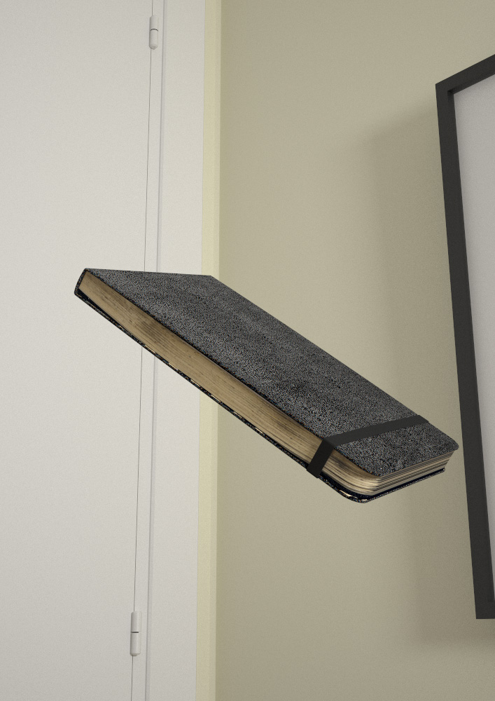
thanks karina! yes actually, each object was modelled before I had the idea of making this scene, so they were done for closeups, and thus very detailed. The notebook on its own is 33Mb! It's all bent and distorted from use, and the textures are scans of the original, quite large.
@artysmedia said:
I like the lighting (sharp) and modeling scenes. the book's scene is my favorite. What is not well managed is the movement. why not try with some blured air trails?
Goooood work!
hi artys! thanks for the comment, I do want to try and see how blurring it would look, but have no time at the moment. If anyone wants to give it a try, be my guest!
@juanv.soler said:
jopsa2
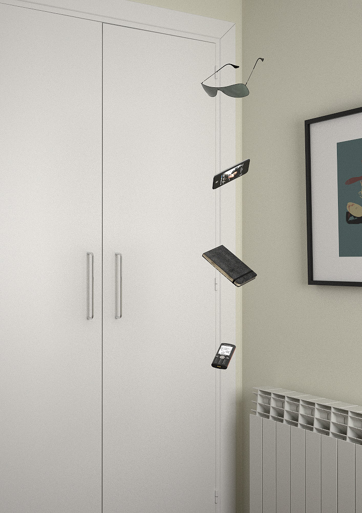
(sorry to the english sketchucationers  ) gracias juan! la verdad que son cosas que no me habia planteado, pero lo del armario en la cuarta imagen si que tiene un motivo! por un lado, me gustaba la idea de encuadrar los objetos coincidiendo justo con la esquina de la habitacion, pero por otro lado, el radiador y el cuadro robaban mucho protagonismo a la imagen. asi que decidi descentrarlo para que se vieran menos. ademas en versiones anteriores a la final, los objetos arrojaban una sombra sobre el armario, que luego decidi quitar.
in english, what i just said is that, in the final composition, the wardrobe has a lot of presence to avoid giving importance to the radiator and frame, but also trying to keep the floating objects aligned with the corner of the room
thanks guys! lovely comments 
@juanv.soler said:
hi jopsa2,
juan, I'm sorry I didn't understand your comments on the third and fourth images, but since it seems like we're both from madrid, please tell me in spanish!!  cualquier comentario es bienvenido!
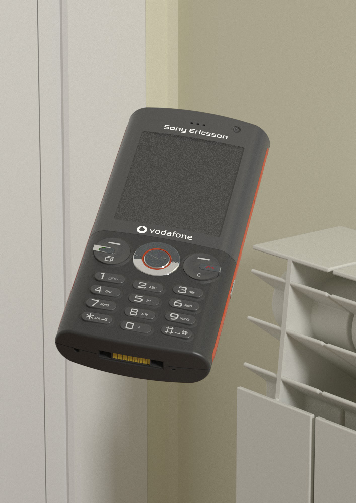
Mainly because I hate being bored, I modelled some objects I use daily, the corner of my room, threw them together and dropped them. Here are the results!
I was looking to make a still-life, so quite like that they look like they're floating rather than falling.

personally, I think Sketchup's limit is extremely high, it's only a question of letting it compute with more than one core.
in regards to file sizes, I have a 100Mb file that works perfectly, with 1M edges and 0.5M faces. It was the result of importing four 20Mb CAD files (topography curves), and letting the sandbox work on it overnight.
I wouldn't say it's touching Sketchup's limit, it orbits fine and behaves very well. I even exported some jpegs and video from it. No ceiling there!
(this video, btw)
YouTube - maqueta valle del aramaio
[flash=480,385:qlsgd4g6]http://www.youtube.com/v/X8arhdTT7-I&hl=en_US&fs=1[/flash:qlsgd4g6]
I definitely learned how to optimise with the Pantheon model, 8.7M edges, 4.7M faces, and the file size never went over 24Mb (until I started texturing). The size actually dropped as I went along and kept optimizing! About exporting, no problem doing video and 9000pix jpegs, other than time.
The file is still workable, orbiting is fine, even with materials switched on. The answer is definitely to make everything a component (86 component definitions, 5000 component instances), and to use layers if it slows down.
Not sure this is what you were asking, it's always fun to brag about whose is bigger 

hello people!
really loved this grass, so i decided to make it easier to throw over a large surface, making it dynamic! simply scale it with the scale tool, density is editable as an option in the component's option dialog
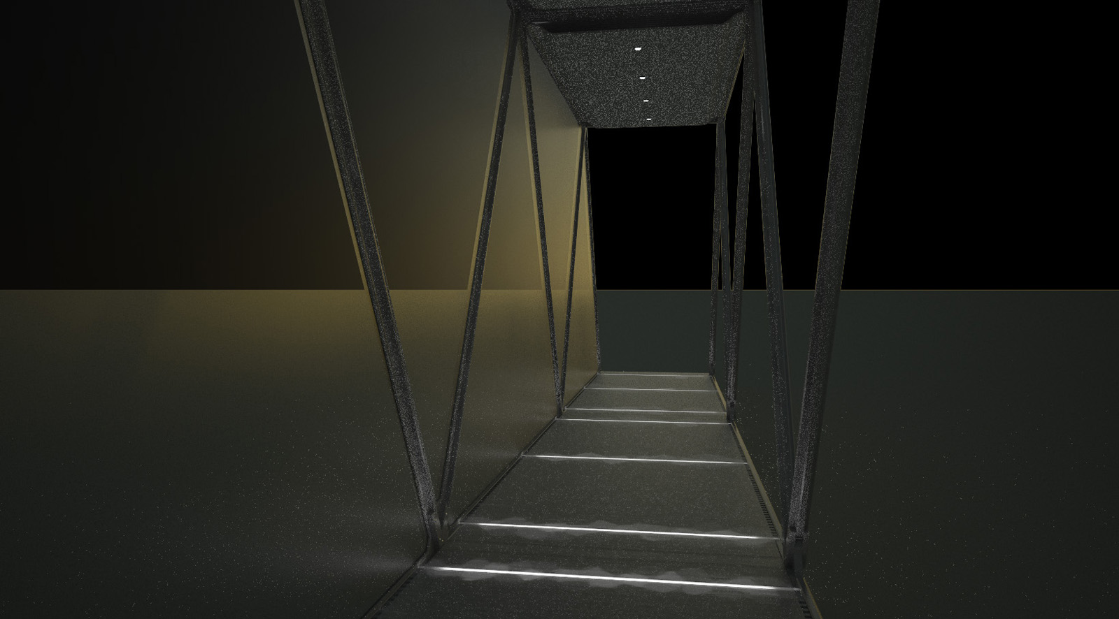
Hello sketchucation! I need some help, it's been going on for a while but until now I've been able to cope with it. Every time I use an emissive material, loads of annoying noise comes up, and I'm not sure what's causing it...
I'm sure this question has been answered before, please bear with me 
the case in question:
@roger said:
Pilou, it is true. The floor of the Pantheon is in the way.
haha good answer  yup, it seems like the marble does a good job at stopping the rain
but apparently there's a rumour going around that if enough people were inside, the heat they would generate would create an upwards draft that would deflect the rain... not true obviously, that would be one windy building!
@pichuneke said:
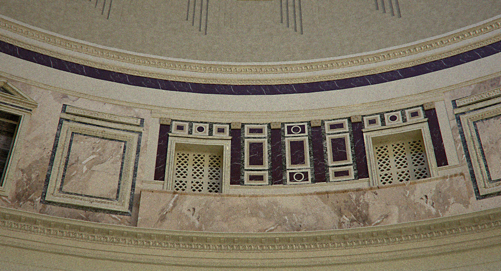
In the National Geographic Magazine of History (not the usual one) of this month , appears a drawing of the Pantheon. In that drawing, all the windows have the aspect of the first photo that you have uploaded. Perhaps those two windows are the original roman ones, and the others are recent restorations (I don't know). If you want to see the magazine, don't worry, it's the spanish edition, paisano

(I suposse you are modeling the actual Pantheon, not the original one).
hi pichuneke! yes, I read about this on Wikipedia (so you know it's true  ), the Pantheon has undergone lots of restorations in it's time, to the point that everything under the dome is different. Apparently those two windows were an 18th century attempt to make it look like it did originally.
I'm supposed to be studying for an exam, but, y'know, I could let the computer render while I'm reading... and once it's done, I can't not post-process it 

I'm getting annoyed, I'm sure it's just a day or two away of being finished, I just don't have the time!
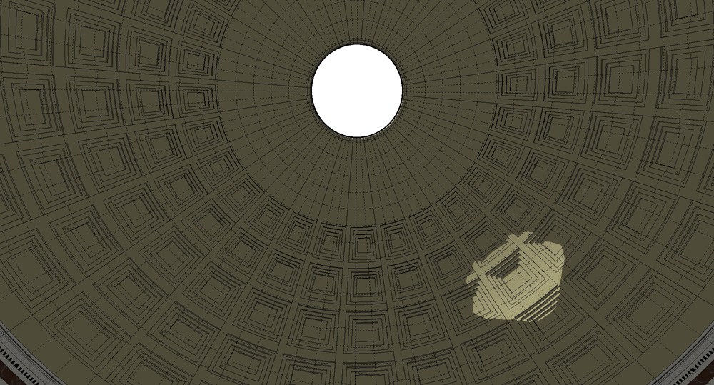
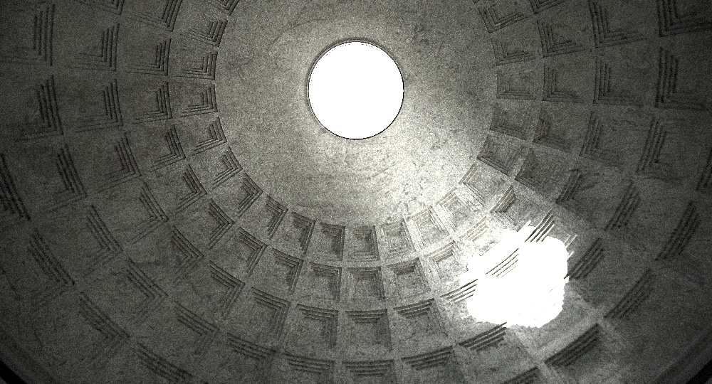
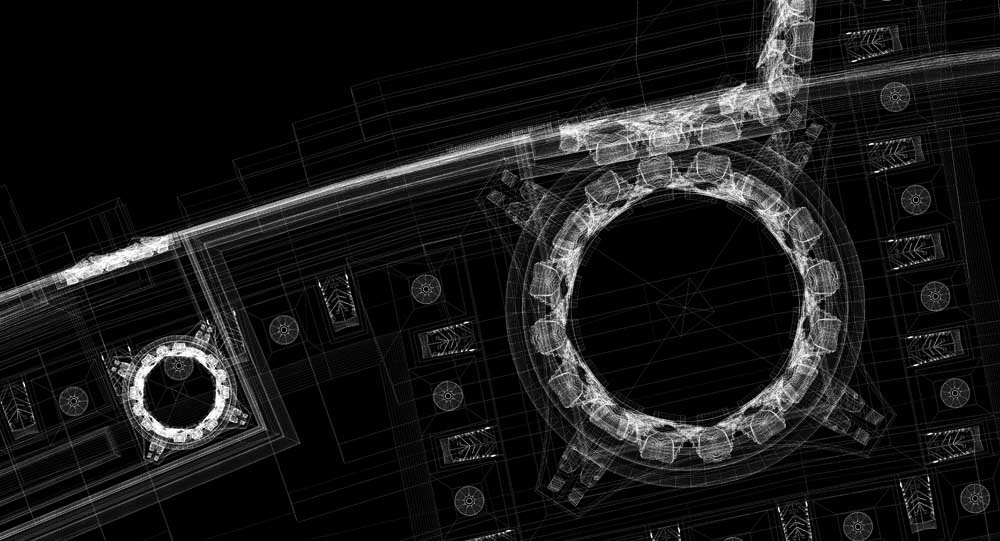
This post brought to you by sheer boredom 
wow artys, an interesting exercise! did you use photo match at all, for the modelling?
also about the cobbled road, did you place the stones manually? it looks very tiring, I would have thrown a displacement map on it! wouldnt have looked as good obviously 
very very impressive!! what a huge project to undertake, but definitely worth it! I would definitely recommend texturing it, would turn it into a killer project!
Can i ask about the stats? hoy many edges etc, did Sketchup handle it ok?
PS. nice touch with the sketchup fog 
@unkr3at1v said:
OK, this part is only rendered when ungrouped! Is this a known issue?
I'm using Vray
cool model! great attention to detail. I'm a big fan of post-pro so I'd touch the levels up a bit, get the whole range of greys.
about the grouping, I found out vray ignores groups inside groups, they just dissapear. The answer is either to explode, or to make components, which vray does render if they are inside others.
Thanks guys, I really appreciate it!
Rogeryou're right, I've learnt so much, not only about the Pantheon, but all about the Corinthian style, etc. (not to mention about Sketchup!)
broomstick, thanks for the comment  it really isn't that crazy, most of the detail are displacement maps (which I made), so not that much geometry really.
this is amazing!! shows the huge potential in sketchup, how many edges did you end up with?
also I notice in the clays that you modelled the lines on the street, I imagine it's so you only had one asphalt texture? very clever!
@unknownuser said:
Even though the rest of us hate you.
[/size]
haha noo please don't hate!  all I know about plugins and vray I know thanks to these forums, I'm very happy to share! Even though I realise these posts look like shameless self-promotion
thanks to everyone on sketchucation!
at the expense of looking cocky, I'm just too proud not to post 
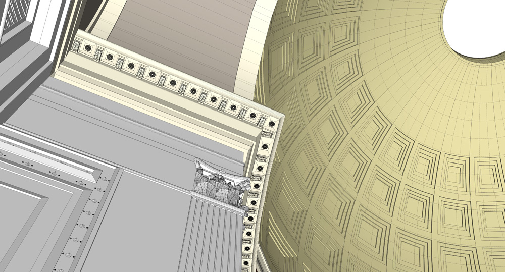
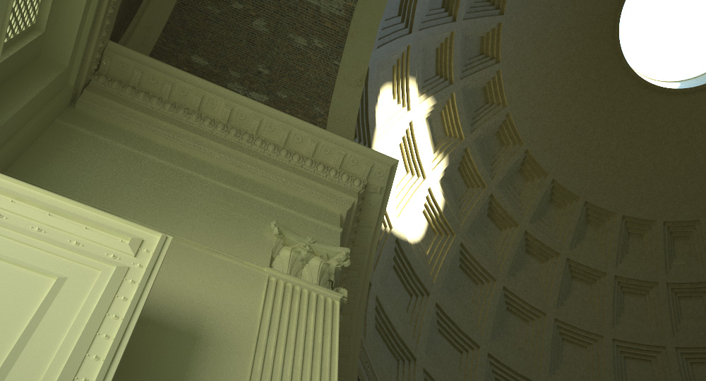
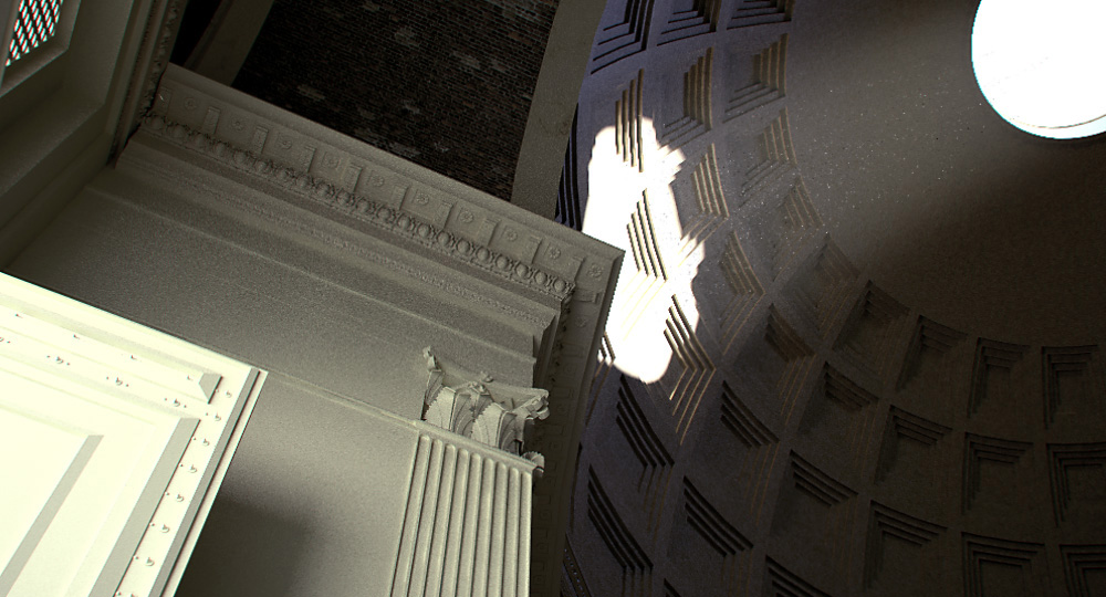
PS. this one took an absurd 4 hours to render, at this quality. still need help with that if anyone has any tips?