Falling
-
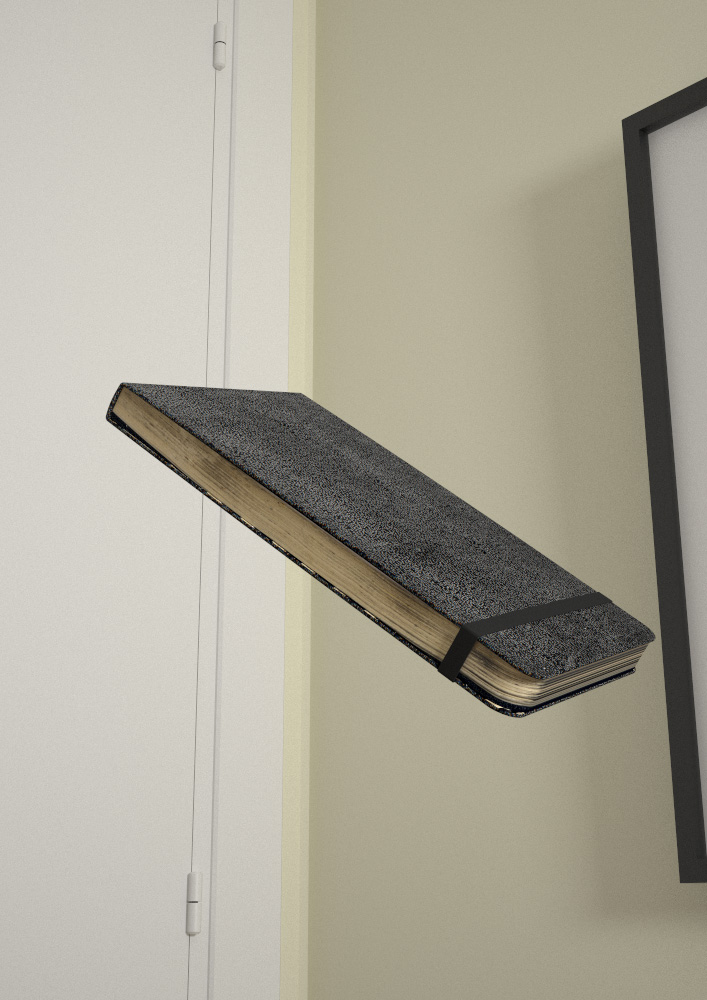
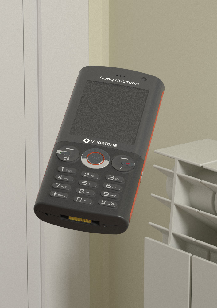
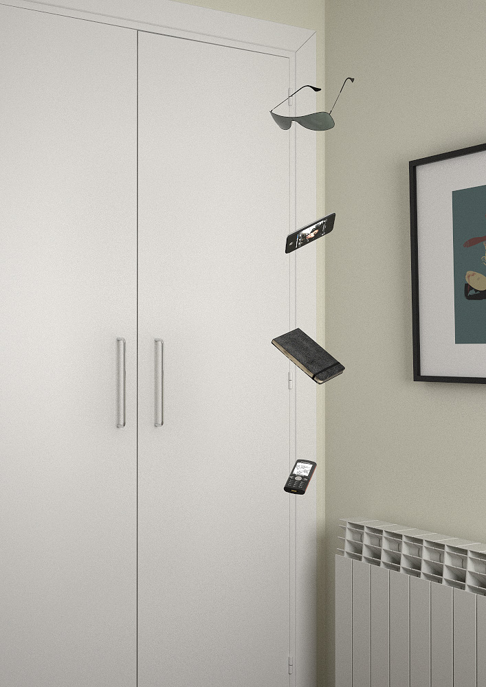
Mainly because I hate being bored, I modelled some objects I use daily, the corner of my room, threw them together and dropped them. Here are the results!
I was looking to make a still-life, so quite like that they look like they're floating rather than falling.


-
nifty concept. lovely execution. Simple and really well done.
-
Wow, very cool mate! The Moleskine would look great printed and framed

-
hi jopsa2,
the first is a good one
the second is cloudy
the third i would- of saidd, ¡ glasses ¡ better to stay quiet

the fourth , ¿ looking at the wardrobe ?
the wardrobe should not fall should it ? maybe you have to deal with walls to get it
cheers and take care
paisan
it must be hard to take the picture because of trying to look at the object and getting the space, no ?
but i like them -
thanks guys! lovely comments

@juanv.soler said:
hi jopsa2,
juan, I'm sorry I didn't understand your comments on the third and fourth images, but since it seems like we're both from madrid, please tell me in spanish!!
 cualquier comentario es bienvenido!
 -
Cool, fun and whimsical.
I like!
-
Ahhh I like the notebook.
Is it completely detailed? looks very nice on the render -
I like the lighting (sharp) and modeling scenes. the book's scene is my favorite. What is not well managed is the movement. why not try with some blured air trails?
Goooood work! -
jopsa2,
lo que quiero decir es que si tu intención es hacer un still life y reflejar que los objetos flotan en el espacio más que caen y tú eres el observador, en la tercera se me confunde todo y por eso creo que yo no hubiera tirado las gafas para hacer esa foto y lo que me pasa con la cuarta es que poniéndome en el punto de vista de observador creo que la mirada está dirigida al armario más que a los objetos y éstos parecen que caen.
La primera foto es excelente y transmite exactamente tu intención creo.
un saludo paisano
-
@karinagm said:
Ahhh I like the notebook.
Is it completely detailed? looks very nice on the renderthanks karina! yes actually, each object was modelled before I had the idea of making this scene, so they were done for closeups, and thus very detailed. The notebook on its own is 33Mb! It's all bent and distorted from use, and the textures are scans of the original, quite large.
@artysmedia said:
I like the lighting (sharp) and modeling scenes. the book's scene is my favorite. What is not well managed is the movement. why not try with some blured air trails?
Goooood work!hi artys! thanks for the comment, I do want to try and see how blurring it would look, but have no time at the moment. If anyone wants to give it a try, be my guest!
@juanv.soler said:
jopsa2
(sorry to the english sketchucationers
 ) gracias juan! la verdad que son cosas que no me habia planteado, pero lo del armario en la cuarta imagen si que tiene un motivo! por un lado, me gustaba la idea de encuadrar los objetos coincidiendo justo con la esquina de la habitacion, pero por otro lado, el radiador y el cuadro robaban mucho protagonismo a la imagen. asi que decidi descentrarlo para que se vieran menos. ademas en versiones anteriores a la final, los objetos arrojaban una sombra sobre el armario, que luego decidi quitar.
in english, what i just said is that, in the final composition, the wardrobe has a lot of presence to avoid giving importance to the radiator and frame, but also trying to keep the floating objects aligned with the corner of the room
-
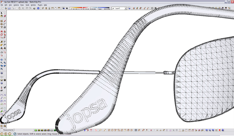
if anyone wants to toy around, ive uploaded the ipod and sunglasses to the 3d warehouse
see if you can find how i watermarked the glasses

http://sketchup.google.com/3dwarehouse/details?mid=561c7a36563c488cd41b0ee5b32426d8
http://sketchup.google.com/3dwarehouse/details?mid=710f2da37e164dcb5f8e25a909275a57 -
Nice Modeling indeed. The textures on the Moleskine are great as well.
Oh, and your watermark...

-
this is really cool, but I guess will never try such modeling, as I am too lazy

-
eric why is your model above your toolbars? eh!

hey they are my sunglasses!! nice work, weird, but nice!! I understand your boredom modeling! sometimes boredom is really inspiring!
-
How did you map the textures in the notebook?
Is it just projected even for the edges?I'm having troubles maping textures to a chair. I'd use blender (or something like it) but I have no idea how to map there either lol
nice detailed glasses

-
@unknownuser said:
Nice Modeling indeed. The textures on the Moleskine are great as well.
Oh, and your watermark...
thanks! yeah, not too hard to find

@majid said:
this is really cool, but I guess will never try such modeling, as I am too lazy

haha thanks
 im pretty lazy too, but this was done instead of an exam I'm supposed to be studying, which is definitely more boring!
@olishea said:
eric why is your model above your toolbars? eh!

hey they are my sunglasses!! nice work, weird, but nice!! I understand your boredom modeling! sometimes boredom is really inspiring!
boredom is awful! that corner is what I see when I'm at my desk studying, so no real creativity, just what is stuck in my brain!
@karinagm said:
How did you map the textures in the notebook?
Is it just projected even for the edges?I'm having troubles maping textures to a chair. I'd use blender (or something like it) but I have no idea how to map there either lol
nice detailed glasses

hi karina! i did the notebook a while ago, I think it's just projected normally. I've never experimented with any other way of projecting textures, never had the need for it. I've definitely seen a plugin for that on these forums though, "UV tools" or something similar.
-
Hi Jopsa
I edited your sunglasses so the arms would open and close dynamically

http://sketchup.google.com/3dwarehouse/details?mid=ea010debc316684b7110df4a9067471b -
@olishea said:
eric why is your model above your toolbars? eh!

I did that with the new "Outside Toolbars" plugin, you can find it.... nah, just Photoshop.

Hello! It looks like you're interested in this conversation, but you don't have an account yet.
Getting fed up of having to scroll through the same posts each visit? When you register for an account, you'll always come back to exactly where you were before, and choose to be notified of new replies (either via email, or push notification). You'll also be able to save bookmarks and upvote posts to show your appreciation to other community members.
With your input, this post could be even better 💗
Register LoginAdvertisement


