Dear LE, a few impressions:
Interesting project. Renovations/additions to existing buildings can be challenging. Sometimes the solution is obvious, and sometimes it's "oh, crap, what am I gonna do with this?"
I would lose the blue glass in the refurb model - it looks cartoonish. Try a gray colored glass. For added effect, put drapes/blinds behind them to make it look more real. Swap out your green pool water with blue water (algae makes water look green; blue water will look clean and inviting)
The area enclosing the pool seems chaotic to me. There is a lot going on. I don't see any unifying design element or materials. Part of it could be the textures you are using, too.
I don't think the idea of the slate ribbon is "too bold" - perhaps that can be the unifying element, with the slate paving flowing into the pool court and elsewhere? (just a thought)
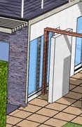
You have a large glass window on your addition, and just outside that window is... a wall? What's up with that? Who wants to look out a window and see a wall?
That large lawn area to the left of the pool court appears as left over space, and isn't engaged with the house or the other two site areas (pool and area off the addition).