Yes, very nice. Looks dark on my monitor too, but I'm guessing it's because of all the light coming in through the window, the rest of the room looks dark in comparison (without lights on).
Oops, your profile's looking a bit empty! To help us tailor your experience, please fill in key details like your SketchUp version, skill level, operating system, and more. Update and save your info on your profile page today!
Check out Febhouse | New extensions for Shadow Analysis in SketchUp Download
Posts
-
RE: Bathroom
-
RE: A few renders.(updated)
It's nice seeing your work again after too long an absence. Thanks.
-
RE: Temperance Hall Rendering
Andy, Bryan: thanks for the comments. I had included some soldier coursing on the construction documents, but when I added them in the model they seemed pointless. I may have to re-look at that.
Bryan, you are correct, the stair tower sets back from the Temperance Hall and the office building to the right. If you move further to the right, or look at it from the left, the stair tower addition is all but obscured (the building on the right extend past the Temperance Hall almost to the sidewalk).
-
RE: Temperance Hall Rendering
Thanks, Andybot. The space for the addition was very limited - the stair/elevator is as small as possible, so there really is no room for breaking it up. Our goal on the addition was to create something simple and different from the historic building, so as not to compete with it, and to clearly delineate the addition from the existing.
-
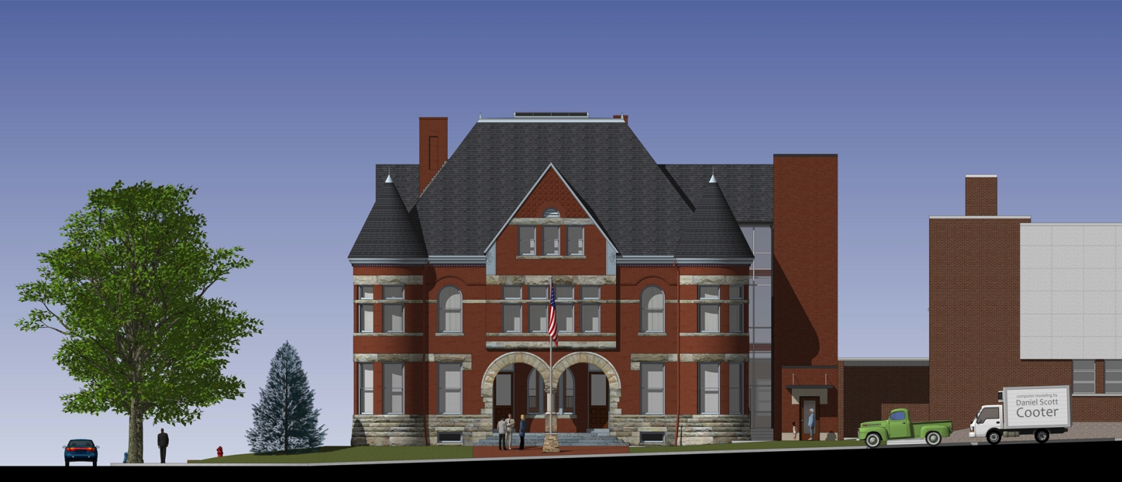
Temperance Hall Rendering
Restoration project our office has been working on over the years. They asked for a rendering for fund-raising purposes; fortunately, I had already started a model years ago (http://sketchucation.com/forums/viewtopic.php?f=81%26amp;t=20154%26amp;p=167829%26amp;hilit=temperance+hall#p167829) Tadema was kind enough to do the shingles on the conical roofs for me.
The tall brick tower to the right of the building is a new elevator and exit stair. Linking it to the building is a new glass and steel structure that aligns with the gable on that side. The masonry work and windows are left intact and visible within the structure, with one window at each floor removed and the opening lowered to create an entrance into the building.
Here's a LumenRT rendering and a raw SU rendered elevation.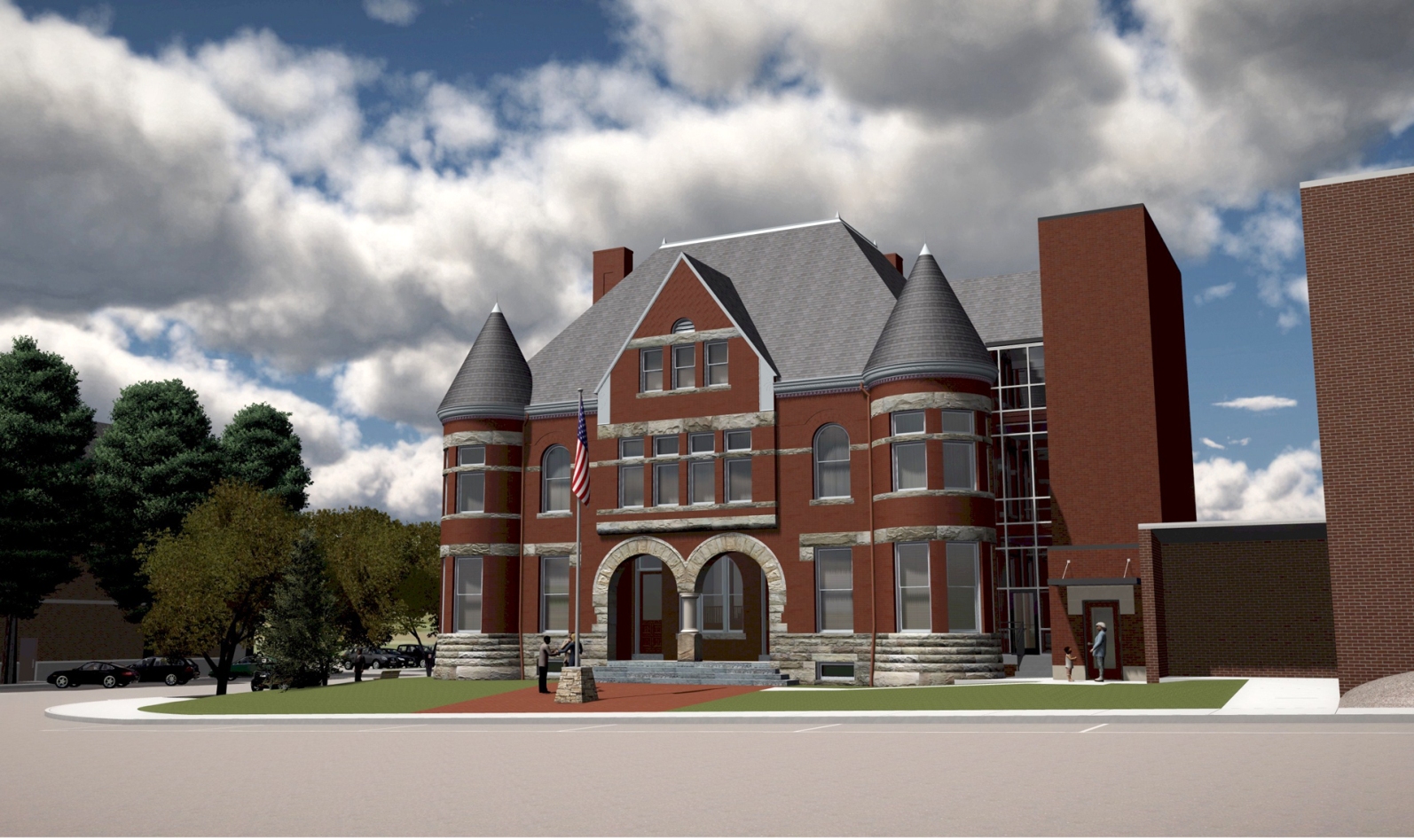
-
RE: Community Modeling
@solo said:
I'd like a stab at rendering the final model if possible
When done, maybe it can be a "render-this" challenge
-
RE: Scania 164L
Great image, John.
I'd be up to the community model project if schedule permits and depending on what it is. -
RE: Basketball court
That looks bankety-blank fantastic, Adam.
Any custodial staff would be envious of that floor. -
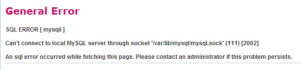
Trouble accessing the Forum?
I received an email from one of the forum members in England. He hasn't been able to access this website for over a week. He gets the following error page. Anyone have any information or advice I can forward to him?
-
RE: Midway Gardens
Very impressive work, sir.
A few things to consider, as seen in your last rendering "interior of private club":
- be careful of the direction of the grain on your wood textures. It appears to be running vertically on the horizontal bands. Likewise on a stile & rail door, door casing, etc.
- When modeling a wood element that is adjacent to another wood element (such as double doors in a wood frame), and it is going to be rendered, remember in the rendering those SU lines will disappear and those elements will appear as a single object (especially if the same texture is used). I usually model a slight gap between around the doors; for added measure, I sometimes color the inside of that gap darker.
-
RE: Fifty Shades of Grey - Saucy 3D Visuals!!!
@unknownuser said:
@solo said:
Is this based off the upcoming movie set or just your imagination?
I could be wrong but this may indeed be the first porn set modeled with SU, well done.

Haha! I didn't think of it in that way!! These images are based on the actual descriptions in the first book and NOT my imagination!!!

YOU READ THE BOOK!

Nice renderings, but the leather couch and bedspread appear a bit grainy....oh, god...I hope that's what it is, a grainy rendering...and not...something else

-
RE: H PLAN HOUSE
Nice design, Serrot.
Your floor plan would red better if you turned the end points off. Likewise on the perspective images. The emphasized end points are creating ink blobs at your window corners, rather than showing the clean, crisp design you intended. -
RE: 3d animation House Project By lumion+Sketchup
@unknownuser said:
@unknownuser said:
Is it as easy to use as it appears?
Sure it is! That is its first quality! Second is the speedy of result!

Alas all that has a cost!
Yeah, I saw the price tag...unless I win the lottery, it's out of the realm of possibility for me. The demo videos make it look slick, and at that price it should be, but who knows what all went into making those videos (kinda like the commercials for cancer treatment centers we have here, with the small print at the bottom stating "results not typical").
-
RE: 3d animation House Project By lumion+Sketchup
Nice video, Jones04. It could use some improving: it's a bit jerky, a higher resolution would be nice, and the wood texture (such as the columns in the courtyard) could be better. Also, if you don't have much surrounding context, I'd start with a closer shot so one doesn't see the endless grass plain surrounding the model.
How do you like Lumion? Is it as easy to use as it appears?
-
RE: Maxwell grass feature experiment
those look incredible, novena.
Makes me wish I had the time to try that software out.