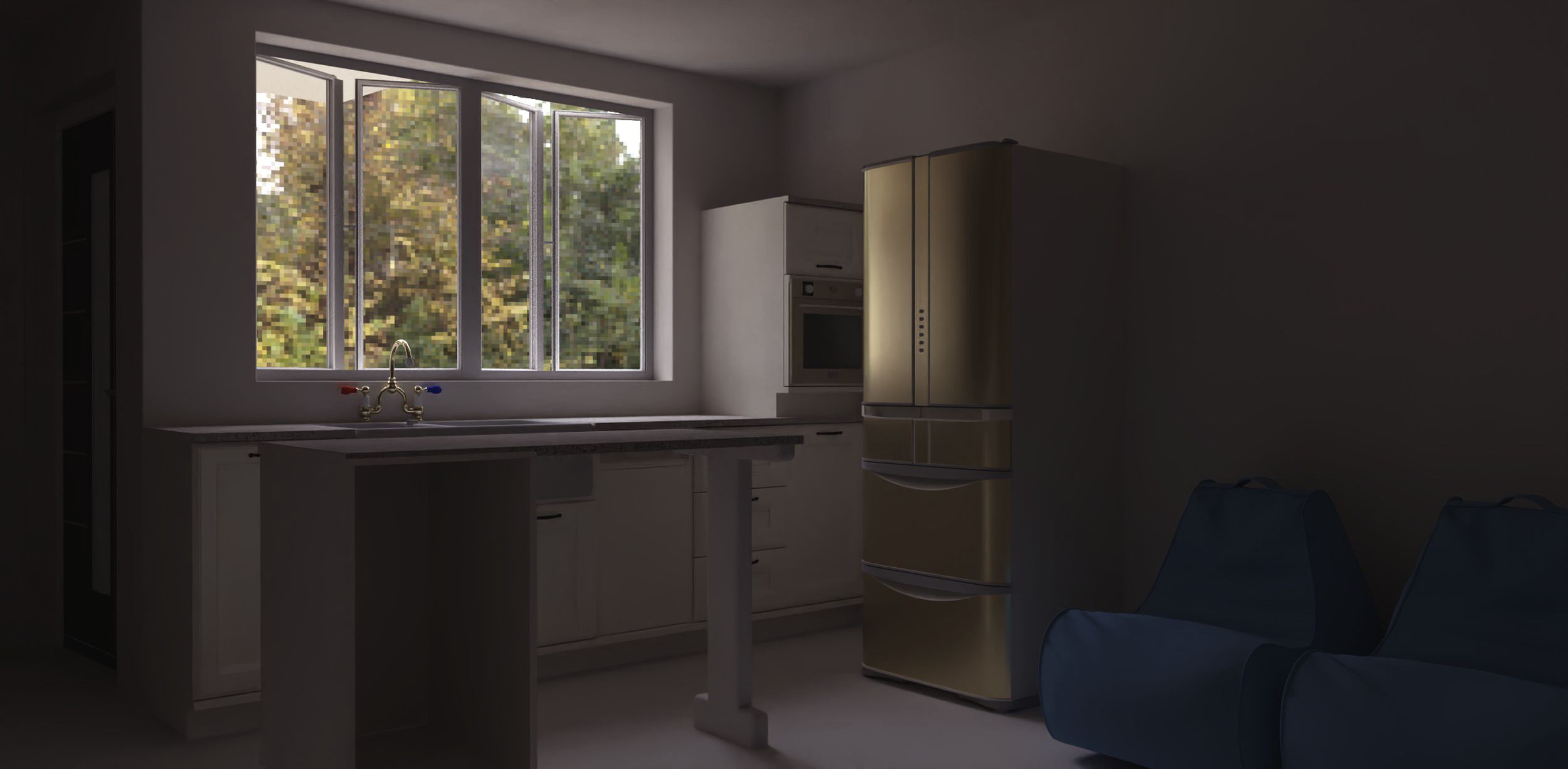
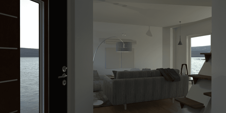
Rayscaper, My trip down the road to adjumacation.
-
@Mike-Amos said in Rayscaper, My trip down the road to adjumacation.:
When I mention colur of a metal I am talking abouyt the change in colour when 'metal' is chosen as a finish but, still early days yet.
At the moment an automatic colour change turns what I want to be chrome becomes brass or bronze with no method of changing/preventing that.
Hey @Mike-Amos
I'm not sure I'm following the when metal is chosen as finish - do you mind providing some more info or a screenshot?
Cheers,
Thomas -
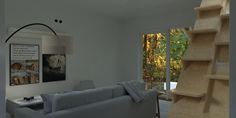
A little further down the road, moving on, officer......
-
Nice render, but the interior could do with some extra lights. Very interesting stairs, never saw that before. Was this done in Rayscaper?
-
This is my Rayscaper thread so, yes, in Rascaper.
There are 8 lights in that scene which should be OK along with an EXR.
I would like to have a better, more informative method of identifying the lights being adjusted. Several are candles so the light has to be reduced for that. Perhaps a designator on the scree would help.
Basically I am finding any real adjustment difficult to near impossible due to not being able to read the dialogue boxes. I will have at some stage to acquire a nother monitor but that will do nothing to fix this issue.
TBH, while I render architectural pieces, I do not DO architectural renders. I have a leaning towards more realistic lighting levels which is out of synch with folk who want "More lights on everything".
The stairs are more commonly found on yachts and small boats and are a space saving measure. Not popular with architectural purists who will simply say that "Never get that past inspection in America, etc".
I know, a bit like those who want fridge freezers in a kitchen boxed in for the same reason. Not doing architectural renders and NOT in America let alone actually expecting these things to be built.
-
@Mike-Amos @Rich-O-Brien - The latest release should resolve the material/camera picking issues. Can you confirm that?
-
This is my Rayscaper thread so, yes, in Rascaper.
Makes sense, I didn't want to assume

There are 8 lights in that scene which should be OK along with an EXR.
I would like to have a better, more informative method of identifying the lights being adjusted. Several are candles so the light has to be reduced for that. Perhaps a designator on the scree would help.
That's a good idea. Overlaying the viewport with some widgets to indicate the lights. I will put it on my roadmap.
Basically I am finding any real adjustment difficult to near impossible due to not being able to read the dialogue boxes. I will have at some stage to acquire a nother monitor but that will do nothing to fix this issue.
This is good feedback. What is your display resolution, and are you using display scaling? I don't think Rayscaper respects display scaling right now, but I have to check the documentation of the user interface library I am using.
TBH, while I render architectural pieces, I do not DO architectural renders. I have a leaning towards more realistic lighting levels which is out of synch with folk who want "More lights on everything".
Gotcha!
The stairs are more commonly found on yachts and small boats and are a space saving measure. Not popular with architectural purists who will simply say that "Never get that past inspection in America, etc".
I know, a bit like those who want fridge freezers in a kitchen boxed in for the same reason. Not doing architectural renders and NOT in America let alone actually expecting these things to be built.
No worries, I wasn't criticizing; I was just curious about the staircase.
Cheers,
Thomas -
G'day mate,
The monitor is set at 2560 x 1330 at the moment. Good enough for most tasks.No criticism taken mate, we are discussing the topic and it's all good. Just covering off the things I do rather idiosynchratically. Being a 'do things my own way' personality.
I am getting to grips with Rayscaper, it's taking a bit of adjustment from the ol' noggin but getting there bit by bit. Well worth the time tbh.
Something that might help the screen issue I feel is in the way would be on demand dialogue boxes to reduce screen 'clutter'.
-
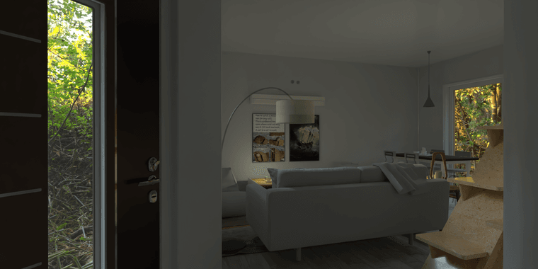
Further on, different view. I have managed to return the walls to the previous material.
-
Wow! That is well done!
-
Thanks mate, some mat changes and a better hdr for the scene will help.
-
@Mike-Amos Very well done. I'm pleased to see you are getting good results.
-
The monitor is set at 2560 x 1330 at the moment. Good enough for most tasks.
Do you also use display scaling, or is it at 100%? Also, do other applications behave well? A screenshot might help us see how it compares to other applications.
I am getting to grips with Rayscaper, it's taking a bit of adjustment from the ol' noggin but getting there bit by bit. Well worth the time tbh.
Great to hear!
Something that might help the screen issue I feel is in the way would be on demand dialogue boxes to reduce screen 'clutter'.
In the latest release, I'm trying to hide more things, especially if they are not enabled. But can I hide even more things? Is there any screen in particular that is bothering you?
Cheers,
Thomas -
Nothing actually 'bothers' me, the screen is reminiscent of Maxwell in most respects.
The hdri/texture corner is both bigger than it need to be while being too small to show much in the way of detail of the different options.
When it comes to it, the single screen thing is getting old but I am looking into that but clearing screen clutter when elements are not requirted would be very helpful.
Undocking these different parts of the Rayscaper window an placing them on =the second or third monitor would enable much more clarity for the render window itself. IMOHO, of course.
-
-
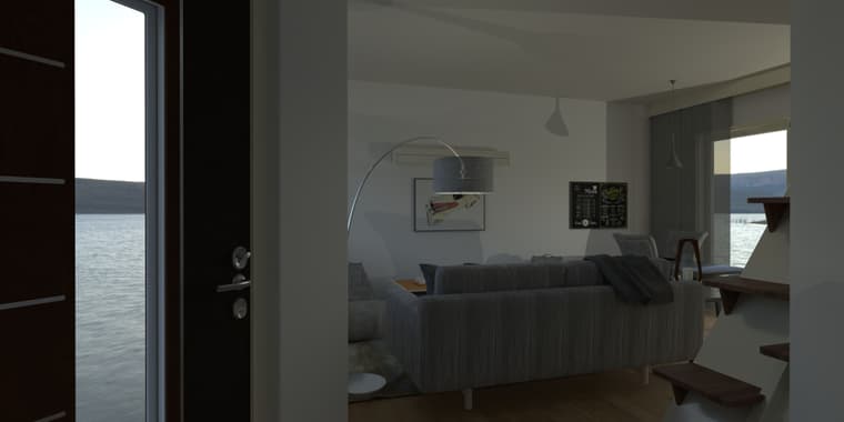
Next.
-
Any thoughts folks?
-
Take my opinion with a grain of salt. I'm a developer, not an artist...
I like the interior very much; it is very realistic and uses materials well. But I find the combo of the HDR and the glass in the front door weird. It's as if the house stands in the middle of the lake.
Cheers,
Thomas -
@Mike-Amos said in Rayscaper, My trip down the road to adjumacation.:
Nothing actually 'bothers' me, the screen is reminiscent of Maxwell in most respects.
That's an interesting observation; I've never used Maxell before

The hdri/texture corner is both bigger than it need to be while being too small to show much in the way of detail of the different options.
Would clearer tabs help here? Or tabs at the top instead of sideways?
When it comes to it, the single screen thing is getting old but I am looking into that but clearing screen clutter when elements are not requirted would be very helpful.
Undocking these different parts of the Rayscaper window an placing them on =the second or third monitor would enable much more clarity for the render window itself. IMOHO, of course.
I plan to do docking/undocking, but it's a bit of work because the user interface library I am using does not support it.
-
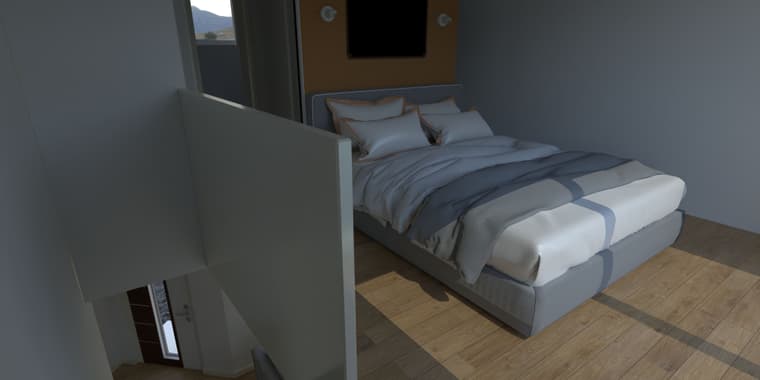
For some reason the mirror is not reflecting, suitably set up in Rayscaper, just not apparent in the render.
-
@Mike-Amos said in Rayscaper, My trip down the road to adjumacation.:
For some reason the mirror is not reflecting, suitably set up in Rayscaper, just not apparent in the render
What render method are you using?

Could it be the Max Depth for Approx GI need increasing if you are using Approx GI?
Hello! It looks like you're interested in this conversation, but you don't have an account yet.
Getting fed up of having to scroll through the same posts each visit? When you register for an account, you'll always come back to exactly where you were before, and choose to be notified of new replies (either via email, or push notification). You'll also be able to save bookmarks and upvote posts to show your appreciation to other community members.
With your input, this post could be even better 💗
Register LoginAdvertisement
