I have a hard enough time mastering cubes and rectangles, so organic forms are out of my league. But I do think the texture you used on the antlers is off. Looking at pictures online, the antlers should be more of a whitish gray color, and what little texture there is runs parallel with the length of the antler.
Oops, your profile's looking a bit empty! To help us tailor your experience, please fill in key details like your SketchUp version, skill level, operating system, and more. Update and save your info on your profile page today!
Check out Febhouse | New extensions for Shadow Analysis in SketchUp Download
Posts
-
RE: Caribou Mount
-
RE: Looking for a new droid
How about the one in the suit. It looks human...kinda.

-
RE: My crappy models look better rendered.
I think you are being too hard on yourself. What you are missing is another level of detail and texturing.
-
RE: WIP - Vray - Residential Dwelling
I'm assuming you are referring to the first two images.
I don't know anything about VRay, but I can offer some general remarks (IMHO); hope they help:
-
The composition can be improved. You've an interesting building in an uninteresting setting. A sea of paving is not a very inviting look to have in front of a residence. Add a car, some outdoor furniture or other "stuff" to show someone lives there. Add some foreground foliage. Make your image tell a story. Right now it's saying the contractor just finished building it, he did the minimalist amount of landscaping (sod on the lawn) and now its sitting empty waiting for someone to buy it.
-
Your roof texture is creating large square patterns. I feel for you - finding good shingle textures that are seamless is hard to do.
-
Your stone texture looks like you just painted with a solid color. There's no variation as one would expect to see in stone, and I can't make out any joints in the stone.
-
On a design note, those chimney pots look too puny for the chimneys they are atop of.
Overall, it's a nice model with good texturing. And I like the fact one can see some things when looking into some of the windows (as opposed to seeing a big empty volume).
-
-
RE: Npr home exterior
Please always remember my criticism, for what its worth, is always meant to be taken constructively, and never-spirited.
I didn't explain myself very well in regards to the neutral tone. I wasn't referring to the colors themselves, but rather the tones - all the colors seem to be within the same tonal range. Not enough variation with light and dark tones. Does that make sense? I was just wondering if darker shadows would give it more depth.
Most of this is nitpicky, and only noticeable to those of us who actually model and render. Most people, when they look at your work, probably respond "OH MY GOD THAT'S FRICKEN AWSOME!!!!"
-
RE: Npr home exterior
Stone corners should be relatively easy with a vertical stone wall - just make sure the texture continues seamlessly around the corner. Easily doable with the eyedropper.
Your siding corners look fine to me. The only thing "missing" is that sawtooth profile one would see in reality, but honestly I don't think anyone would really notice (until now that I've pointed it out!
 ). I've modeled a few simple roofs with wood shingles and physically modeled the profile to see that sawtooth profile at the edges. But that would be too much work for something other than a simple rectangular building, and I think the effect would be lost, too (I once modeled lap siding to try to get a more realistic effect with the trim; the end result was not very satisfying, especially for the amount of work involved. So I reverted to a good lap siding texture).
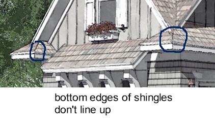
Your roof texture could use some work. Shingling starts at the bottom and works up, so you should see full shingles at the bottom edge. Also, at hips, if the same roof slope is used on both planes, the bottom edges of the shingles should align. If those are asphalt shingles, the hips and ridges would be capped with shingles.
On a related note, I wonder if darker shadows wouldn't give these images a bit more punch. The images seem too neutral - the same tone (color-wise) is used throughout.
Horrible siding corners aside, nice images as usual.
-
RE: A Simple Room
Good start, but could use some improvements.
You need to pay attention more to how you apply your wood textures. On the desk and chair the textures are all running in the same direction; in reality, they wouldn't. Each piece is composed of individual horizontal and vertical pieces of wood, and the wood grain should reflect that.
The texture used for the wood flooring and wood paneling appear scaled up too large. That is probably why they appear out of focus.
Your window looks strange: the upper sash is very narrow compared to the bottom sash, and the muntin bars are strangely spaced. -
RE: Farewell to a Friend
That's a question I have been pondering all day, Pete.
The dogs were actually my parents', but they spent so much time with me it was as if they were mine too. When young, they spent an entire year with me while my parents were on the west coast, and I bonded with them then, especially Wanli. They asked me today if they were to get another, would I be willing to take care of it if they reached a point they cannot due to their age. -
RE: Farewell to a Friend
Thanks for the kind words, everyone. It really helps.
-
RE: Farewell to a Friend
Sorry to hear about your cat, juju.
We had to euthanize Wanli's half brother two years ago. The one consolation in such a tragedy is knowing their suffering is ending.
We were fortunate with Wanli; he just laid down as if to sleep, and died. Very peaceful, I was told. Although we were expecting it (his age), the call still hit me like a hammer. -
Farewell to a Friend
Tribute To A Best Friend
Author UnknownSunlight streams through window pane
unto a spot on the floor....
then I remember,
it's where you used to lie,
but now you are no more.Our feet walk down a hall of carpet,
and muted echoes sound....
then I remember,
It's where your paws would joyously abound.A voice is heard along the road,
and up beyond the hill,
then I remember it can't be yours....
your golden voice is still.But I'll take that vacant spot of floor
and empty muted hall
and lay them with the absent voice
and unused dish along the wallI'll wrap these treasured memorials in a blanket of my love
and keep them for my best friend until we meet above.
WANLI1999-2015 -
RE: Red Bull soapbox racing.
Great looking racer, Mike. But I wonder if the pocket around the red cone will create too much wind resistance, especially at high speeds.
-
RE: Board Game Build (Firefly)
@hellnbak said:
You have got to be kidding! That's ridiculous, to say the least. Probably wouldn't want to have a fan going anywhere near
Are you kidding? Only a fan could have invented such a complicated looking board game.
Good job, Eric. But a true fan would have made it look like the Serenity
-
RE: Lake home npr
If it was really important, I suppose the easiest way would be to save another copy of your model and change the solar orientation in it.
I can usually get decent shadows all around the building by changing the time of day and the date. Invariably, if I model with the correct orientation, however, at least one side of the building is always in shadow.
-
RE: Towers and buildings by Waleed Karajah
Wow, outstanding work.
Thanks for making me feel inadequate
My only critique would be that larger images would be nicer. -
RE: Kitchen-great room photo real

Are those two versions of the same space, one with stained wood trim and one with painted? Or is there a transition between the two that doesn't appear in either image? -
RE: Lake home npr
Beautiful work, Paul.
On the elevation image, the projection of the garage wing would be better illustrated with the shadows projected from the opposite side. -
RE: Two more npr fly around videos
@pmolson said:
Please excuse the right side siding not lining up with the front siding....I missed that before I created the 3400 images for the movie.
I was going to tell you I thought the vids look great, but then that one GLARING MISTAKE you already pointed out just completely ruined the entire experience for me. Other than that, fantastic job!