Nice images, I like the colour mapping, lighting, and the crispness of kitchen modelling
Posts
-
RE: Modern Kitchen
-
RE: Looking for a Cloth Type Backdrop for a scene.
You could try using either artisan or sculptris to create the type of drop you're after.
-
RE: Some UK/Ireland electrical symbols for you all
These are great, thanks
-
RE: How to add specularity map in Vray materials option ?
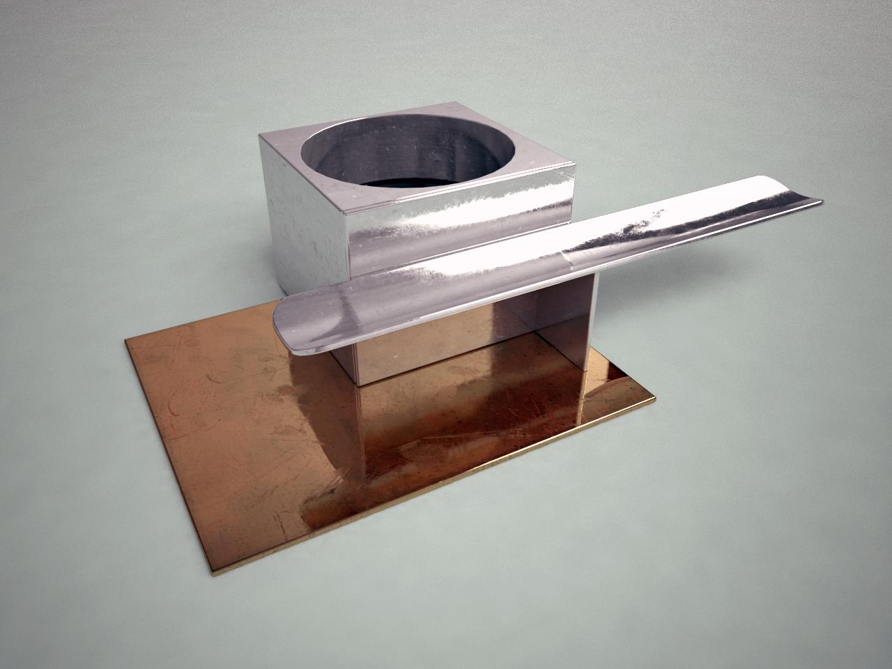
Thanks Stefan for your tips on map slots, been very useful! I managed to cook this up following your advice and Bertrand Benoit's 'materialism' post.
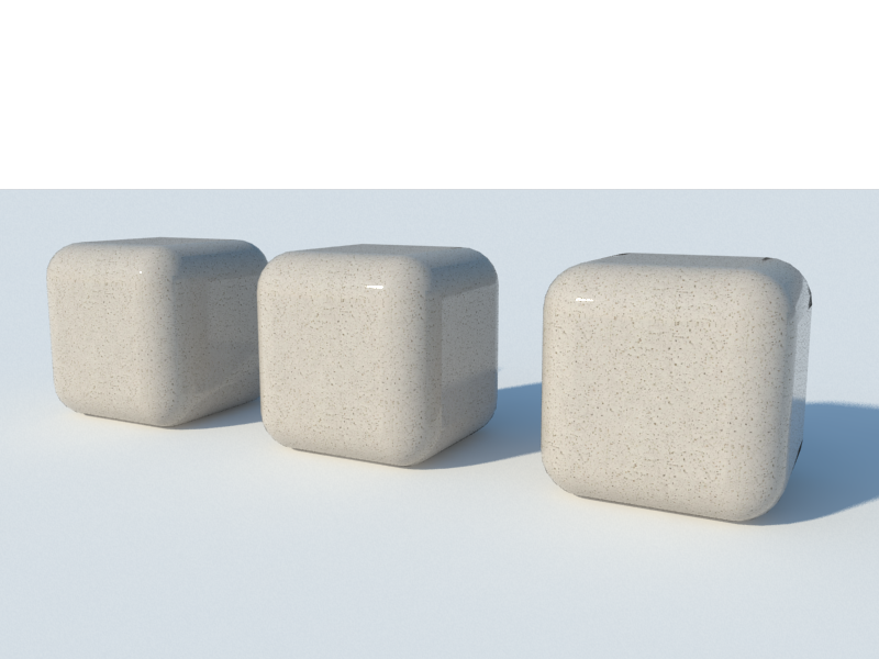
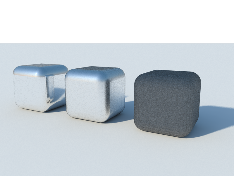
To clarify on the percentage contribution of the glossiness, I've found that once you plug a map into the glossiness slot this overrides whatever figure you use. In the example below is the same material with spec map and glossiness set to 1.0, 0.8 and 0.2 from L to R, it's not a great example scene but you can't see any diminished reflection as a result of the map being 'darkened'. If you drop the texture multiplier however, it blurs the whole thing rather than reducing the contribution of the map alone (shiny cube example), which means you have to go into photo editing software to finetune the map. This is a bit frustrating, if anyone knows a workaround within vray settings please share!
-
RE: Invisible Cities- Diomira
Model wise the first thing I fixed on were the 'sixty silver domes' so I drafted around 15 sections in CAD loosely based on domes such as Pantheon, Florence, Santa Sophia, then used 'follow me' to make quarter, half and full domes of the sections, then copied them to various scales and arranged. Same for the greek theatre type affair in glass on the right.
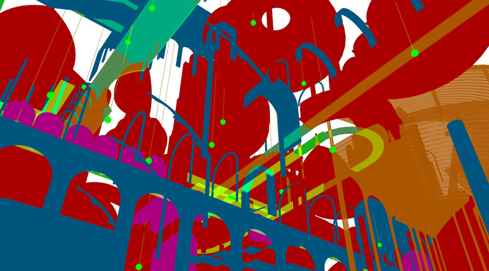
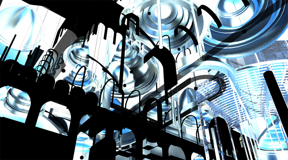
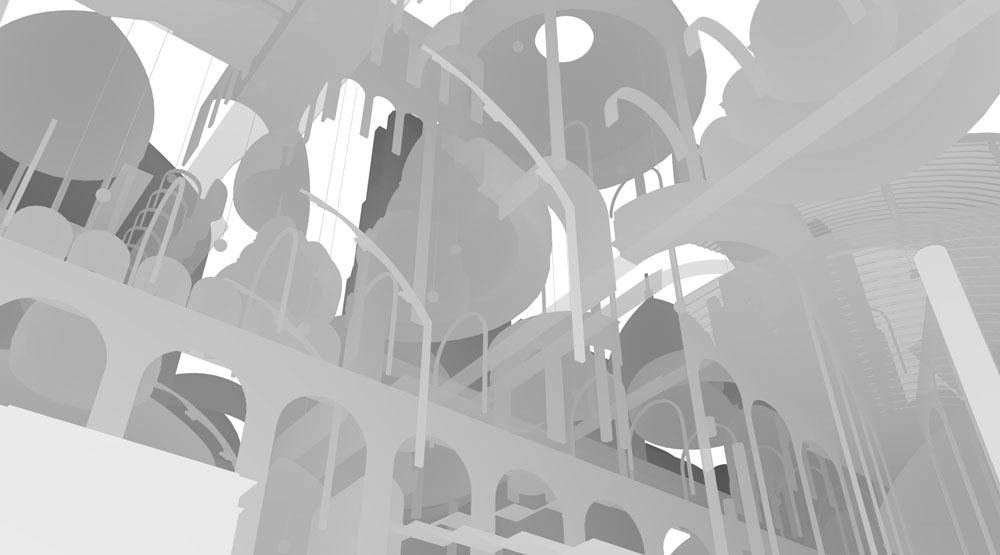
The scene was rendered in vray, to play about I turned the model upside down so the sun would shine into it from below. Materials are basic glass and metal. I rendered out reflection, zdepth and material ID and lighting channels then layered in photoshop something like this;
Reflection- blend mode overlay 20%
Zdepth- tinted purple to get evening haze effect, blend mode lighten 100%
Lighting- blend mode soft light 10%I made a couple of dirt layers using the mat ID layer for masks and painted in with grunge brushes and decals from CGtextures. I also added some different coloured gradients to elements using the ID again. There's a dusky sky in the background which was adjusted to match the edge haze from the zdepth. People are brushed in using this technique;
http://vyonyx.com/tutorial01-creating-a-realistic-crowd-in-photoshop/
and statues are images I sourced and cropped adjusted etc to suit. I would like to draw my own statues in using the tablet but I fear my wacom skills might not be up to scratch yet!
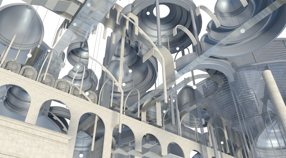
Here's what the channels looked like;
-
RE: How to make such a material?
The trick is (if I remember correctly).
- Add your bump map using the sketchup material interface and paint the object(s) so the bumps are where you want them to appear.
- In vray material dialogue, add a new diffuse layer to your material and pick the colour you want the material to actually be. Put this 'diffuse1' layer under your original 'diffuse' layer.
- Back on the 'diffuse' layer, add a map to the transparancy slot and use the TexColour map, then pick white as the colour. This will make this layer invisible in the vray render but still visible in your SU window.
- Tick vray bump map, add the bump map you used to paint with.
- Et voila, when you render the bump should appear similar to what you see in SU window but with the colour you picked in the 'diffuse1' layer.
I think the UV coordinates you paint in the first step will apply to other map slots such as glossiness, reflection filter etc. So if you added another different map (say, scuffs or dirt to reflection) it will scale the same as your bump image.
I'll do a settings extract later if this is clear as mud.
-
RE: Black screen
Probably a lighting issue, have you tried resetting the options to default setting? It might help if you post your settings and an extract of your scene, as this could be caused by several things.
-
RE: Aerial Roadways
This probably wouldn't be quick, however if you're interested in modelling traffic paraphernalia to detail out your scene I've found most D.O.T. sites have a raft of standard details in CAD format for gantries, crash barriers, lamps etc.
http://www.dot.state.tx.us/business/standardplanfiles.htm
Example: ftp://ftp.dot.state.tx.us/pub/txdot-info/cmd/cserve/standard/traffic/stds66.pdf -
RE: Invisible Cities- Diomira
Thanks for your comments, I hear what you're saying Dale, this image does have an equivalency of composition which flattens it out. It could perhaps do with some larger blocks or foreground element to up the contrast so that it might hold up as a value study, or (dare I say) achieve the chiaroscuro effect. Composition isn't my strong suit though I've been sketching a lot of Hokusai prints which should inform future images. I do still want to retain some sense of it being an worms eye architectural illustration with lines and a feeling of a technical assemblage of bits so I guess the key is finding a balance point.
It's been quite educational creating this so far and hopefully in time I can learn the light and thoughtful touch you speak of
-
Invisible Cities- Diomira
Here's the first in a series of images I intend to produce illustrating Italo Calvino's 'Invisible Cities'. The first is Diomira, 'a city with sixty silver domes, bronze statues of all the gods, streets paved with lead, a crystal theatre, a golden cock that crows each morning on a tower.....when the days are growing shorter and the multicoloured lamps are lit all at once at the doors of the food stalls"
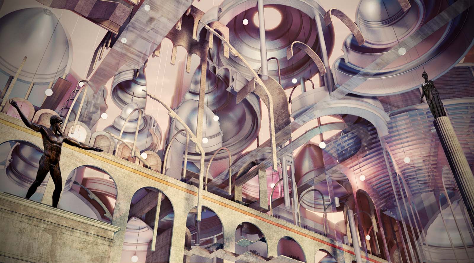
I've been trying to strike a balance between the concrete nature of some of the descriptions and the more poetic allusions to time and space given in the chapter by playing with recognised architectural forms in an abstract fashion. The aim of this is to give the images scope for multiple interpretations, as the original text provokes in the reader. -
RE: Villa Skanör, Sweden
Nice images and design. I agree the white walls could benefit from some light dirt/weathering, maybe something mossy at top edges and dirty at ground. I tend to chuck some of the decals on from CGtextures and mess with the blend mode, v quick. This might just be a personal preference though as living in Scotland you get used to being around older buildings that have been rained on a LOT.
Where'd you get your pendant light, it's pretty cool.
-
RE: The Art of SketchUp - part 1: Fantasy
I suspect my rate of work will drop off significantly when this game comes out...looks great
-
RE: Scaling native .vismat material
The way I did it doesn't involve any adjustment of UV, just leave them all at 1.0.
-
RE: How to make such a material?
I'd throw a b+w version of the bump map into the reflection glossiness slot as well and adjust so it gives some soft reflections like the paint.
Would second valerostudio on not using displacement unless you're intending on producing a close up view of an edge, on my machine it takes properly aaaaaaages. Even if you are doing closeup, probably quicker to photoshop it.
-
RE: Scaling native .vismat material
If you look at jonedvard's last attachment showing the texnoise window you'll see a dropdown under the colour A/B for type, you can change to different noise types in there. The size setting is to the right of that.
-
RE: Scaling native .vismat material
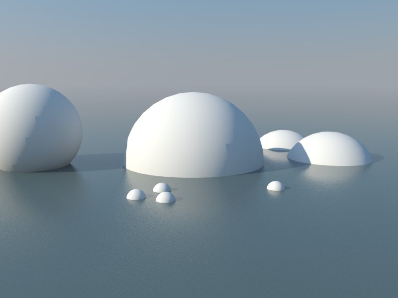
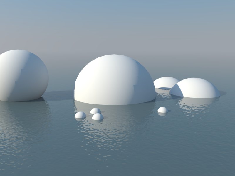
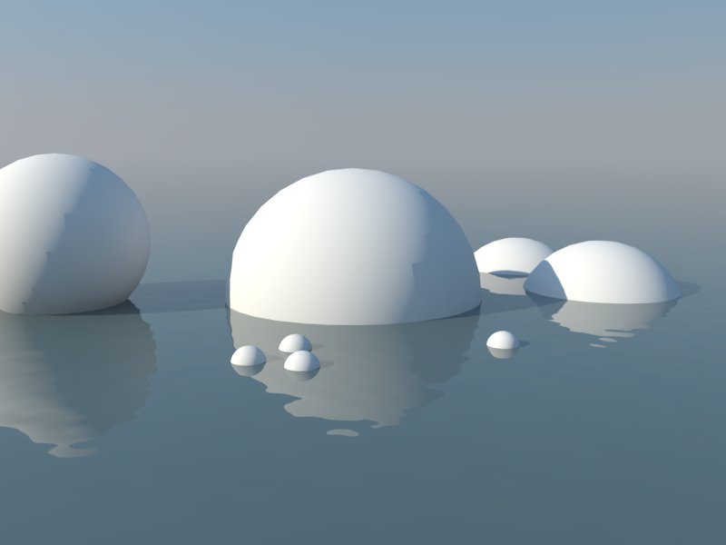
For noise maps I tend to adjust the size. Here's an example with a perlin noise bump map for speed. On a side note, apparently vray spheres don't really like accepting shadows, and have horrible edges.....maybe I'm using them in the wrong way.
Noise size 0.5
Noise size 10
Noise size 50
-
RE: Thea for SketchUp - Available Now!
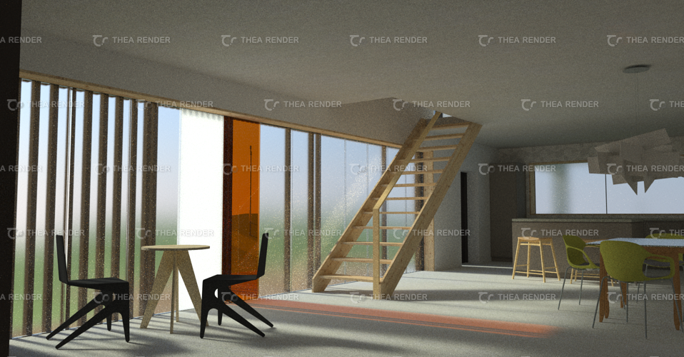
Installed this afternoon and went through tutorial videos, quite excited to try out proxies as been v-raying for ages. Material editor is nice to use. For pic below I just imported the model, swung camera about, tweaked a couple materials and hit go, pretty impressed with result. Would like to know how to reduce noise if there's any experts reading!
-
RE: Nodetail in the texture!
I see what you're saying, I would only tend to adjust individual textured surfaces after painting everything depending on what sort of final export/output needed, never had any bugs using this method, must be luck!
-
RE: Problem with glass render
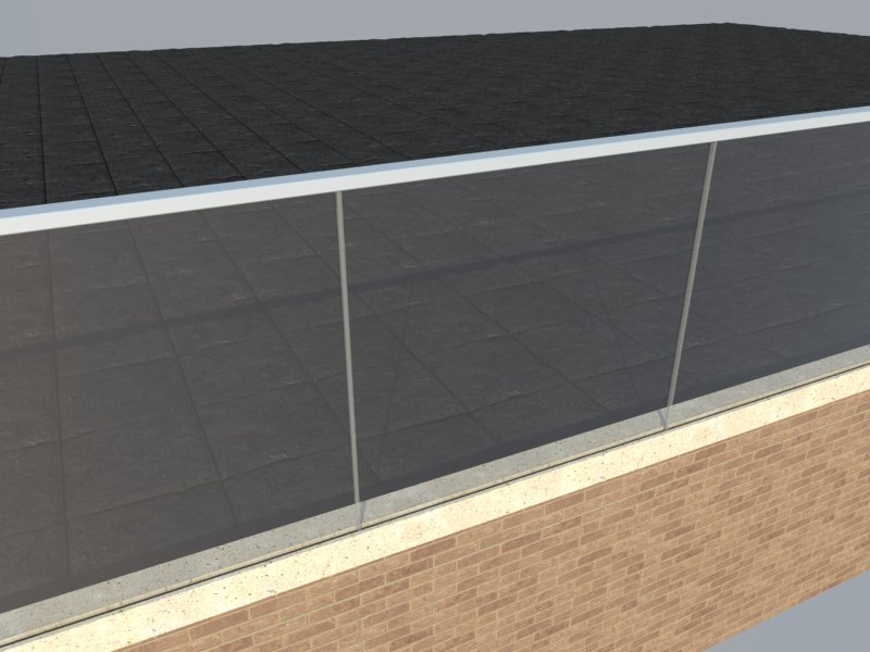
Two planes shouldn't cause a dark shadow effect, what is your material setup? I usually model glass panes at their actual thickness (8/10/12mm), and copy the sheet with a cavity for double glazed windows, so it's physically correct. For planar glass I wouldn't bother with the refraction layer, I find it produces unwanted distortions. Here's a test I made with a 10mm thick sheet. Glass colour is black, opacity 5, reflection layer added with default settings.
-
RE: Nodetail in the texture!
If you group or component that element and paint the whole thing with the wood material that should also fix it.