You have my vote bobrsta. Jumped out of my seat when saw new 2018! and then..... opened browser and typed: alternatives to sketchup
yep sketchup sucks again!
no improvements in speed or user interface at all. Sketchup is still slow, crashed from first touch, no isolate objects option, no search for components option in model, still floating toolbars (on mac), no scenes grouping, no improvement in layers organization, still have layers with names 'm', 'c'. And biggest of all is layout being soooo slow! Working in hybrid mode is almost impossible. even zooming in/out or panning is a nightmare. And I have latest iMac 5K 27" i7 4.2 with Radeon Pro 580, 40 GB DDR4 and SSD. All other apps running like a butter, then I open layout and it feels like I'm working o a phone... Shame... looking for alternative at the moment.
Posts
-
RE: SketchUp 2018 - first impressions
-
RE: Wish list for Sketchup 2018
Can not believe we still can't search component in the model by typing its name.....
@pipingguy said:
Wish for a search utility in the tray's components panel. (like the search box found in window's file explorer)
-
RE: [Plugin] Anchor Points v1.0 Update 13/12/2011
tool palette for this plugin keeps reappearing on Mac each time I start Sketchup it comes on top. I love the plugin and keep it in my toolbar, but tool palette just keep poping up
 I know many other plugins has save problem, but please fix if its possible. Here is a screenshot

-
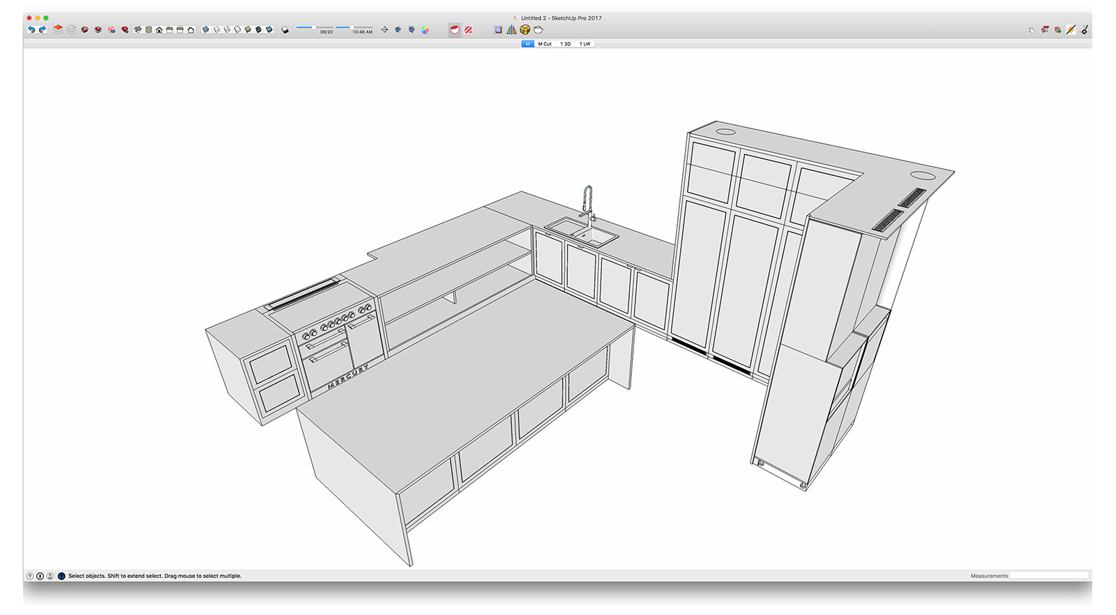
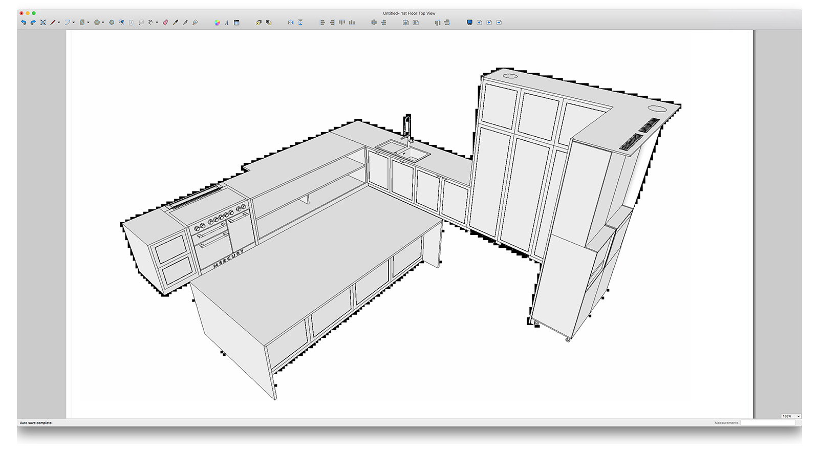
Strange texture pixels in Layout
I get these strange pixels around all my drawings when exporting to layout. Anyone has any idea what it is? I try to change different parameters off styles but no luck only x-ray makes some difference...?
-
RE: [Plugin] Material Replacer
I'm using this plug in a lot. Changing materials all the time in my work. It would be good to have an option to change materials in a group or component only and not in all model. Would that be difficult to integrate?
thanks! -
Looking for V-ray for sketchup to purchase - Mac
Hi everyone.
Our company is thinking to purchase a mac vray for sketchup 2.0 license.
Anyone has one for sell? -
RE: [Plugin] S4u Scale Definition
It works with simple components or groups, however when I scale my dynamic components it doesn't work.
I have attached dynamic component:
Cabinet Base B.skp
Could you to take a look and try to figure out why is it so?
After all its superb plugin, can not figure out why sketchup doesn't have this by default.Thanks S4U!
-
RE: [Plugin] S4u Scale Definition
Didn't get it what this plugin does? Bit more info or quick video tutorial would be great! Thanks.
-
RE: Line weight is too thick!
Here is dropbox link to the file. Not sure if I can attach it here?
https://www.dropbox.com/s/5bgaxkboee505rl/16%2301%20PPS.skp.zip?dl=0
-
RE: Line weight is too thick!
Hi John, thanks for quick reply, I've checked openGL settings, middle one (Use maximum texture size) was off.
I rarely export layout to images, but if I do so I use .png. Most often I export to pdf. You can see one attached in my first post. I guess this is just a limit what Sketchup can offer - meaning scale 1:100 is the limit, otherwise objects like furniture just gets too small for Raster Style. And turning on Vector or Hybrid just freezes Layout for minutes. -
RE: Line weight is too thick!
@dave r said:
You've never answered my question about the setting for Profiles weight.
Hi Dave, I set my profiles weight to 1, same for section cut lines.
-
RE: Line weight is too thick!
@driven said:
You can try turning the AA levels up on your mac, but you need to do it in SU's 'Ruby Console' as there is no User Interface...
Open SU and from the menu select 'Window' >> 'Ruby Console', then in the small bottom text area paste this code...
Test.get_AA_methodin the top window you will see the code followed by the 'return' which will show the default setting...
@unknownuser said:
Test.get_AA_method
0then change it using...
Test.set_AA_method(4)Restart SU for it to show, then restart LayOut to see any improvement...
john
Could you explain what difference that makes? I did like you said, but see no effect...
-
Line weight is too thick!
Hi everyone,
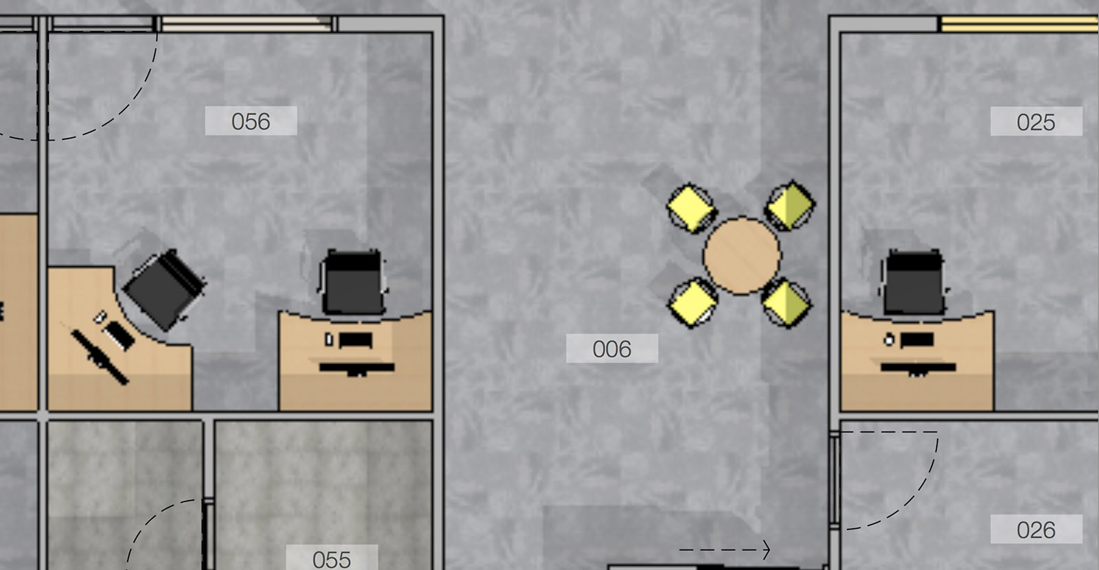
I'm struggling with lines in Layout 2016- If I have floor plan with scale 1:150, small objects, like doors or furniture became too pixelated.
I'm always making lines 0,1 in Raster mode - the smallest Layout can offer. I also aware of section cut width in SU styles.Is there any way to make line weight ever smaller?
Vector or Hybrid is simply not possible to work in (when I start to import furniture and plants) even with new iMac 2015. I was really hoping for some improvement in 2016, unfortunately....I was trying to change Paper size in Layout's Page Setup - it did not give any result too.
Attached you'll find pdf plan with scale 1:150 and screenshot with zoomed in rooms. Notice how thick lines appears.
I've posted this question in Sketchups forum but didn't get any good answer.
Anyone found solution to this???Thank you.
-
RE: RCP and lighting plan
Hi all,
quick questions about scrapbooks:
is it possible to copy some symbols that I've made in Layout and paste them into my scrapbook, or I need to redraw them separately in scrapbook. I'm trying to copy/paste from Layout, but it doesn't work. Any tips?
Thank you! -
RE: RCP and lighting plan
Hi all,
having fun with lighting plans
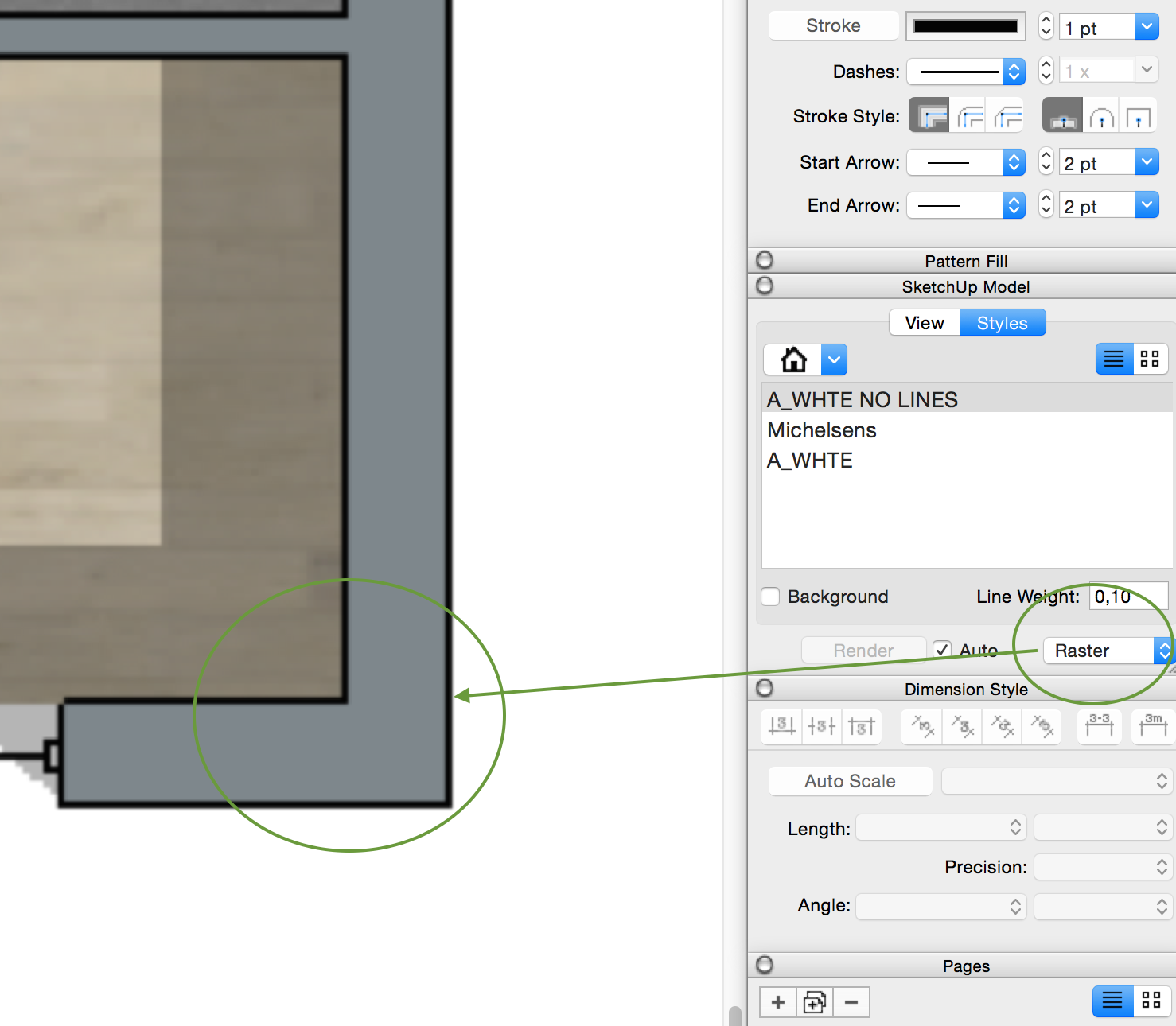
 starting understand how all works. Try to follow Nicks method by aligning SU color plan in Raster with SU Linework plan in Vector on top of it. However color raster lines are too thick and don't know how to make them thinner? Changing thickness in Styles - Linework to 0,1 doesn't help. Anyone knows any tips on that?
P.S. Hybrid solves that, but would like not to use hybrid at all.
-
RE: RCP and lighting plan
@unknownuser said:
@asimonas said:
@unknownuser said:
Thanks Tig!
A reflected ceiling plan is exactly as it sounds. It is as though you are looking down at the floor plan with a mirror for the floors surface.
I keep a separate RCP file that is used for both the architectural RCP and the lighting plan. It simply has my main structure model as a reference scaled at -1. The model is never edited in this file and the file is only used to create the specific scenes for the differenct RCP's. Then you simply cut a section looking down at the ceiling. Funny timing as I am doing a lighting plan right now.
But after you put it into Layout, how to you align your 2d scrapbook symbols on top? Try to find a centre of a recessed light and put 2d symbol?Later do you hide 3d lighting models? And if something changes - like you move recessed light, you do this in 3d model, then you have to move 2d symbol as well?
The only lights I model in SU, are typically decorative fixtures like pendants and sconces. All the general lighting like cans, I only add when I render in LumenRT. Any lighting that I add in SU is on its own layer and turned off for the CD scenes for LO. For the RCP in LO, I use my lighting scrapbook with symbols for various lighting types. I simply place them on the ceiling in an appropriate pattern. It's very easy to copy in LO in a defined grid & spacing, since you can set the insertion point of any element, anywhere you like.
Thanks Nick, but how you adjust symbol in LO without having real 3D lamp model in precise location in SU?
For example: here I have screenshot - first left light must be 400mm from left and 400mm from bottom wall.
How you would measure it in LO? I would love to have Layout tape measure where you could choose scale and draw guide lines so you know exactly where to place symbols. How do you find that point?
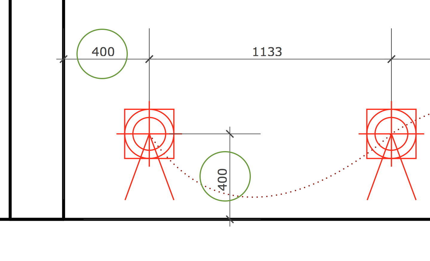
-
RE: RCP and lighting plan
anyone has something to say about 2d symbols and how you align them?
-
RE: RCP and lighting plan
@unknownuser said:
Thanks Tig!
A reflected ceiling plan is exactly as it sounds. It is as though you are looking down at the floor plan with a mirror for the floors surface.
I keep a separate RCP file that is used for both the architectural RCP and the lighting plan. It simply has my main structure model as a reference scaled at -1. The model is never edited in this file and the file is only used to create the specific scenes for the differenct RCP's. Then you simply cut a section looking down at the ceiling. Funny timing as I am doing a lighting plan right now.
But after you put it into Layout, how to you align your 2d scrapbook symbols on top? Try to find a centre of a recessed light and put 2d symbol?Later do you hide 3d lighting models? And if something changes - like you move recessed light, you do this in 3d model, then you have to move 2d symbol as well?