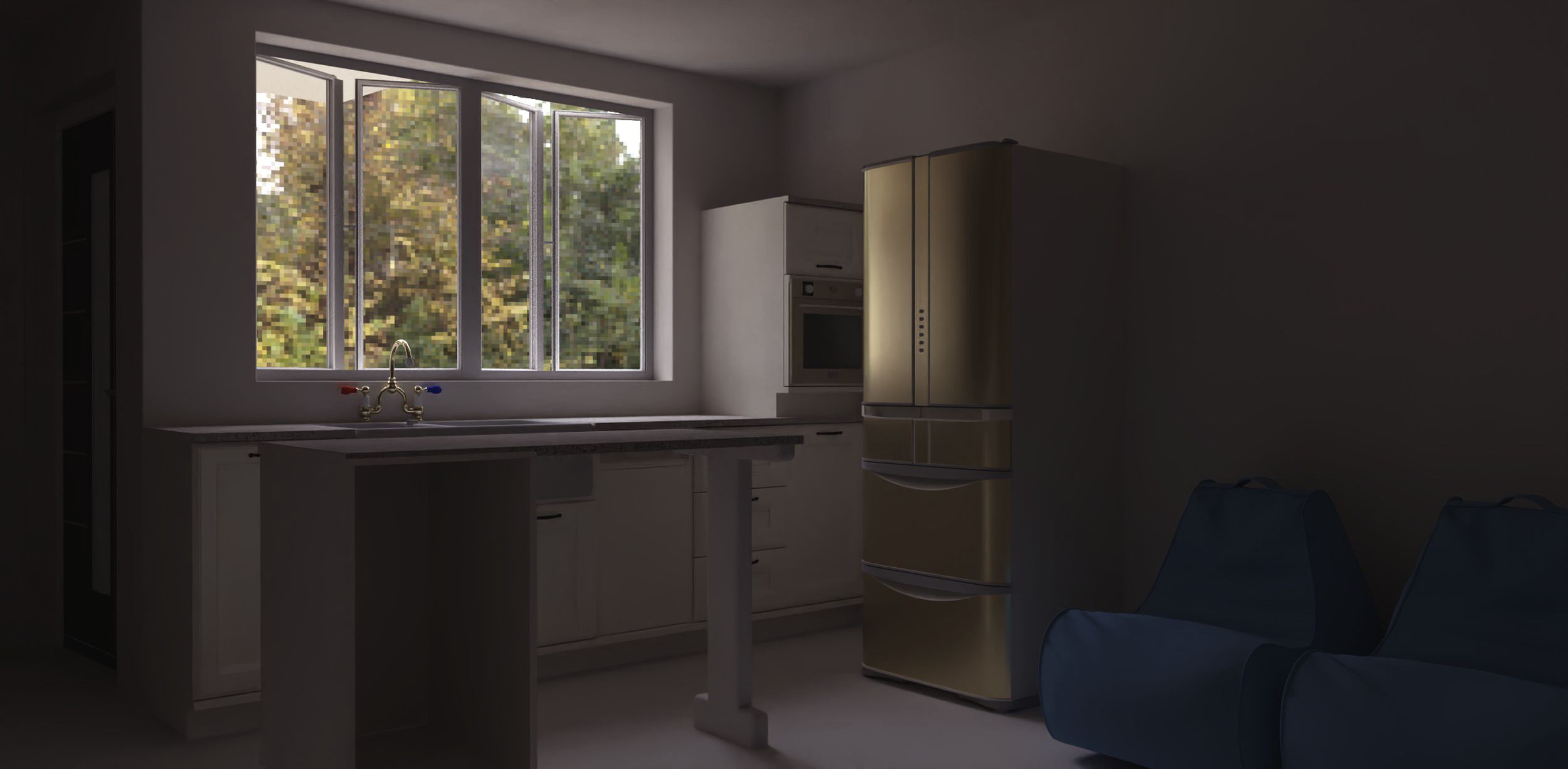
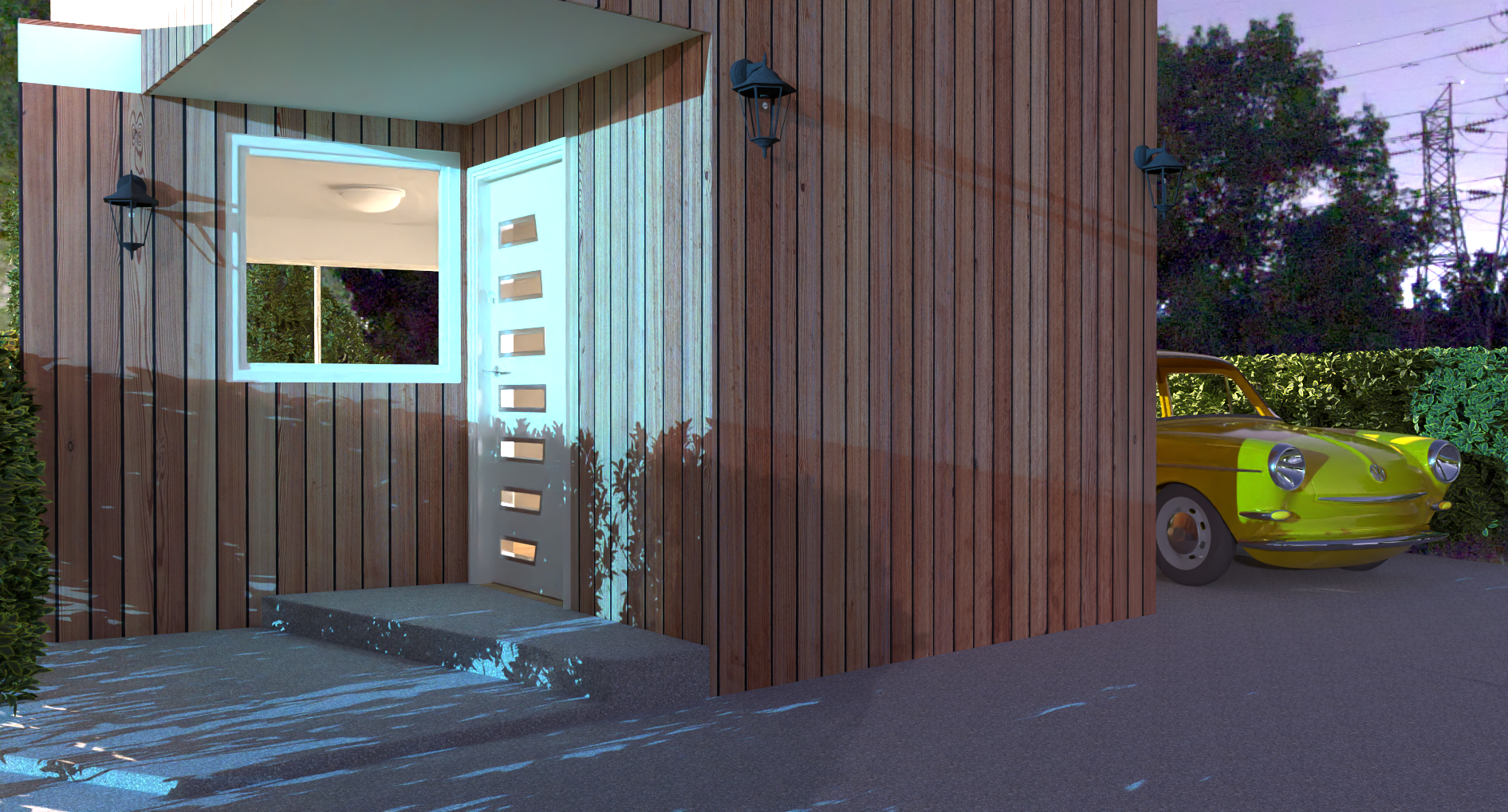
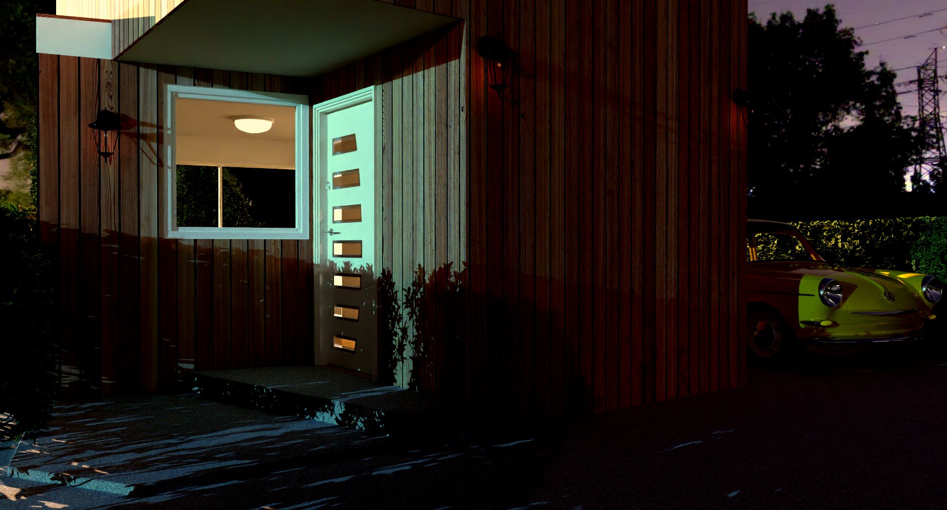
Rayscaper, My trip down the road to adjumacation.
-
Perfect!
-
-
@Mike-Amos Nice result! Those lanterns could use some sphere lights for extra effect.
-
Ta, agreed. As could the interior lights. Another D'uh moment in life's drawer full. I just forgot while setting up the scene which means I should think a bit more or render earlier in the evening.....
Oh well, next time I hope I will remember.....
-
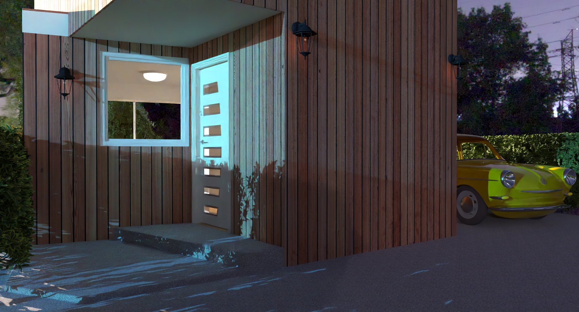
Trying the fake emitter thing on the exterior lights but not much of a result. I placed sphere lights in the same location as the wall lights but limited success so far.
This is how it looks after 70 passes, it will take a couple of hours for the full render. Exposure reduced from 2.00 to 1.00.
-
-
You would want to place the sphere lights (point lights) in the middle of the lanterns. If you place them inside the bulb, then add some transparency to the light bulb.
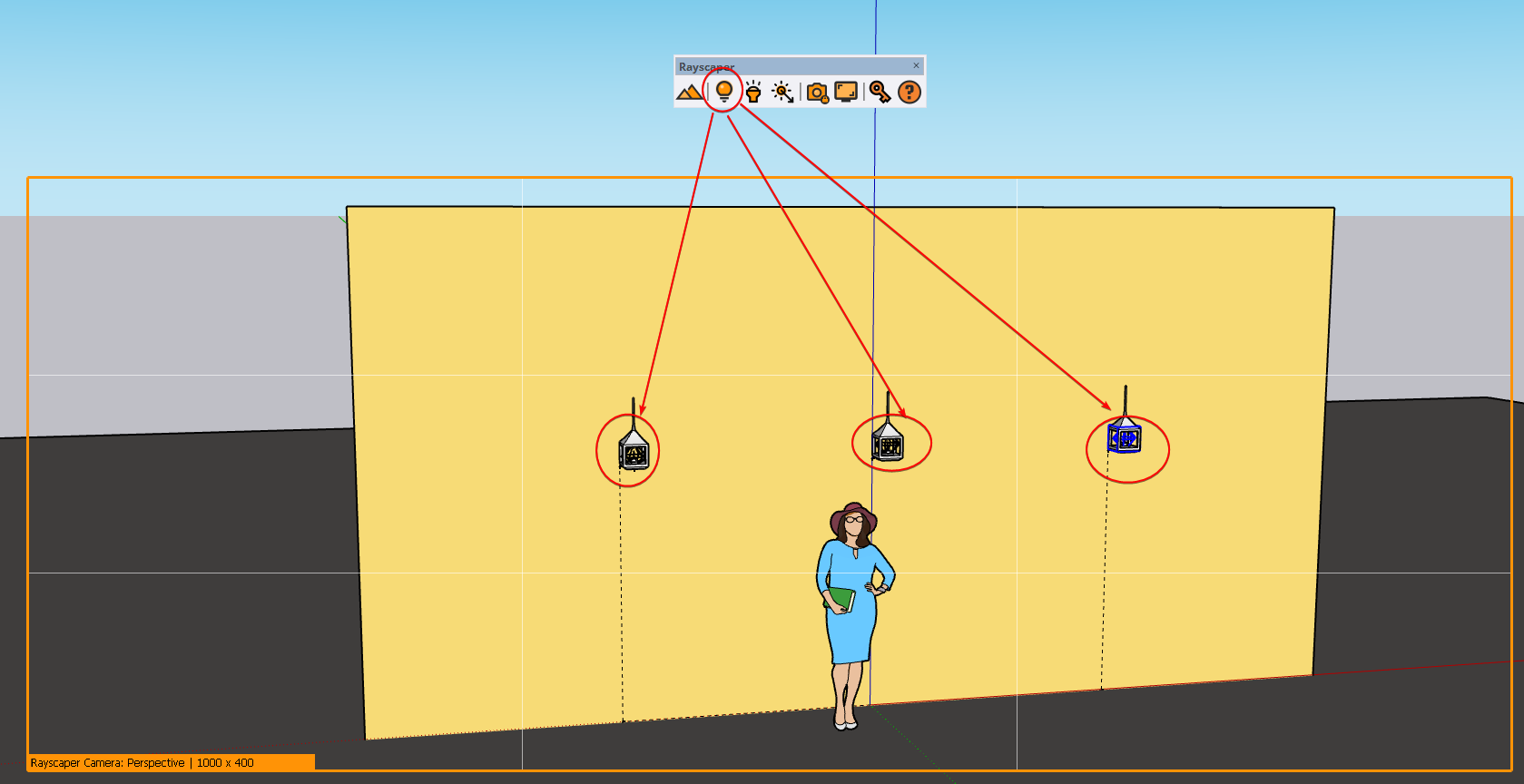
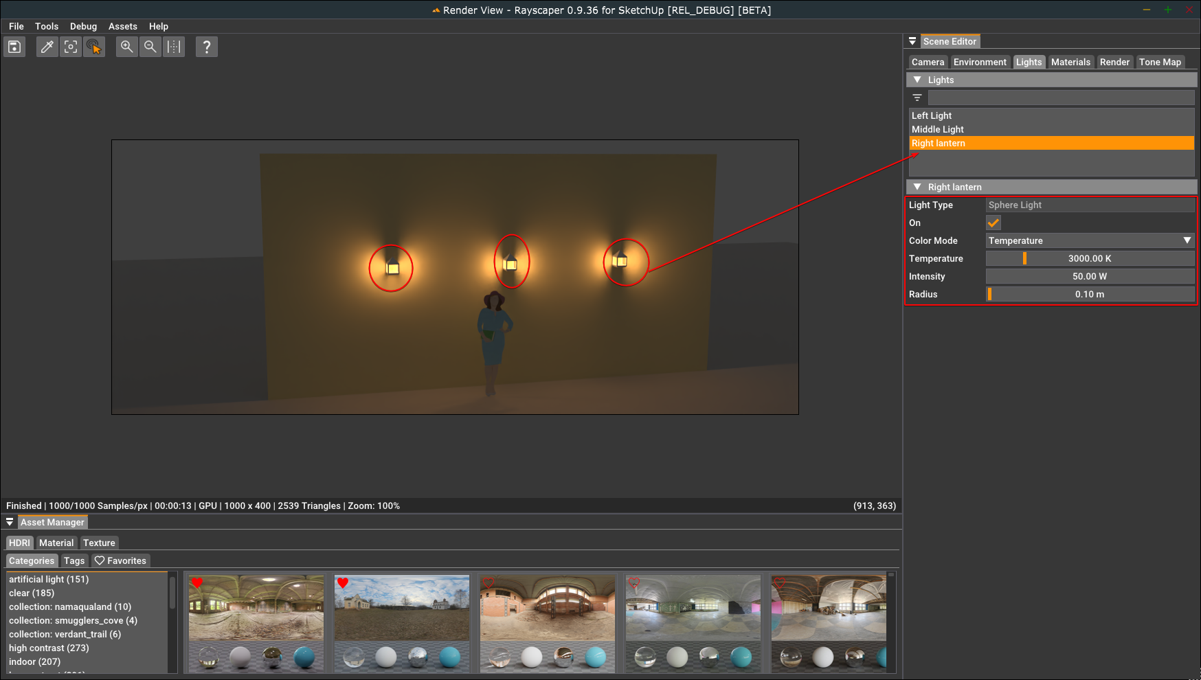
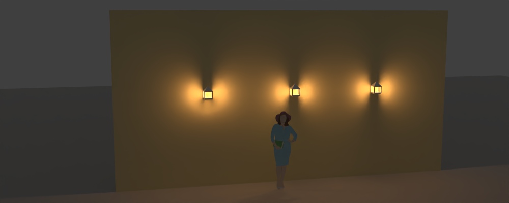
I attached an example (mike_lantern_example.skp) of how to configure sphere lights. In the scene below, I have three lights with the following configuration:
- Light temperature 3000K to get a warm color.
- 50W power for each light.
- Radius of 0.10m to make the shadows softer.
I dimmed the environment to low strength to make the lights stand out.
Light configuration in SketchUp:
Light settings in Rayscaper:
Result:
That should help you tune the lights in your scene.
Regards,
Thomas -
Thanks for that, how did you rename the lights tho'?
-
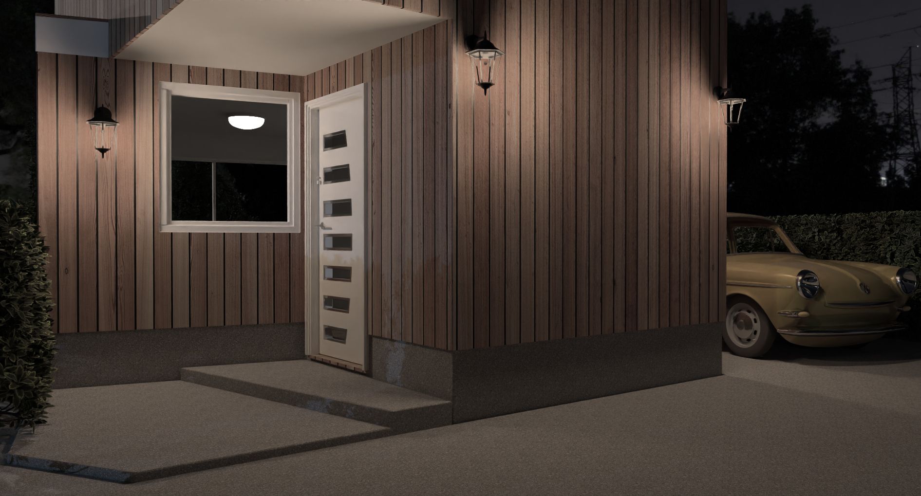
Not a full 500 samples but getting there. I desaturated in Affinity photo.
-
It's getting there. I would pick a warmer light color and make that interior light less strong.
Thanks for that, how did you rename the lights tho'?
Rayscaper takes the name of the light components. You can rename them in the outliner:
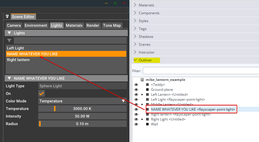
The same for materials, Rayscaper takes the names of the SketchUp materials.
Cheers,
Thomas -
Gotcha, for some reason 'outliner' was missing from my default tray.
I completely missed the absence. Pun intended.
-
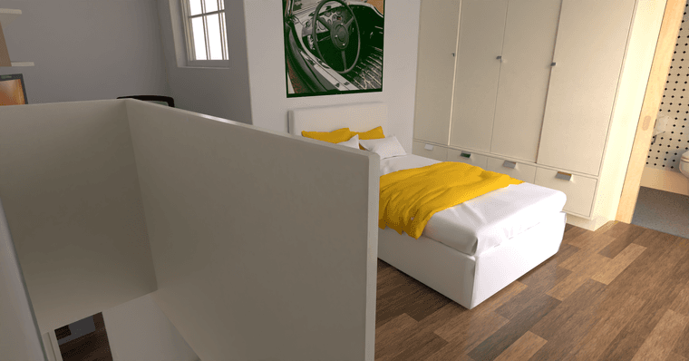
OK, moving on, in a continuous movement.
Getting smaller which seems to be a trend, however this theme still has all the basics such as a full bathroom and a study area.
-
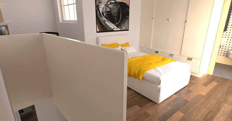
Repeated via a GPU render, much faster and a lighter render from otherwise the same settings.
-
@Mike-Amos like the last one better.


-
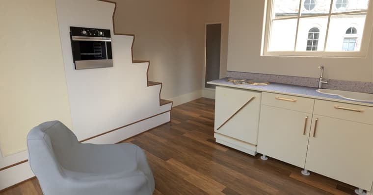
Ta mate, agreed. GPU works best. This is the ground floor level which is smaller in footprint. Also GPU.
-
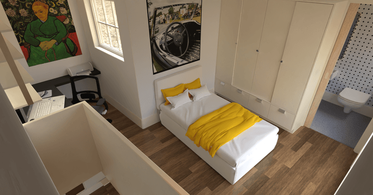
Upper floor, poor scaling of the laptop and a 3.5' bed make it look toylike.
-
Great results, @Mike-Amos. Nice showcase of Rayscaper.
 The oven in the staircase is unique, but I guess you have to put it somewhere in tiny homes.
The different results between CPU and GPU lighting are an outstanding bug. The CPU uses a different, more sophisticated light selection algorithm that's harder to implement on the GPU. As a result, the light looks different in some situations. It's on my TODO list.
Cheers,
Thomas -
Thomas mate, the bugs are life in the raw, as natural as bathroom visits when we get older. Sometimes I swear my bladder has a gps, go NEAR the bathroom and........
The journey is a good one and enjoyable.
-
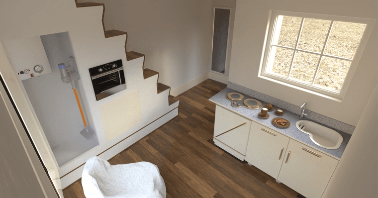
Growing the scene somewhat.
Still perplexed as to why some metals turn copper/brass without input and quite why the reflectance of shiny finishes shopuld be green.
Also, the coffee image from the top of the 'liquid coffee' does not import into Rayscaper which is a nuisance but no doubt will improve when I work out what I got wrong.
A higher vantage point definitely demonstrates the built model better when dealing with smaller properties.
-
Another odd angle for some, I am finding that I have to restart sketchup sometimes, Rayscaper slows but a restart of Sketchup cures this and back to the 6 minutes ballpark.
Some more odd scaling issues with boots.
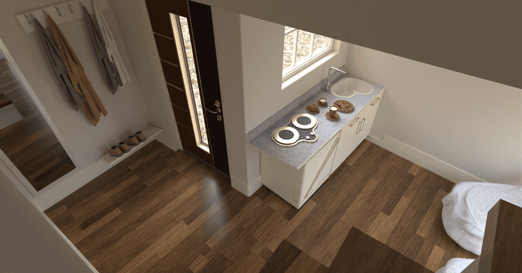
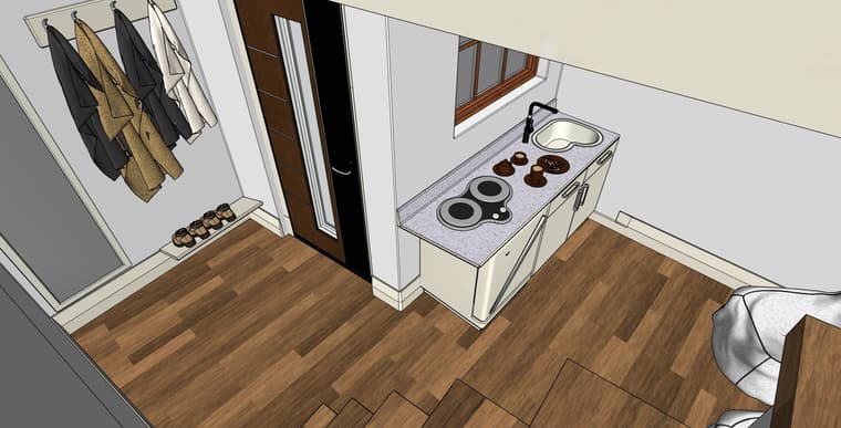
When I can get the blind texture to render properly, there will be a blind unit in the window.
The raw Sketchup vioew will demonstrate what I mean when I mention textures not making it into Rayscaper.
Hello! It looks like you're interested in this conversation, but you don't have an account yet.
Getting fed up of having to scroll through the same posts each visit? When you register for an account, you'll always come back to exactly where you were before, and choose to be notified of new replies (either via email, or push notification). You'll also be able to save bookmarks and upvote posts to show your appreciation to other community members.
With your input, this post could be even better 💗
Register LoginAdvertisement
