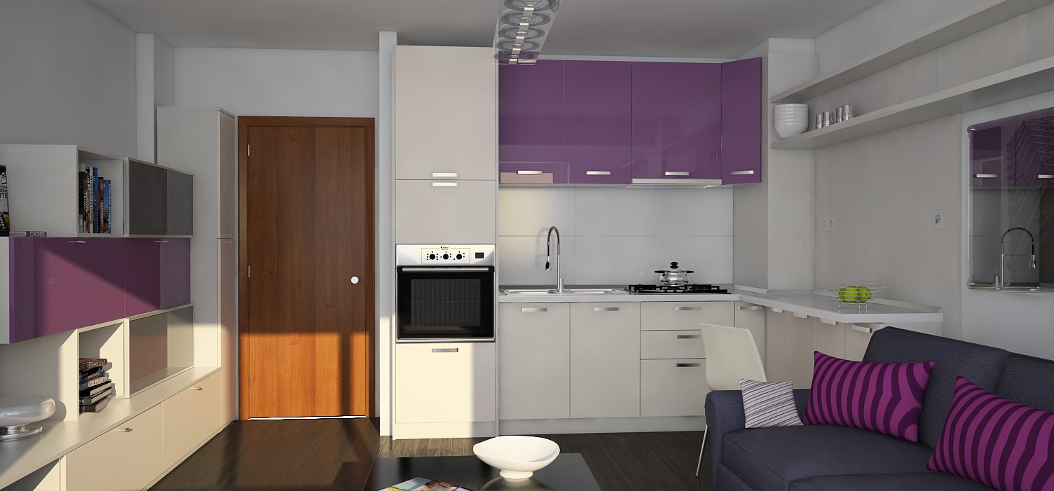
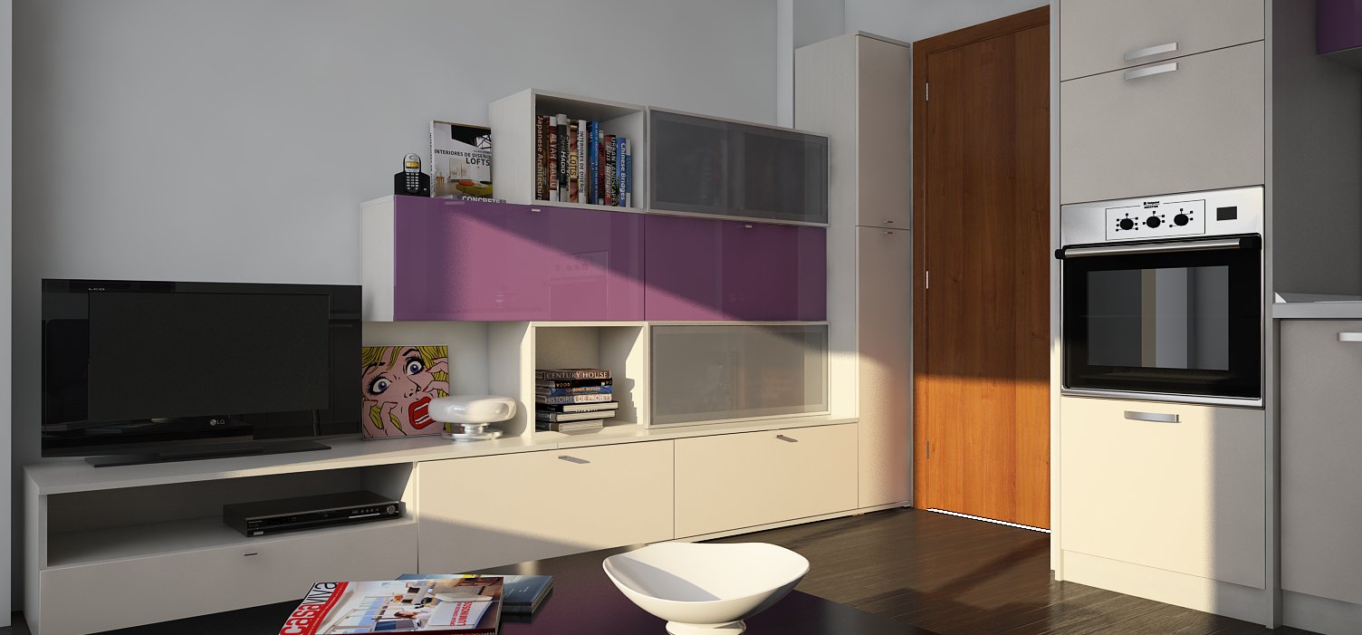
I really like the glow from the windows. And finally, some blue colour. 
Cheers,
Stefan
Posts
-
RE: Different render mood...
-
RE: Latest Project - Done and Dusted
WOW, what a beauty! I really like that you used clean lines. It's massive, but easy on the eye. No handles, neutral colors...are you sure you're not Italian?

What about the heavy surface, it's made of concrete?
Congrats,
Stefan -
RE: Spaceship (Collaborative Project)
I think it's just great, you're pushing each-other to do things that otherwise it could take an eternity.
Good job you two ! -
RE: Spaceship (Collaborative Project)
Guys......stop having so much fun.....is depressing.

-
RE: Spaceship (Collaborative Project)
I think is too compact for such a big ship. I'm browsing concept ships again. Darn!
By the way, I just bump into the USCSS PROMETHEUS .... sexyyyyy -
RE: Spaceship (Collaborative Project)
Yes guys, you are being watched. Now, I'm just jealous of you two, because you're having fun and TIME to do this. But. I can't imagine what your ship will look like. You guys definitely know your sh.t with all that terminology, but I for one, don't know the difference.
"not a cluncker, streamlined explorer" and so on, but I think you should put here some references, if not for you, at least for us, the watchers.Like I said to Marian, I've already spent an evening browsing concept ships blog.
So, what are you guys building?
-
RE: Render problem
Yes, I had this issue in the past. My problem was that the face (surface) was reversed. Use the monochrome style to see if your floor have this problem.
Cheers! -
RE: NPR Great Wall Cinema Sketch
Yeah, it's very simple, and yet, I keep watching...
Nice one, Khal Drogo!
-
RE: My Barbara Barry's inspiration
Fred, every time you make a new post, I become a bigger fan of yours. If you continue to do so, I'll be your number one fan.
Since in the last topic of yours I brought into discussion the beautiful Candice, and after reviewing some of her images (Google images) I've noticed that your images are very "earthy" to say so. What I mean is that I think you need some blue or gray in your color scheme. Not saturated , and just here and there, like a sofa, a curtain or a small wall.
I'm not very good with colors, I just love architecture and interior design more and more, and I don't necessary know what I'm talking about. It's just something that you could experiment.
Regards,
Stefan -
RE: Huge Living
I really like your style Fred. It's very ...Candice Olson!

The floor texture is not tillable, but WOW, you're good!
Regards,
Stefan -
RE: Single Room-WIP
Ciao Nino, I've used different color combinations, but now it's out of my hands. Like I said in a previous post: "people and color choices" .
Thanks for your comment! -
RE: Single Room-WIP
You're welcome! OK, some more images with minor modifications, these should be the last ones, as I got bored of the project. It's coming along quite slow. Still, it was fun, I was missing rendering so much.
Regards,
Stefan


-
RE: Single Room-WIP
Thanks Tom. Previous, I had to do some "gymnastics" in the V-ray frame buffer(adjustments) in order to make the image brighter, but I remembered Fernando's technique who basically used nothing in the GI slot, but a blue color with a big multiplier (40 or so), and enabled the sun in global switches (Default Lights). In this way, you don't need to put rectangular lights in the windows. I used HSV Exponential as color mapping, because I wanted to keep my colors saturated. I like the quality of the render, but I think this approach of lighting the scene was responsible for the pleasing result.
In the end, all that matters is to find what works best. I bet if I had to render a different scene with the same approach, it will turn worse, or.... better.
Cheers!
