My Barbara Barry's inspiration
-
Hi all,
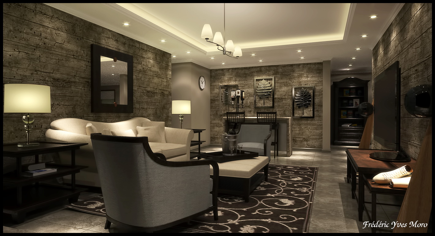
I like since a long time Barbara Barry's interior design, very class and chic for me.
So I decided to make this composition just for fun with 90% of the Barbara Barry's furniture and decoration items.
On another hand, I would like to demonstrate that the association between Sketchup and Thea is just what I wanted for a long time.
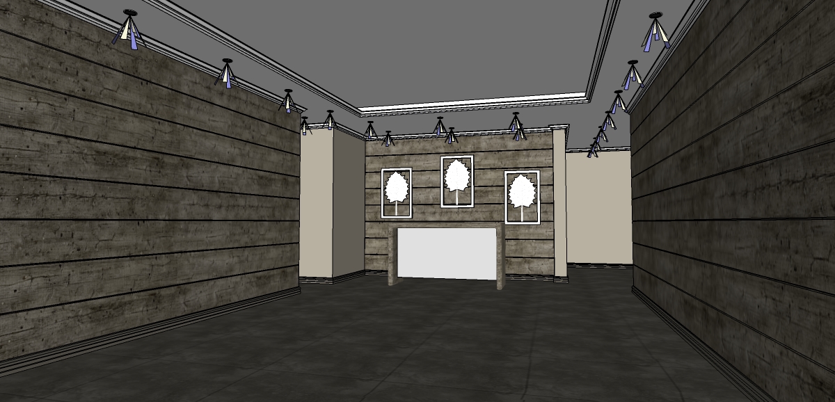
So easy to setup the scene (Ceilings, walls, lights, materials) in Sketchup and then let's go to Thea, setup the view and the lighting without furniture.
After that, I can merge what I want, there is no limit... It's amazing...


-
Fred, your work just keeps getting better.

-
Where did you find the flying carpet? Looks like the left corner is revved up and ready to go.
-
Fred, every time you make a new post, I become a bigger fan of yours. If you continue to do so, I'll be your number one fan.
Since in the last topic of yours I brought into discussion the beautiful Candice, and after reviewing some of her images (Google images) I've noticed that your images are very "earthy" to say so. What I mean is that I think you need some blue or gray in your color scheme. Not saturated , and just here and there, like a sofa, a curtain or a small wall.
I'm not very good with colors, I just love architecture and interior design more and more, and I don't necessary know what I'm talking about. It's just something that you could experiment.
Regards,
Stefan -
@dale said:
Fred, your work just keeps getting better.

Thanks
@roger said:
Where did you find the flying carpet? Looks like the left corner is revved up and ready to go.
 Ok just see it...
@stefanq said:
Fred, every time you make a new post, I become a bigger fan of yours. If you continue to do so, I'll be your number one fan.
Since in the last topic of yours I brought into discussion the beautiful Candice, and after reviewing some of her images (Google images) I've noticed that your images are very "earthy" to say so. What I mean is that I think you need some blue or gray in your color scheme. Not saturated , and just here and there, like a sofa, a curtain or a small wall.
I'm not very good with colors, I just love architecture and interior design more and more, and I don't necessary know what I'm talking about. It's just something that you could experiment.
Regards,
StefanThanks a lot Stef for your kind comment, I notice what you say about the colour shame.
Hello! It looks like you're interested in this conversation, but you don't have an account yet.
Getting fed up of having to scroll through the same posts each visit? When you register for an account, you'll always come back to exactly where you were before, and choose to be notified of new replies (either via email, or push notification). You'll also be able to save bookmarks and upvote posts to show your appreciation to other community members.
With your input, this post could be even better 💗
Register LoginAdvertisement


