Doubled up post
Oops, your profile's looking a bit empty! To help us tailor your experience, please fill in key details like your SketchUp version, skill level, operating system, and more. Update and save your info on your profile page today!
Urasik Extensions | Lots of new extensions to check out Learn More
Posts
-
RE: New website
@paul russam said:
Gota say Richard that your site's are really nice, I've always admired your layouts when you've posted them and you obviously have an innate sense of design. This is where we differ as I have to go steal (by force if necessary
 ) mine, i Just need to go robbing a better class of designer in the future
Thanks mate, but don't think we both are somewhat guilty of pinching ideas!!!
Mate, don't know if you've tried Webflow? I seriously dig it! One of the beauties - if you like something on a page in the showcase, you can open it in webflow to see how they structured the object or set it's transitions. Make pinching ideas a lot easier!
BTW, those to pages you linked, again for me load slowly!!

-
RE: New website
I tend to adjust font size per device, In fact I'm so OCD, that sometimes I'll change text content per device so it stacks properly! Weird!
-
RE: New website
@paul russam said:
Fonts are a little smaller on large monitors, It’s always a toss up between font size, words per line and content width. I’m using 4 sizes / 3 breakpoints and I’d rather have largish fonts than too many words per line or too narrow a content area.
Mate, I'm still finding the font largish on my desktop, I know whilst you say you don't want too much text maybe you could put the text to two columns and introduce some more H1/H2 headings.
@unknownuser said:
I reprocessed the images used in the header(s) through https://tinypng.com
If you haven’t used it yet its remarkable how much it can squeeze png’s and jpg’sI use tinypng often, the results are amazing, minijpg is also brilliant, if your images are in PNG it might be worth converting to JPG to save some size.
@unknownuser said:
I’ve also limited the header to 7 random images (from 30) instead of the full 30 - that was stupid of me not to put in the limit.
Yeah holy crap, 30 is silly thinking mate, I'd even say three is enough as your scrolling down instantly anyway!!! The page is loading MUCH faster!!
@unknownuser said:
The Services icons are pure CSS and are remarkably fast, have a look here at some of my tests http://www.sandbox.russam.me/wilburys
I did read an article on the Webflow blog about speeding page load, CSS transitions are one of the things they suggested to limit to speed load. Mate despite them being clever, I'll still hold and reinforce my view that these are out of style with an architectural practice!!! I'd prefer beautifully styled icons!!! I've done a similar treatment on my own (under development STILL duh) page with icons and titles to deal with services, might give some thoughts (maybe not) http://builtbrand.webflow.io/ and here is another page where I've stylised icons to have some meaning http://sipform.com.au/.
@unknownuser said:
I’ll look again at the number of projects on the Projects page, It’s a common mistake I make in that I try to list everything instead of what is important.
Maybe bring two projects featured to the top, and then rows of four under, BTW again that little circle is polluting them
@unknownuser said:
The site is built with Rapidweaver + Stacks + Foundation + a bucket load of other add ons
The site is fully CMS’d so I can add /modify projects any time.Wow, that's a great deal knowledge cranked into one site mate, well done!!! I've been sticking with Webflow, love the editor and CMS system!! I changed over from squarespace as it's been turning to crap. I don't know enough about to be doing any great works!
I've only done about 15 pages but the change from squarespace has been a game changer! -
RE: FormFonts work offer
So now their chances of meeting deadline themselves ZIP!!!
-
RE: Kitchen render
Render quality aside, I rather like the whole style and framing of this scene! NICE mate!!!
-
RE: Render this: Old Camera
Some seriously nice renders of what looks to be obviously a sweet model!!! Well done all!
It is strange time when we are making completely CGI images of an old camera, oh how things have changed!
-
RE: FormFonts work offer
Alan, I could probably suggest a workflow that might help you out a LOT to crank through this work! And certainly get a lot MORE SU (or in fact Layout users) to enlist!
I think like many I find Illustrator rather clunky so I avoid it like the plague, so would always myself resort to LayOut for all this type of work as it's so much faster and often cleaner. I'll hint at my workflow and you'll be obviously much better at understanding how such a workflow could be enhanced for your purpose here. Be mindful that I’ll throw InDesign in as a step to avoid any work in Illustrator.
- All vector work done in Layout,
- Objects to be styled ie: shadowed, bevelled, embossed etc, are placed to a “by style” layer,
- TIP: ensure there is a layer “border” at the outside of the page and this is ALWAYS ON!
- Export as PDF with layers enabled, all layers on,
- In Indesign > insert PDF > then manage object (PDF) layer options (Border layer always ON),
- Copy object (PDF) > "Past In Place" on a new layer > Manage layers > apply object style,
- Again paste in place on a new layer > Manage layers > Apply object style,
- Remember any modifications to the style can be adjusted!
- Repeat as necessary.
- Finally export PDF or EPS > open in Illustrator > Adjust Artboard if required > Export SVG
If the style treatments are made common or even you have more styles and layers than necessary (with applied styles) just turn those off in Indesign prior to export. Where the beauty lies here, you can use just one Indesign file to process ALL LayOut PDF’s fast by just updating the PDF and hit export!!! Meaning you could have 20 layers / 20 styles / the PDF layered 20 times but not all need to be exported! Just ensure the BORDER layer from the LayOut PDF is always on so the objects in the PDF don’t move!
Again mate, if you are proficient in Illustrator, you may be able to skip the Indesign step, I just can’t work out how as I find Illustrator just flattens my layers when I import the PDF from Layout, and then even working on styles within illustrator seems clunky.
So in the end, I’m suggesting there may be an army of peeps here that could help push out the geometry work, then just a few minutes at your end could process each. Hope this gives you at least some idea! Flick a PM if you need better explanation.
-
RE: Rounded rectangles
Mate the easiest way, like many things in layout, is to make your own and compile a scrapbook.
-
RE: New website
Nice clean site Paul, though the font is rather large on a desktop, though sweet on a mobile, these can often be ! There is some serious loading lag (here is Aust anyway - our hampsters are lazy), this could be due to the large number of transitions you have, as I understand these are seriously taxing on load! Could also be the use of a large background image! I'm not really seeing a need for that to be blunt.
The "services" icons for me are just that bit gimmicky for what is obviously a well accomplished Architectural practice! Whilst they contain some really very funky transitions, my bet is that this is where the load lag is born of. Personally I'd prefer static well designed (architectural) icons with a title even if then the text expands out on hover rather then a pop up text bubble.
It's one of those things I battle with in my site designs, funky transitions v's faster load! A SEO guy I've been working with of late continues to hammer me on the importance of fast load!!!!
The projects section IMHO is a little overwhelming, I'd probably pull a few "best" projects whilst being contrasting styles as featured, with the option to open more. As many of the projects are similar, which I find appealing that you have a style, I'm probably as much questioning if you may lack vision to create beyond that style! This is probably also the cause of the "overwhelm" - I start to wonder if these are repetitious.
The little circle on the project tiles for me are unnecessary and even polluting what is otherwise clean. I'd rather here a clean title and brief summary!
The news section is just that bit untidy with the use of smaller thumbs with varied image styles.
Hope you don't mind the crit mate? I like the site and loved checking out the projects - it is for me just a few tiny things that would take it from a good site to a GREAT site!
BTW what platform did you use to build your site?
-
RE: Webstore help and advice
Majid, have you tried SquareSpace, VERY easy to put a gallery / store page together!
-
RE: Kitchen
@imabzeous said:
@richard said:
VERY NICE mate!!!! I love the slightly sepia images too!
One thing I'd suggest, some of the fall off on the materials seems a bit weird. IE: the metal on the toaster and tops of the stools. This sometimes happens in you just add roughness instead of bump mapping.
WOW thank you richard i did noticed the toaster one but it was thea material so didn't understand whats wrong with it, and thanks for mentioning the other one yes rougness was added now will add bump and try it again, thank you for this tip
Mate, I imagine unbiased engines are much the same when it comes to physical properties - they should be in mt guess. The word I got from the maxwell gurus (of which I'm most definitely NOT one) is that materials generally don't respond well when just roughness is added. Sought of makes sense. Materials are probably mostly gloss, it's surface imperfections that make then appear other.
These comments came around from reference to metals, that once you add roughness, they, in a general sense become a plastic (Not sure though they are correct, I roughened up some stainless steel and sat there for 3hrs with a lighter to it and it wouldn't melt, LOL).
HOWEVER! All that said, you are putting some seriously stunning work before peeps that will look at it with a seriously critical eye. Joe Blow general public would never pick it in the quality of the image you have produced. So then for me personally it comes down to a time in production aspect, in the end unless you have free time to spend in production - I'd seriously focus on camera and lighting WAY before materials!!!
-
RE: Kitchen
VERY NICE mate!!!! I love the slightly sepia images too!
One thing I'd suggest, some of the fall off on the materials seems a bit weird. IE: the metal on the toaster and tops of the stools. This sometimes happens in you just add roughness instead of bump mapping.
-
RE: From SketchUp to the real product.
Wow, I'm seriously impressed! How is the chair's padded shape achieved? Just by wrapping and contouring the foam? Or is it shaped from a polyurethane foam?
-
RE: Render | Brochure Style Test
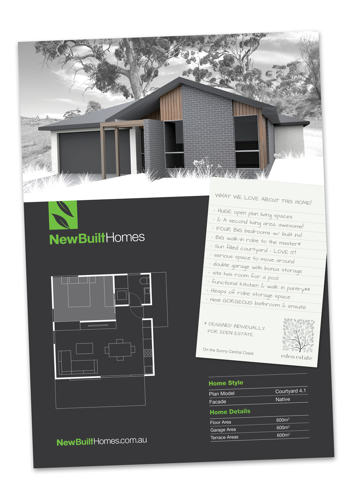
@mpardek said:
Looks good, very clear. Like the use of a simple color palette. I would suggest some minor adjustments:
-
The houses walls are slanted because of the perspective, would try to make these truly vertical. Especially because you have angular roof lines and the rotated note. To many non-perpendicular lines can become distracting.
-
Might be good if there is more space between the top of the note and the bottom of the house. This graphical tangent, where the note is almost at the same angle as the bottom of the house, causes the eye to focus on the interaction of these two graphics and not on the content.
-
If you are showing most flattering face of the house, I think rotating the view to show the front door might be good to explore. You could even show some people walking up or through an open door, so the eye is invited in.
Hope these are helpful.
Big thanks for those great observations mate!!!!!!!
As mentioned in the original post, this image was just one dragged for facade testing and shot in as a place holder so not truly representative of any final.
I'm certainly one to observe the standard of maintaining verticals. Similarly with ensuring the entry door is shown, even on tests such as this one I'd observe that but at this stage of testing I haven't even got a front door, front step or even door head in as it wasn't yet going to any client. It was just a personal test on a design I was working up.
I've been playing the the page layout to add other content that will be needed, so how much of the note may nee to lap the image, if any, is unknown. I do want to be careful not to have to lift the home too much, as it testing the layout it suddenly looked weird if too high.
Hey and thanks again for great feedback mate!
-
-
RE: Render | Brochure Style Test
@jo-ke said:
I really like the style of your presentaion
@imabzeous said:
Its beautiful, love your presentation styles techniques
@cotty said:
Another great example of the Richard style

Thanks guys, thankfully the client really digs the style. Works out well given the arrangement as I do really want to keep the workflow to a minimum in the case that he doesn't sell any homes due to his pricing. This has unfortunately happened to me before, working just on royalty for every home built only to realise in the end the builder cant sell any homes as they are wanting way over the market normal. Duh!
-
RE: Render | Brochure Style Test
@pbacot said:
I like it very much! Quite crisp. Like with the earlier images, I wonder a little about the gray background. If you want a monochromatic look, maybe there could be very low green in the tree leaves and a suggestion of blue wash in the sky.
As always mate, thank you for feedback!! The main reason for the monotone is so that I can get away with almost any image in the background, I will trial that though and see what it comes out like.
-
Render | Brochure Style Test
Dealing mainly with new building companies at start-up means most often they are low on cash. Most of those I deal with from start with branding, brochures and website have no current home designs or renders and cant really afford to have them done!
So I've been playing with render styles that would provide a fast and visually effective solution. One which I can provide on a royalty only basis. Thus the solution has to be time effective for me.
Here is one VERY VERY DRAFT pitch prepared to demonstrate how one such solution might look on brochure. The funky thing that came out of playing with this draft > the note paper overlay with hand written notes works out sweet! It's allowing for languaging that normally couldn't be accommodated in a more formalised point form.
It allows for switching between UPPER and lower case text for highlights, use of wording like Huge, Awesome, Love it!, and then even strike through corrections to really highlight items.
As far as the render solution goes it's fast: Super low on modeling (though needs more detail than this draft eg, entry apron, gutters and roofing. This is just a rough design test model I've dragged in), no lights, no interior, no entourage, and maybe only 10 minutes in image post processing.
Looking forward to some thoughts and feedbacks!
-
RE: Outdoor Discovery Center Part 4
Mate I really do like that NPR style, works a treat with the purpose of the development!