Chedda, the black and white is SO suited this scene. Seriously awesome stuff!
Oops, your profile's looking a bit empty! To help us tailor your experience, please fill in key details like your SketchUp version, skill level, operating system, and more. Update and save your info on your profile page today!
Urasik Extensions | Lots of new extensions to check out Learn More
Posts
-
RE: Chinese Yard
-
RE: Re-branding Feedback
@bob james said:
Is it HiTech Homes or Hi TechHomes?
I'm going to assume it's the first, so, IMO, HiTech should be the same color
Yeah I reckon your right mate! Update the link to reflect. http://hitechhomes.webflow.io/
-
RE: Re-branding Feedback
@mike lucey said:
Richard, I have to agree with Box when he says the first comes aver as "Hi from Tech Homes" rather than Hitech homes.
I do wonder though Mike if the "HI" intro is what then holds with us, when we look at the logo thereafter, would we have this same impression in the case of the logo standalone?
The "HI" was conceived as it give lots of greater opportunities: HI Life | HI Quality | HI Returns, plus it's use as a favicon, app icon, facebook profile image etc.
@unknownuser said:
The black over block shape that encompasses the house / home at the same time gives the impression of seriousness and solidness which is good.
Totally!!
@unknownuser said:
I take it that the orange upright rectangle graphically represents the hitech element to be incorporated in the house / home, fair enough.
Part of the reason is a possible move toward SIPS as part of their bigger business model. In that case the logo icon could cover both aspects of these businesses. 1. Homes and 2. Panels as part of a home's construction.
@unknownuser said:
The company name 'HiTechHomes' is what it is but I think the gray colour of the 'Tech' word should in some way be brought into the graphic logo, possibly as an inner / smaller grey rectangle.
Totally get what you are saying, I like what you have presented, though it then IMHO becomes rather obvious, maybe trying too much.
Thanks for the feedback Mike!! Excellent ideas!
-
RE: Re-branding Feedback
@ely862me said:
I also like the 1st, it's simple and effective. The second one seems a bit edgy and lost, imo.
Can you make the T come a bit over the HI orange background ? See how that works.I do see some scope with what you are suggesting!!!!

One other option I guess to lessen the effect of the "HI" TechHomes might be to reverse the grey / orange so that the tech is same colour as the Hi!
Thanks mate I'll play some more!
-
RE: Re-branding Feedback
Thanks Chaps!!! Personally I like the first as it gives good campaigning options, though even like you guys and other friends the second option seems to fly the best!
-
Re-branding Feedback
This isn't really something for the gallery of WIP, as it's got no SU or LO work in it.
I've got a new client and the first job is to update their branding. Would love your thoughts on which new logo is working best. There are three in this link. The first aims to set a theme for an over arching campaign, the second simply aims to morph their existing logo. The third is really the second shown as an imprint to a card or signage.
Looking forward to any feedback offered. http://hitechhomes.webflow.io/
-
RE: Deciduous Forest
Very nice mate, though the SS on the trees might not be working so well!
-
RE: Bazar proposal
Wow mate, that's some pretty impressive work!!
In the night shots it looks like you could use some spot lights to enliven them a bit!
-
RE: [Restaurant Renders]
Very nice mate! It's a huge restaurant wow! I would suggest that fish tank, although a feature, is jumping out a little too much!
-
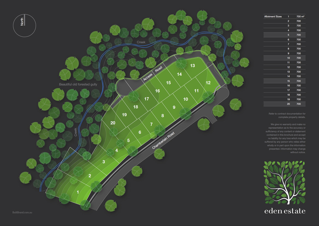
RE: Subdivision Marketing Plan with LayOut
@marked001 said:
I'm in love with this plan, richard. This actually popped up in my tumblr or twitter feed yesterday or the day before and i thought it was really beautiful and saved it for future reference
 had no idea it was yours! but i should have suspected.
Hey Thanks man!!! Interesting that it got on to tumblr or twitter somehow!
I'm myself pretty chuffed with how it came out!
-
RE: Subdivision Marketing Plan with LayOut
@pbacot said:
How did you make the variation of tree color? Did you color different trees in PS or something then import to LayOut and set them where they'd make sense for the depth of the gully.
Mate the trees are just layout geometry (default scrapbook tree plans) with different fill weights and spread over 6 different layers. Then in INDESIGN I've taken the PDF > managed its layer visibility and copied it over itself 6 more times IE: Base layer > tree 1 > tree 2....... Tree 6. Than added a drop shadow to each tree layer.
Pretty simple process, and the beauty again that I can push out a completely vector based PDF so it's always crisp!
-
RE: Subdivision Marketing Plan with LayOut
@imabzeous said:
Waou Richard. if i ever came to australia please have me as intern

Mate, I could teach you all I know over a beer. Meaning I don't know much OR we are talking a fair few beers!!!
-
RE: Subdivision Marketing Plan with LayOut
@rich o brien said:
love that presentation!
Thanks Rich, the client and agents are stoked! They are after top dollar in the area so they are pleased this represents the site quite well!!
-
RE: Subdivision Marketing Plan with LayOut
@otb designworks said:
As far as giant PDF exports from Layout, this is what I have been doing to minimize file sizes while maintaining print quality.
I export from Layout with high resolution and no jpeg compression. This yields a huge file. I then re-save the PDF in Acrobat as a PDF Optimized. This often times will decrease the file size by a factor of 10 with no appreciable degradation. YMMV but works for me
Cheers mate! As the PDF out of Layout was vector only it is probably pretty light already!
In this version it is only about 300kb, one dragged into Indesign, shadows to the tree layers and logo added it only jumps to 1.3Mb. Interestingly I thought I'd try optimising this final file and it jumped to 10Mb and turned to crap. Flattening the transparency stuffed it!
However, if as I tried earlier to use these trees I'd created with Layout as just geometry and scatter a hundred or so around the file size as you'd imagine the size went skyward!

-
RE: Subdivision Marketing Plan with LayOut
@ntxdave said:
I agree with @pbabcot. I think a lot depends on the target audience. If it is a developer/home building organization, I think this documents would be sufficient. What they would want to know is how many lots, where are they located, and to some degree how much excavation will they have to perform to get the lots ready for market.
If the audience is home buyers, the document can be used to let them select a lot but in the end they would want more detail like where streets, alleys, and other such things are located before they select their lot.
Still think that overall, it is a very good document. As stated before, and agreed to by many, the logo is a little too big (distracts from the main topic of showing the parcels) but otherwise very nice and effective. I can just see it on the wall of a sales office.
Thanks for throwing in more feedback mate! The blocks are to be sold as each vacant to the home buyer. The contract documents will have full details on the subdivision. We tend not to give too much information in marketing docs, you want them to start talking with the sales people so they get excited. This plan is for the first round of enquiry.
Here is an updated version, still a few details to be corrected.
-
RE: Subdivision Marketing Plan with LayOut
@pbacot said:
I think the tree shading for depth works very well! and the overall fresh approach is nice but subtle. ( I like the idea of a gradient background for depth but probably enough going on graphically already. Great as an overall project "avatar", and possibly other versions add various info and details. I don't know if it will be effective on the target audience. More sophisticated investors will probably find it has that confident, professional touch. I think the only thing that might be lacking for potential homeowners looking to buy a lot is sense of scale.
That's a great point regarding the scale mate! I did suggest to the client previously that we through some home outlines on there, but he didn't want to confuse the fact these are vacant house blocks.
I did try to pull the tree sizes down so the sites seemed bigger but it became overly busy!!!
Once the site areas are on there it will inform correctly I think.
Thanks as always mate!
-
RE: Subdivision Marketing Plan with LayOut
@unearthed said:
An interesting idea not showing contours. Lovely, rich looking colours.
To get more 'pop' and depth I would at least try adding a little green-blue to the deeper trees and ever-so-slightly redder haze/speckle/noise/colour to the trees nearest the viewer - I don't know if it would work but it should.
No I don't think it needs 3D (even tho' I a huge 3D advocate). Will there be any 3D/perspectives/iso-views used as well?
Yes logo too big - also as subdivision is quite organic/soft shouldn't the logo assume the same shape? After all it is a tree, and the road layout and stream are probably somewhat dendritic (treelike) especially if this only part of a larger whole. Is the logo the clients's or yours for the job? Could the timber of the tree be blue-edged???
Thanks for the feedback mate! I didn't want to add too much more texture to the trees as trying to keep the files light. As everything is vector it doesn't take too much to double the file size.
Regarding the logo as relative to the plan, this is just one spread in the brochure, so the logo will also be used standalone. So being relative to the site / creek isn't so important. Rather nice idea though!!!