sketchucation logo sketchucation
    • Login
    1. Home
    2. Richard
    3. Posts
    ℹ️ Licensed Extensions | FredoBatch, ElevationProfile, FredoSketch, LayOps, MatSim and Pic2Shape will require license from Sept 1st More Info
    Offline
    • Profile
    • Following 0
    • Followers 0
    • Topics 127
    • Posts 2,055
    • Groups 2

    Posts

    Recent Best Controversial
    • RE: Subdivision Marketing Plan with LayOut

      @ntxdave said:

      Interesting that this was all done in Layout. Nice Job 😎

      Do agree that the logo is kind of big in comparison to the drawing though.

      Thanks man, as mentioned the tree shadows weren't done in Layout, I dragged the layered PDF into Indesign for this.

      As replied to Baz, indeed yes the logo is too big.!!! πŸ‘

      posted in Gallery
      RichardR
      Richard
    • RE: Subdivision Marketing Plan with LayOut

      Baz, thanks for all the awesome feedback mate!

      @unknownuser said:

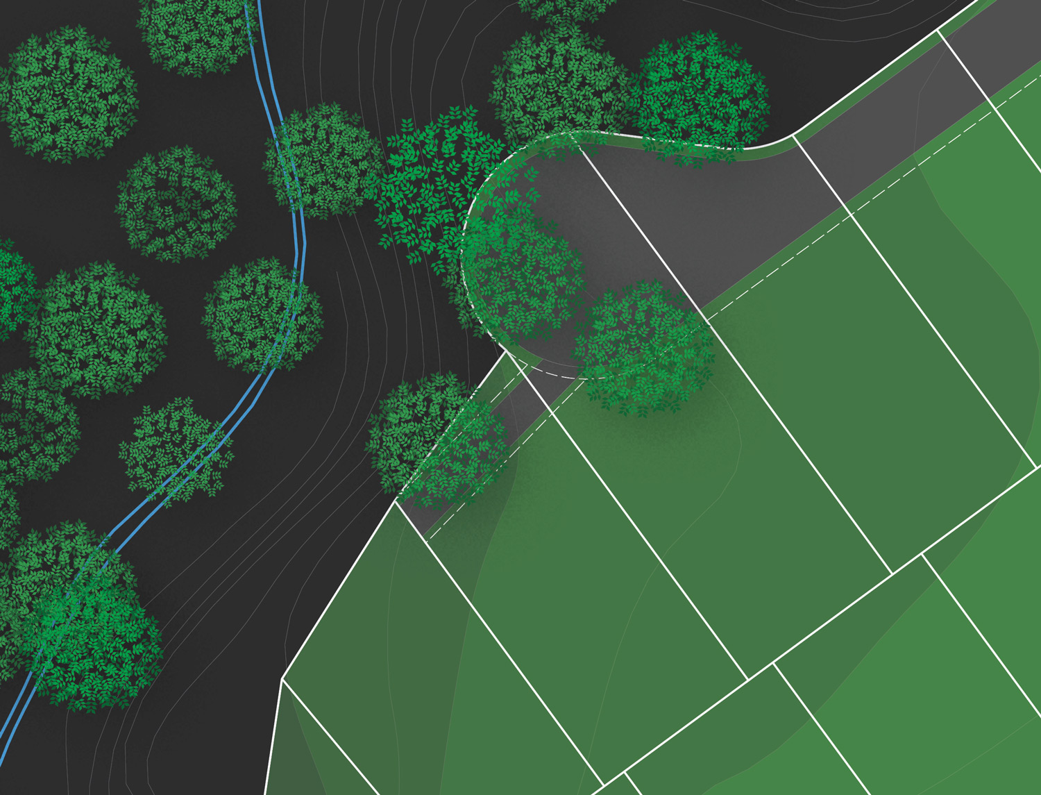
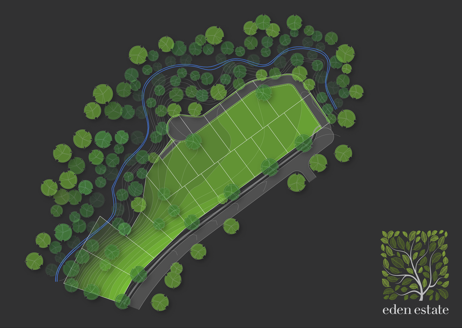
      Illustrating the slopes nearly works, but think of those classic blue mountains... further off, more haze. (Methinks 0f SU Fog here).

      I'll play around a bit more with the "fogging" of the depth, might try a gradient fading filter in Indesign, though the problem I may have here is getting it correct multi directional

      @unknownuser said:

      Not sure whether this is a criticism or not, but those trees look like they came from "The Matrix" Materials Pack'.

      Yeah I'm not loving them so much, I did make a more realistic tree (in plan) with layout geometry, but as I scattered them around the file was becoming increasingly unmanageable. Plus the PDF export itself was becoming HUGE!! I might play around with them a bit too!

      @unknownuser said:

      Logo is too big in relation to the 'Landscape', in fact its almost the main draw, needs to be much smaller, (and a bit of humble would be good)..

      Yes most definitely TOO big, I pulled it a bit bigger so it would be same width of a table I'll place above it with the lot numbers and sizes.

      @unknownuser said:

      In any case, the logo colours way too similar to the illus.

      Funny But I actually do want these colours to match.

      @unknownuser said:

      Bit of kerning required on the logo type, esp. 'eden'. (Bad kerning is my current GMTS 😞

      Good pick up, I'm not so happy with the whole font there really!

      @unknownuser said:

      And wouldn't just a touch of 3D explain the thing so much betterer?

      Betterer, maybe, but this would then likely require another version in true plan so the lot proportions are more accurate! And then converting the 3D view to a vector file may not be so easy without making it look strangely flat!

      Again mate, THANKS for such a complete crit! Love it!!

      BTW, this was the more realistic tree version mentioned. Just LayOut Geometry!

      CLOSE.jpg

      posted in Gallery
      RichardR
      Richard
    • Subdivision Marketing Plan with LayOut

      A fun little rainy day job, a marketing plan for a boutique subdivision. Other than the tree shadows all was created direct in LayOut.

      The client wanted to portray the slope so to demonstrate the outlook into the densely forested gully. Took a bit of trial and error, but I think it does the job or emulating the depth. Thoughts? Improvements?

      plan.png

      posted in Gallery
      RichardR
      Richard
    • RE: Drawing a Line Perpendicular to Another

      Option to ensure you get it correct is to draw a line over the SU model and rotate it with "snap to object" on! I do this as a matter of course as it quicker than trying to find the right inference.

      posted in LayOut Discussions
      RichardR
      Richard
    • RE: Recent Layout Presentation

      @unknownuser said:

      @richard said:

      @unknownuser said:

      Richard,
      I am curious......do you mean use 2 point perspective(s)?
      Thanks,
      Charlie

      Well yes but not by forcing them with SU's camera. Just set it up that way.

      Can you explain what you mean by "just set it up that way".

      I often fuss with SU camera FOV and save my scenes.
      (getting things as vertical as I can)
      Is this what you mean by forcing SU's camera?

      Thanks,

      Charlie

      Ok I should probably explain better. If just for NPR then I'd suggest the two point perspective camera can work fine. If rendering - any heavy forcing can make things look a bit weird, like an excessive crop.

      posted in Gallery
      RichardR
      Richard
    • RE: Recent Layout Presentation

      @unknownuser said:

      Richard,
      I am curious......do you mean use 2 point perspective(s)?
      Thanks,
      Charlie

      Well yes but not by forcing them with SU's camera. Just set it up that way.

      I know many here will argue that this isn't important, though the simple challenge - open any good architectural magazine and try to find one photo off vertical. If you do, checkout who was the magazine's art director for that issue, then check the next issue - likelihood is they've been replaced.

      posted in Gallery
      RichardR
      Richard
    • RE: Need Some Graphics Advice

      The trial might have export limitations for sure, but I cant see why. There is usually a printer set up dialogue box! Or it could be using the native built in PDF printer on your system and you haven't set this!

      BTW Layout is VERY easy!

      posted in Corner Bar
      RichardR
      Richard
    • RE: Recent Layout Presentation

      Nice work again Paul, though when you put images or renders onto a page you can see why maintaining verticals vertical is important. I'll say this again, that it only seems to be the SU community that break this industry convention.

      posted in Gallery
      RichardR
      Richard
    • RE: Another Recent Layout Presentation

      Nice work Paul!!! As Baz suggests the clipping mask is brilliant. You can actually apply one mask to numerous images.

      You can see what I mean here, the flooring is a texture repeated and then clipped.

      plan.jpg

      clipping.jpg

      posted in Gallery
      RichardR
      Richard
    • RE: Divider at entrance

      Another brilliant solution mate! Impressive as it would seem ALWAYS!

      posted in Gallery
      RichardR
      Richard
    • RE: SU to Unreal Engine any progress?

      @liam887 said:

      @richard said:

      Does anyone know if there has been any progress on the workflow from SketchUp to Unreal Engine? Obviously without going through Blender?

      I have Richard, the difficulty has been creating the bounding edges around the model once its imported. I am planning on writing a tutorial soon so will keep you posted.

      Really looking forward to that mate!

      posted in Corner Bar
      RichardR
      Richard
    • RE: Layout Hatching tips?

      @ryanmas said:

      Thanks for the tips. That was the issue I was concerned about, dark textures and colors being printed. Even on small SD sets the "rehatching" of revisions is just a ridiculous method of working.

      I'll just stick with textures in SU.

      One option might be to use a B&W lined texture in your model! Just flip the coloured texture out with the lined texture and flip it back in for other shots. I know it's a workaround but certainly a quick one!

      Just make sure both textures match in scale and proportion.

      posted in LayOut Discussions
      RichardR
      Richard
    • RE: Dividing a child's room

      @dave r said:

      Very nice! What does it run on? Are there wheels underneath?

      What provides the lateral stiffness to the book case to prevent it from racking when it is being moved?

      I was just about to ask those same questions Master Dave!

      Racking would be my concern, as well as some restraint at the top when extended out.

      How did this feel in the end mate when completed.

      posted in Gallery
      RichardR
      Richard
    • RE: From roughed out design to real (more added)

      Oh Jeez, that throws everything out! I'd stick with the unbiased settings, the engine just seems to pull out better results.

      posted in Gallery
      RichardR
      Richard
    • RE: From roughed out design to real (more added)

      Wow Majid, you've knocked it out of the ball park!!! Well done mate! The only thing I could see needed there is some bump in the door finish, so it's not so silky.

      posted in Gallery
      RichardR
      Richard
    • RE: Single/twin occupancy dwelling 24' square.

      Mate one of the first things I do when designing a tight space is to place standard sized furniture around and ensure it fits comfortably and can be navigated.

      Every now and then I present plans designed by others for marketing, to demonstrate the layout well I again drop in furniture so the plan is easily read. Its amazing how many times in those cases it seems to have not even been considered by the designer.

      I think your approach to multi use spaces is the perfect way to go in the case of the space being small!!! However a space of 24' x 24' (8m x 8m) isn't actually that small. Here is Sydney we can legally place a granny flat in 60m2 from that (as just a single floor), we'll normally design for accommodating 2 bedrooms, bathroom with combined laundry, living / dining area and kitchen.

      Here is a recent design that I utilised a similar kitchen / dining / living similar to that projected in your space.

      18TWENTY-PLAN-SET_Page_9.jpg

      posted in WIP
      RichardR
      Richard
    • RE: Japanese Farmhouse

      @chedda said:

      Thanks guys. I think its the volumetric fog that adds the final touch.

      Maybe, but the subdued focus on the building makes it all the more enticing!

      posted in Gallery
      RichardR
      Richard
    • RE: Japanese Farmhouse

      Wow mate, that is seriously something special!!!

      posted in Gallery
      RichardR
      Richard
    • RE: Single/twin occupancy dwelling 24' square.

      @mike amos said:

      Not having formal training I accept the learning curve.

      That makes two of us mate! No formal training this end, just a jump in at the deep end can be good grounds for learning!

      BTW I wouldn't let the function of the TV determine the layout of space. Well yes but not if it overly effects the function.

      posted in WIP
      RichardR
      Richard
    • RE: Single/twin occupancy dwelling 24' square.

      BTW, in regards the idea of a dropped ceiling feature - I'd probably not use this for each space.

      On the plan I've provided, consider one in the kitchen, then that same size replicated to the living area, then utilise a pendant light over the dining area. Downlights throughout can be rather unforgiving!

      posted in WIP
      RichardR
      Richard
    • 1 / 1