@unknownuser said:
These are great images and I would have to be critical to find fault but there are a few things (minor) that I see:
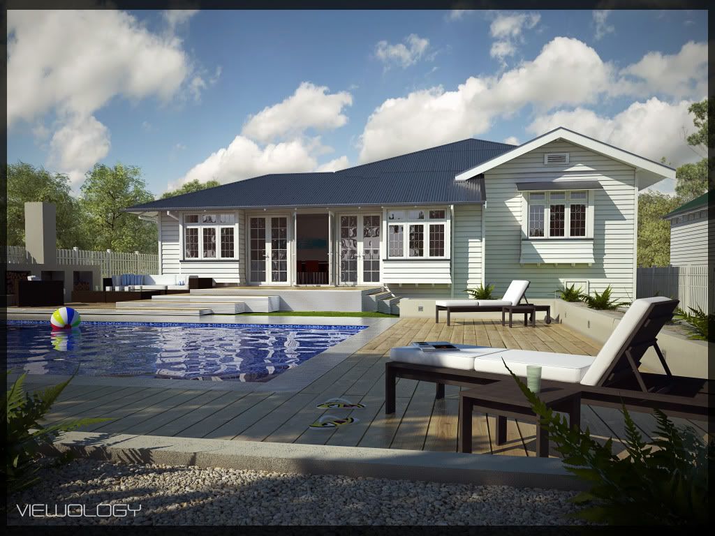
First image
The furniture wood looks flat and without any shine
The flip flops dont look grounded
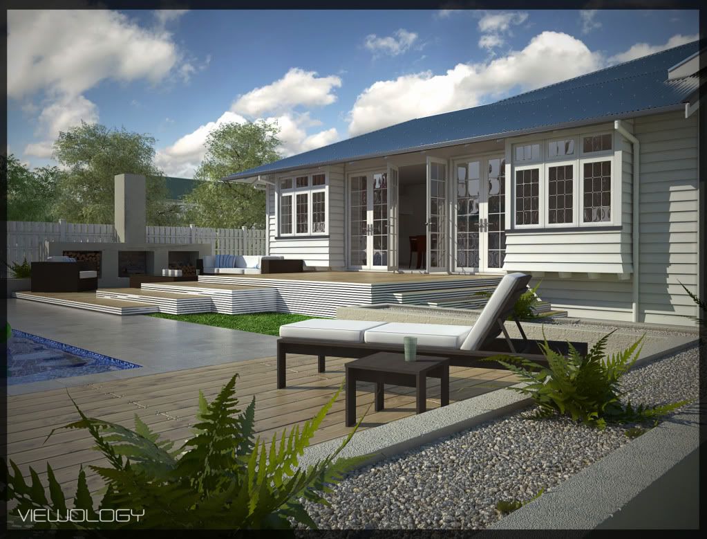
Second Image
Can't find anything wrong 
Third Image
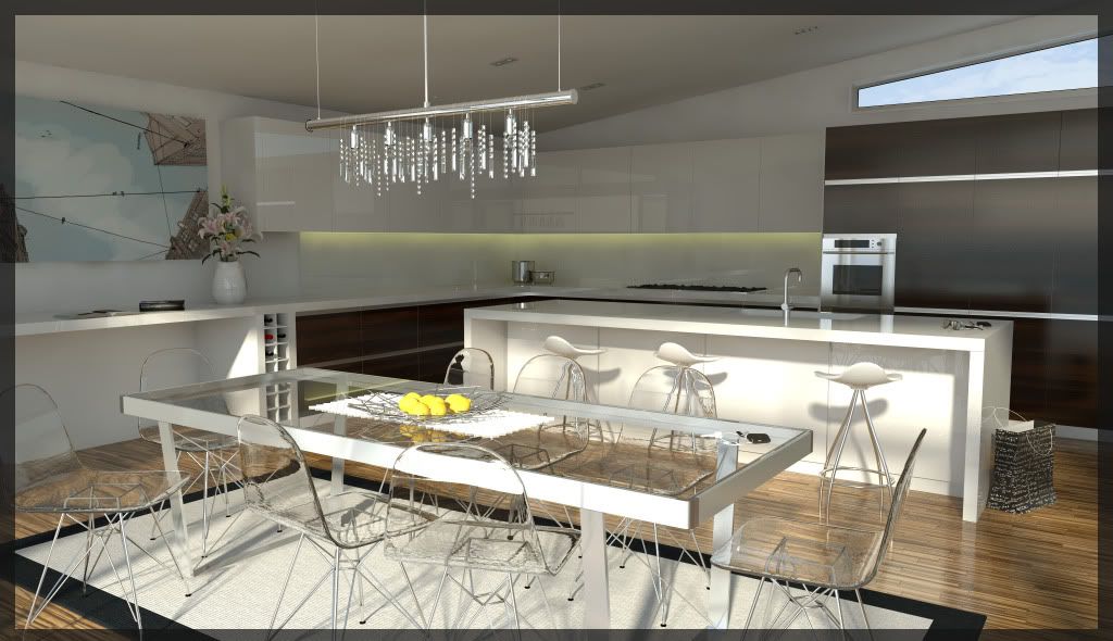
At first glance the clear chairs throw me off for some reason.
I would change the angle of the shot just a bit to get more seperation between the island and the back counter. currently they look to blend a bit.
The lemons are blown out a bit
The placement of the cooktop seems odd to me (under cabinets?)
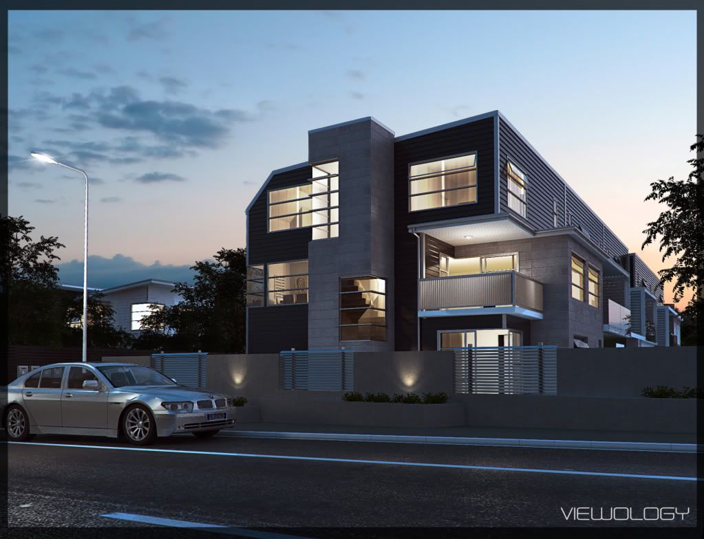
Last image
The BMW....The side skirting is way to low and is incorrect. The paint almost come off as chrome or aluminum. I would not add to bright of a color but some color would look better.
The flare on the street light looks forced.
Again, great images!
Scott
Thanks so much for your time.
Third image
The kitchen has been built as Ive designed it. The cupboards over the bench are alittle higher. The cupboard over the
stove top is actually mock. There is an extactor fan there. As for the chairs, I agree totally over the top. But like I said was playing with refraction.
Thanks so much for your other comments. At some point I would like to go back and clean them up. Addressing the crits you have pointed out.