....................................................................
Could have Limbo'd that about 20 years ago 
 B
Offline
B
Offline
....................................................................
Could have Limbo'd that about 20 years ago
..................................................................................................
As I understand our profile setup, it's up to the user to nominate their perceived level of Sketchuppiness, n'es pas?
I first put myself down as 'Advanced' cos I am good!... At least in my world. 
But on reflection I changed it to Intermediate, cos I'm a bit humble. And I don't know anywhere as much as Dave. (Who should be in his own category anyway).
But, as a craftsman who believes in the old guild system of 'apprentice, journeyman, master', is there a possibility of applying a standard to members sketchuppiness though a vote or moderator or something.
And what would be the criteria?
Obviously, clean models, but after that?
Just putting it out there...
@rich o brien said:
I'd love to see your handiwork if you ever decide to share.
I second that, although describing Boxes' sculptural endeavors as 'handiwork' might be like asking Mozart to play us a ditty. 
Sorry, touchy point with me, I used to describe myself as an artist, only to be asked what I did for a living.
@box said:
And how it looks rendered with Twilight.
The balls are easily added as a cube component.
That is beautiful, is it make-able in glass?
@pilou said:
Why not put a ShortCut ?
Default Tray seems to be on the end of the list of ShortCut!
So no mouse's move!
And it's toggle mode![attachment=0:2ibeynm3]<!-- ia0 -->Default tray.jpg<!-- ia0 -->[/attachment:2ibeynm3]
Nice one pilou, but still have to agree with Kass auto resize would be good.
@utiler said:
I've had mine set to 204/204/204 [80% black / white] for some time but I actually like 240/240/240 better. Thanks Rich!!
While on base colours, does anyone stick with the standard default front / back colours?
The 240 is great, never occurred to me to change before, despite eyestrain.
And yes, never saw the need to change the default front/back, except when I need a good 2d graphic export, then I use black for the back.
I can nearly see this as a new way of creating in Sketchup...
@jql said:
Adding to that that dashes and other line styles should also display as they are printed. They change scale when zooming.

Also, I hate that my carefully chosen Typeface appears bolder when printed to PDF.
@stinkie said:
Funny, sad, scary ... You decide.
I would say predominantly scary. (As if the world didn't have enough problems...)
New for me, thanks.
How about scaled rectangles?
Where is Durant Hapke?
I miss him.
I hope he is still doing his stuff.
Love to hear from you Durant...
For those who wish to experience: The queen is hot, so get it on"
http://sketchucation.com/forums/viewtopic.php?f=81%26amp;t=6786#p43436
BUMP!
Was wondering how you are going Durant? Still doing crazy inspirational/shit?
Get Back....
BUMP!
Bit late here, so excuse my french, but that is one butt ugly piece of sideboard.
And perhaps your mate should stick to chairs, them essentially being better karma.
Baz 'in the kingdom of usefulness' Mills.
What ever happened to Durant Hapke?
A beautiful piece of art Richard.
IMHO.
Illustrating the slopes nearly works, but think of those classic blue mountains... further off, more haze. (Methinks 0f SU Fog here).
Not sure whether this is a criticism or not, but those trees look like they came from "The Matrix" Materials Pack'.
Logo is too big in relation to the 'Landscape', in fact its almost the main draw, needs to be much smaller, (and a bit of humble would be good)..
In any case, the logo colours way too similar to the illus.
Bit of kerning required on the logo type, esp. 'eden'. (Bad kerning is my current GMTS 
And wouldn't just a touch of 3D explain the thing so much betterer?
Baz
Interesting results, if a bit dystopian. (Just made a typo there; 'Systopian'. Might be more accurate).
Baz
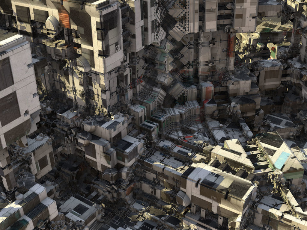
Full article here:
http://www.wired.com/2016/06/monstrous-alien-cities-built-computer-algorithm/?mbid=nl_6216
@solo said:
[attachment=0:w1ofxmo8]<!-- ia0 -->13330926_2732834886763684_1478202565744736347_n.jpg<!-- ia0 -->[/attachment:w1ofxmo8]
That's a railway station in Wales, they make a fortune selling tickets to tourists.
@kaas said:
@baz said:
I am really not getting on with the new trays in 16, I would like the option to revert to the 15 version.
- 100
Thank Kaas, from us here in the wilderness. I thought that the simple dialog box interface in SU15 was so easy, Especially liked that I could stick em all together and click on the ones I needed at the time.
Software designers have to justify their bucks I s'pose.
My bottom line advice is; If it ain't broke, don't fix it, please. (Or,another way of saying it: Don't add 'features' for the sake of it, please.
Me personally, I would prefer if SU stayed just as it is. My workflow can handle 'clipping' and 'UV' mapping and all the other 'things'.
My main ask would be more integration with LO. With similar, if not exact, commands.
@jql said:
Yes I think I did!
Now a question for you: what if a skilled carpenter would put all his talent into designing a stool?
Too broad a question... is he just skilled?
If so, he would make a beautiful stool following the classic rules of 'form follows function'.
But. As a skilled 'person' he would be aware of all the myriad ways of achieving ass sitting.
He would also be dealing with client expectations, and we know how that can go.
He would be dealing with available material.
He would wondering how he could get it onto 'ETSY'
Design challenge anyone. A stool that is both art and design in equal portions?
