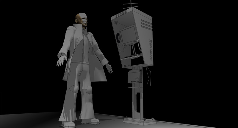
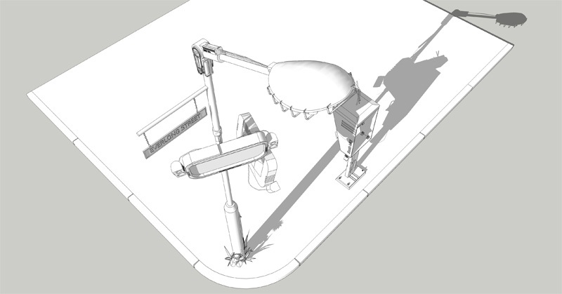
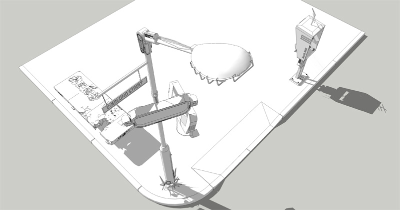
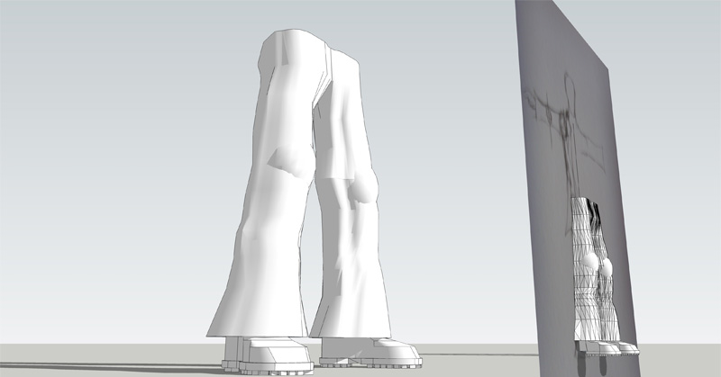
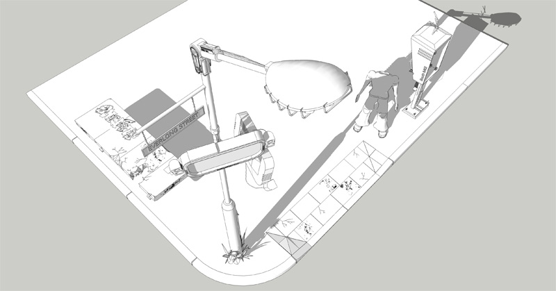
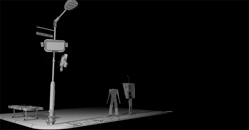
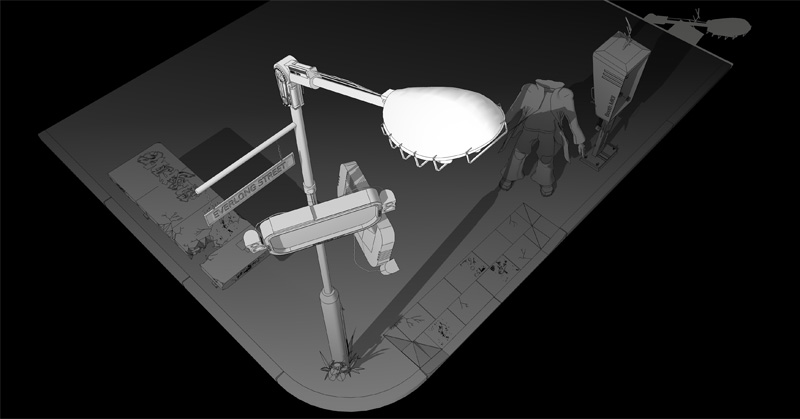
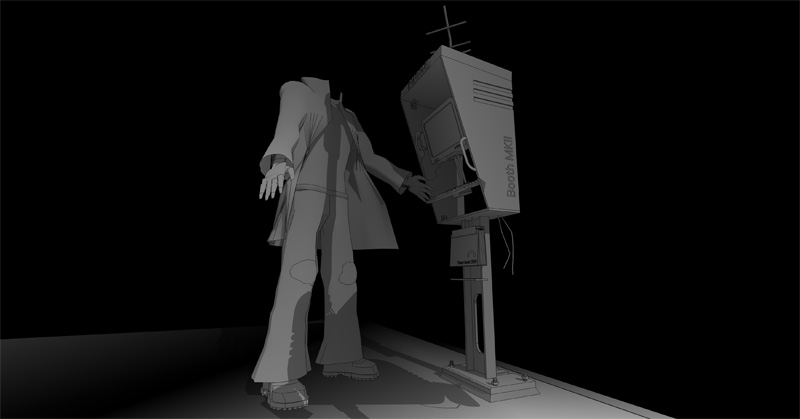
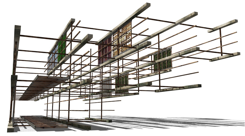
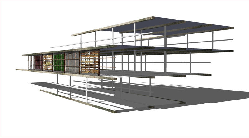
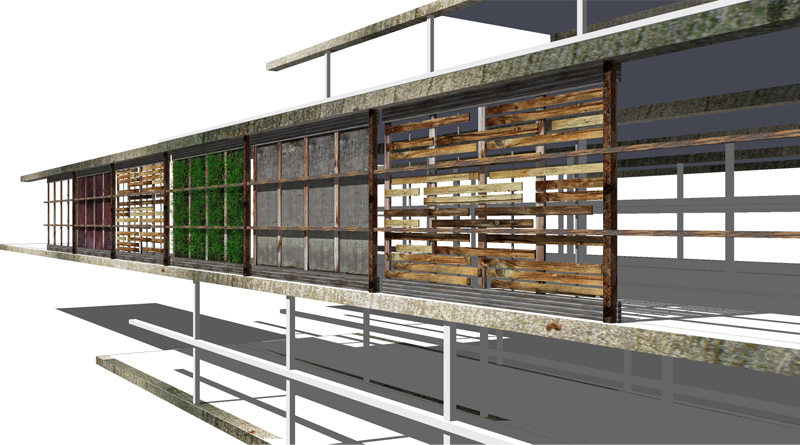
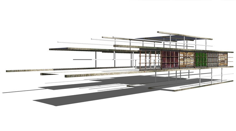
the style is the basic sketchup monochrome one with a black coloured fog.... a fairly simple effect that can hide some of the edges whilst keeping some inner detail.
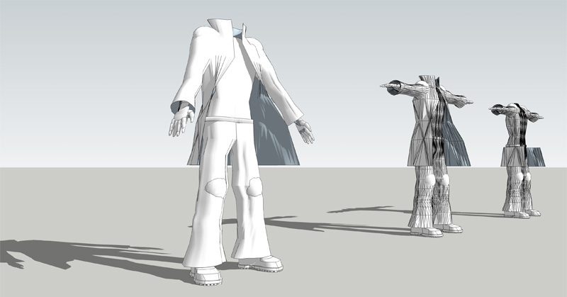
Her is a quick go at the head i used the texturing technique outlined in another gallery post with some cool vehicles excellent tips!
Posts made by Archi Rag
-
RE: Comic Scene
-
Comic Scene
Haven't had a chance to post on here for a while but have recently had a chance to get back into doing some fun stuff for myself... I'm trying to make a comic(ish) scene with modelled in SU here is my progress so far
-
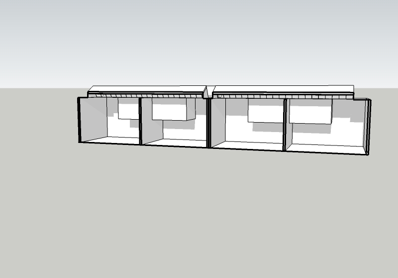
Need a little help, light going into section
hi, i want to view shadows within a section but keep getting light and shadows that have been cast from outside, i cant move into the space to move into the space as it is too small is there a way to put up a wall u can see through that will block the light from going into the section?
-
RE: Observatory WIP
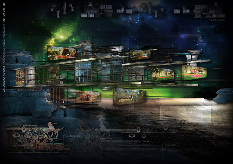
hi, yep i did, it reads fine on A4 but i see wehat u mean about the monitor reading.....
theres some explaination that i have added in the description on the site but i didnt want to clog the page full of text when its supposed to be a basic concept. I don't expect it to do particularly well, the reason why its so sketchy is because i found it hard to fit in around work but will give the second brief a proper go, but im kinda content with making a nice looking image for now apologies for the lack of clarity etc... -
RE: AutoCAD
make sure it is set on paralell projection (in camera menu) when u export the image, then select the iso view (in view>standard views menu)
check that the units in the properties dialogue is set to the correct ones (millimeters / inches)
otherwise it should work
-
RE: Portfolio tips
id take a mixture of all your work, anything that relates to the arts, but try and keep the portfolio diverse and only show your best work its quality not quantity but its best not to lug around anything larger than A2. Try and include a mixture of work in terms of the medium/materials used.... try and include photos and present them neatly with some kind of title that you can elaborate on.
In addition to all this try to print off an A5 or A4 booklet of your work including your CV on it- preferably get it thermally bound (very cheap to do) this is what you can leave with your interviewers and is always a cool thing to have to hand if you want to show someone in a compact form (for future interviewers & friends alike). This will hopefully be helpful in leaving a lasting impression on them so you dont get lost in the crowd.
Which uni/course do u have an interview for? -
RE: Observatory WIP
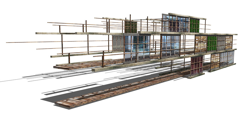
very slow progress, hard to find the time with my new job- heres some more pics
-
RE: Zooming into road imported from AutoCad
i think the biggest problem when importing dwgs to skp is that curves/circles become heavily segmented. when i have this problem i group the autocad drawings and then use it as a template (making high segmented curves/circles to form the road)that way (when it comes to closing faces it should all work out fine
-
RE: Observatory WIP
hi, just thought i would post some progress on the model, have only really had a chance to start the final build today, im working on the framwork and facade texturing as i go along, c&c welcome although theres not a lot there yet!
-
RE: Doughnut
@unknownuser said:
You could call it the swiss army knife of doughnuts, but please, do not try and use it to open a wine bottle
....no sale probably one of the first things i look for in a donut
-
Periscopic Projecter
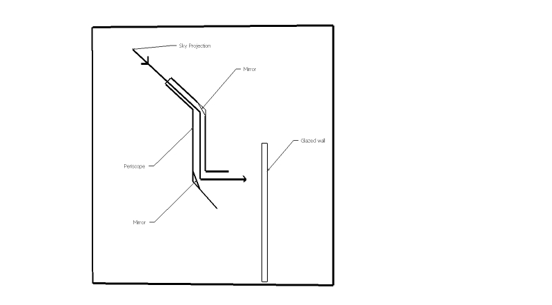
Hi, i dont really know much about this and thought someone here might be able to help, im trying to design a periscope to project onto a wall inside a building (with no artificial projection so using no electricity) it needs to be passive so that it can project the movement of the sky over the course of a day.
heres a brief mock up its litertally taking a periscope and reflecting the image onto a glazed wall that the viewer would be on the other side of, but im not sure how this would work in terms of using a lens to magnify the image onto the wall (hence keeping the distance between the wall and mirror to a minimum) i have attached a very crude image any comments/help would be really useful including how this would work in 3d if i wanted to project across a whole wall- would the periscope then need to span the entire distance?
thanks in advance
(any suggestions are seriously welcome as im a bit lost on this one)
-
RE: [Tutorial] Seamless textures in Photoshop
Genius, especially the bump map side of things but then again im a rendering n00b
-
RE: Illustations using trees form this forum
very cool i like it i think i have used those trees too, they are really good- must dig out the jpegs, can u say a bit more about the project?
-
RE: CHUCK NORRIS
Chuck Norris is/was/once/has/mutated/electrified/owned/destroyed..... http://youtube.com/watch?v=eBGIQ7ZuuiU
-
RE: Observatory WIP
hi, yeah it was just for a painting i was going to do inspired from that brief (using SU to get the outline/perspective right) the telescope was just for aesthetics but yeah i think painting an aurora will be hard.... it would be a bit too unnecessary/unrealistic for this competition although i hope for the people doing the competition that the emphasis isnt to heavily reliant on buildability, the brief comes across as an ideas competition in some way even though its quite well detailed, maybe grand concepts (to me) would be where the appeal could be to all designers.
but cheers for the comments nevertheless
-
RE: Uni Project SU output / Renders
@plot-paris said:
these look rahter than artistic paintings than architectural plans... wonderful!
Funnily enough i printed onto canvas for my exibition which was kinda cool but got it cheaply done and the black went green from the sun.
ive just finished my third year of uni, so will be nice to have a break from it