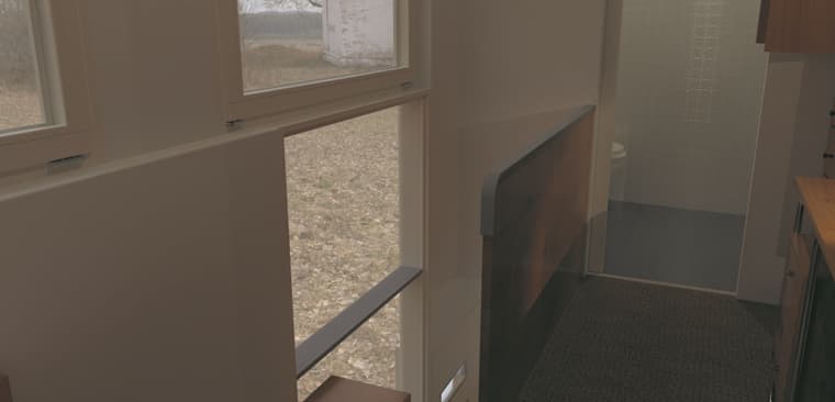
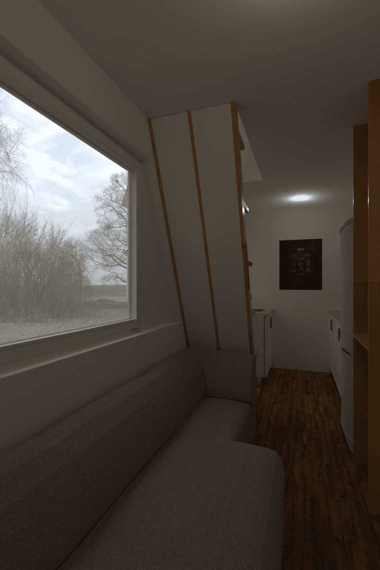
Rayscaper, My trip down the road to adjumacation.
-
@pixelcruncher Moving on a bit.
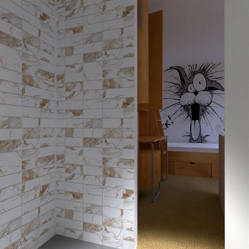
I have noted that textures that are repeated as in the wood texture on the furniture, can become corrup. the scaling can be lost but sampling from a different piece of that furniture can fix the issue. It's not apparent here for example.
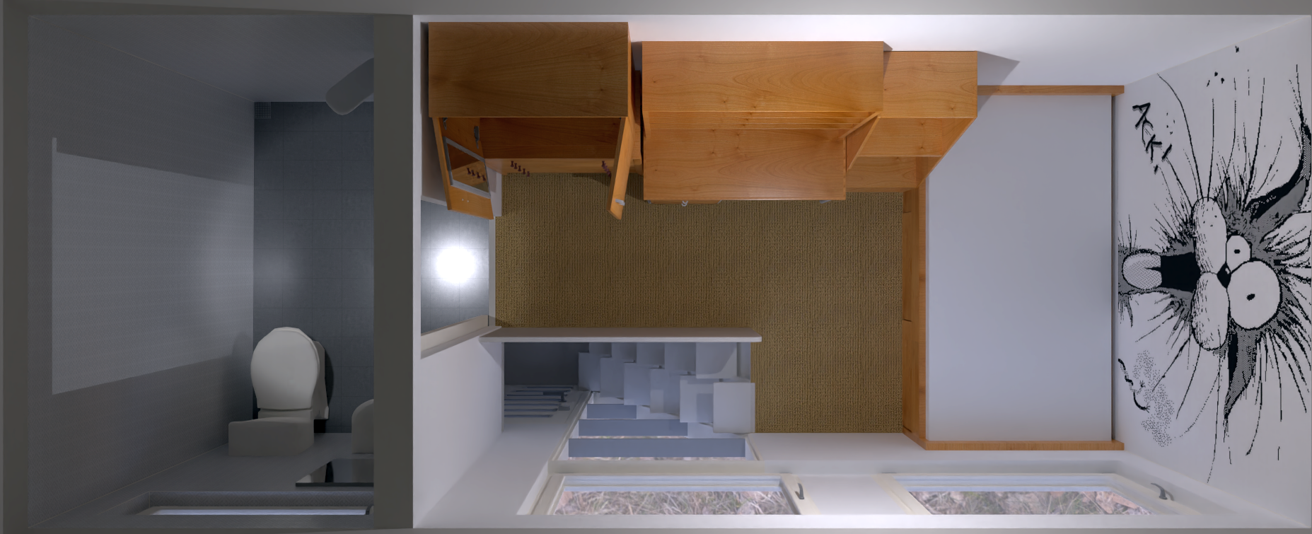
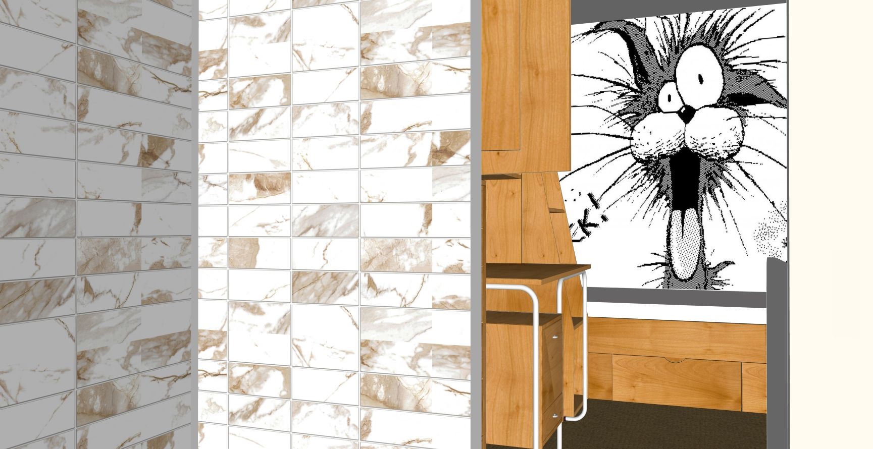
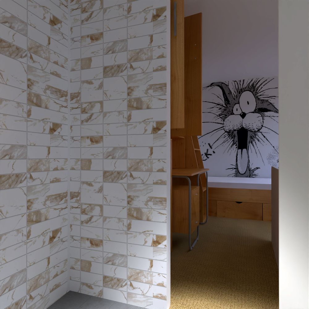
The 'chilli cat' image here has rescaled too. Originally stretched is has reduced in size in the render.
-
Success creating a normal from a texture via Affinity photo. Lightened here in Irfanview.
-
Try this Mike, you can drag in your texture and within 2 seconds you will have a normals map, and in fact any other type of map.
NormalMap-Online
Online NormalMap Generator FREE! Create a Normalmap directly inside your browser! No Uploads required, completely client-based

(cpetry.github.io)
-
Very sharp, thanks mate.
-
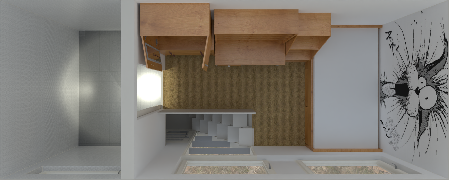
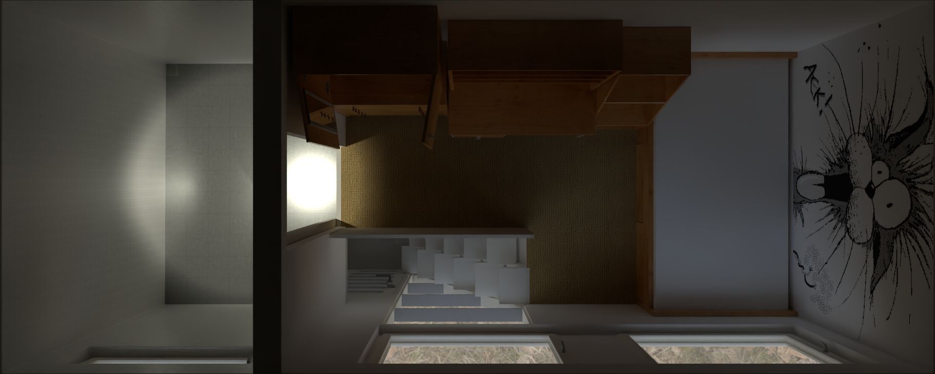
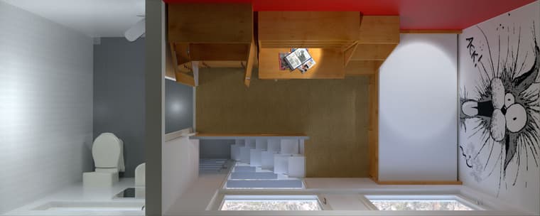
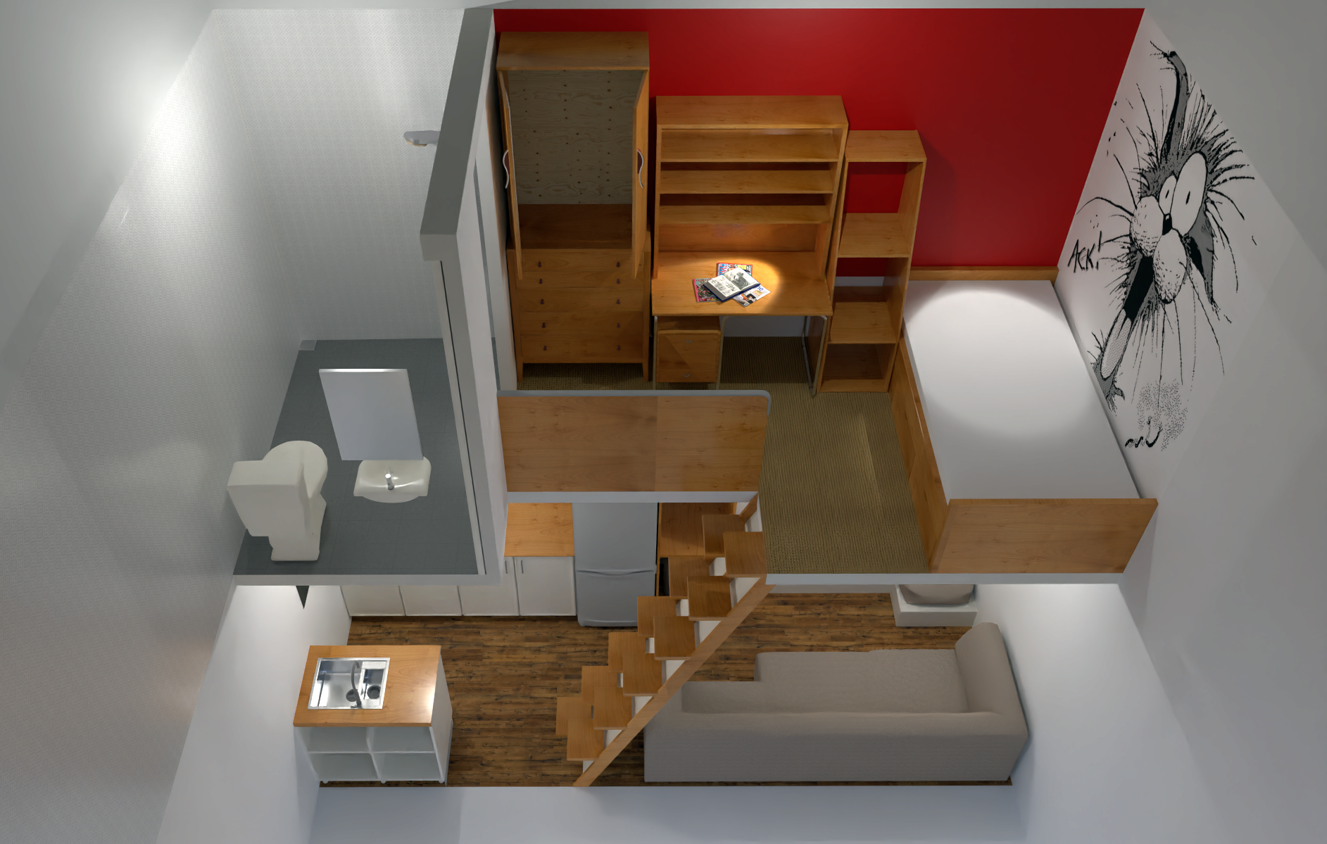
Looking at camera views and trying for a defined FoV. This top view with a 'Cap' is handy to see where in the render scene, I need lights.
Still trying for the right mix but it will take a bit of fiddling.
1st is without a domplete roof cap the second with.
-
-
I change a directional light for a round light and experienced Crash #146881.
I will restart and go again.
-
@Mike-Amos Do you mind sending me that scene again? I would like to investigate why the scaling is off.
-
I have sent the model earlier. a few adjustments, the circular lights in the ceiling to 5w and the spotlights to 20w which makes them more obvious in the render.
Bout it re4ally.
Not convinced by the shower unit which is meant to be chrome so another look later.
-
Looking damned good!
-
-
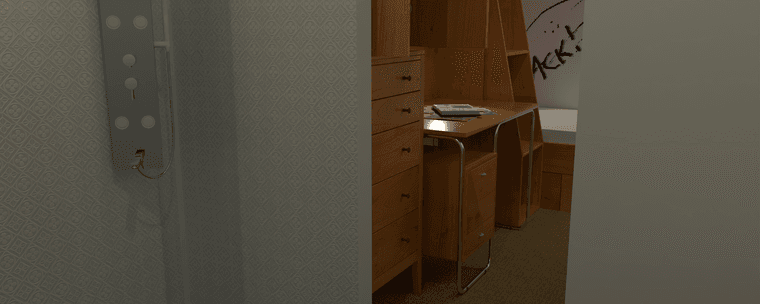
Moving onwards, had some incidents of the pc shutting down without my input. Seems to be a win doze thing again but I'm keeping an eye on it.
-
-
-
-
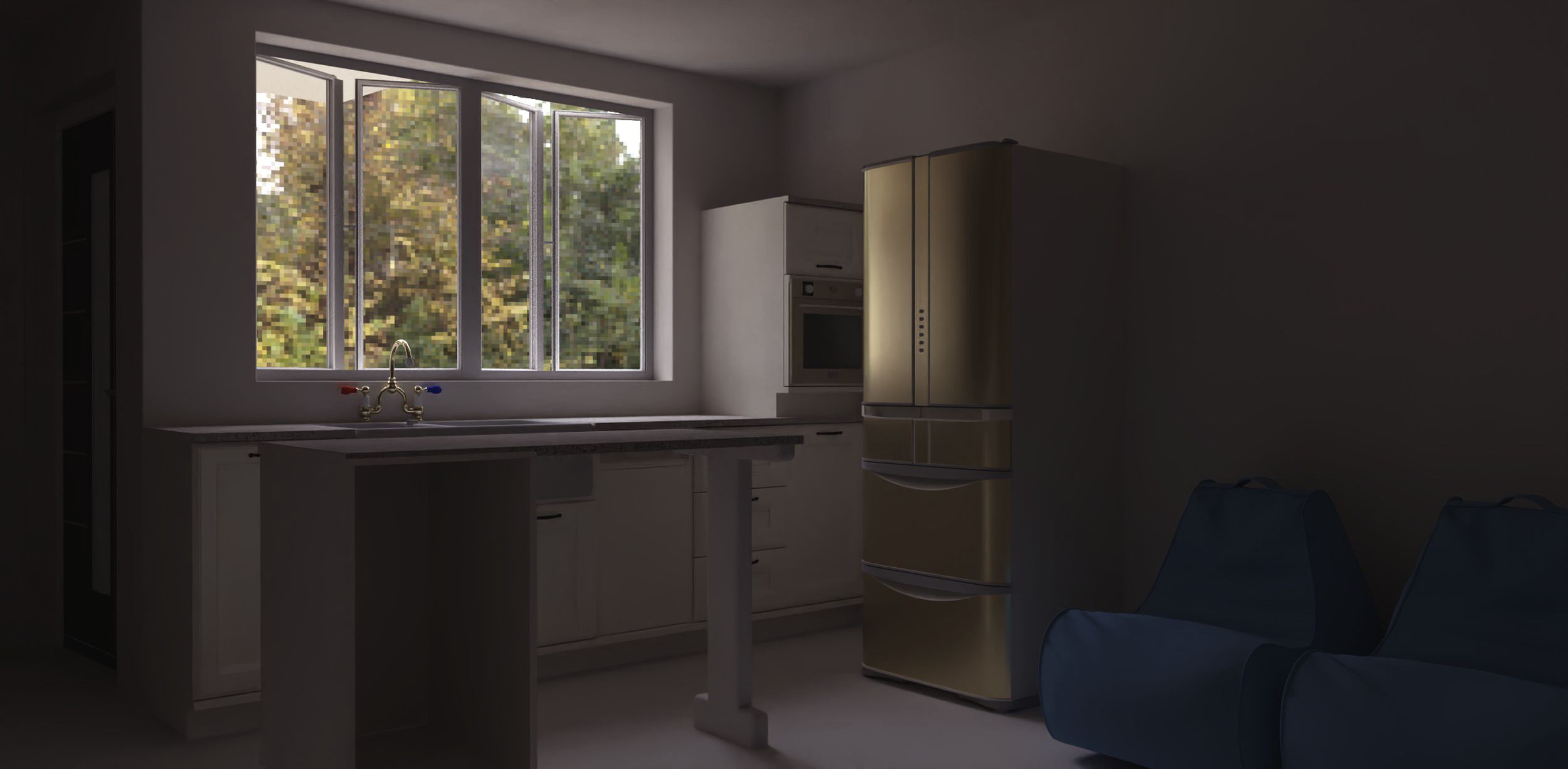
To better fit everything in the viewing panel I have tried a panoramic image.
I do not have a panroramic viewer right now but it seems better ballanced.!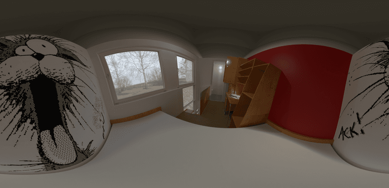
-
I think I prefer the 4k x 4k version. Slightly lighter in Irfanview, will try Affinity Photo later.
Well, I tried, 4k x 4k will not uploead, fair enuffski.
-
-
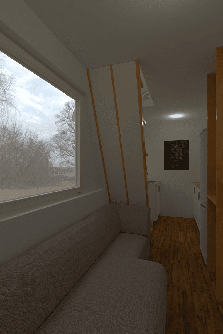
2000 x 3000 Lightened Irfanview,
-
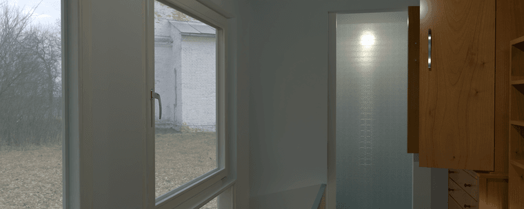
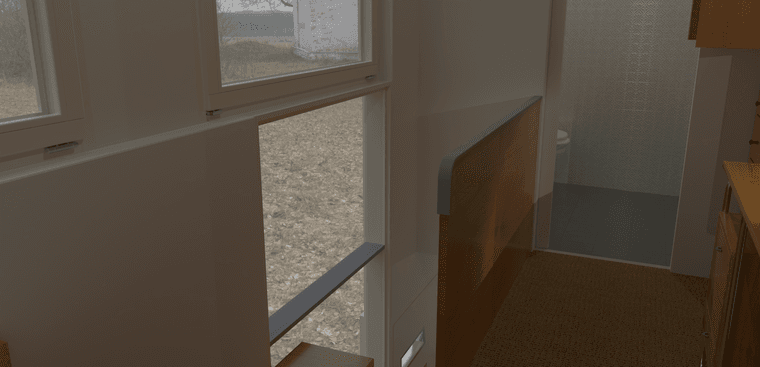
Playing with a 'mask' around the physical model to increase fov and 'see' both levels.
Hello! It looks like you're interested in this conversation, but you don't have an account yet.
Getting fed up of having to scroll through the same posts each visit? When you register for an account, you'll always come back to exactly where you were before, and choose to be notified of new replies (either via email, or push notification). You'll also be able to save bookmarks and upvote posts to show your appreciation to other community members.
With your input, this post could be even better 💗
Register LoginAdvertisement
