SketchUp 2016 Wishlist
-
@pbacot said:
I would first have to search for that component (if it isn't a group) in a list... bleah.
From my experience when you select the component or group in the drawing the highlighted entity shows up regardless of its position in the outliner list, clicking once on each expanding button in outliner reveals the nestings, easy to select, copy ,move, explode, outer shell, etc.even multi-select.... then one click completely out. No sore repetitive strain with multi clickings and escapes. Outliner makes it easy, no need to look it up unless you cant actually see it on the drawing, then outliner would show it even if it is hidden
-
Thanks for the reply. Like I said, searching in a list. I don't see how that improves upon multiple double-clicking on an object that is "in plain sight".
-
Ok, To those of you who want UV mapping, why? Its already embedded in. You can texture without it. Straight onto the model itself. I love this aspect of this and its the primary reason I use this tool. Seriously making UVs is a pain and i hate it. Discovering accidently that I didn't have to. That it would take a photorealistic image and paint it without distortion onto a face is an awesome thing. Yes, I understand about normals etc. That can be prepped outside of a 3d tool anyway. The sooner UV is shot in the head the better.
All the other wish items I see are ones that you all could get in Blender, zbrush and other tools. I don't need rigging nor animation. I have access to that in Blender.
What I do want to see is:- Selectable axis arrows like in Blender so I can click one and thats the only axis it moves on.
2 a Move function that is isolated to move only. The bounding box turns into a a 3 ring sphere, click a ring and the component/model rotates only in that direction/axis. Move the copy and other functions elsewhere and kill the protractor. Move needs to be simple basic and not need a tutorial to relieve confusion and frustration.
3.an interest function that actually intersects. The purpose of intersect is to merge two components together as one. That should be the default function. Highlight both components and them merge them together, intersect and bang, one component. - OBj import
- stl export
a match photo function that works with pictures shot from top down.
(I can't helicopter shots because it makes steve look like he's falling into a black hole)
I am happy this tool does have rigging or animation or other robust items. I don't feel It needs them.
- Selectable axis arrows like in Blender so I can click one and thats the only axis it moves on.
-
@thunderclapmorgridge said:
- Selectable axis arrows like in Blender so I can click one and thats the only axis it moves on.
in the other thread but...
use the arrow keys@unknownuser said:
2 a Move function that is isolated to move only. The bounding box turns into a a 3 ring sphere, click a ring and the component/model rotates only in that direction/axis. Move the copy and other functions elsewhere and kill the protractor. Move needs to be simple basic and not need a tutorial to relieve confusion and frustration.
so it's move only.. but also rotate?

i get it though.. you want one of these:

a gumball, or gizmo, or widget, or whatever they're called.. that one is mostly move,scale, and rotate with some other functionality as well and i personally think it would be a waste to have one that only moves.
thomthom's bezier surface plugin has a custom made one:
http://sketchucation.com/forums/viewtopic.php?t=32810
he now works for trimble.. beg him
@unknownuser said:
3.an interest function that actually intersects. The purpose of intersect is to merge two components together as one. That should be the default function. Highlight both components and them merge them together, intersect and bang, one component.
intersect intersects.. you're describing Booleans.. the solid tools are boolean tools. would be nice to see their functionality on non-solids as well.
@unknownuser said:
- OBj import
until that time may come..
http://www.fluidimporter.com -
@thunderclapmorgridge said:
2 a Move function that is isolated to move only... Move needs to be simple basic and not need a tutorial to relieve confusion and frustration.
One doesn't need a tutorial for moving only - you move and don't press CTRL. As simple as that. But it's great that it copies things when you press CTRL. And then when you're there you type, for example "6x" and after ENTER you have 7 same things (lines, surfaces, groups, components, whatever) at the same distance. Or if you press "/6" it puts them inbetween and you don't have to calculate distances. And of course, if you use keyboard shortcuts, it's so quickly and easy.
The same can be said for the ROTATE tool.
I don't want this being changed.


-
I know this was a few replies back, but I should reiterate this:
@jql said:
6 - Filters and groups on component browser for in model components and search to work on
 instead of warehouse
+1

We shouldn't be searching 3D warehouse for models in the components browser anymore (much quicker to find things on the 3D warehouse browser now). So I would love the search box to filter in-model components. Or more accurately, the search box should filter the list of components for that context (In Model, My Collections, local collection etc)
This is an obvious win for:
- people who want to pop in an existing component into the model, without having to trawl through the list
- inputting data into components (name, description etc.) systematically, perhaps when preparing the model for LayOut auto label take offs.
- people with a system for component names (eg - all electrical items have a suffix "electrical", which effectively gives the user a palette of electrical components to easily pick from, but simply entering "electrical" into the search box)
- people with a local library of components
So yes, please do this. It would make my life so much easier.
While you're at it, perhaps you could integrate the component window with improved Dynamic Components? I understand that Dynamic Components uses javascript running on a browser (IE or Safari). I know Safari is slow with Javascript compared to Chrome. Perhaps get rid of Javascript and use C? I know this is a big ask, but if we want Dynamic Components to have a future, I think it probably needs to be rebuilt.
-
Either REPLACE an existing SU-Ver whatever and maintain all configuration settings (toolbars, shortcuts, file locations, etc) including updated plugins and extensions so far as possible.
OR
Install the new version and transfer all old configuration settings (etc) to the new version.
It took me 2 1/2 days to configure my newly installed SU-15 to mirror my old SU-8.
-
@jgb said:
Either REPLACE an existing SU-Ver whatever and maintain all configuration settings (toolbars, shortcuts, file locations, etc) including updated plugins and extensions so far as possible.
OR
Install the new version and transfer all old configuration settings (etc) to the new version.
It took me 2 1/2 days to configure my newly installed SU-15 to mirror my old SU-8.
seconded, it's such bliss when upgrading software and it looks for the old installation (if present) and migrates settings, etc. to the upgraded installation.
-
Hello.
I think many of us have often heard that SketchUP is not a serious 3D software, because they saw just some simple models. My small idea is to add a splash screen with most impressive SketchUP modelling examples from this thread: http://sketchucation.com/forums/viewtopic.php?f=81%26amp;t=33509 . Many software products use this kind of approach and this is good inspiration for newbies. -
Allow choosing Vertex colors through the API!! That would be awesome for heatmmaps and other stuff.
-
@gmolina1 said:
Allow choosing Vertex colors through the API!! That would be awesome for heatmmaps and other stuff.
This would be a bigger change than it sounds, since Vertex isn't a Drawingelement and has no on-screen representation or material at present.
-
Vertices are not easily accessible...
But of course placing a colored-by-height 'tag component' at every vertex in a selection is already easily done with a Plugin...
Chris Fulmer already made a color-by-height Plugin which colors selected mesh faces by their height; and also there are ones to color-by-slope.
You can also manually project a gray-scales black-to-white [or even colored] textured material from an image, onto a mesh, so that the higher parts display in say 'white'... -
I kind of asked for this before and we all agreed that without 64 bit and loads of memory it would not go anywhere.
Well now we got 64 bit and plenty of computing power. So let's see what you think.
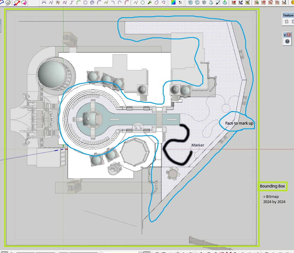
This does not have to be fancy with true colors or high resolution, just basically a pen or marker that you can use to sketch a bitmap directly on a surface.
The tool could have say 4 different resolutions or anything between 320 by 320 pixels up to 3200 by 3200 pixels. 4 different line widths from thin to thick and of course an eraser.
Many times I was thinking to have some pen to draw on a say empty landscape surface or wall, to sketch in some rough ideas on the fly in a presentation or work meeting.
The point is that we could draw in rough geometry on a surface as a bitmap and later 3d edit with lines, arches and circles as geometry.
It would only work on a special sketch material that would appear in the materials window. Each surface that gets sketched on will create its own new material. Background colors could be chosen before the first line gets drawn.
-
@desertraven said:
I kind of asked for this before and we all agreed that without 64 bit and loads of memory it would not go anywhere.
Well now we got 64 bit and plenty of computing power. So let's see what you think.
This does not have to be fancy with true colors or high resolution, just basically a pen or marker that you can use to sketch a bitmap directly on a surface.
The tool could have say 4 different resolutions or anything between 320 by 320 pixels up to 3200 by 3200 pixels. 4 different line widths from thin to thick and of course an eraser.
Many times I was thinking to have some pen to draw on a say empty landscape surface or wall, to sketch in some rough ideas on the fly in a presentation or work meeting.
The point is that we could draw in rough geometry on a surface as a bitmap and later 3d edit with lines, arches and circles as geometry.
It would only work on a special sketch material that would appear in the materials window. Each surface that gets sketched on will create its own new material. Background colors could be chosen before the first line gets drawn.
I rather like this idea. I think it would work well with the sketchy way in which people use sketchup. I wonder if it can be achieved with a plugin....?
-
@aerilius said:
It "can" be achieved, .....
[*]User workflow: The faces must be seamlessly textured before. This is trivial for planar projections, but in many cases users would need more advanced mapping techniques to avoid image stretching.[/list]
What if this would only allow one face/coplanar shape at a time? One texture image per face at a time is produced? The pen sticks to this face during the command / operation and only draws in the limits of the extents. Maybe by pressing the alt key it also aligns, zooms to extents and centers the camera to the face in question?
2048 resolution would be sufficient. The image size will automatically fit to the size of the face's extents/ bounding box. The origin is set in the lower left corner of the extent/bounding box.
E.g. My wall is a n-gon shape/ face, as I attempt to draw on it SU creates a texture image this image is treated like any other image you can load into SU.I don't know what it would take to get rid of the limitations of the "API", but maybe there is a way?
Maybe not as a plug in but as a native SU tool?
-
It "can" be achieved, but not reasonably good and usable. In fact I have this laying around for a couple of years. I'm not sure how useful it is (since resolution is very limited in SketchUp to 1024–2048px, and SketchUp does not have adaptive texture resolution techniques like Ptex). There are a couple of problems that would lead to undesired behaviors:
- Interactivity: SketchUp's API does not allow direct pixel manipulation, and saving images to disk and reloading takes a too big fraction of a second, and makes it feel very sluggish.
- Mousemove events: SketchUp signals only mouse positions in time steps. When the mouse hovers a face and then leaves it (to hover another face or empty space), it is hard to reconstruct the path that the mouse took in between, it requires a lot of intersections which had sometimes numerical errors.
- User workflow: The faces must be seamlessly textured before. This is trivial for planar projections, but in many cases users would need more advanced mapping techniques to avoid image stretching.
-
Layout:
I would like to have non-rectangular viewport in LayOut.
It would be nice to be able to write plugins for LayOut in ruby.
Sketchup:
Better importing of dwg/dxf files - to have an options to load only some layers (based on its size). Loading text?
Better UI in ruby console like proper window with tabs and colored syntax and auto-completion.
Better functionality on Outliner.
Pricing:
I would like to have smaller price for a year subscription or to have a new stable version every 2-3 years. -
I would love to some see extra customization options for the toolbar icons; custom toolbars with flyouts like on the 'getting started' toolbar. Not only for the native commands but especially for all the plugins. That way, you could group plugins into custom categories and really clean up your interface and get some screen space back.
edit: More customization options for the dimensions in Sketchup (and Ruby) would be very welcome as well. Custom size for the endpoints, custom trailer and leader sizes, maybe even custom endpoints.
-
@desertraven said:
Okay here it is,
- !!!!! Give us an override for that obnoxious constraint engine and give us object-snap options already!!!!!!! Try tracing something that's not supposed to be square????? :berserk: :berserk:
Yeah!!!!


Drawing a line from endpoint A to endpoint B should NOT be a crapshoot because B is not exactly on an axis projection. I know that if A to B is "constrained"; ESC then going from B to A works. But that is double work and often the "constrained" message is not forthcoming. So that blows a solid up, and Curviloft goes nuts, followed by a 1/2 hr to sleuth out the error.


-
@jgb said:
@desertraven said:
Okay here it is,
- !!!!! Give us an override for that obnoxious constraint engine and give us object-snap options already!!!!!!! Try tracing something that's not supposed to be square????? :berserk: :berserk:
Yeah!!!!


Drawing a line from endpoint A to endpoint B should NOT be a crapshoot because B is not exactly on an axis projection. I know that if A to B is "constrained"; ESC then going from B to A works. But that is double work and often the "constrained" message is not forthcoming. So that blows a solid up, and Curviloft goes nuts, followed by a 1/2 hr to sleuth out the error.


I think all we need to resolve this is a modifier key, which if you hold down turns off axis/perpendicular constraints, on move, line and circle tools. I think "Ctrl" is the only obvious key that isn't taken by all those tools. If I understood you correctly....
Advertisement


