thanks, pete. this is a helluva waterfall.
with all the lessons i was given in this topic i'd better live up to them and present my own soon.
thanks, pete. this is a helluva waterfall.
with all the lessons i was given in this topic i'd better live up to them and present my own soon.
@anglaret said:
Edson
I made a personnal style with long soft lines, which is very near straight lines but with a light diffeent touch, if you like I send it to you.
Marc
yes, marc. i would like very much to get your style. if you prefer to send it by PM, do so. if you need my email address, let me know. thanks.
@didier bur said:
And remember you can give Style builder a go.
yes, didier, i will. it is one more item in a long list of apps i am planning to try out.
yes, mike, quite a nice response. i have sent you a PM with my email so that you can send me the skippy when you are done.
cheers.
thanks, tom. very good. another sound way to go about it.
we are actually putting all the ideas together to create our own water.
by the way, did you forget about those poplars i teased you to do?
thanks all for the information and for taking your time to help me. as soon as the compettiton is over i shall post the results i obtained with your help.
regards.
p.s.: the kids who work for me are amazed at the generosity and resorcefulness of the members of SCF. no questions go unanswered here!
@remus said:
something like this?
i'll do you a quick tut if its the sort of thing your looking for.
it definitely is. i would appreciate it if you could do that. thanks.
gai,
there is a style there that seems to be it: RMFF_Pencil.style. however, when i download it it reaches me as a quicktime file(!!!). could you download it and send it to me attached to a PM?
there is also one by ivica, but i do know exactly what to do with the contents of that zip file. what do i put where?
thanks.
i was hoping to find among the sketchy styles that ship with SUp one that would resemble a drawing finely drawn with a sharp but soft graphite pencil whose lines would go past each other at the ends. just a black on white affair. no luck. the styles available are not to my liking and unfortunately i do not have the time to create one.
would anyone out there have something like that to share?
note: before anyone tells me so, i am aware of the fact that form fonts sell marvellous styles. however, the only way to buy them is through a yearly subscription. i would gladly pay for some of their products should they be available individually or in groups.
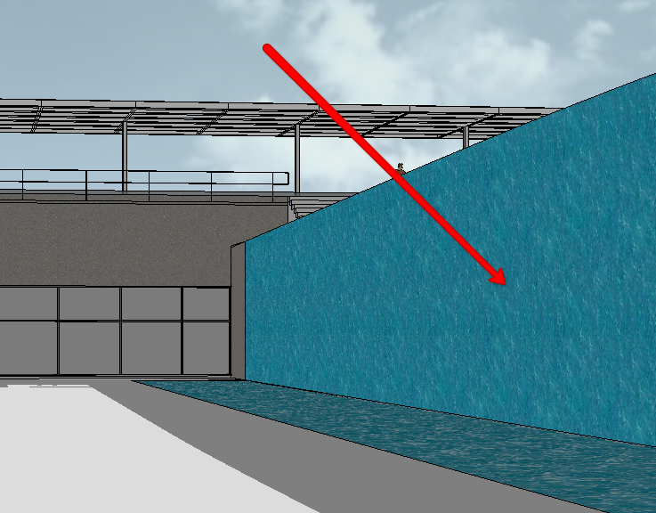
i need a better way of doing a waterfall in SUp than just coloring a plane.

the picture shows the situation: a large sheet of water falls from a top pool into a lower pool.
any ideas on how to do it? the model will be exported to be rendered in another app, but i would wish it look believable in SUp.
nice start, freec. try to direct some sunlight to the tower's sides. it looks a bit dark right now. cheers.
a difinite improvement upon the version i commented before. congrats.
craig,
annoyingly, the problem remains the same. what should i do? wipe my machine clean and reinstall SUp?
thanks.
scott,
i also have a blog on blogspot and always wondered how to tweak it to look differently. how did you insert your logo + image at the top of it?
yes, rob, i have been teaching architecture for 24 years (wow, all that!).
i must say it is a great learning experience as well, because to be able to help people to learn architecture one has to be always evolving, looking around, being suspicious of one's certainties.
every end of semester i realize i have learned a lot from setting up a program for my design studio and helping the students to come up with their designs.
the coincidence pointed out by jackson is very common in the creative fields. lots of people working at the same time, facing the same problems and sharing the same kind of info makes it possible for two designers who have not heard from each other to reach similar solutions.
this is bound to happen. i would not bother about it. even if channel had been rob's inspiration, it is ok. as a friend of mine said: "every project begins with the best example of its kind. it is a proof of intelligence to use what has been well done. why reinvent the wheel if you do not need to?".
great work, as usual. much kudos for it. and the wassilys, my favorite seating object, are incredible.
great work, andrew. I had a quick look at your site and was very impressed. I shall certainly be back and will point the link to my design students.
regards.
edson