Thanks tadema,I must say that your images are always the ones I gravitate towards when I see a new post.Your use of textures and mood are some of the best Ive ever seen.Because we use a digital medium sometimes its easy to think that "the computer does the work".
Obviously it does to a certain degree,but the best images always have a style,imprint and a certain uniqueness that no matter how many tutorials are used ,certain "ideals" , for want of a better word,come to the fore.
For me its composition.Then its light.Then its whatever I have to work with.I dont mean that in a smart way,Im lucky that now I work for myself,so every decision is mine,good or bad.
Oops, your profile's looking a bit empty! To help us tailor your experience, please fill in key details like your SketchUp version, skill level, operating system, and more. Update and save your info on your profile page today!
🛣️ Road Profile Builder | Generate roads, curbs and pavements easily Download
D
Offline
Posts
-
RE: Summer/autumn
-
RE: Summer/autumn
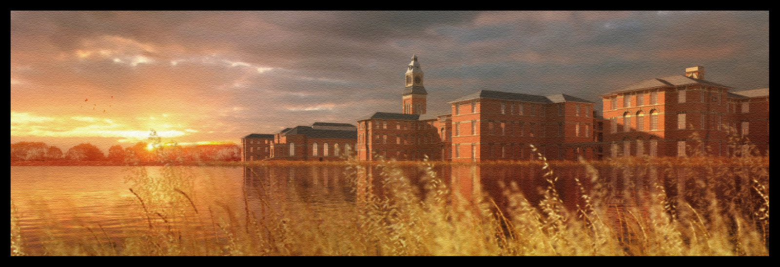
A"watercolour" sunset version.I think I will have to move the sky background(a layer in photoshop) over to the left, as at the moment the light on the buildings seems to be slightly different.But the mood of the scene is close to what I want to achieve.The treeline at the rear is also photoshop and when I used the "overlay" blend option,I got the effect I was looking for - an almost semi transparent,red colour as if the sun is burning thru the trees.
-
RE: Summer/autumn
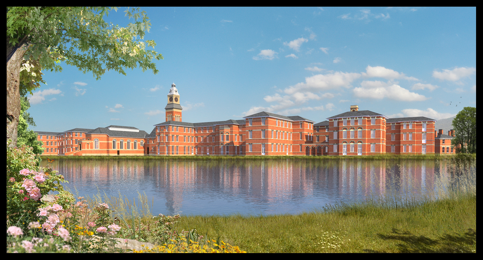
The original of the last image uploaded.i.e before the watercolour effect was applied.The foreground grass element at the waters edge is made up from the grass .png I uploaded a few days ago,but with some additional elements added such as the daisy's.I think the water reflection is still too blue so I guess its back to the drawing board on that one.
-
RE: Summer/autumn
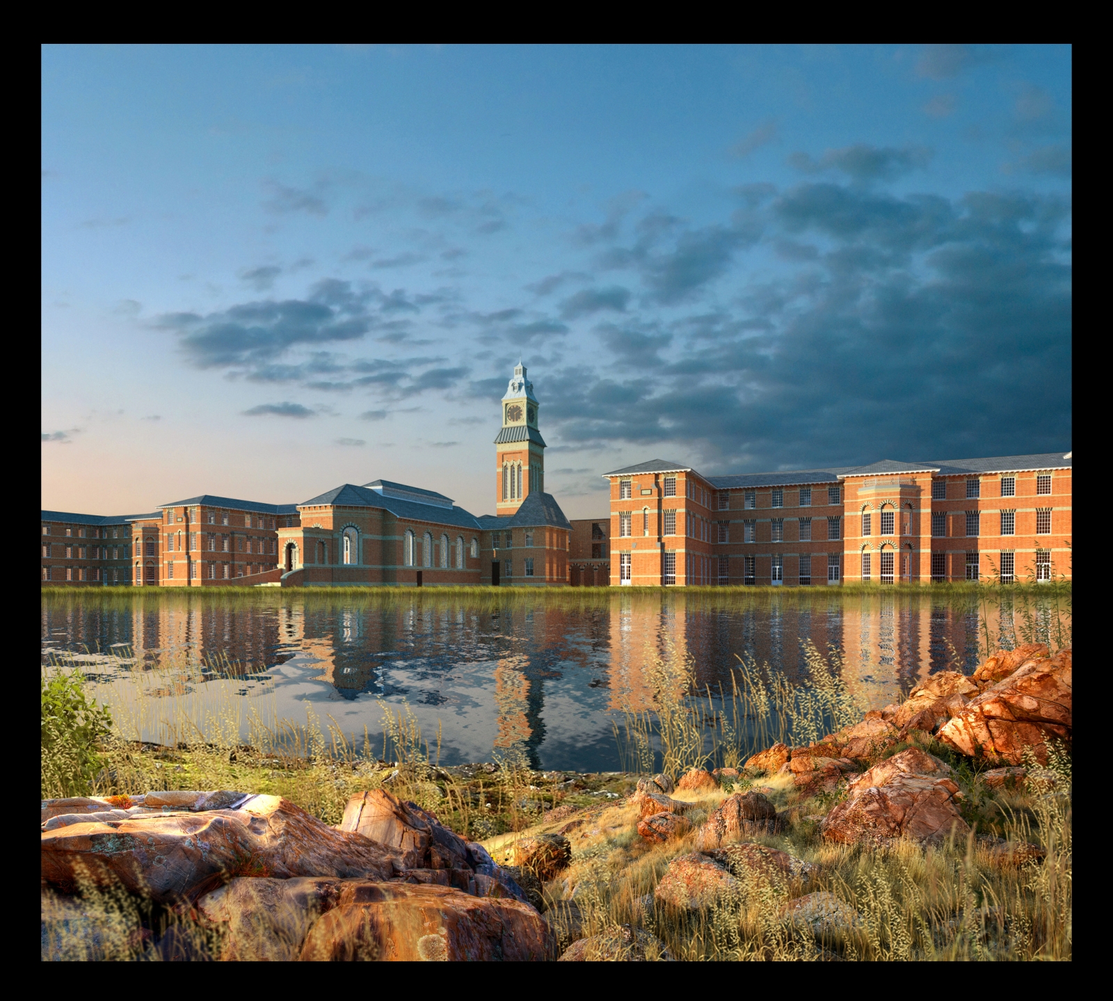
I think looking at the above photo that the reflections in my renders should be much darker.Next render I'll try and do something similar.Its really all about getting the correct lighting.My favourite light is definetly the low evening/morning sun because its possible to get much more dramatic images.
-
RE: Summer/autumn
1 more lakeside view with foreground depth of field added in the second image.the foreground rocks have had highlights burnt onto them in photoshop to try and make them more compatible with the lighting in the render.
-
RE: Summer/autumn
A lot of the stuff I use over and over are Dosch and Evermotion products.I purchased them about 4 years ago and they were one of the best investments ever.But I also make a lot from images on the net,overlaying and blending in photoshop.I'm also constantly looking out for elements such as rocks leaves etc which can be easily extracted from their original image.It takes time but it means that you will have a ready made library and you can start post processing very quickly.
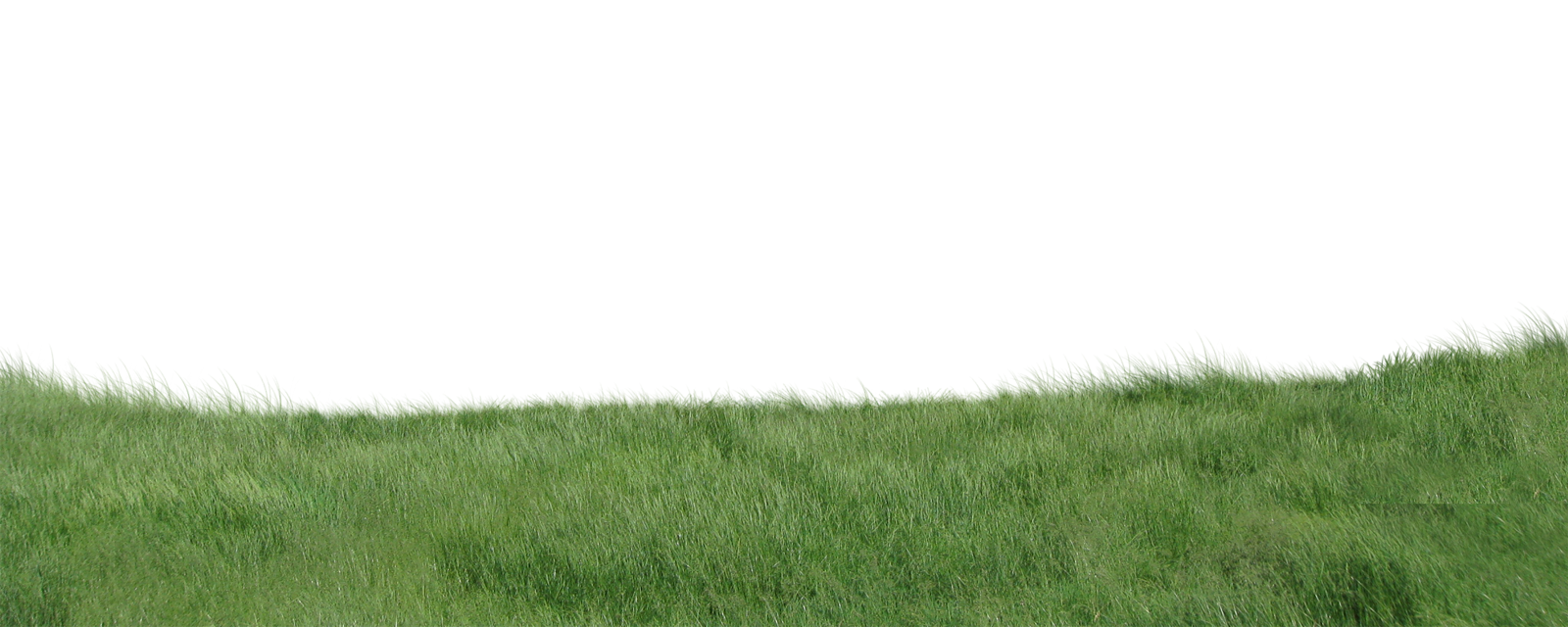
One thing I usually do is render out a very low res version of the model at the correct size and instantly start adding the entourage in photoshop while a hi res version of the render is cooking.Then, once the final model image is finished rendering at a higher resolution,you only have to drag and drop the hi res image in place of the low res and do some small tweaking.(I have attached a grass layer from the images, made in photoshop,feel free to use)
-
RE: Summer/autumn
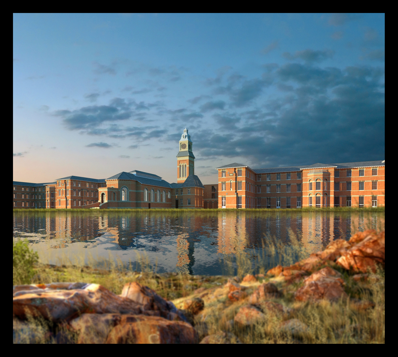
a misty morning version of the lakeside image.the model was re-rendered with a low sun but,again,all the same vegetation was used,just darkened and a low mist added over the far bank.

-
RE: Summer/autumn
Attached is a lakeside version of the previous images.I have reused most of the original vegetation,just repositioning them.the reflection was done in photoshop using a technique from http://www.sketchupartists.org/tips-and-tricks/.
-
RE: Summer/autumn
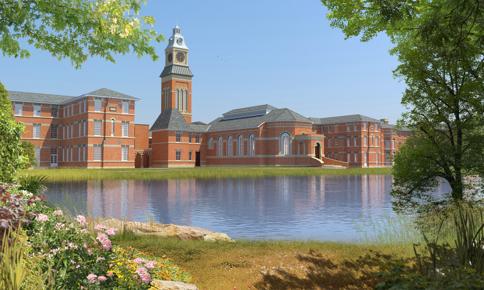
attached is a revised image.I have lightened the building so it sits further back in the image.I have also desaturated it a bit and revised the foreground to add more texture .Rich,all trees and plants are 2d photoshop.for me,the fun only starts when I take the rendered image into photoshop.I try to render the minimum required with the model and then add all entourage in post.it saves a lot of time in rendering and allows extra leeway to experiment with vegetation.
-
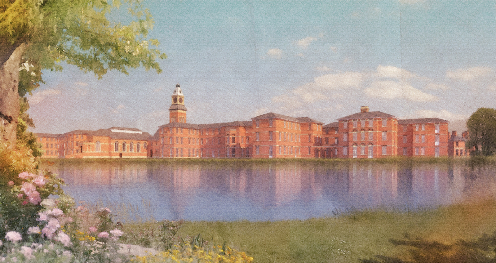
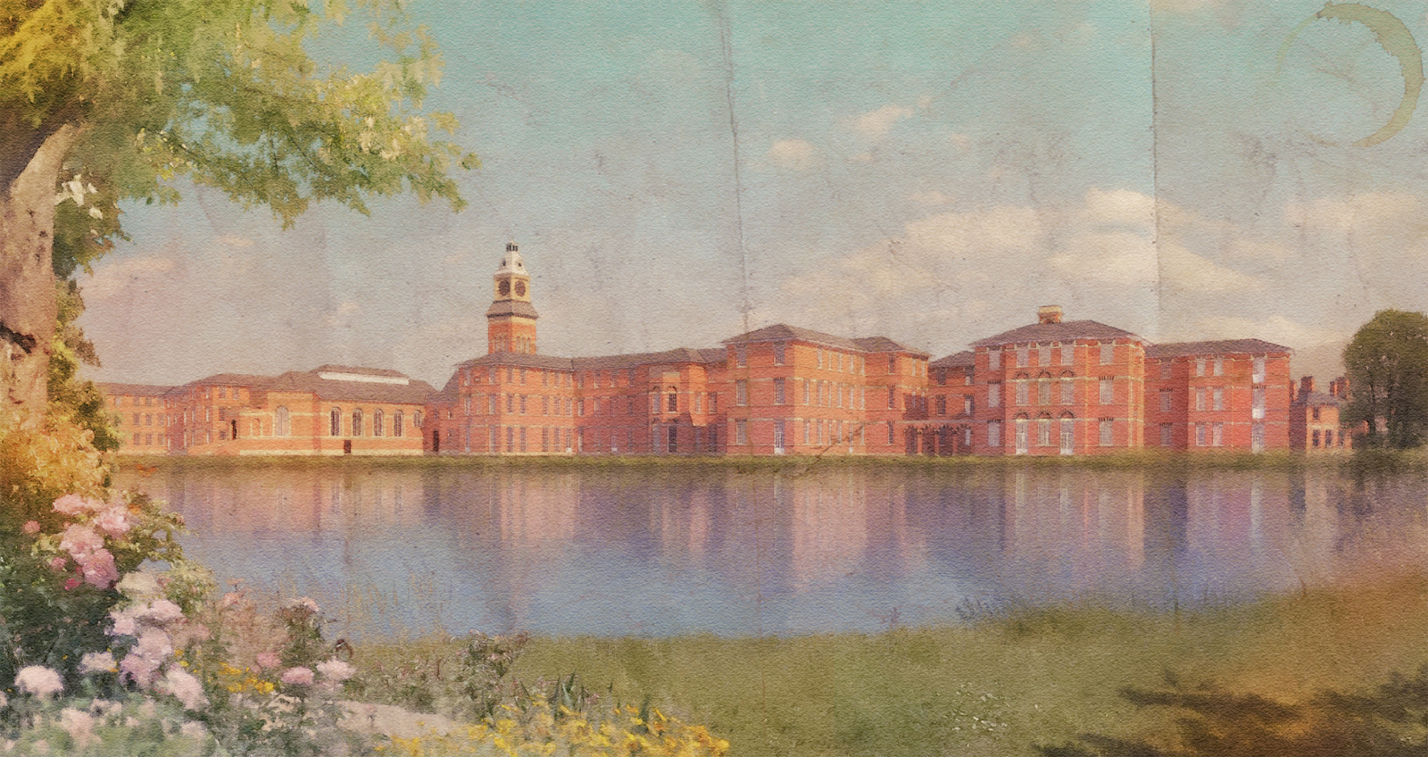
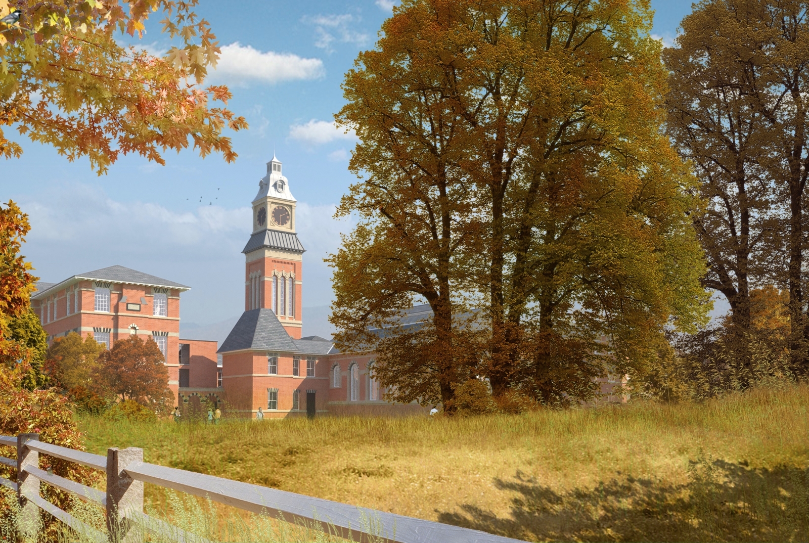
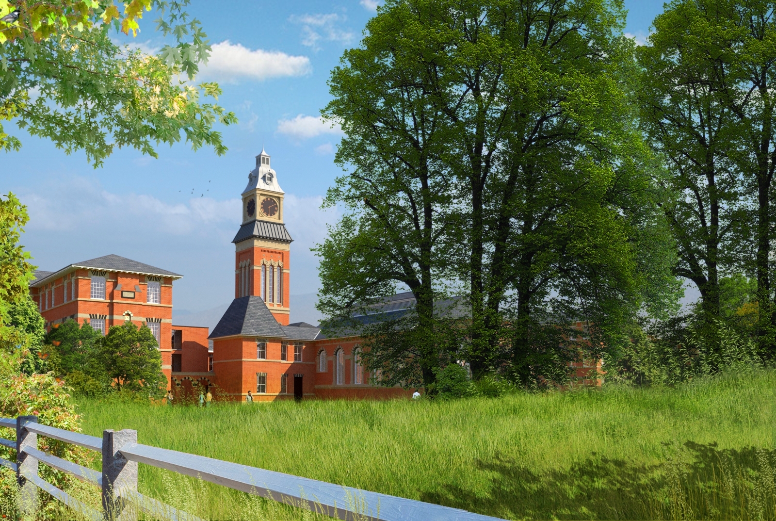
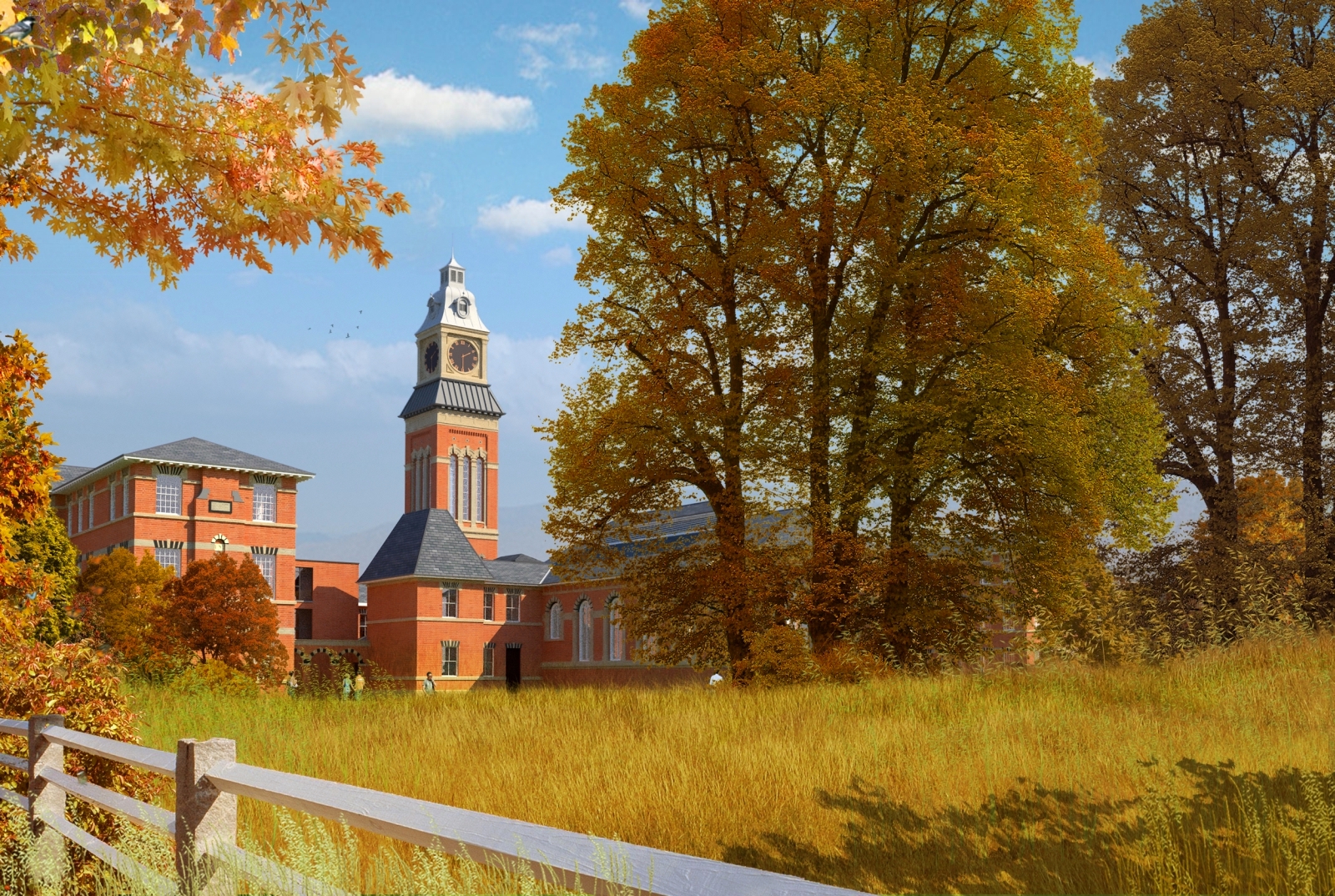
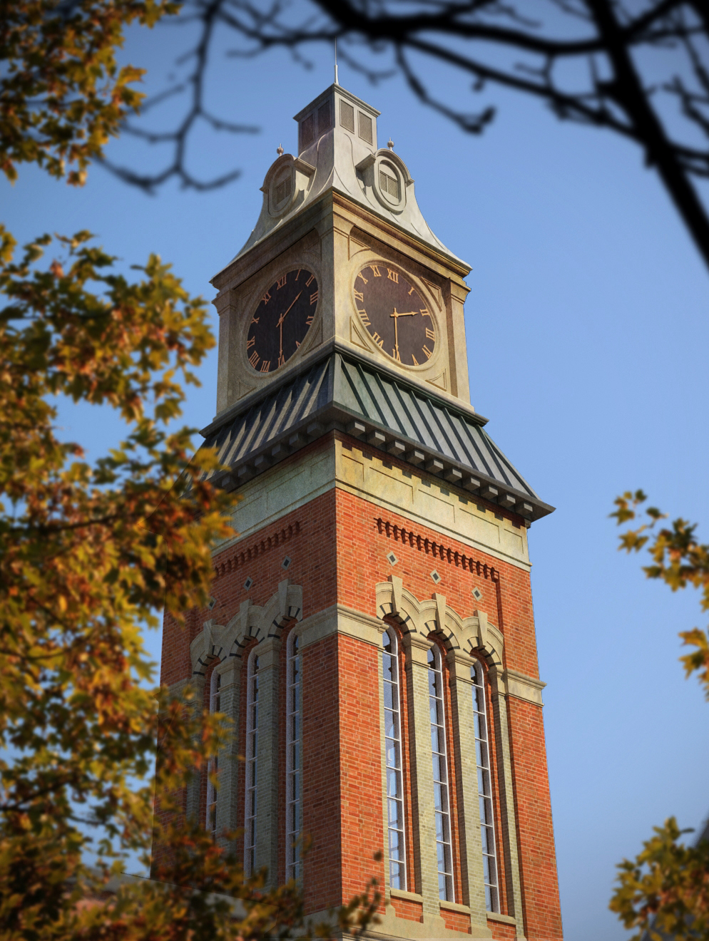
Summer/autumn
attached are versions of the same view,one summer one autumn.all vegetation is photoshop with each plant on its own layer which made it easier to change the colours.The third image is a close up of the bell tower with dirt maps added in photoshop.originally rendered in maxwell.
-
RE: Summer night
Fabiorossi ,
I think the compostion looks perfect but the colours are a bit washed out.Below is a link to a piece of software that allows you to create very vibrant images:
http://www.mediachance.com/hdri/index.html
The Trial version is free to download but with a small watermark at the bottom of the image.I often take my final renders thru this software and then overlay the result with the original image.you can then play around with the layer blending modes to get the image you want.It works especially well for nighttime shots.
The screensnap here shows the original image overlayed with the hdri image.a third layer was also created whereby I altered the threshold of the original image( see final image) gaussian blurred this layer.when this third layer is blended using "screen" you get a very fine halo effect around the lights.I hope you dont mind me using your image to explain the process but the composition is perfect.


-
RE: Maxwell Villa part 2
guy
attached is the .mxm file for the glass.its named "glass-ultrafast-clearlight.zip".just change the .zip to .mxm and it will work.
-
RE: House in a forest render
I would say the first thing that jumps out at me is the perspective.Use a lower angle without looking up as much or pull back more with the camera and if necessary, render out at a larger size so you can crop it later in post processing.
The second thing is that there is no foreground,middle ground and background.By that I mean is everything is in focus and consequently there is no depth to the image.this can be easily added in photoshop,add some foreground elements and use gaussian blur on the foreground.the best thing about adding blurred foreground images is that they dont have to be high resolution as the blurring hides most inaccuracies,and yet it immediately adds depth.
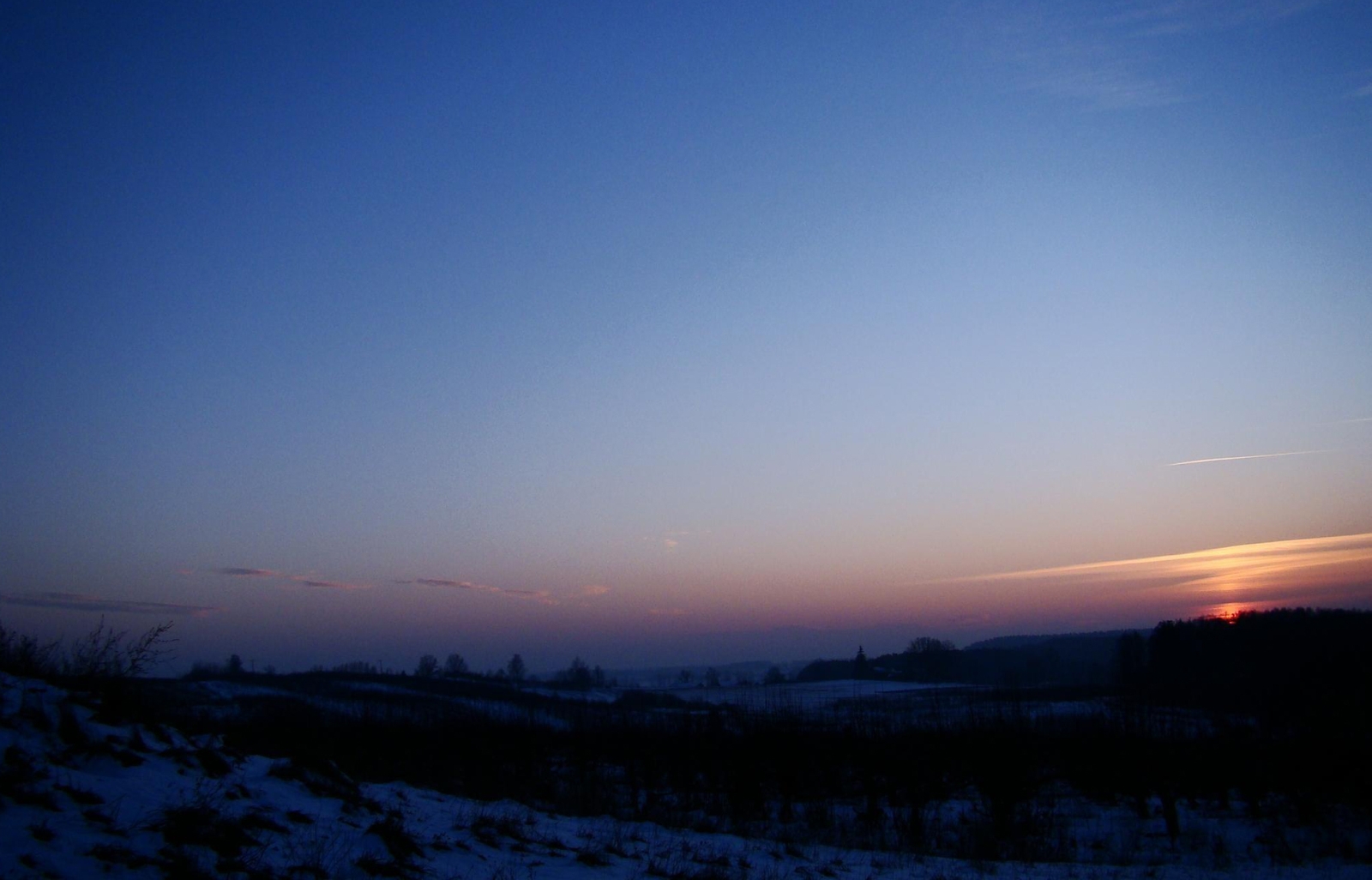
Thirdly,there seems to be some conflict between what type of lighting you are trying to achieve.On the first image,it looks like a blue sky but with what looks like up-lighters on the side.Turn these off for the daylight and for the night time/dusk shot use a bitmap/hdri for lighting.I have attached a dusk jpeg that I often use to light my models when also using internal lights.
Normally what I do is use this image for the environment(Value 0.3) and background(value 1) so I get the correct colour cast on the model,but render out with an alpha channel so I can simply drag the same image in as background in photoshop.Increase the multiplier of the environment if you need or use a proper hdri file but this one works for me.Finally try and keep the same colour values in your scene,the red bush just jumps out,reduce the saturation of the red so it sits easier with the other colours.
Regarding the glass change the reflection to 2.2 from 1.5 to get a better effect and add an orange colour to the lights for good contast with the blue sky.Sorry for the longwinded post but this strategy works for me!
-
RE: Maxwell Villa part 2
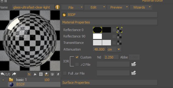
the glass is one I downloaded called "glass-ultrafast-clear-light" with index of refraction changed from standard to 2.250.(screensnap of settings attached.)Lighting will also play a big part in reflections.
-
Polaroid collage
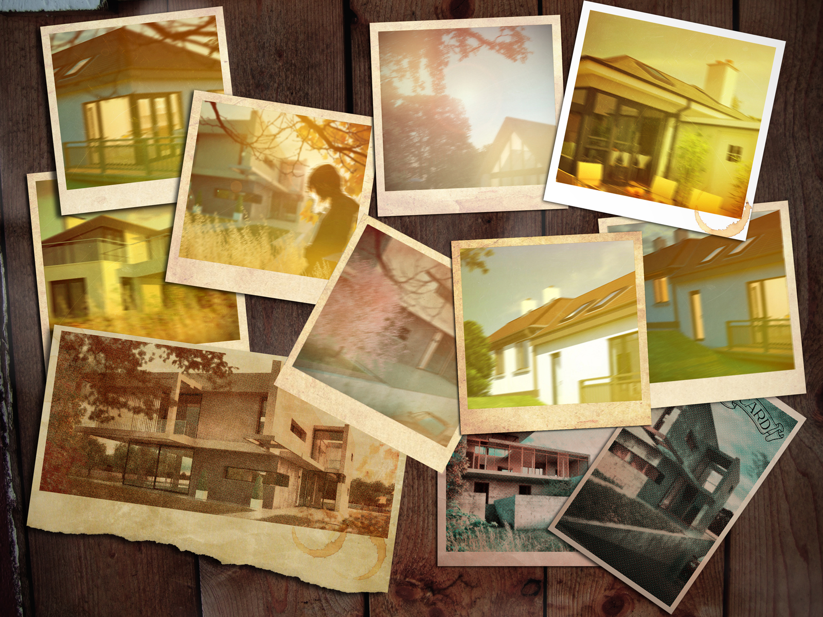
attached is a collage of some of the 'polaroid" images I previously uploaded.(unigami,I have added the drop shadow)
I have also added some additional images where I am trying to get a "print" effect along with a more technicolour tone.
-
Maxwell Villa part 2
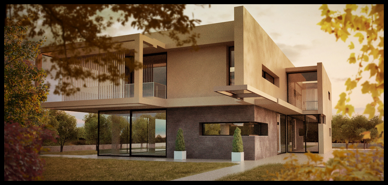
Attached is a new render of Hieru's villa,again rendered in maxwell with photoshop post processing.its still quite grainy but the colour and lighting is pretty much as I wanted
-
RE: Depth of field tests & polaroid picture
2 more images,the second is a part post processed maxwell image,based on the villa model previously uploaded by Hieru.
Rich ,currently I have a demo version of Thea.I had access to the full version a few months ago but the company I was doing work for at the time are no longer in business.From what I see of thea it looks great but as I have already purchased vray,twilight and maxwell I am not in a position to purchase thea (as of yet).Currently I'm just playing around with different presentation styles/lighting moods.The method for the polaroid images is quite simple,overlay an orange/brown colour,add motion blur,add gaussian blur,add foreground elements and a vignete and thats it.


-
RE: Depth of field tests & polaroid picture
2 more"polaroids" with the original vray render.What I would like to do is arrange a collage,one on top of the other whereby I can use the drop shadow technique,but I'm still working on the arrangement and hope to upload soon.The last image here,one I downloaded from the net is actually more in line with the type of lighting I want to achieve,like the time known as magic hour in cinematography,very prevalent in 1970s movies.