Similar to the Roman forum images previously uploaded,attached are some NPRs of St Basils Cathedral in Moscow(again,downloaded from the 3d warehouse).
It is a remarkable building and really lends itself to rendering.
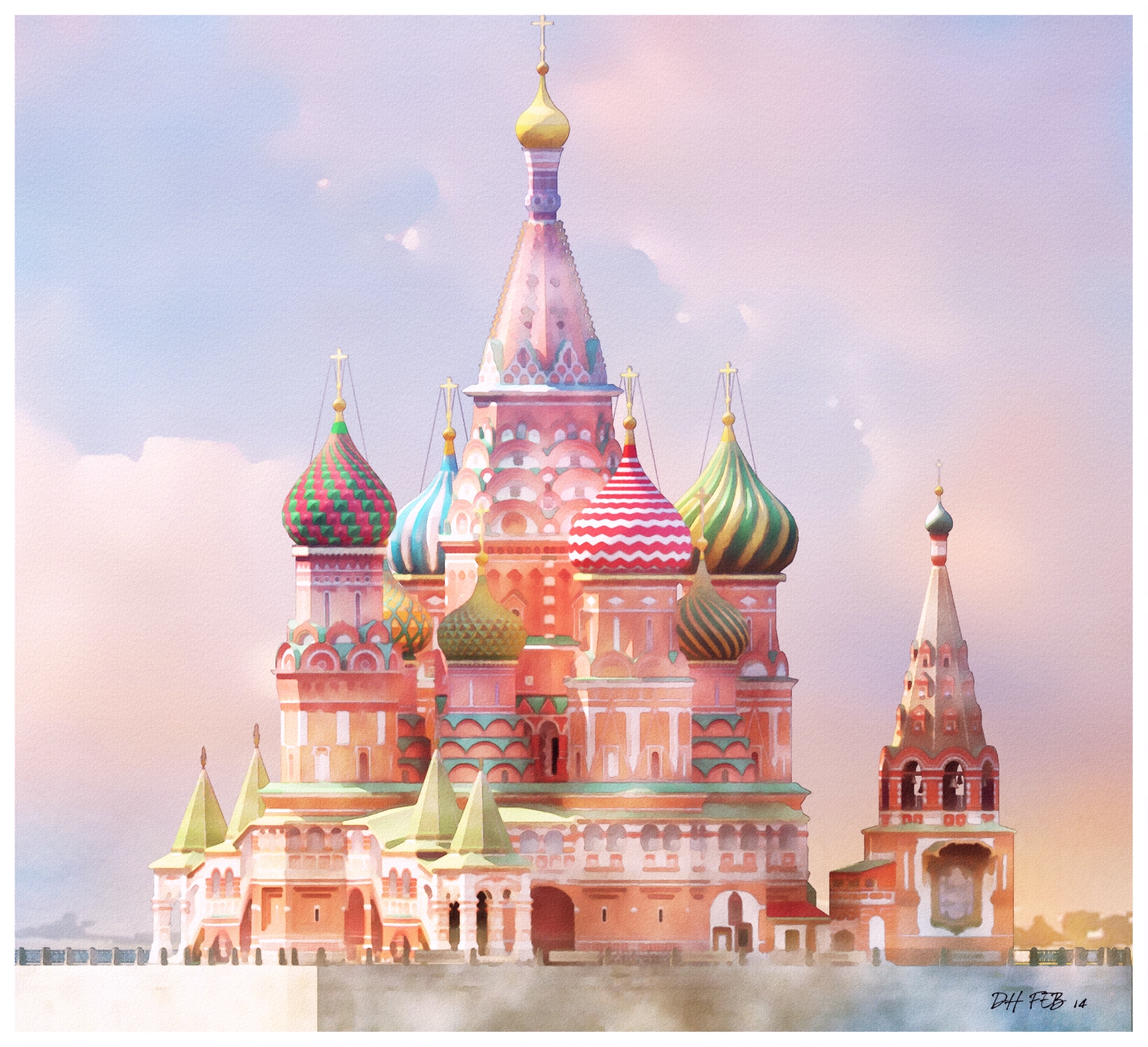
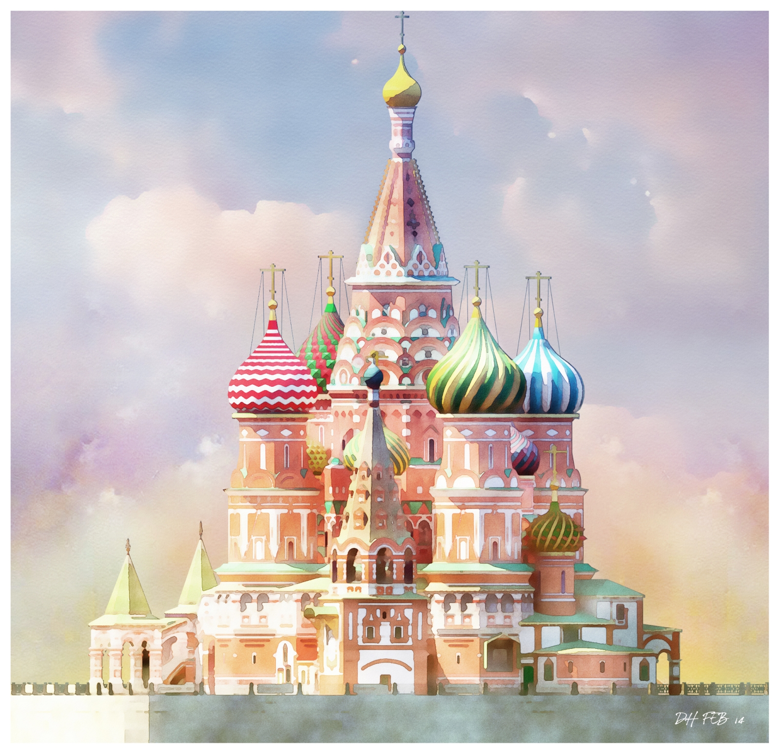
Similar to the Roman forum images previously uploaded,attached are some NPRs of St Basils Cathedral in Moscow(again,downloaded from the 3d warehouse).
It is a remarkable building and really lends itself to rendering.


Heres a parallel view of the entire model.I had to reduce the size of the original image to 1600 wide but I have attached a cropped version of the original size.
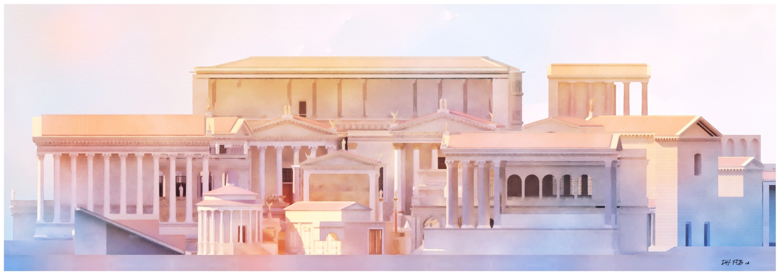
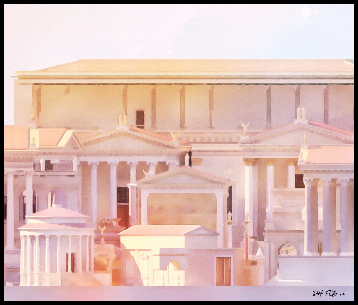
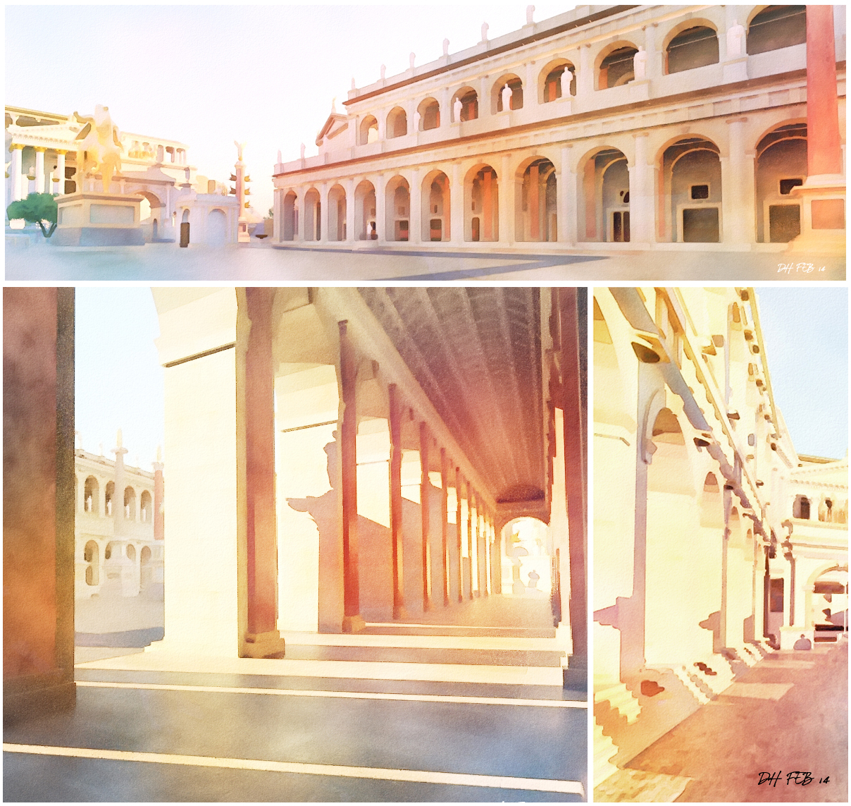
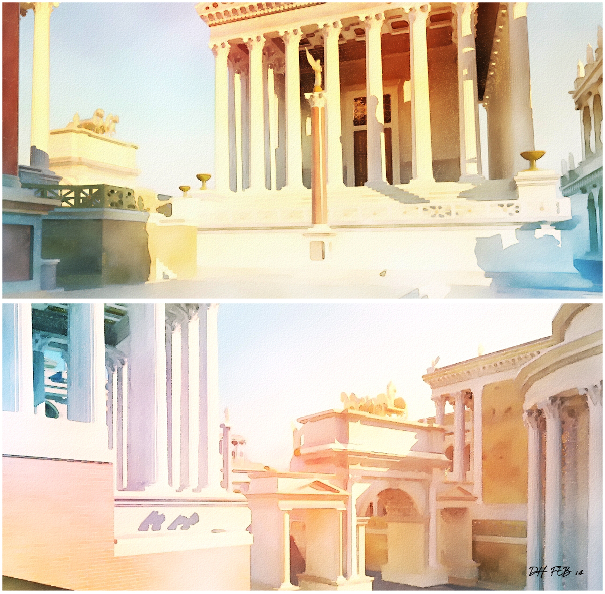
Attached are a few images of the ancient Roman forum rendered in Thea and post produced in Photoshop .(The model is FORUM ROMANUM by L.VII.C available to download from the 3d warehouse)
Heres a similar style applied to the modern version of the main street.
Again,it was done overlaying many different layers using the different blending tools in photoshop.
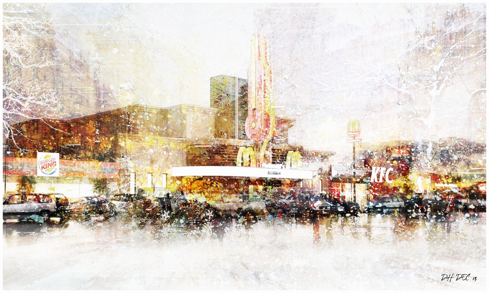
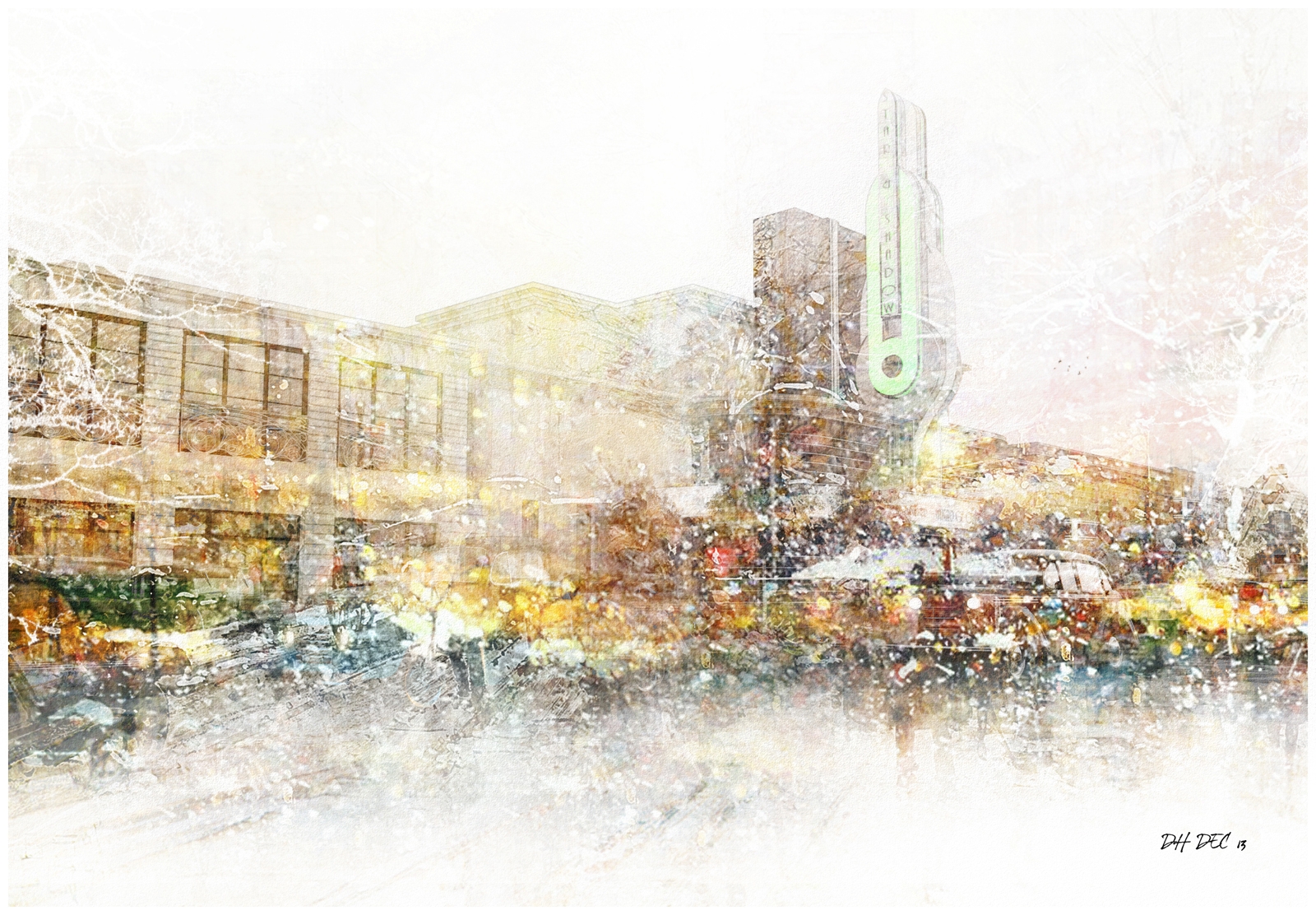
Attached is an NPR image of an art deco cinema and main street that I have previously uploaded(a small scale version of the original image is below)
I wanted to really attack the image with overlays and splashes to give a feeling of winter.
Some parts of the original image have been obscured totally but I wanted to get a feeling of
wind driven snow and lots of warm red and orange light.
This is probably one of the more abstract images I have done.
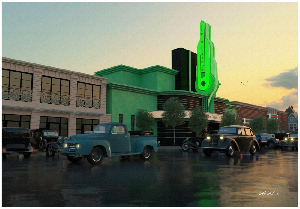
Like most of my images,these are studies in mood,lighting and composition.
I would put a light in the last image,03, but it would detract from the idea of life happening in the town behind,contrasting with the old building in the field.
In fact the only reason light is in the second image is because, otherwise,it is all blue and way too still.
I dont use people in most of my images so it is usually the idea of something happening behind the walls that gives them life,just like my birds which are normally placed way back in the distance.
My own preference is for buildings sitting in the landscape as a natural element,almost as if just discovered , if it is too far forward it can seem like the context is forgotten and not applicable to the design.
All landscaping is photoshop,
Heres the original jpg used in all images,obviously like in all my images,these are colour toned and masked depending on each image.
I have used a lot of the same winter tree entourage in each image and also reused the snow-covered wall with fence.
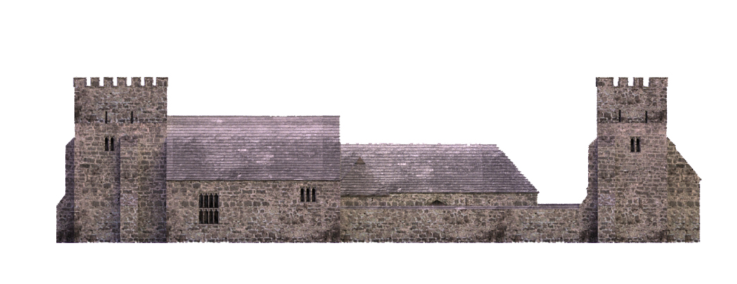
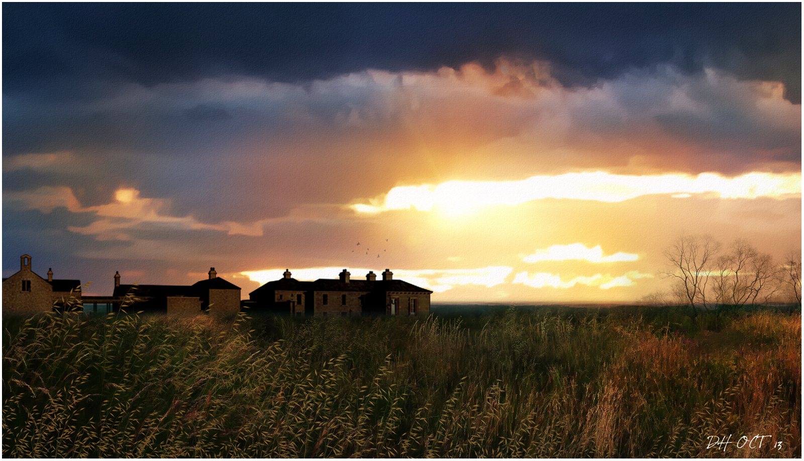
Attached are 3 NPRs of the same model originally downloaded from the 3d warehouse and rendered in Thea.
The images are different variations of proximity to the building with the last,03,set on a very high vantage point with the building in the middle of a white field just below the brightly lit town.
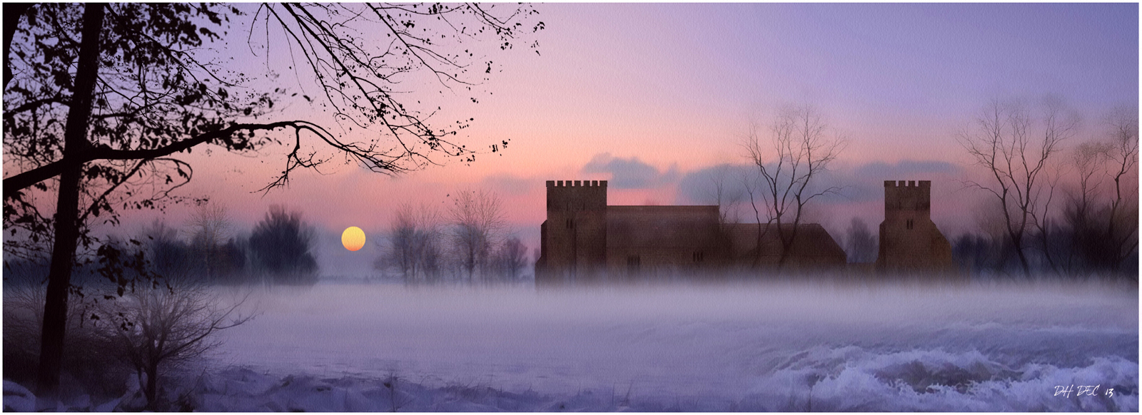
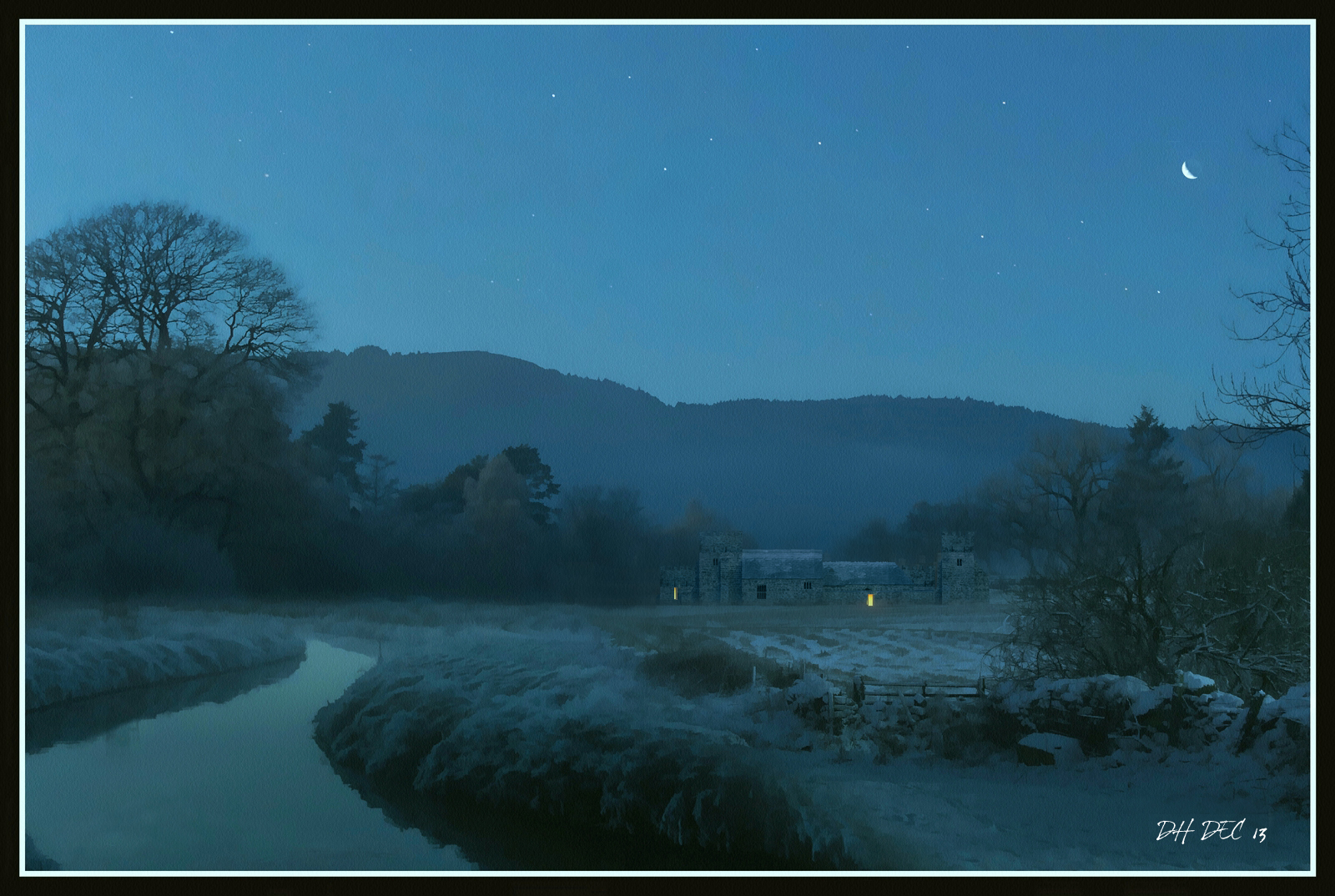
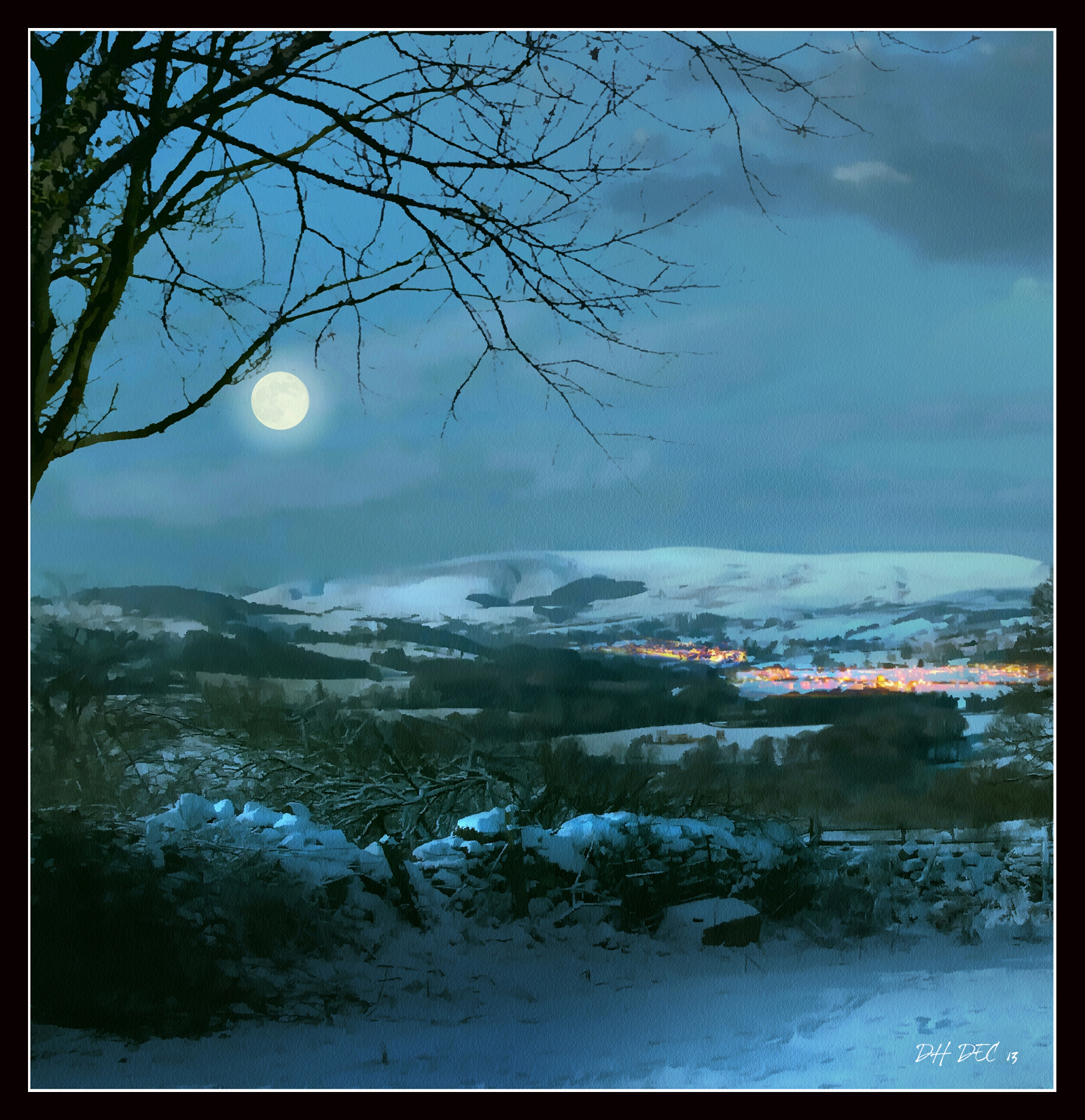
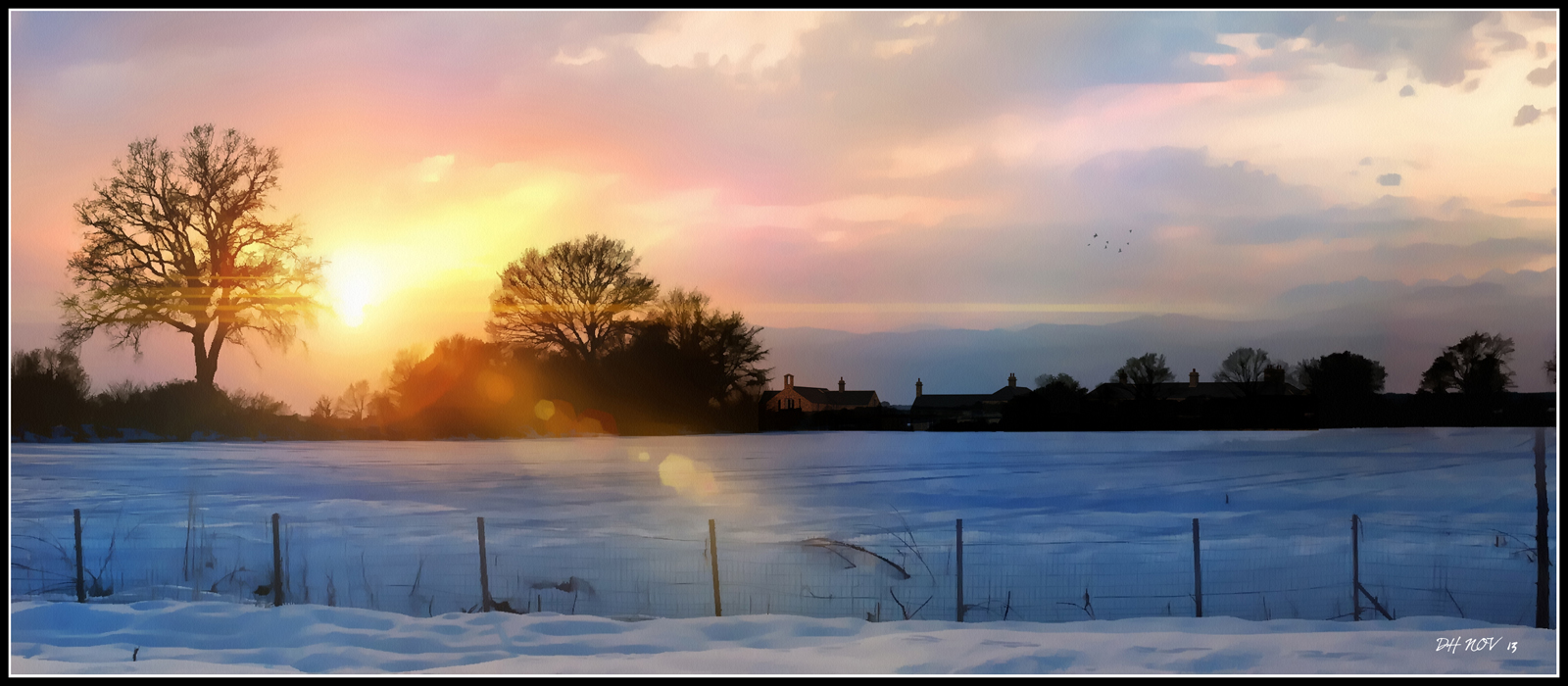
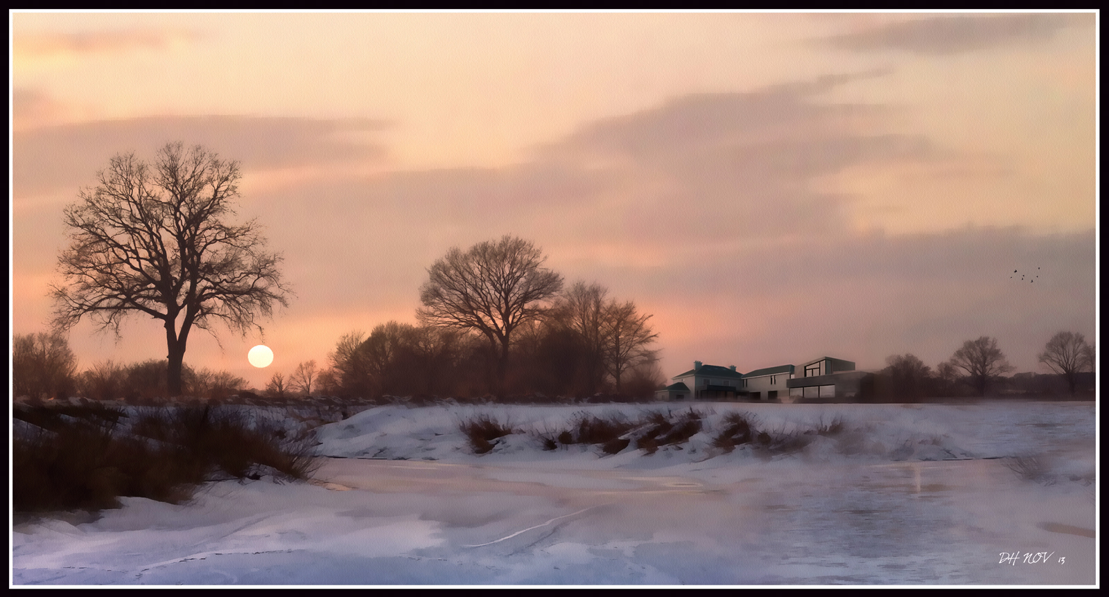
Attached are 2 NPR winter landcapes with 2 different lighting conditions.
The buildings are different in each case but the winter trees are the same.
I wanted to use a lot of colour for the first one with vivid blues,reds,oranges and purples. and a strong glare caused by low evening winter sun.
The second is much more subdued and still.
As with most of my landscape images,the only movement is by the birds,which are placed far back in the image to help convey the idea that there is a larger world beyond what the images show.
Majid,
These are excellent,I particularly like the long landscape with the context of the surrounding area.
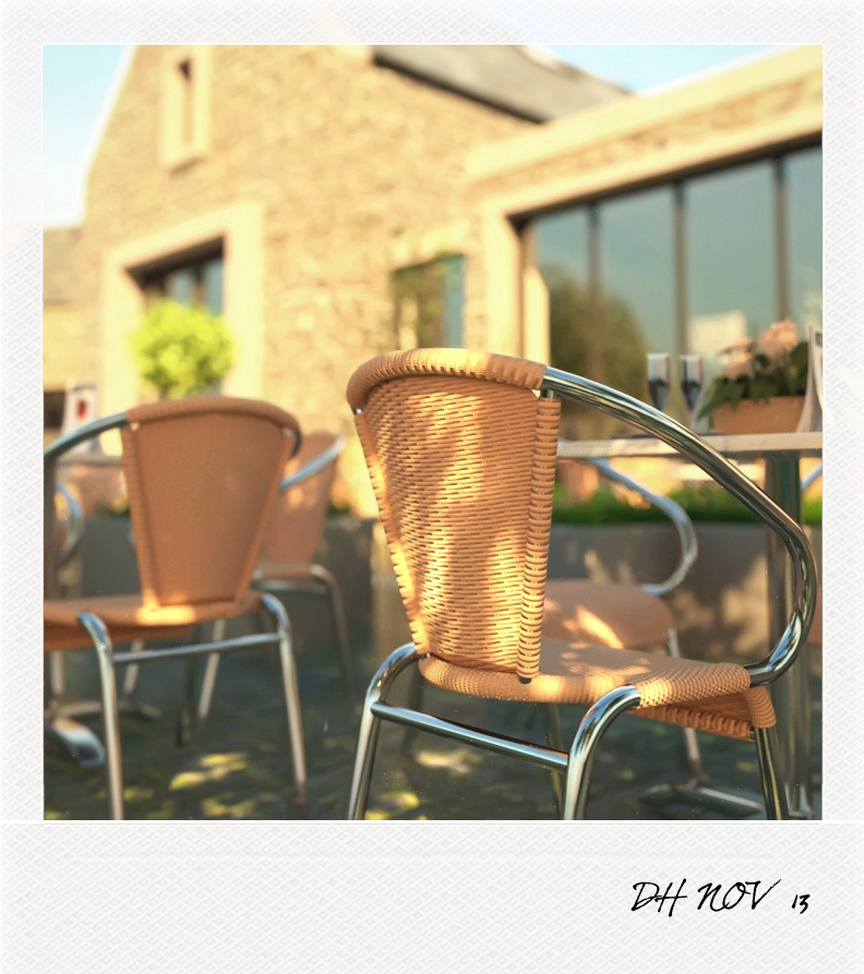
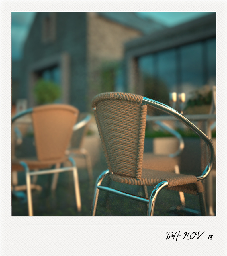
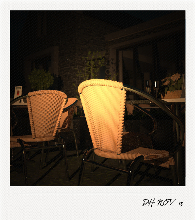
3 versions of the same tables and chairs under different lighting conditions and presented in Polaroid format.
The building behind is a project I am currently working on.
One thing I would say about your version is that the birds are way too much prominent in the image.
If they were as close to the camera as your image would suggest,they wouldnt be as dark or lacking detail.
The whole idea of my original image is that the landscape and sky reflected no movement - a snapshot of stillness.
I would also say that if you want to add movement in an image and want to add birds, - think about them as part of your idea rather just sticking some entourage in.
Give everything you add-in-post the same respect you give to your render.
That iconic image from star wars was actually one of my references when doing the third image,particularly the sky colour and low orange sun -
here's a slightly different version!

2 more images,the first is a version of the original older windmills set just before an upcoming storm.
The storm clouds are based on an image I downloaded from the net but darkened considerably on the right and used the dodge tool in photoshop to increase the brightness on the extreme left to add to the ominous mood,and pick up some highlights on the buildings themselves.
The second is a more american style wind generator.The building is one I have uploaded in multiple images previously.


Thanks Mike,
Nearly everything I upload is purely a test,a version of how I would want to light a particular subject,sometimes they work,other times they don't.
For every image I upload I would have at least a half dozen that just don't work.
One of these days I will upload an image I am really happy with and once that happens,
thats it! I'm done!
3 images previously uploaded to the Thea site.
The windmills were downloaded from the 3d warehouse and rendered in Thea with landscape added in photoshop.
The renders are done using interactive mode in thea and took about 5 minutes each.


Attached are 3 NPRs of buildings previously uploaded to this site.
These are just pure exercises in light and trying different techniques,placing the building out of the main focus,as with most of my landscape images.
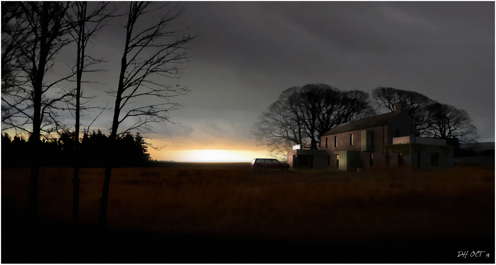
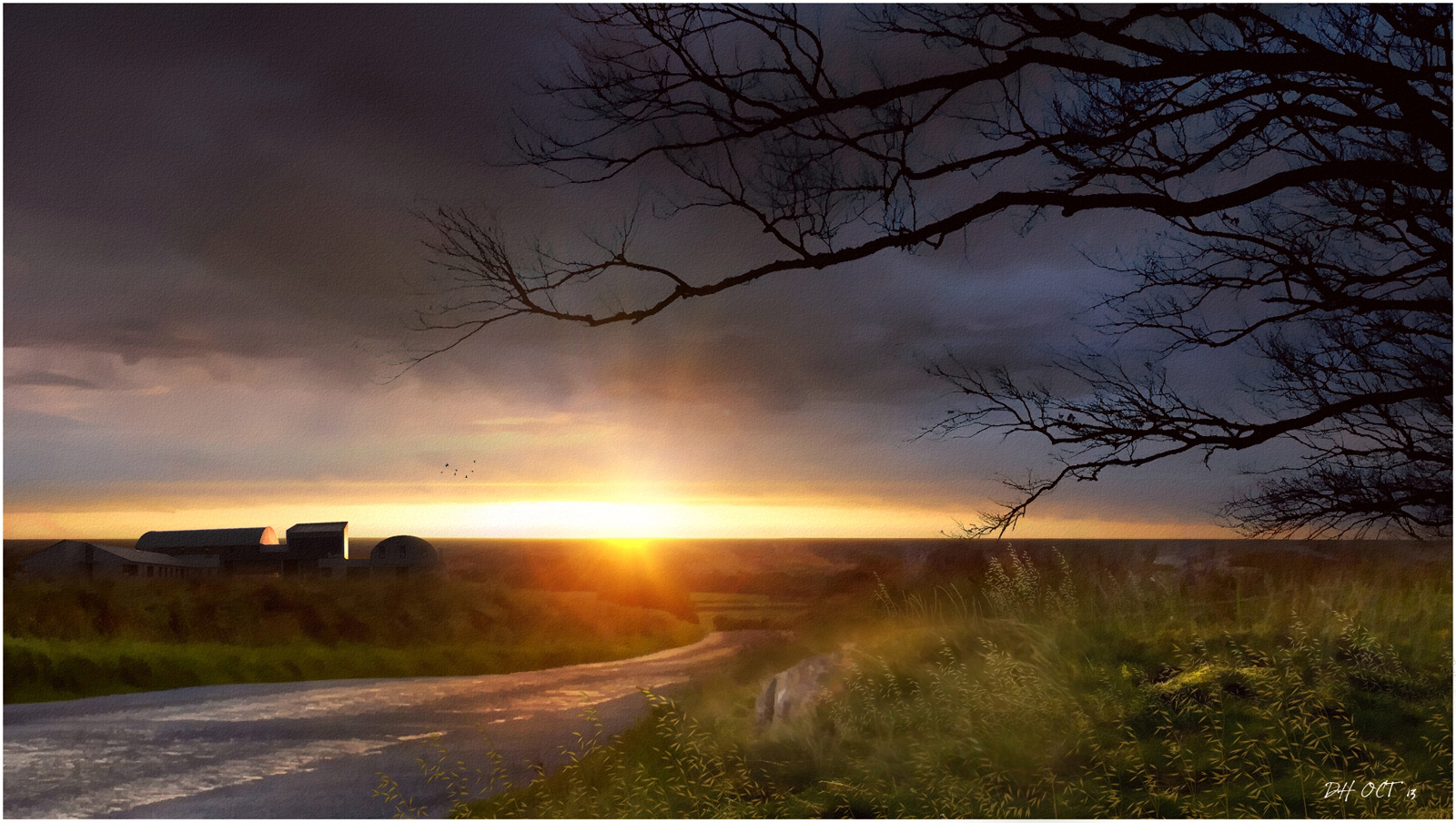
I really, really love Hopper and what I get from him is a perfect stilness.
I actually had some low polygon people in my Thea set ups but forgot to turn the layers on.
When I did,the images became something else,so even though the cars are there,I much prefer the sense of stillness but without human interaction,if that makes sense.