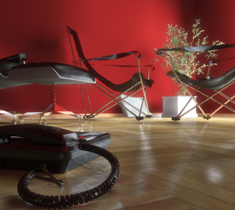
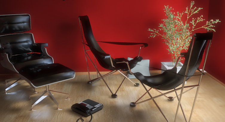
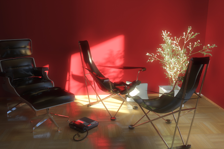
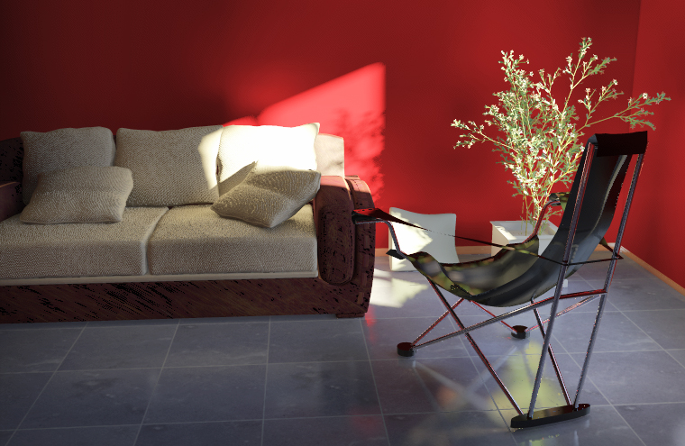
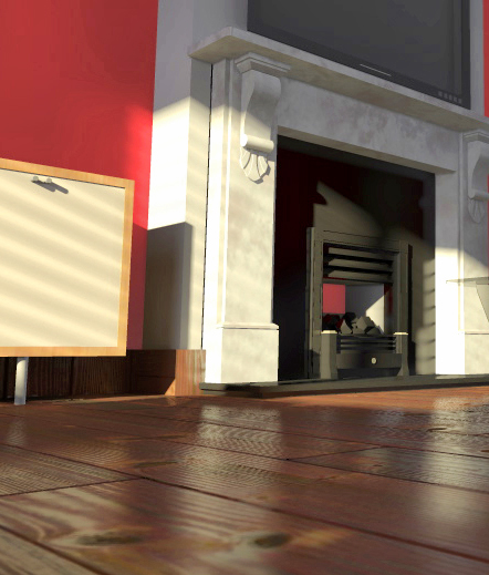
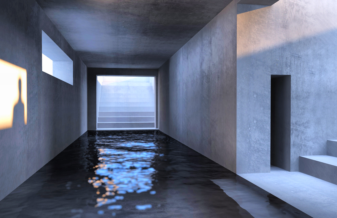
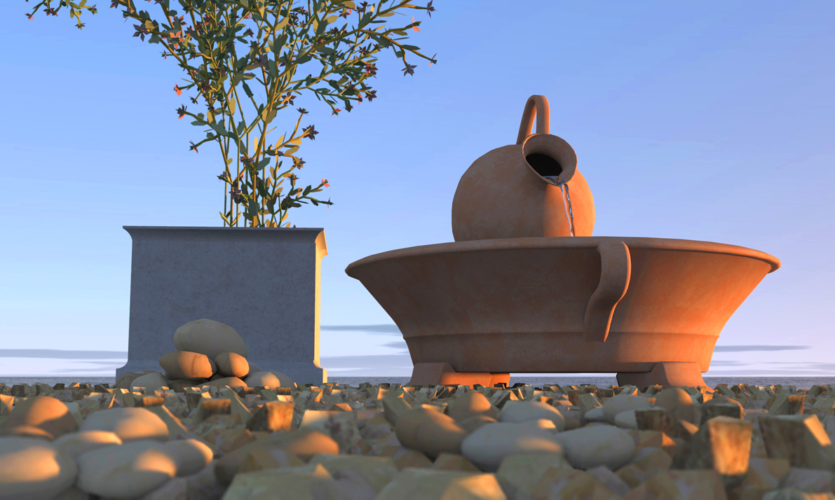
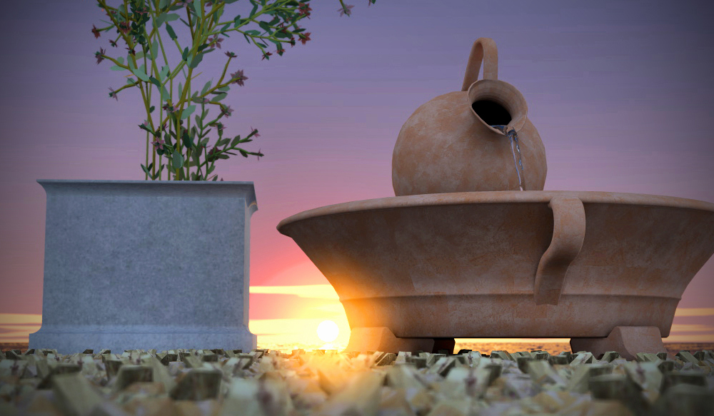
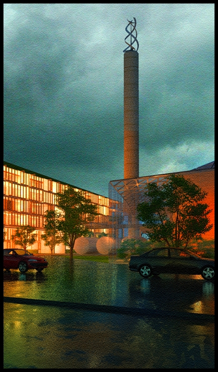
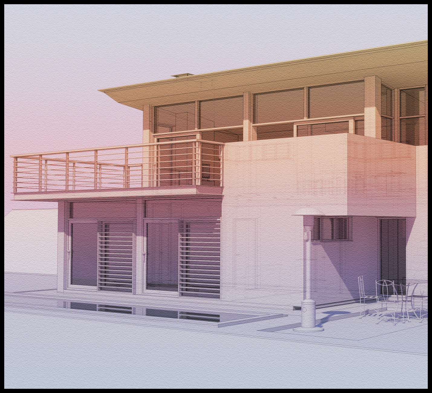
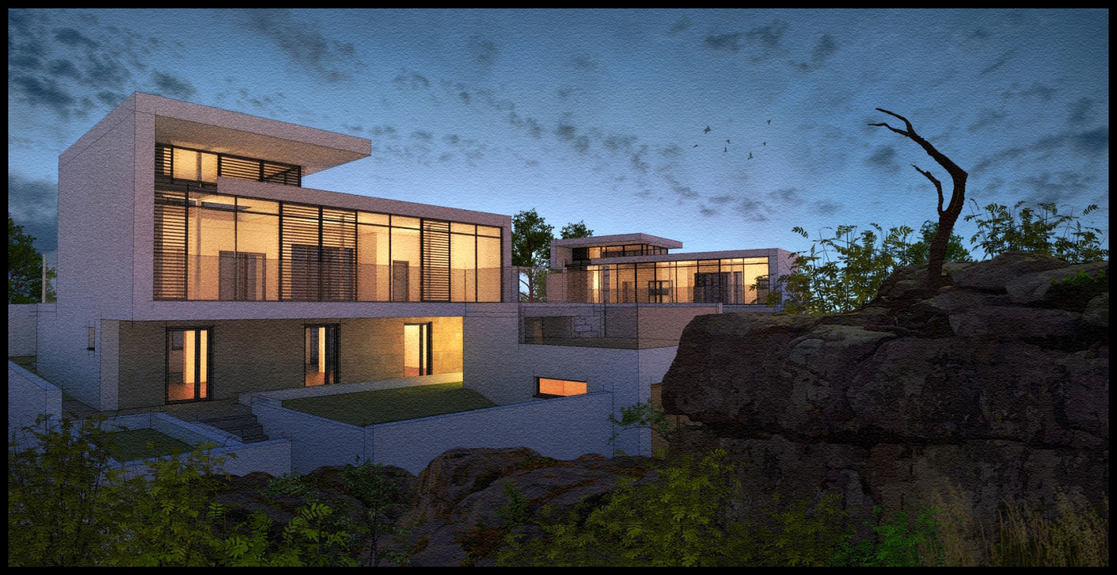
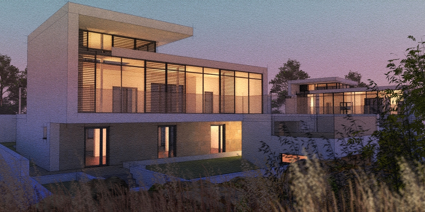
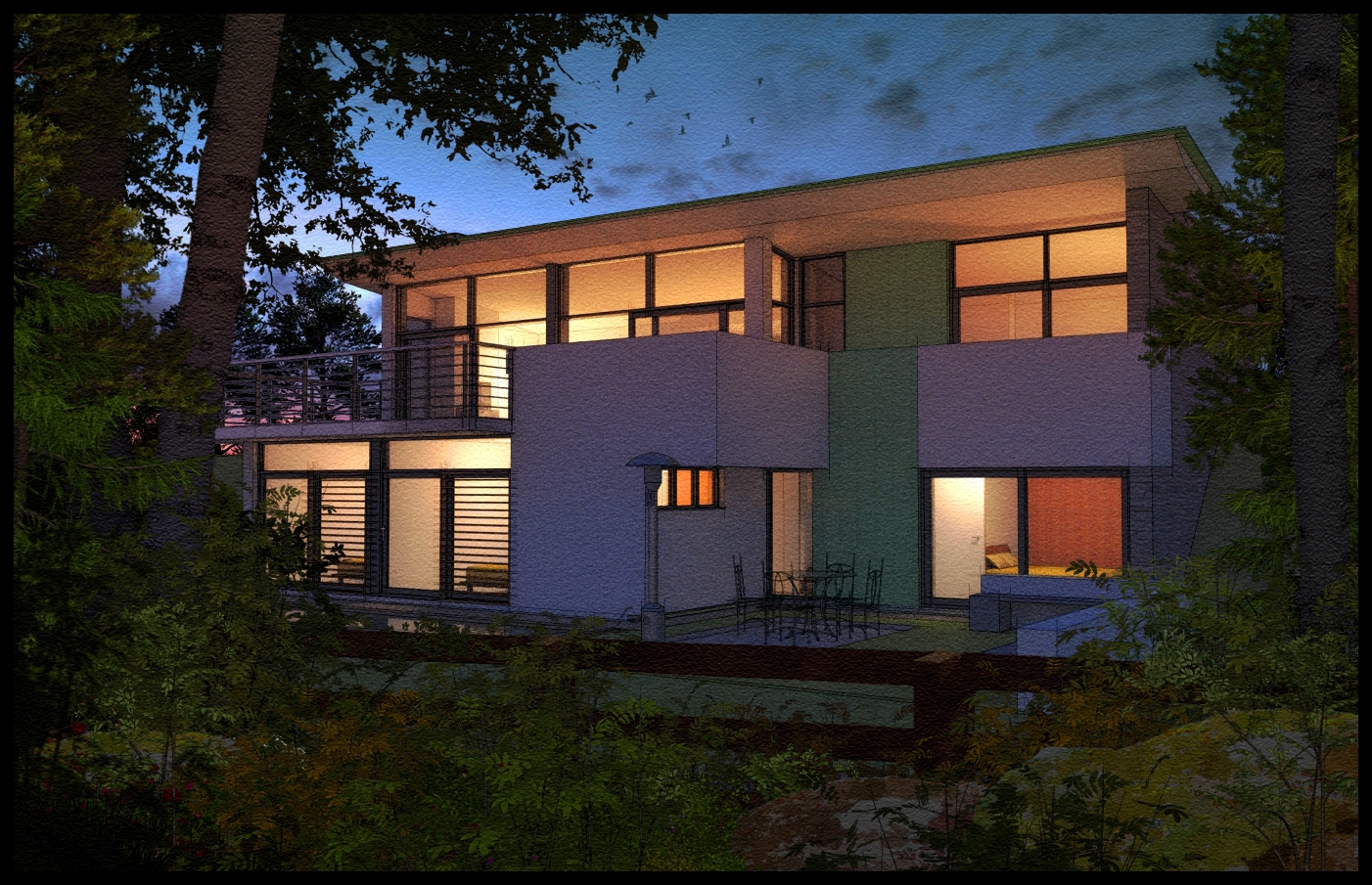
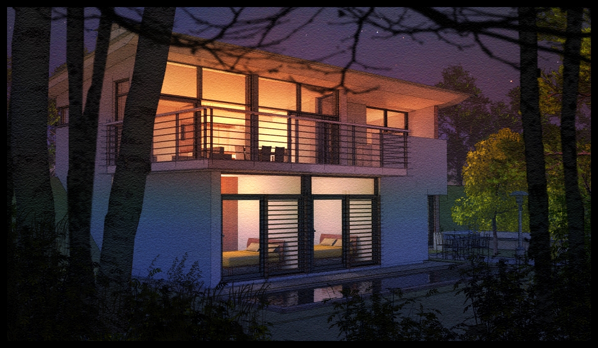
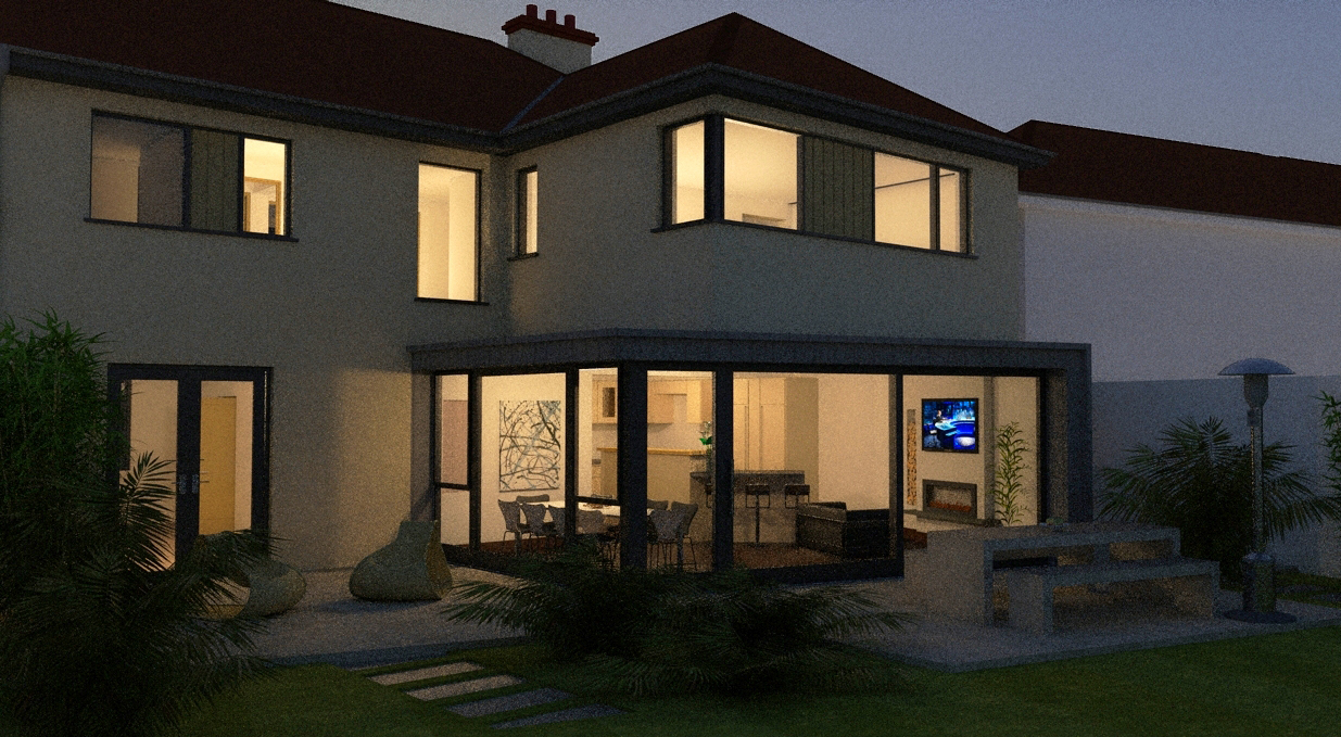
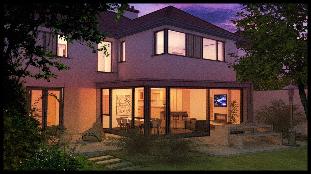
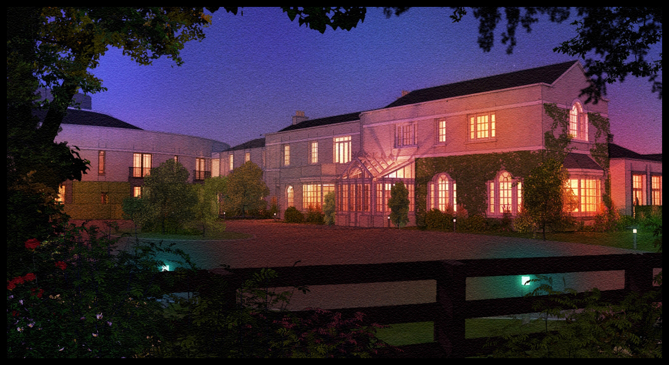
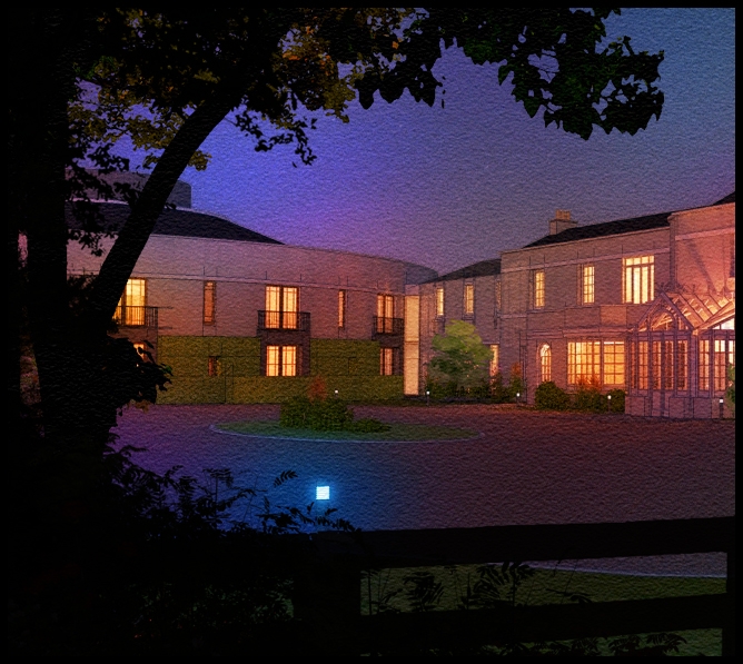
Attached are a few Artlantis test renders playing around with depth of field and lighting.I previously used Artlantis and went on to use other rendering engines,but recently I find myself gravitating back as the set up is so quick.In these images,most of the floors are Arroway Textures and the lighting is either a low evening sun with soft shadows
or an overcast sky with no sun.
Posts made by davidh
-
Arlantis test renders
-
RE: Site cropped
attached is a slightly different version of one of the images.Im still trying to decide wether to incorporate the wet ground and the new sky
-
RE: Moon
Thanks mike,but we are already here!
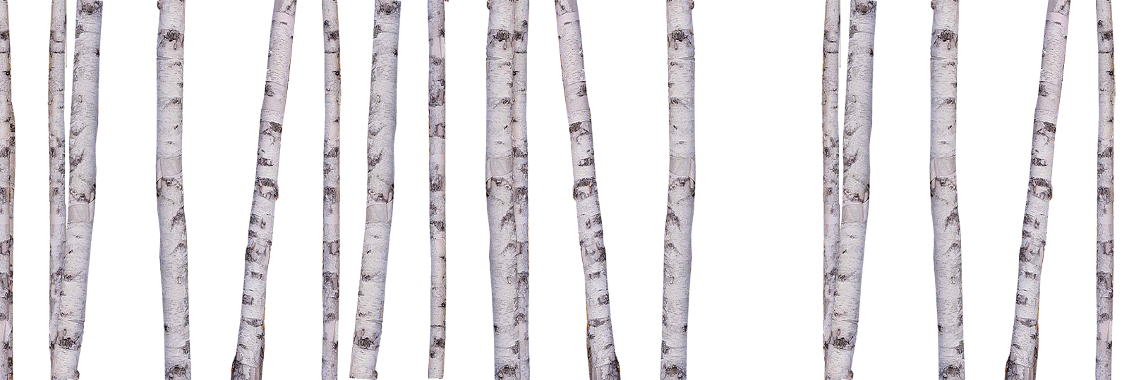
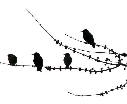
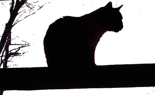
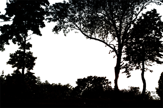
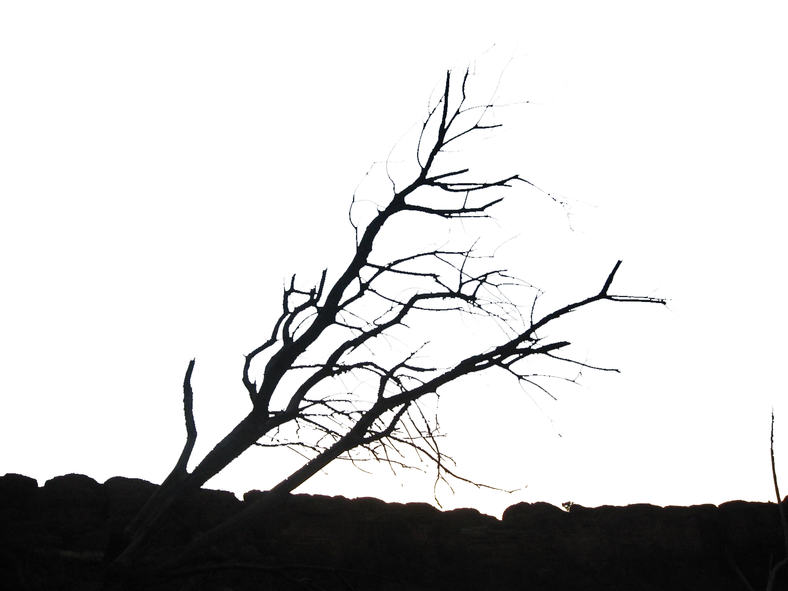
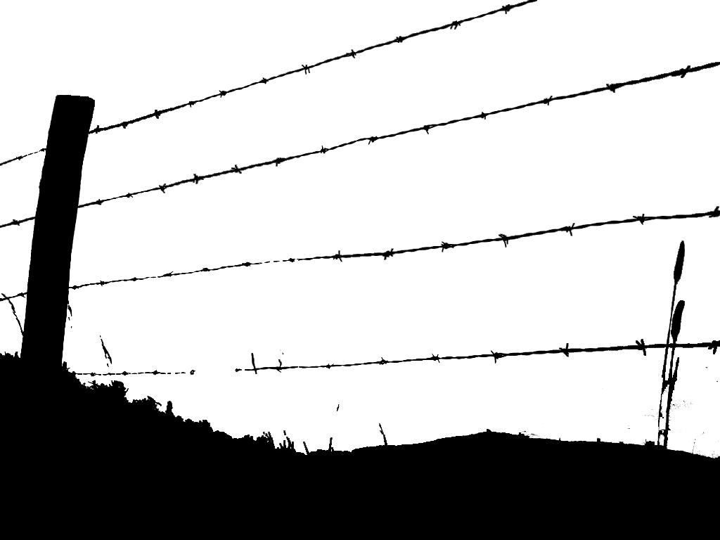
attached are some foreground elements that I have used on some of my images.By layering these images in photoshop you can really change an image.I hope to upload a lotof foreground vegetation,non-photorealistic, in the next few weeks
-
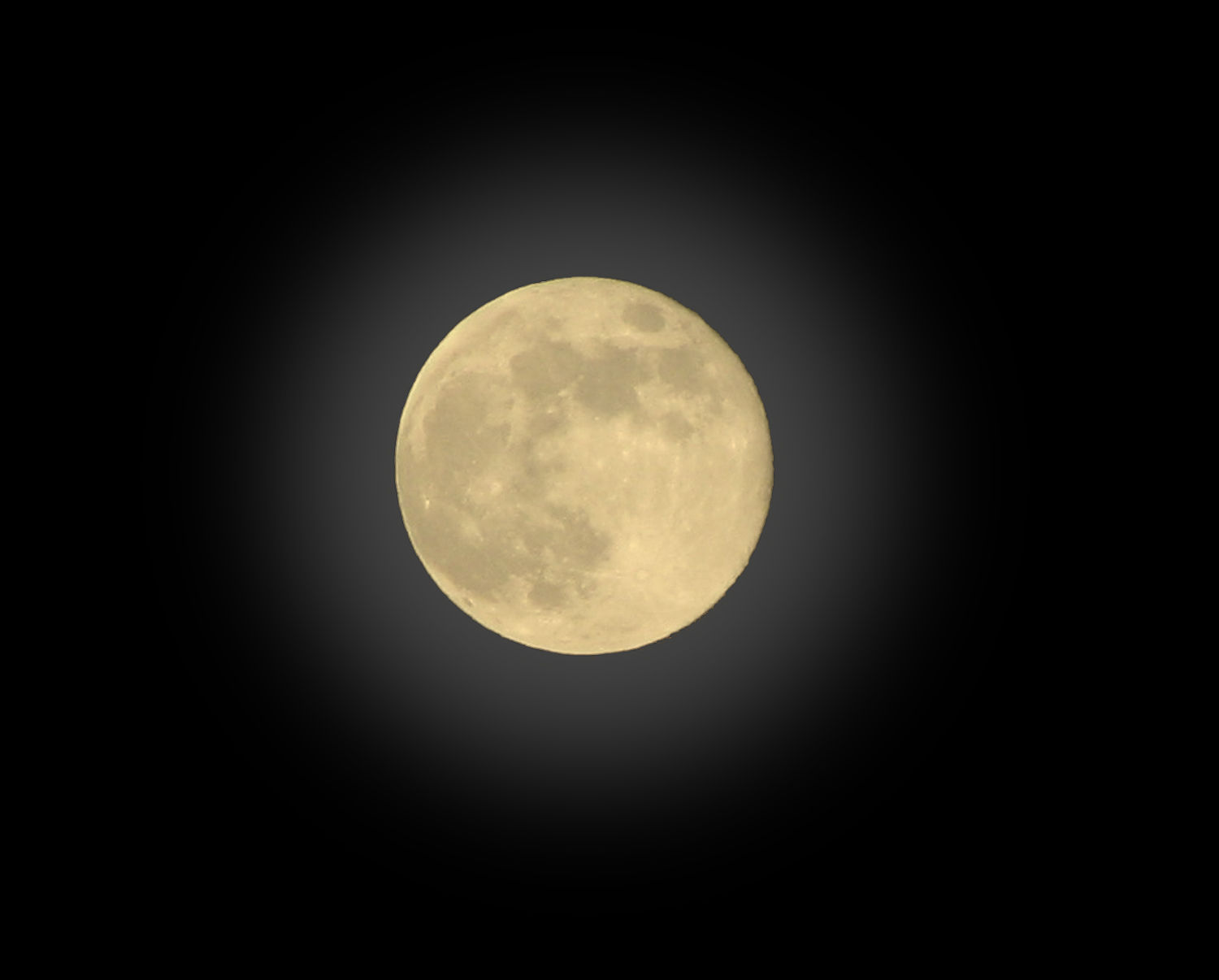
Moon
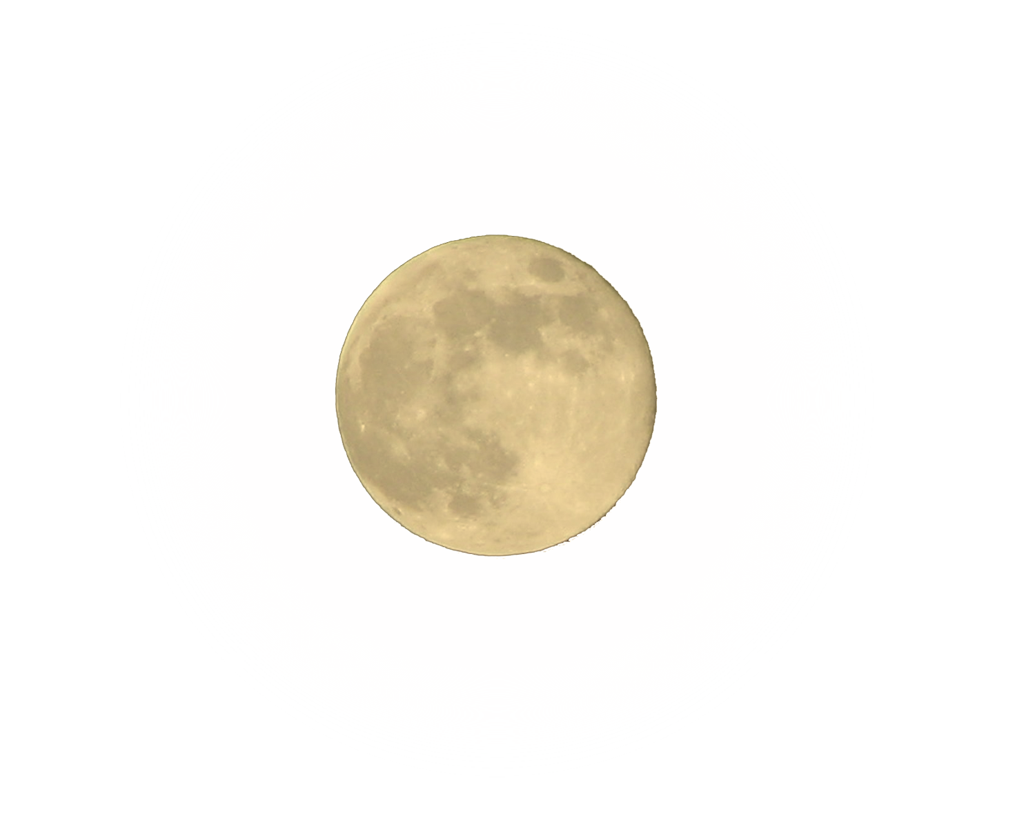
attached is a.png file of the moon.It can be dragged and dropped onto an image.it has a soft halo around it that will light up the adjacent sky rather than just sit there as a yellow circle(jpg shows what i mean)
-
Rainy day thru glass
attached is a low res image of a rainy day shot.im trying to replicate the view as you would see through a window or windscreen.im not happy with the waterdrops,I think they should be more varied and have more breakups like drops running down the glass.I have a few more ideas in how to distort the image but wether they will work remains to be seen
-
RE: Site cropped
This is another part of the large image we hope to present.I have finished the overall image and this is slightly different to the final image we will be presenting,bearing in mind it will incorporate 3 different projects.There will probably not be as much foreground vegetation,maybe none, but it will incorporate the plans for each scheme.Regarding the first image, it was part of a competition which my company entered.We came fourth out of a global entry of 280 entries,not bad for a company of 3 people.
Later,if anyone is interested,I would like to upload a tutorial ,not so much on the buildings but more on the vegetation as soon as the presentation is complete.The tutorial will include a lot of the vegetation in non-photorealistic versions similar to what you see here i.e rocks,trees,plants , in either jpg or a full photoshop file where you can drag and drop elements as you want to.
the final photoshop image with all buildings and planting combined has 96 layers - most of them called "...trees copy" -is this a record?!
-
Site cropped
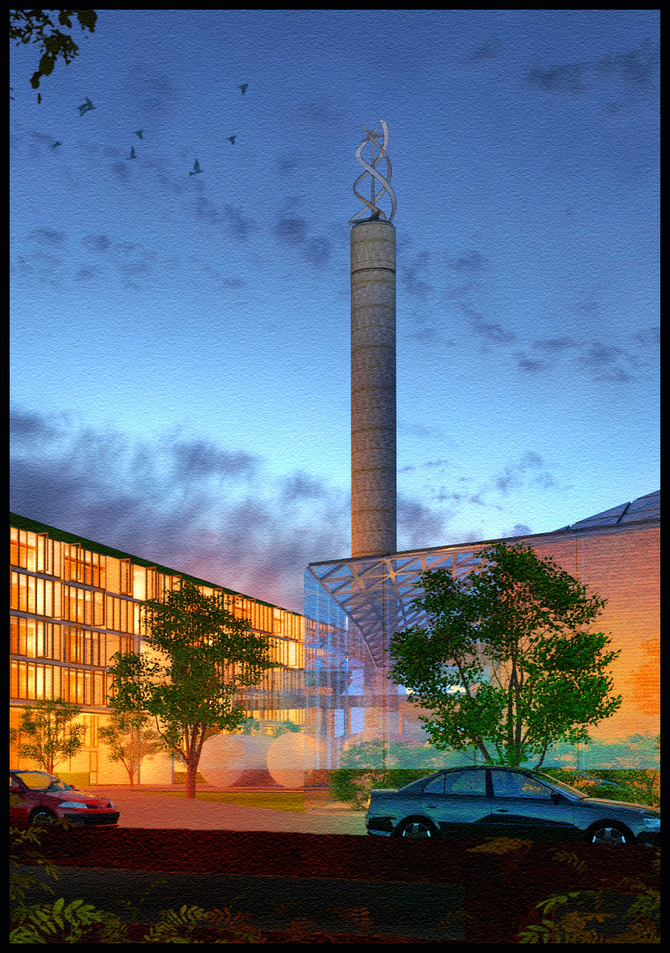
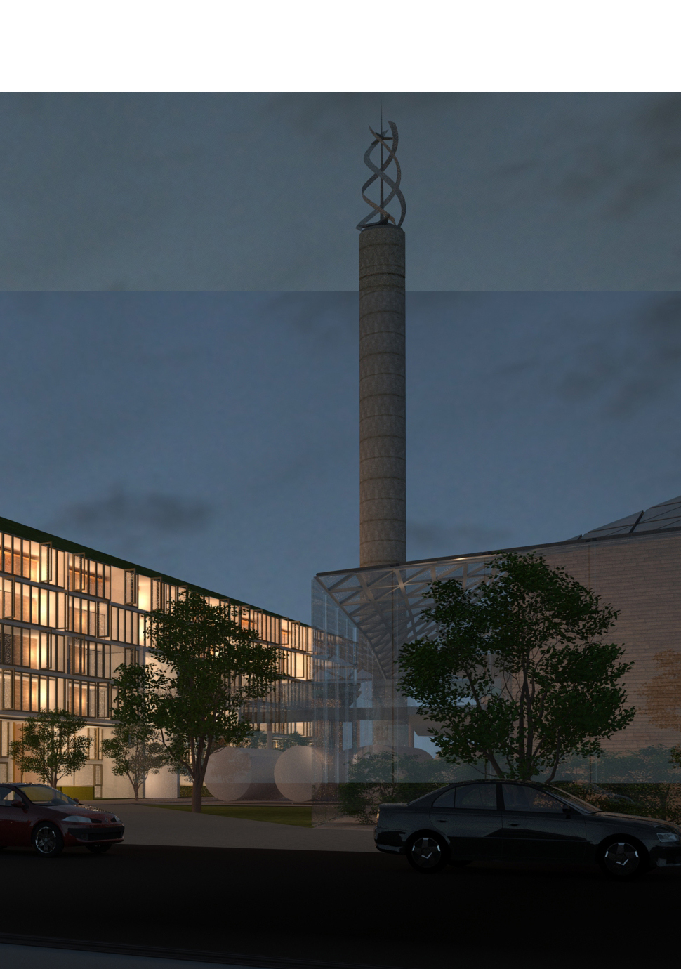
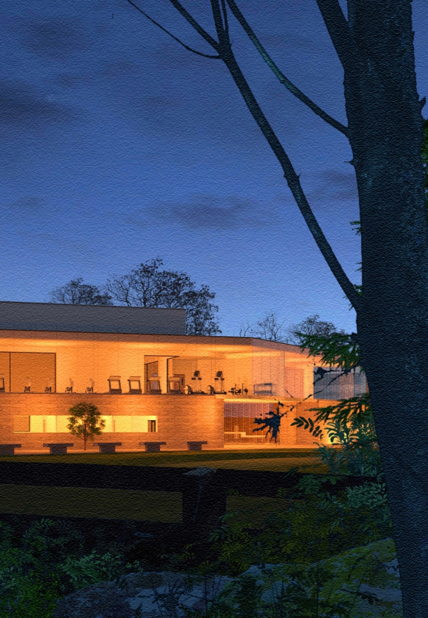
Attached is a cropped image for a presentation I've been asked to partake in the next few months.The original full image for this scene is 90cm x 55 cm and will make up a final image of about 3 times this size,with other buildings included.I hope to upload the final image soon.(rendered in twilight,post in photoshop,the final image will incorporate linework from sketchup,birds will still be present but will most defineltly be not as pronounced)
EDIT-Raw render from twilight attached(15 hours render,50 plus point lights used,the line across the main element is becuase its a combination of 2 different views))
-
RE: Amateur Hour
Solo is right,a good model can be made redundant at early stages by not picking your viewpoint.Pick a point at eye level and follow on from there,and then don't go for the first angle that you think works.Most of the best images that you see here are usually from testing/trying different angles/views but the angle you are working with is not natural.I have attached a pdf based on watercolour painting(uploaded previously)but although we work digitally,the same criteria apply.
-
RE: Blacksmiths Forge
I really like these images,the models are exquisitely detailed and the use of materials/textures is one of the best ive seen.
-
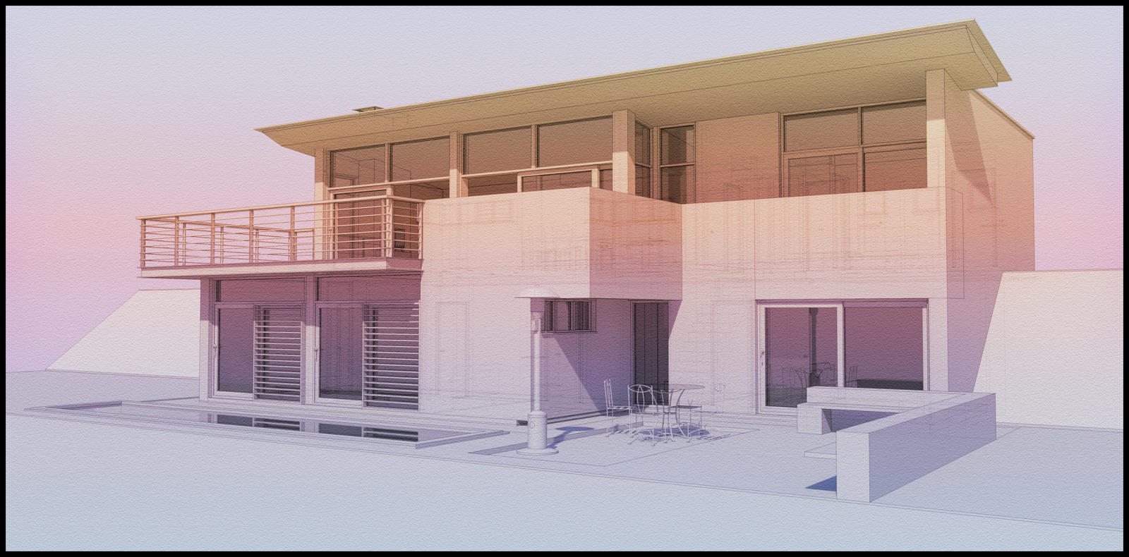
Soft colour and linework
Below are 2 images(the second a higher resolution crop of the main image)using a minimum amount of colour.The basis is a clay render with overlays in photoshop.
-
RE: Wild garden
you might have seen this building when I uploaded a vray version(feb 2008!)
http://forums.sketchucation.com/viewtopic.php?f=81&t=25898 -
RE: Wild garden
one more.Ive been toying with the idea of making one large,long image with multiple models that I have worked on appearing amidst the landscape as it changes from trees to roads to fields etc.
-
RE: Wild garden
Its always good to get positive feedback. I am always trying as much to create a mood, as well as display the building.Rich blues,greens,oranges and purples are usually my pallete.I am also constantly on the lookout for entourage such as trees,skies etc.you never can have enough trees!
Here's another view of the same building but with a much more different sky.The lighting in the house is the same as previous images but its amazing how changing the sky changes everything.
-
RE: Wild garden
below is an elongated version of the last image with more trees and vegetation.
-
RE: Wild garden
another night shot,but there are some additional landscaping elements I need to add and I will re-upload when its complete
-
RE: Wild garden
another night shot,again a 10 minute twilight render with multiple overlays and layers added in photoshop.
-
RE: Wild garden
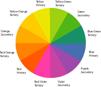
Attached is a low res night shot of the garden.I try to use as many colours from the attached colour wheel in order to create contrasts,i.e bright oranges against mellow blues and purples.As I said before night is rarely if ever black,there is always a hint of blue in the atmosphere.