@speaker said:
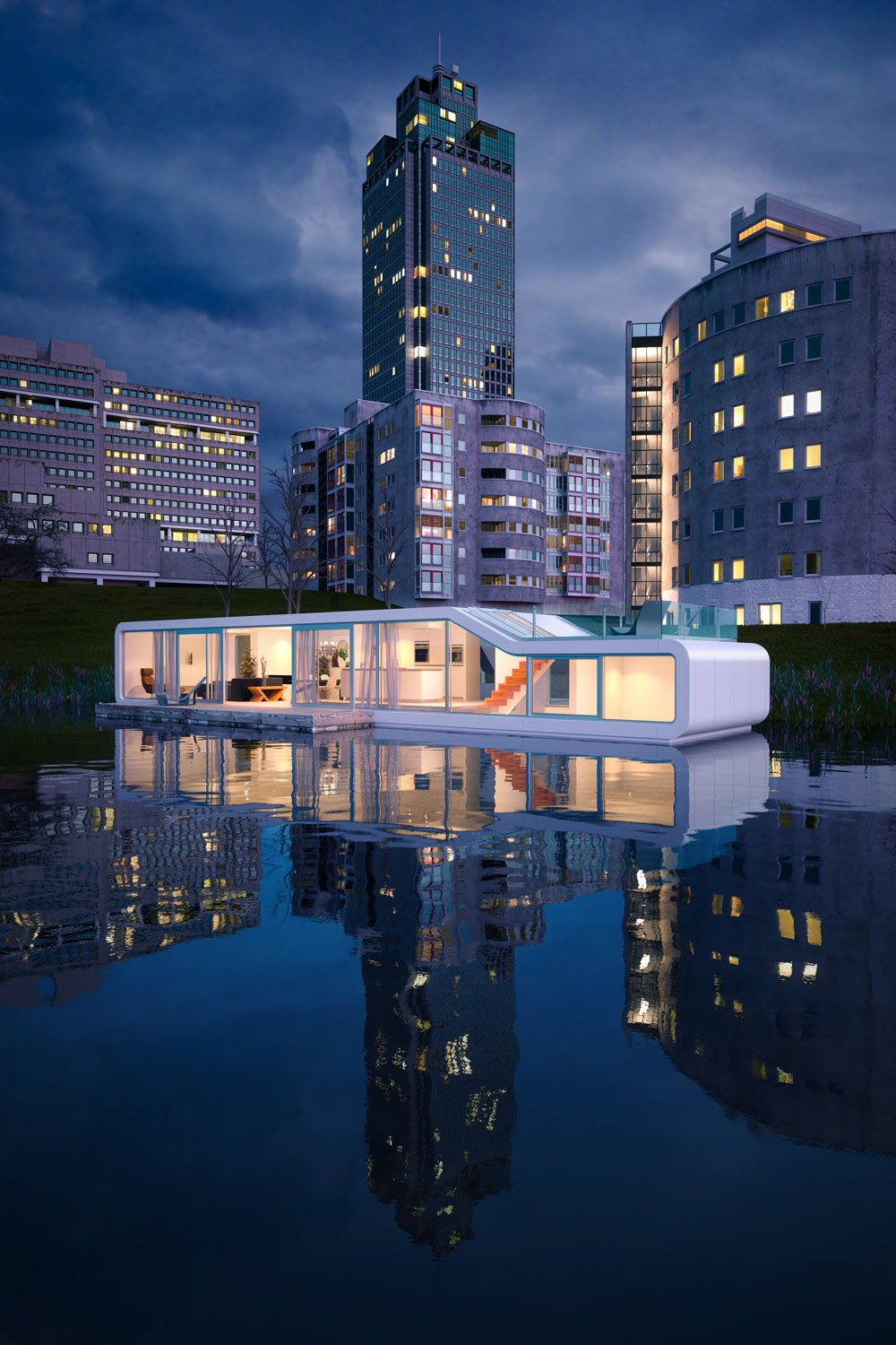
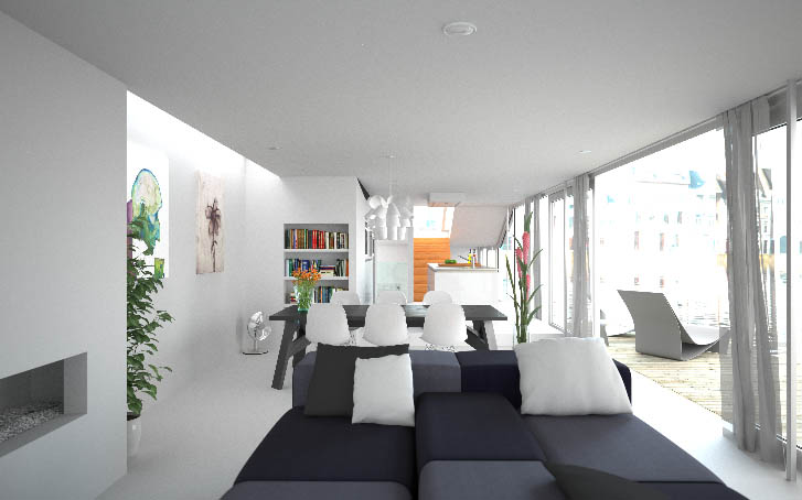
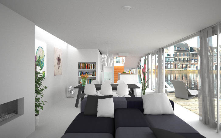
Brodie, if you compare your render to the reference, then you could see that your interior space is over exposed. In the reference- not even the brightest hot spot is brighter then the exterior space. A good rule of thumb is to keep the interior darker. It looks like you used a sky dome for lighting but for such an open space a physical sky or a HDRI would have been the better choice, because your render looks a bit flat, as if a sepia filter would have been applied, but the reference shows a nice contrast between the blue color that comes from the sky and the warm bounce-light from the sun. The over saturated stairs are also more of a distraction. The background buildings could be left at that exposure but the water is too light so the water line is lost and the reflections in the water are too distinctive.
I'm not sure I see the differences you're referring to. To my eye the exposure values are pretty comparable. Doing a few spot checks in photoshop it looks like the lightness values are within about 5 one way or the other. Blurring the images significantly to sort of equalize and average out the image to a unified value produces a similar effect with an overall lightness value difference of 1. The most significant difference, to my eye, is simply the warmer tones in my image which were intentional. The two bright spots in both images seem to be the exterior and the upper left where sun is coming through the skylight. When you say the water is 'too light' I'm not sure what the reference is. It seems to me that the water in my image is pretty comparable, again, to the source image in terms of exposure. Had I darkened it but left the buildings over exposed I'm not sure that would provide a realistic looking effect.
I can understand what you're saying with regards to the stairs. I did have my reasons, but I might agree with you on that one that I should have toned them down a bit. My thinking was to try and balance out an essentially white image with a few stronger colors to provide more visual interest - the intense greens and blues on the left, the orange flowers and books left of center, the stairs leading the eyes through what is essentially a long tunnel of a space, the pink flowers right of center and then the bright exterior on the right.
There are 3 lights in the scene. The primary light is, in fact, an HDRI and the other two are inconsequential. There's a large line plane behind and to the left of the camera to light up that area between the couch and fireplace EVER so slightly (turning it up too much destroyed the shadows on the pillows). And the last light is actually the background for which I used an .hdr emitter so I could control the exposure value in MXI(doing so in PS would have been terribly difficult with the translucent curtains).
-Brodie


 It is indeed lit by skydome. As I recall I tried HDRI first but didn't like the color cast I was getting and didn't find any noticeable difference when switching to skydome other than the fact that I could choose a white light so my final render was already 'white balanced' - a feature I wish I had control over within Maxwell. Both provided the same even light and very soft shadows.
