Mercedes Mansion
-
Do not feel much like modeling, but did decide to update an old render.
Raylectron render. Last rendered in 2021. It was... not bad, then. But when I look at the old and new side by side, it's almost embarrassing.
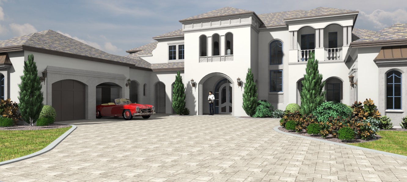
-
If your old projects surpass your latest then you need to lie down....
Revisiting past projects is a great way to improve


I would add ridge tiles to the roof and some rain gutters to level up a bit
-
@unknownuser said:
If your old projects surpass your latest then you need to lie down....
I'd prefer a pint at that point. And then a lie down.

Trims? Agreed. It needs them badly.
That will be the next update.
I'm also not happy with shadow contrast. It needs to be a bit softer.
-
Very nice.
Sometimes I go back to some old Sketchup models and shake my head at all the ungrouped elements in the model. I guess many of us have been at this for a long time now.
I used to neglect the ridges until someone mentioned it to me year many years ago.
You can still get my gutters, downspouts and conductor heads here here.
-
Thanks Gus!
-
Changes made and fixed some textures and changed lighting.
Two versions. Raylectron.
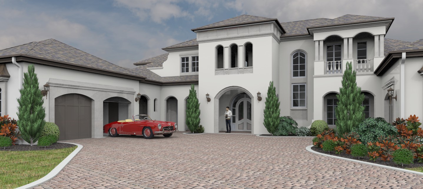
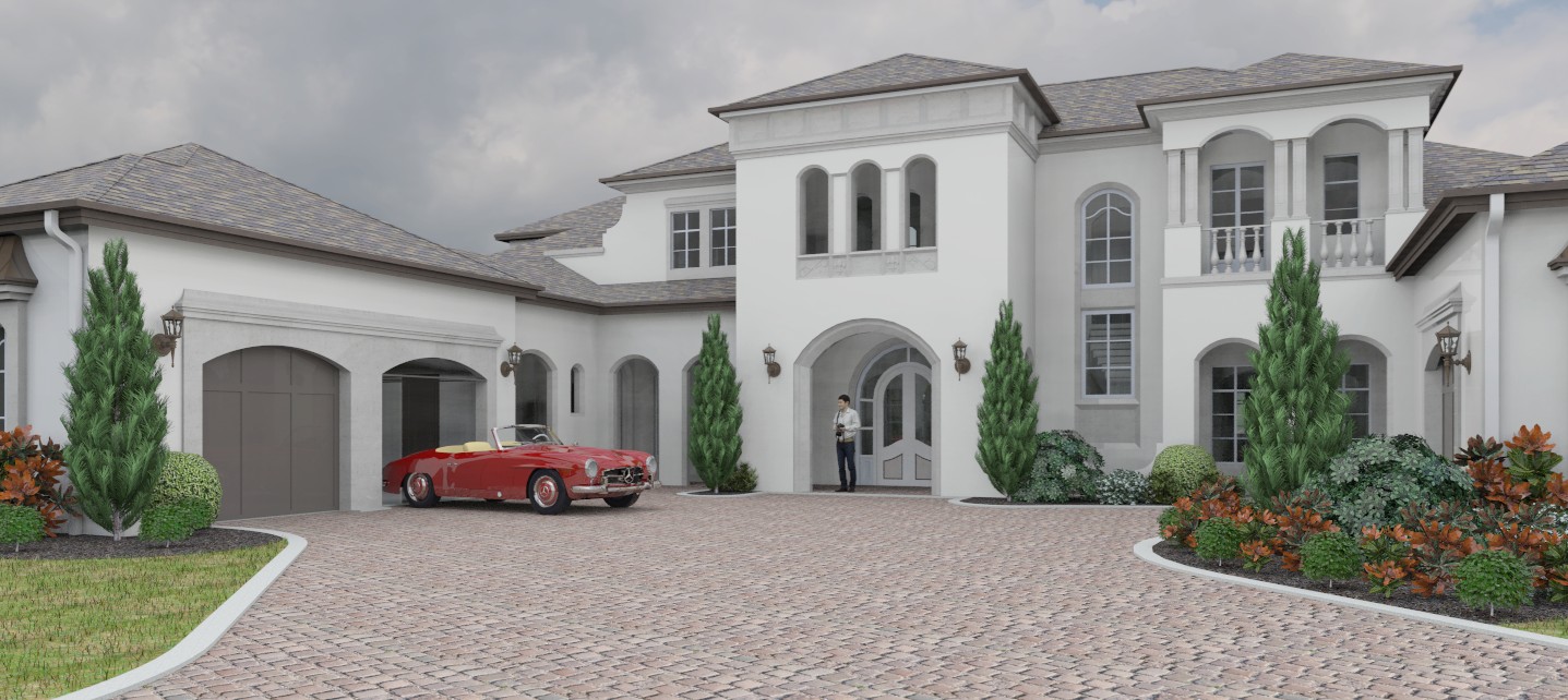
-
D5 render.
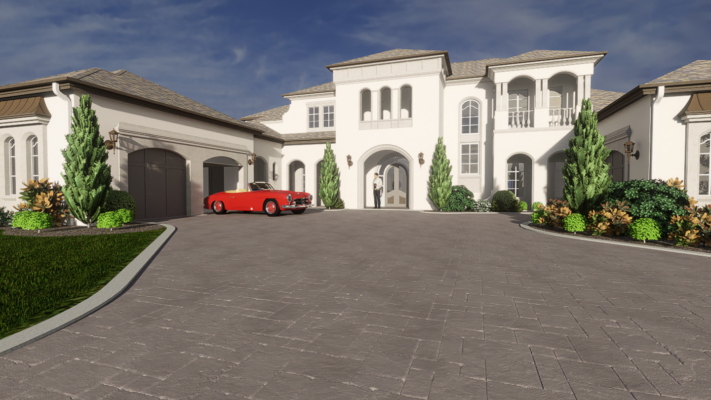
-
Good job Bryan. Curious about the D5 Render. Did you use a depth of field effect with it?

-
Thanks tuna.
Honestly, I like none of them. There is something about this model that is jinxed. It's from the warehouse and had problems from the start. For starters, nothing is grouped except the plants and the car I added. Super high number of faces for the foliage. Many planes are not flat. Color choices are weird.
And I just realized the non-flat planes may be the reason the renders are not quite right.
The D5 render is not using depth of field. It is using a stock sky dome HDRI.
I'm going to take one more stab at this and then move on.
-
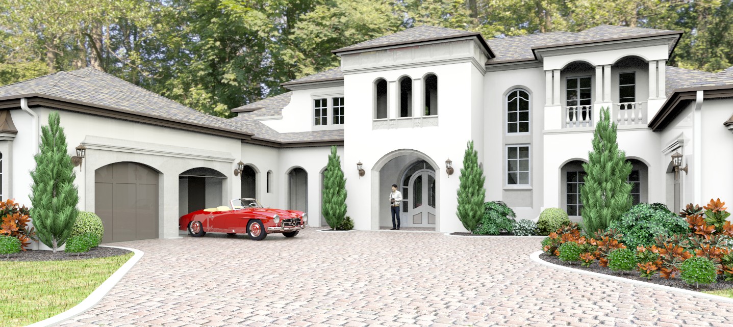
This will have to do. This model really is jinxed. It took 5 tries to get it to load into the render. I also found some foreground objects were double grouped, which also affects the render.
I changed the HDRI again and then pushed the settings past where I normally set them.
But I like this one better than all the previous ones.
-
Rather smashing actually.

-
@mike amos said:
Rather smashing actually.

Thanks.

I'm still not happy with it, but it's still better than all the previous versions including the first one from several years ago.
-
There are times/models and especially from the warehouse, that are so bugged you spend hours just cleaning them up and straightening faces etc so in the end, nothing feels worthwhile.
Sucks mate but instead of worrying about it I just move on as soon as the things get to be too much irritation.
-
@mike amos said:
There are times/models and especially from the warehouse, that are so bugged you spend hours just cleaning them up and straightening faces etc so in the end, nothing feels worthwhile.
Sucks mate but instead of worrying about it I just move on as soon as the things get to be too much irritation.
Yep.

Already considering my next subject. And there's some animation I need to try. -
Nice work Bryan, I would google "California palms" (Images) and use the feel of those images as a concept. Tall, elegant palms will transform that image with many palms and maybe some in the foreground also. Always practice safe design, always use a concept


-
@l i am said:
Nice work Bryan, I would google "California palms" (Images) and use the feel of those images as a concept. Tall, elegant palms will transform that image with many palms and maybe some in the foreground also. Always practice safe design, always use a concept


Good suggestions. I tried to work with the included foliage and in hindsight, I should have deleted it all.
The high poly count of the foliage also created many of the problems I had loading and working with the model. Even with my new PC, it just bogged everything down.
-
@bryan k said:
@l i am said:
Nice work Bryan, I would google "California palms" (Images) and use the feel of those images as a concept. Tall, elegant palms will transform that image with many palms and maybe some in the foreground also. Always practice safe design, always use a concept


Good suggestions. I tried to work with the included foliage and in hindsight, I should have deleted it all and added my own.
The high poly count of the foliage also created many of the problems I had loading and working with the model. Even with my new PC, it just bogged everything down.
I found some pretty nice low poly Palms, about 0.5 MB per tree. I bet if you got rid of the backdrop and existing trees you would be net better off. Whet I see that render my brain cries out palm trees very loudly, Anyway just a thought Bryan

3D Warehouse
3D Warehouse is a website of searchable, pre-made 3D models that works seamlessly with SketchUp.
(3dwarehouse.sketchup.com)
-
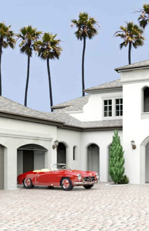
Forgive me Bryan but I could not help myself.
-
HOLLYWOOD!

Yeah, that looks fine.

-
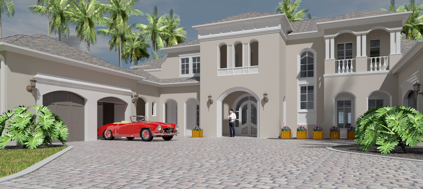
Many changes. Got rid of the stock foliage. That helped right away. Added L I am's palm trees. Got rid of the HRDI dome and used the render stock lighting and clouds. Fixed a lot of materials. A lot.
This model is still jinxed in some way. It took ten tries to get it to render. But I like this version as well.
Hello! It looks like you're interested in this conversation, but you don't have an account yet.
Getting fed up of having to scroll through the same posts each visit? When you register for an account, you'll always come back to exactly where you were before, and choose to be notified of new replies (either via email, or push notification). You'll also be able to save bookmarks and upvote posts to show your appreciation to other community members.
With your input, this post could be even better 💗
Register LoginAdvertisement


