House render, looking for input before I render
-
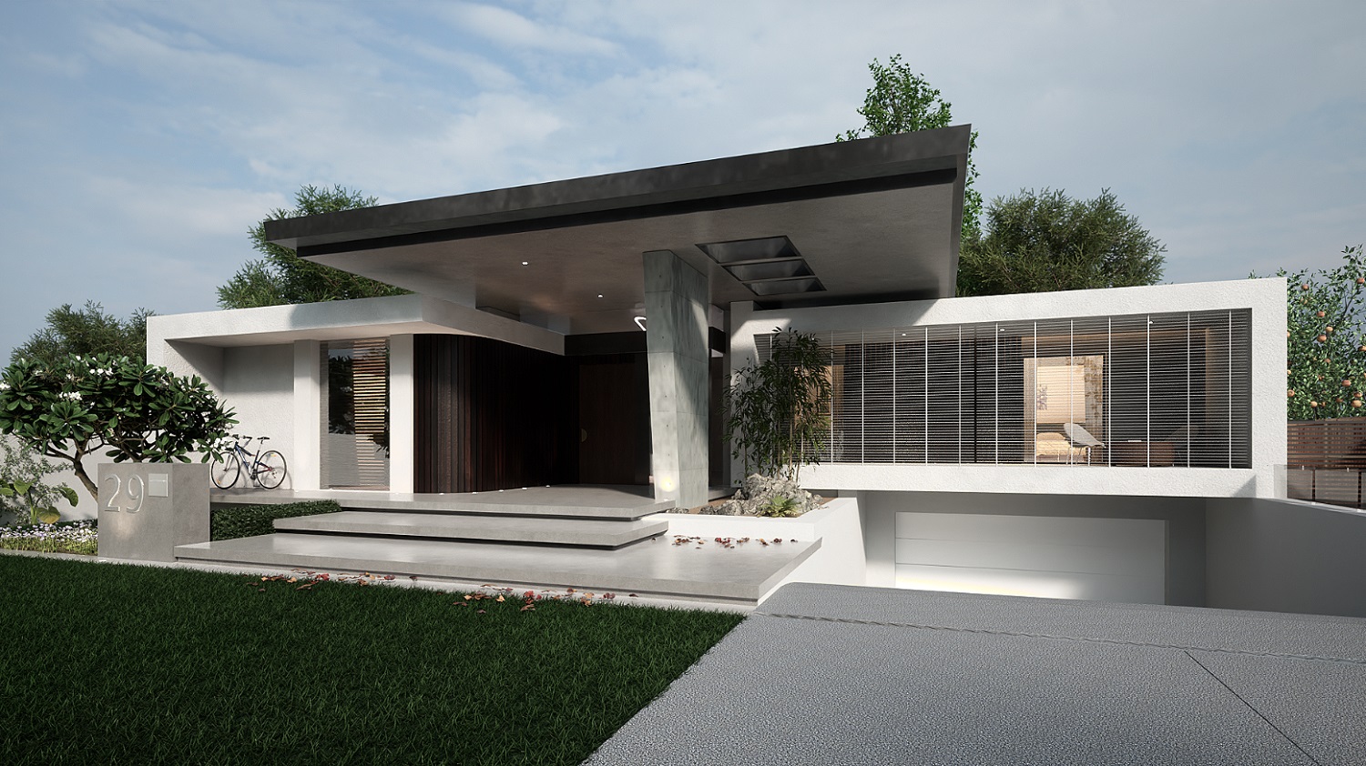
For me, this area is dark and is drawing your eye towards it...

The camera position is also causing the eye to converge towards this area...

Maybe change the sun position or the camera. Or both.
Overall, its very good result. TM is such good engine. Maybe some Megascan stuff to add even more realism?
-
Thanks hornoxx and Rich, Hornox I appreciate your suggestion very much but I aim for photorealism when I have mastered that I may try a more "arty" approuch. I get you point Rich, I will have a look at that. I was rendering this before I read the replies to post. This is the result of my first render.
-
...Hi Liam - given this really visual quality of this house, it could also be an option to aim less for a perfect rendering result (which, as we all know, often becomes an endless task) but more for a much more graphic solution? A rendering probably won't be that much better just because you invest time and sweat in superfluous banalities like a sofa, a ceiling lamp and a dog in the garden?
In my view, the quality worth emphasising here lies in the wonderful geometry, the successful combination of volumes, lines and proportions.
So how about an approach consisting of a fairly simple not too photorealistic render image, combined with SkUp graphic output, maybe any clay render + hiddenline, perhaps even sketchy with overdrawn lines + a striking graphic background etc.? just thoughts - a beautiful work in any case
(I know - even with such an graphic approach one can burn too much time and sweat

 but it's much more fun than waiting to see if any renderer calculates a shadow a nuance lighter or darker here or there)
 -
@l i am said:
... but I aim for photorealism...


either way - A great topic and I look forward to follow the development... -
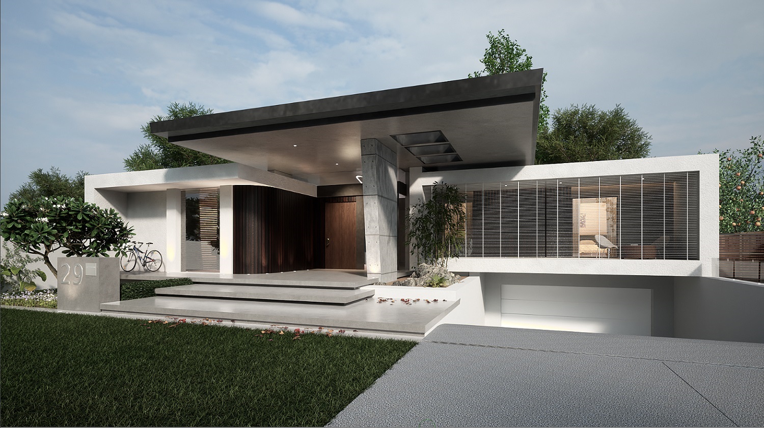
This is a version with some artificial lighting.........which when I think about it, it is quite ironic

-
When you feel that 'the need to add artificial light to produce photo realism' is ironic you may have missed the reality of a photo realism.
Photos are 'artistic realism', they use reflectors and lights and all sorts of trick to fake a believable reality. They don't show the lights and other mechanical helpers.
So think about what you want to achieve in you photo realistic render. Is it perfection of reality or a rendering that looks perfect.
You need to be aware of light sources and their direction but you can add light without having to show the mechanics of those lights if you do it carefully.
So, going back to Rich's comment about the dark hole at the front door, bring light into it but don't make it look like you bolted a flood to the ceiling and screwed in some floor lamps on the curved wall.
There is realism and there is Photo realism. and never the twain shall meet. -
Looks like you fixed the background trees which was something I was going to suggest. Looks good but I'm seeing some things that might need work.
-
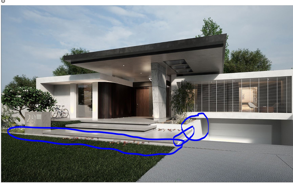
The retaining wall to the left of the garage door looks too bright and almost like it has an emitter. Perhaps tone down the reflectance value of that texture. I think maybe if you replaced it with the same material as the steps might work good.
-
The right edge of the steps makes me nervous seeing how it looms over the driveway and looks like a safety hazard. Possibly add a guardrail there with horizontal elements that match the style of the house. Also try pulling out the end about 4" to the right so there's a shadow below that edge. Right now it's flush.
-
The walk way in front of the steps needs to be wider somewhere around twice as wide.
-
Brighten up the grass.
-
Maybe replace the garage door material with the one you're using for the entry door but oriented horizontally.

-
-
Thanks for your input guys, very much appreciated and of great value


-
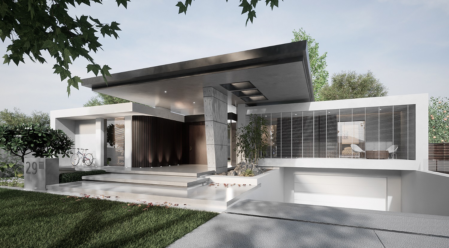
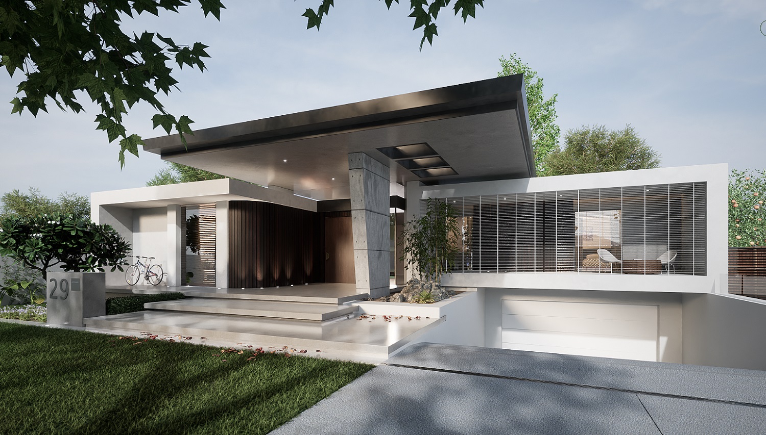
I have re rendered, and that is it for this image, am all rendered out
 I will post on a Kritta site for some post producyion advice.
-
Just a quick but, important point.
If we are going for 'photo' real then we should allow for the fact that the light will never be perfect. Shadow and light exist and are facts of life folks.
Like the advertising folk who fake products they advertise to make them more than they are, for the purpose of advertising. What is called 'photo' real in rendering is in fact anything but. The models in the ad agency look in my humble opinion.
So perhaps we have to have a way to properly describe what folk in rendering 'call' photo real......
-
That turned out great!

-
Whatever you call it, the render is very fine.
-
Cheers Mike and Bryan
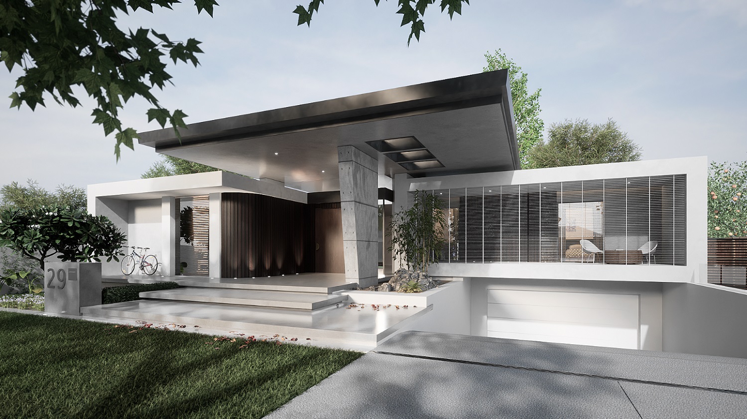
 I will lay this one to rest now. Did a bit of fake DOF with post production on the leaves. DOF in Twinmotion is pretty bad. Not much of a change.
-
Both are perfect!

They are photos.

-
prima!

-
Cheers Bryan and Hornoxx
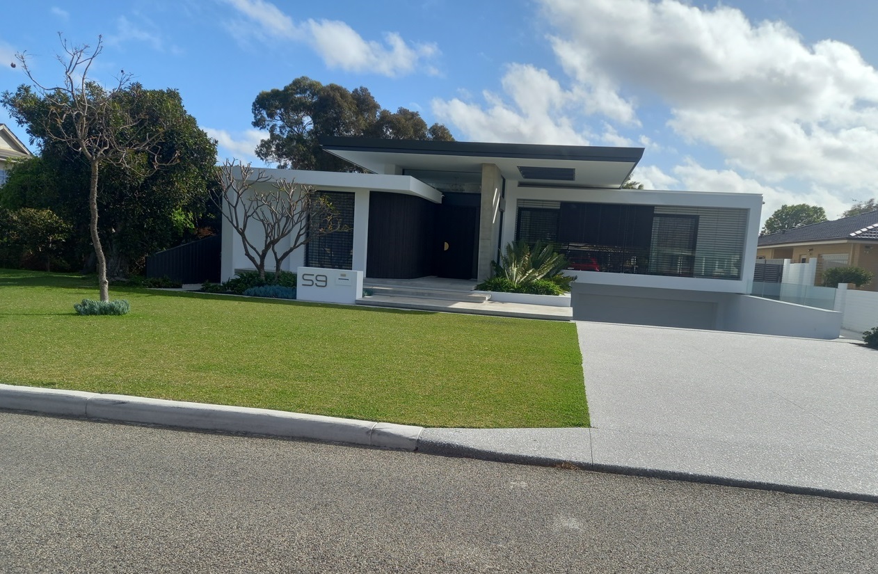
 Here is the image I took from the road, never knem I took such a wonky image I imported the image into SU and rotated it straight, I then used the door height as a scaling reference.
Hello! It looks like you're interested in this conversation, but you don't have an account yet.
Getting fed up of having to scroll through the same posts each visit? When you register for an account, you'll always come back to exactly where you were before, and choose to be notified of new replies (either via email, or push notification). You'll also be able to save bookmarks and upvote posts to show your appreciation to other community members.
With your input, this post could be even better 💗
Register LoginAdvertisement


