Show Me Your SketchUp
-
... and mine.
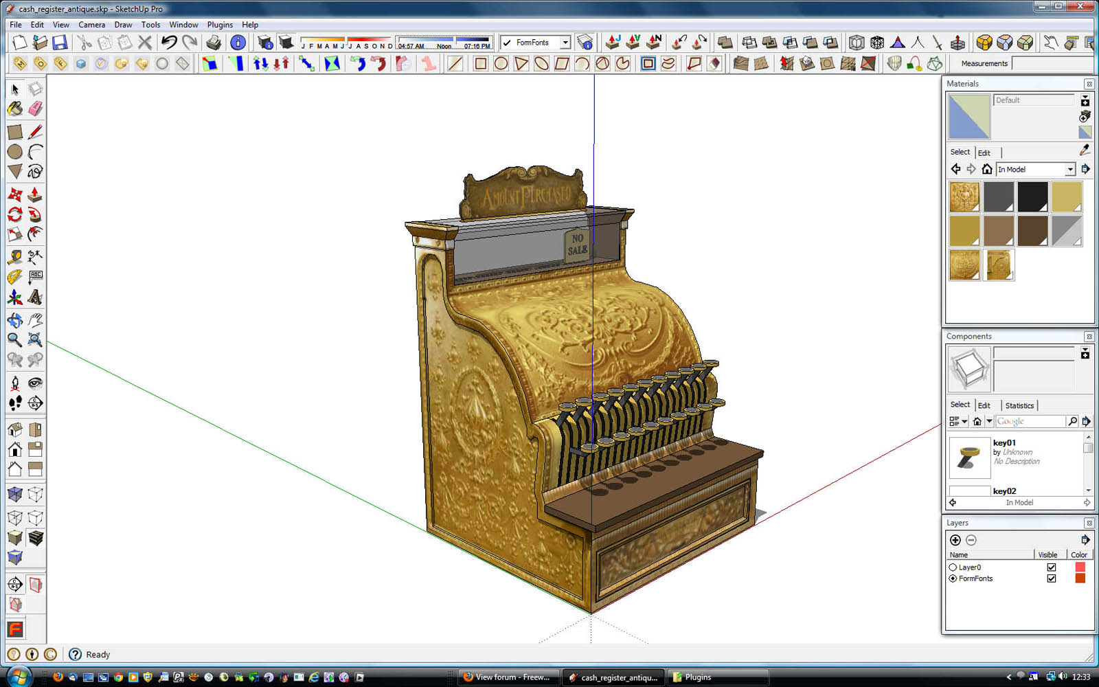
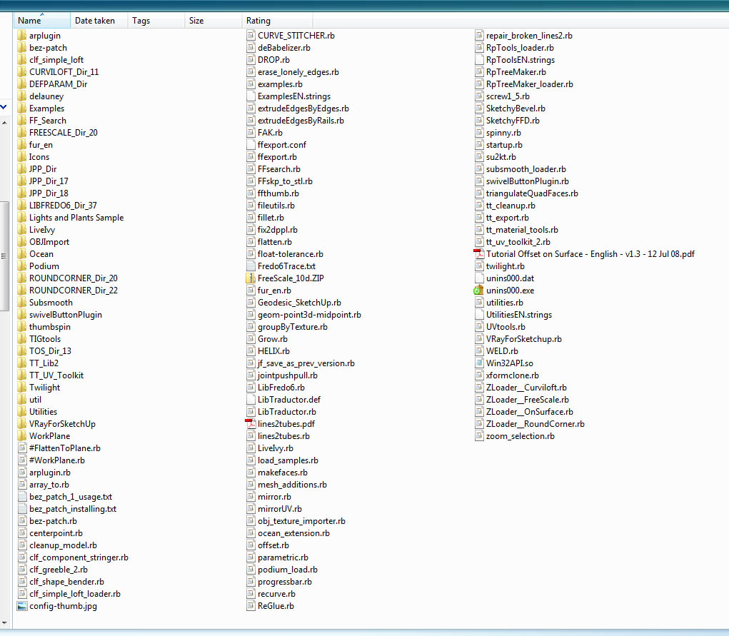
I really don't like to have the bars more than 2 icons wide/deep; I'd rather find them on the menus than take up any more real estate; and frankly, icons are harder to find the more rows and columns you have...and all those slight delays add up. However, the 3 palettes are open all the time. It would be nice if you could crush the Materials a little smaller, but there seems to be a limit beyond which it won't shrink any further.
-
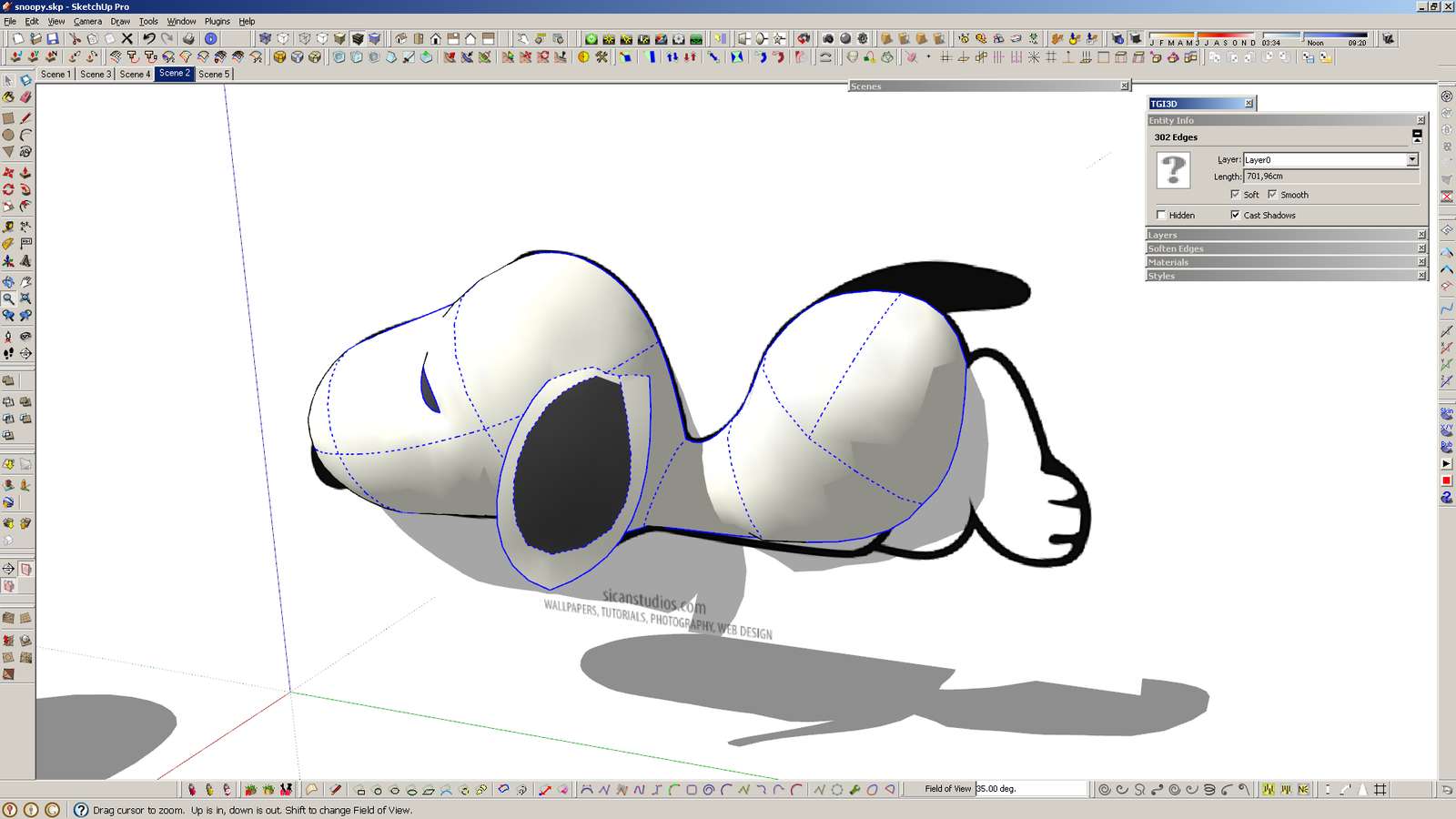
And here's mine - single screen.
It has never been so crowded before, because I have used very few plugins in the past. Now I'm trying out a lot of them, and probably I'll remove those that I don't use. And I'll probably move that right side single bar to the left side and make it a 3-col? I use shortcuts for everything, including show/hide dialogs/panels, so it's quick to get a clean screen.
-
@unknownuser said:
@pixero said:
I recently started to use a three icons wide toolbar at the right side
Looks to me it's on the left side.

not if Im standing on my head.
-
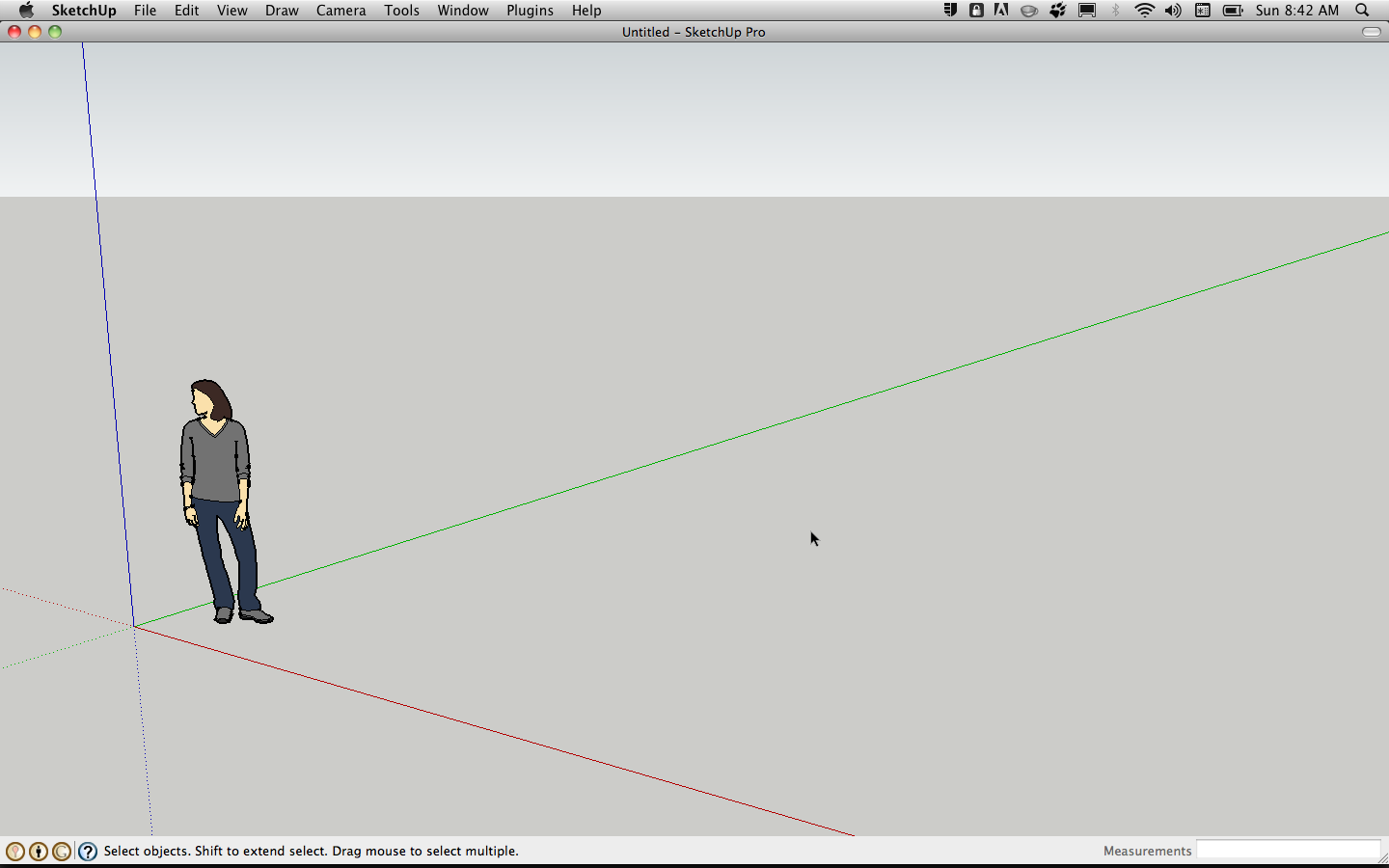
Just realized that I haven't shown you MY SketchUp yet. You'll probably all think this is kind of funny, but it is the honest truth. This is really how I use SketchUp– and I do use it pretty frequently, too. I have keyboard shortcuts memorized for the small number of tools I use, and use a keyboard shortcut (q, for no particular reason) to toggle my panels on and off.
john
.
-
Well, you Mac users...

I cannot believe that you do not get some share from Apple because the Mac version is much easier to customize!

-
@unknownuser said:
I cannot believe that you do not get some share from Apple because the Mac version is much easier to customize!
downside is you stuck with ATI cards.

-
-
Here's mine. I recently started to use a three icons wide toolbar at the left side both for getting all plugins in view and for not having a too wide and low workscreen. (I also use VRay and Twilight that is temporarily removed here.)
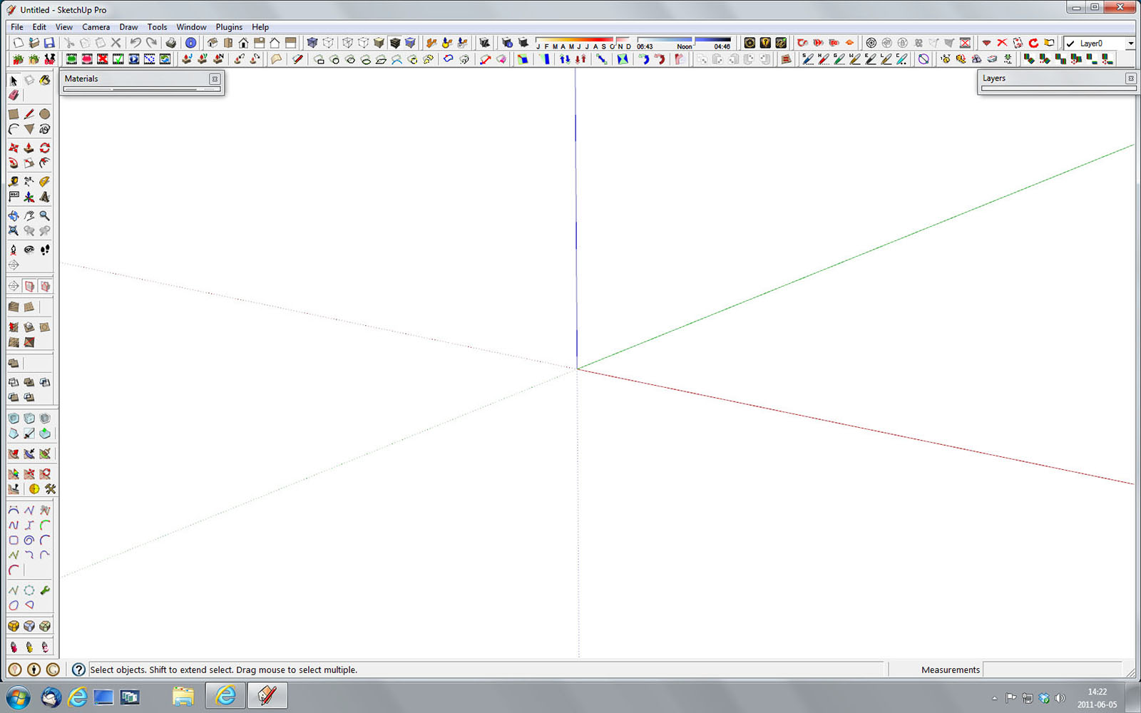
My plugins:
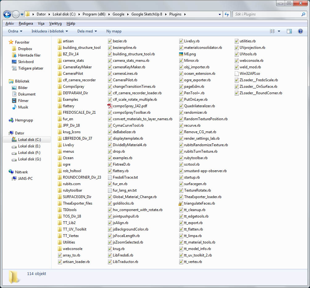
-
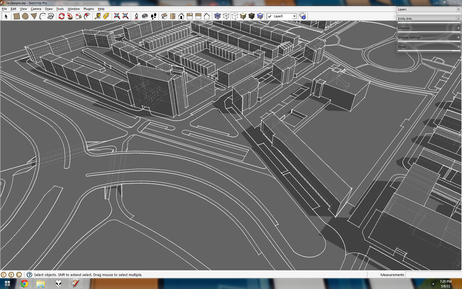
Very empty with, on occasion, an extra plugin toolbar on the left.
-
@jbacus said:
I use, and use a keyboard shortcut (q, for no particular reason) to toggle my panels on and off.
How do you toggle all the panels on and off with one key press? Is that on the mac only?
Since the start of my using sketchup (since version 5) I've been wishing to have a sort of KIOSK mode, that would hide all the toolbars and windows with a key press.
- It would be great for presenting a project (remove all the clutter)
- It would go well in conjunction with the sizer plugin which I've never used, because I don't wish to mess up my toolbars every time. (restore positions doesn't always work)
- Just like there is "restore toolbars positions" there could be several toolbar setups. 'presenting mode', 'render mode' 'editing mode' or any custom mode...
On the other hand, I believe that when a program is too customizable (UI and shortcuts) it can cause the program to be less appealing and messy in appearance and operation, for experienced users, and especially for new ones who have no idea what toolbar might be hiding where).
Take Adobe Photoshop for instance. In it's early stages, it was very tough to customize (shortcuts couldn't be changed). But once you've learned the shortcuts and the basic structure of the program, you were free to use it in your "native speed" on any computer it was installed on.
Right now I have 4 or 5 people sketchupping at work on different computers, and each has a different toolbar setup and it drives all of us up the wall finding things. Luckily I was quick to recognize the problem of over customization, and made sure that all computers had at least the same keyboard shortcuts setup (similar to photoshop shortcuts BTW). Half a problem solved...
Anyway, my point is, that over customization can be a hindrance if not tackled correctly!

-
Yeah, on macs, you can assign app specific shortcuts via system prefs.
Anything that is toggleable via the menus (such as the entity info panel etc) can also be done with a keystroke.Edit- fwiw, JohnB also has a collapsed toolbar on his screen that he can hide/show via that little button at topright. (and you can drop single icons from multi icon plugins up there if you want)
That said, at present, you can only have a single row of icons in the custom toolbar but it'd be nice if apple opened it up to two or more rows. -
Not as nihilistic as John, but i do minimise the toolbar frequently.
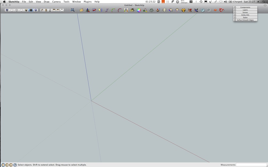
I suppose i would get a little more flamboyant if it were not a laptop 1680 x 1050.
-
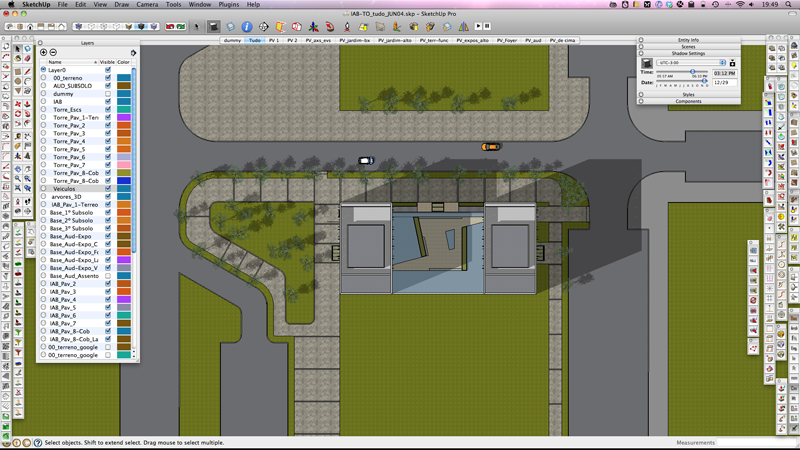
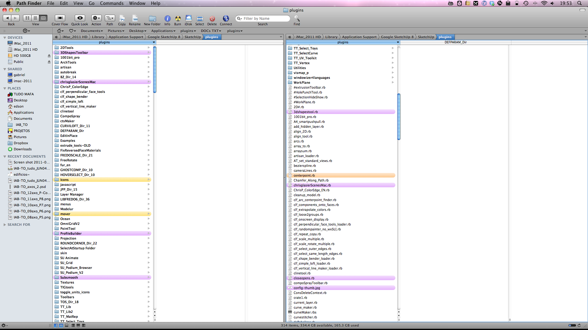
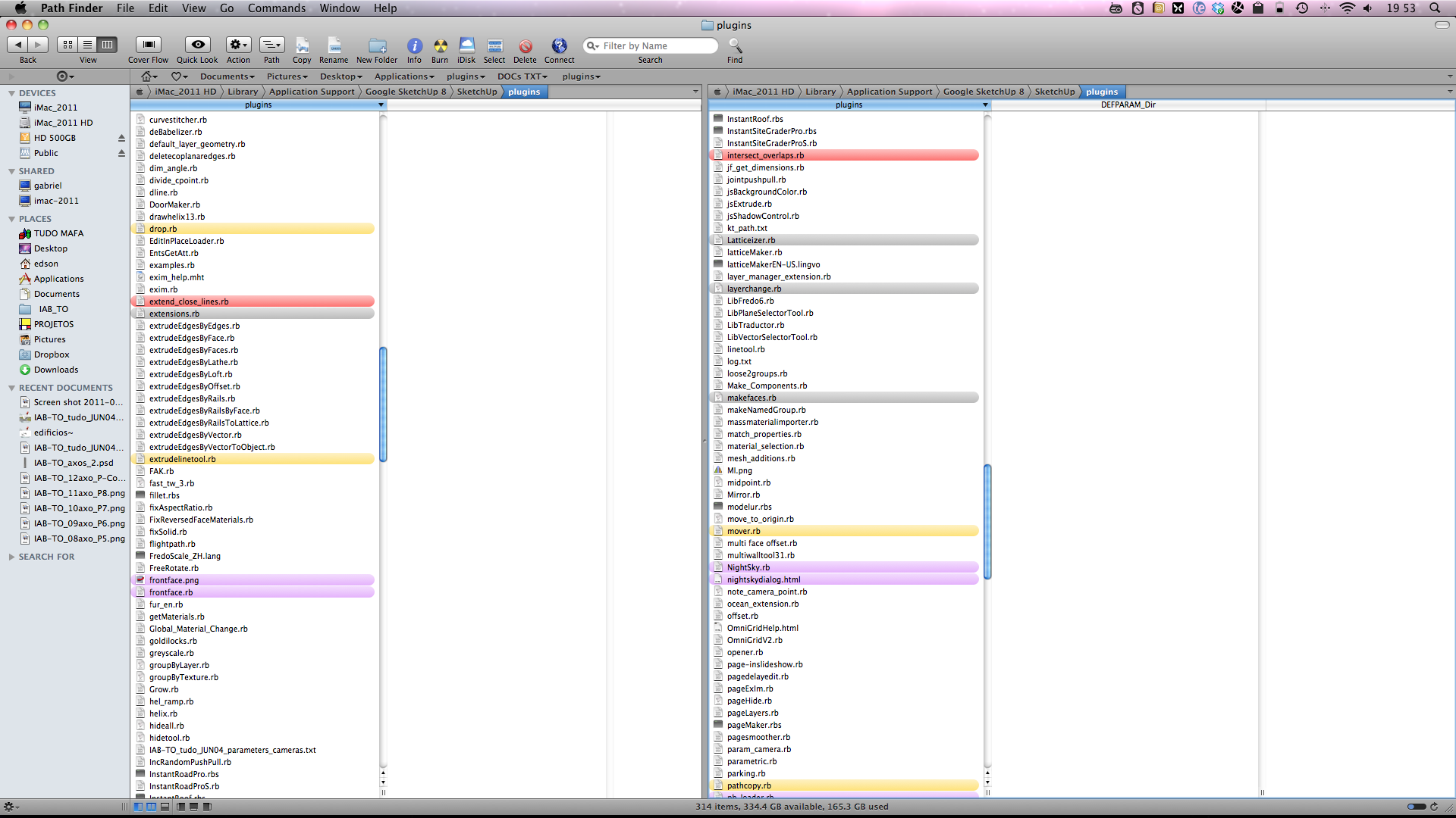
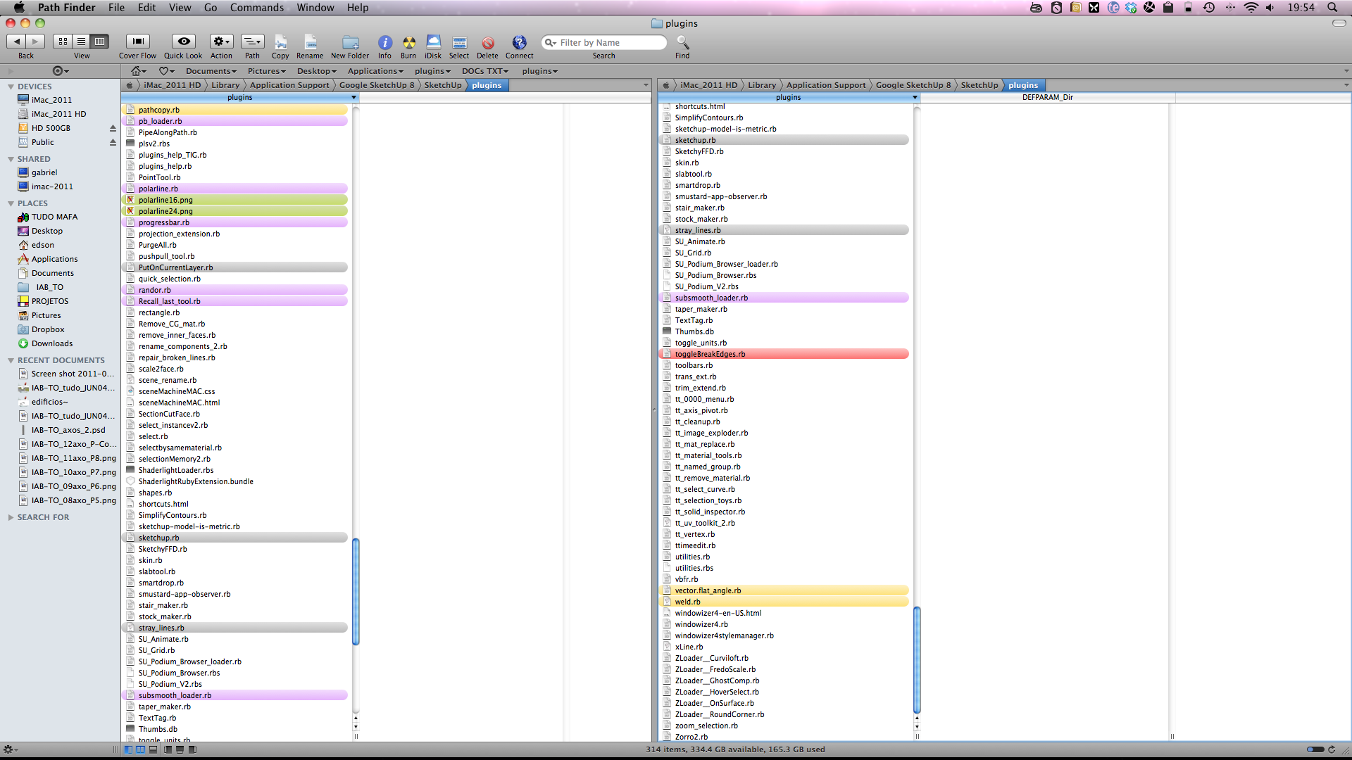
-
Here's mine...
-
This is my setup at my work computer. My home computer has similar setup.
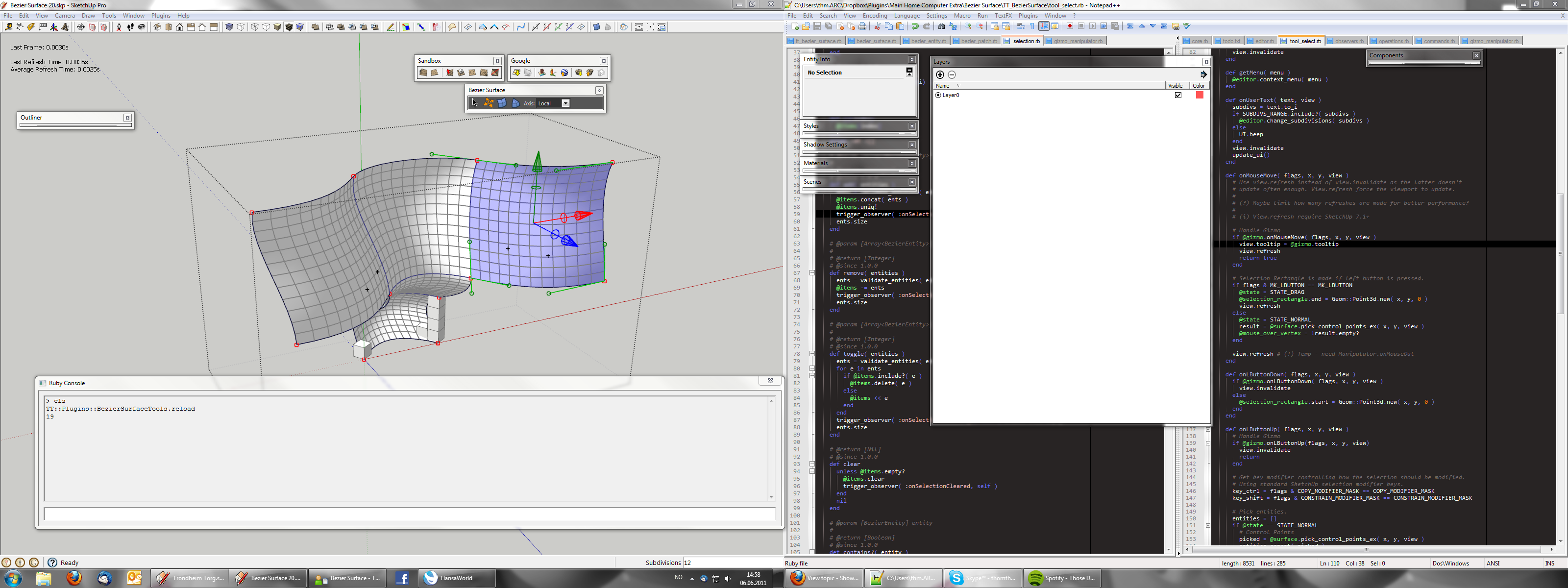
I try to keep installed plugins to a minimum. As well as any UI elements, which is why I use shortcut for frequent functions, toolbars for medium frequency and menus for low frequency. I roll up most ToolWindows when I'm not using them. (Though the Material window keep rolling down... nudge nudge*)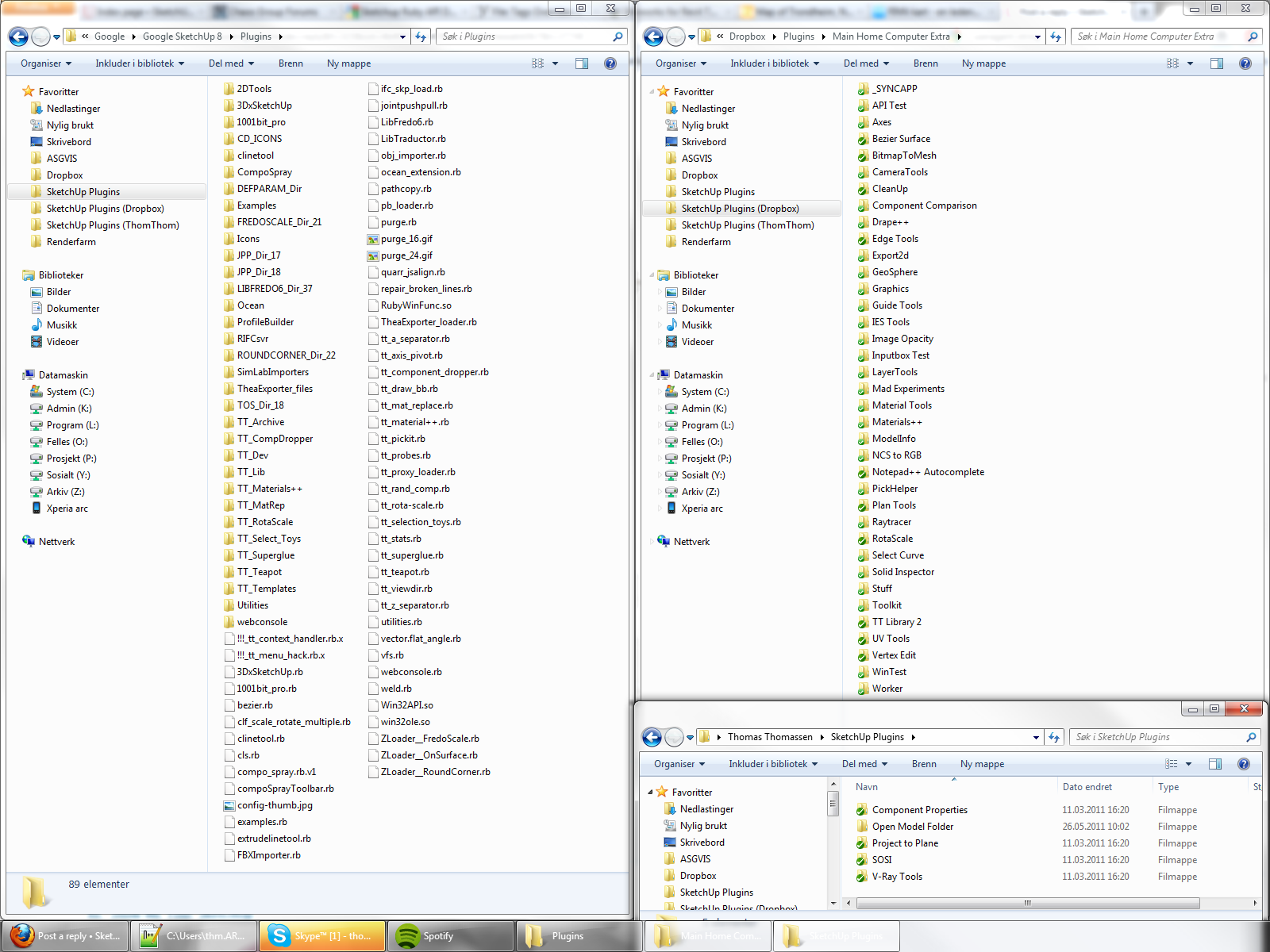
Since I use version control software for the plugins I develop I have isolated them into external folders - with a proxy loader. -
John,
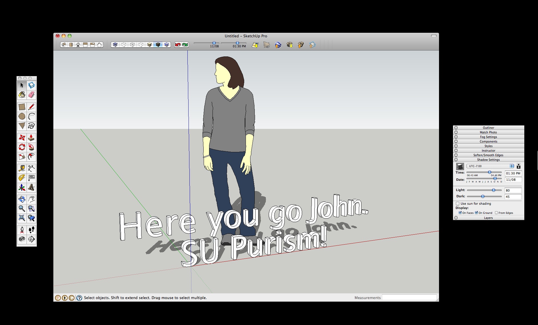
I like to keep it as pure as it was originally intended and still remains if one wants it be. I also use a useful little app called DOODIM which allows me to turn my cluttered BumpTop desktop to black! This helps me to focus on the app I am working with. I don't like filling the screen with any application window particularly on the MBP.
Mike
-
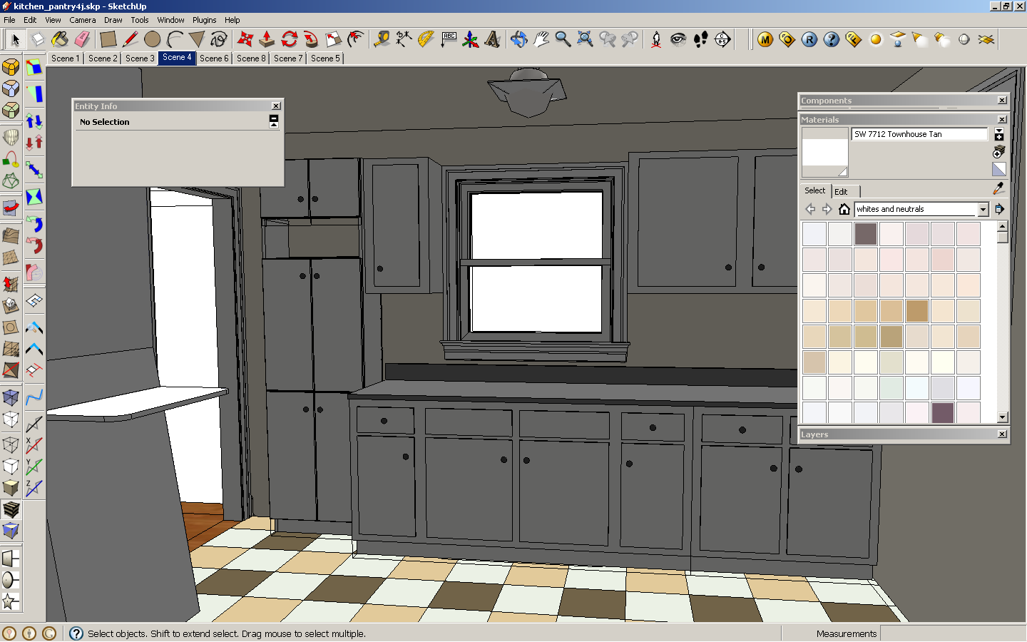
Hey, this is a great thread! It's helpful to see how other people have their workflow. I agree about not having the buttons too deep, I've pared down my visible ones as much as possible. Gaieus, good suggestion about the customizing plugin, there are some long toolbars where I only use one or two features so they end up in the menu only.
-Andy

-
This is what works for me at this time.
-
-
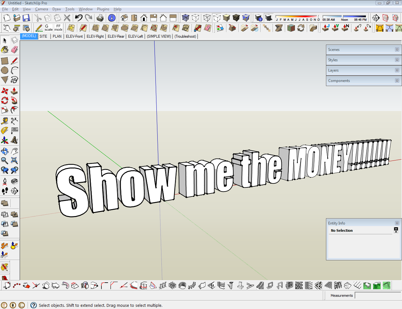
And here is my SU workspace :
![2011-06-07 09h14_13 [1280x768].png](/uploads/imported_attachments/VIak_2011-06-0709h14_131280x768.png)
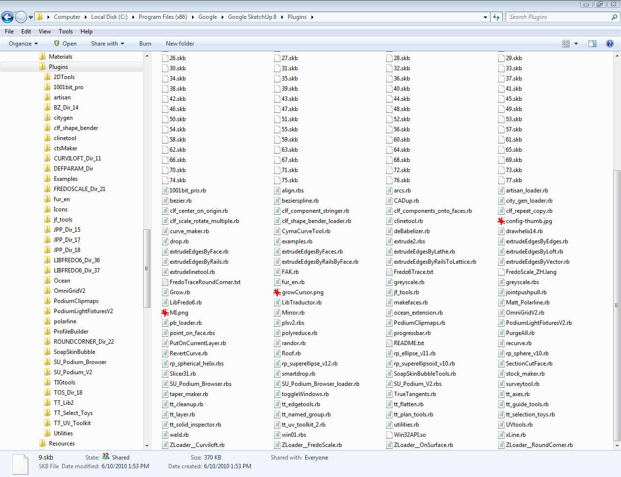
And my plugin folder :
![2011-06-07 09h17_21 [1280x768].png](/uploads/imported_attachments/sqoH_2011-06-0709h17_211280x768.png)
These screenshots was made after a recent reinstall, so all the plugin i'm using are not present, only the most used.
Regards.
Hello! It looks like you're interested in this conversation, but you don't have an account yet.
Getting fed up of having to scroll through the same posts each visit? When you register for an account, you'll always come back to exactly where you were before, and choose to be notified of new replies (either via email, or push notification). You'll also be able to save bookmarks and upvote posts to show your appreciation to other community members.
With your input, this post could be even better 💗
Register LoginAdvertisement


