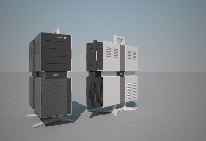
New PC tower design
-
Looking good.
-
Cool looking rigs mate.
I'd suggest the legs be in a material that non conductive, just incase someone wants it on a carpet (learned that expensive lesson once, static electricity fries chips)
-
@solo said:
Cool looking rigs mate.
I'd suggest the legs be in a material that non conductive, just incase someone wants it on a carpet (learned that expensive lesson once, static electricity fries chips)
wait, grounding wouldn't prevent problems?
my tower is all metal and though i don't place it on the carpet, i don't think apple would sell them if carpet&static electricity would cause issues.
-
Just a question, wouldn't the "waist" make it hard to fit the motherboard and fan for the processor?
Also I believe it might reduce airflow inside. -
Richard, assuming that you've sorted out Jan's question about fitting the motherboard, I'm thinking you could find someone locally to bend that out of some sheet metal for not an awful lot of money. Have it done in aluminum or stainless steel and skip the paint. Or look around for someone who does powder coating to paint it. Standard paint colors like white or black would be inexpensive.
What if you combine some wood with the metal case? Black case and maybe maple for the feet and the handle at the top?
-
Built my own computer few years ago. Much more important than the outside look is the inside.. You have the power supply, the cabling and the PIN outs, most have the EMI shields and the foot print holes for the industry spec mother boards, drive rails, all the cooling tunnels etc.and the all the mounting hardware( 100's of parts). I bought an ANTEC SonataII and think it has a nice look when the door is closed. This can be a huge design under taking
-
@pixero said:
Just a question, wouldn't the "waist" make it hard to fit the motherboard and fan for the processor?
Also I believe it might reduce airflow inside.Mate the actual box is BIG! The tummy band is the same width as a normal box! The drive bays arn't in proportion! This overcomes a lot of Mac1's concerns too! Ample room is allowed for all!
Dave R, mate I did on the weekend play further to simplify the whole legs and outer case setup and also to consider how simply it could be made from really simple sheet work and much of the internals modded from another case.
The WS case (second version posted) I consider I'd love to house s cheap simple sandybridge render node/s later - all in the one case - hence the size!
-
@pixero said:
Just a question, wouldn't the "waist" make it hard to fit the motherboard and fan for the processor?
Also I believe it might reduce airflow inside.Mate the actual box is BIG! The tummy band is the same width as a normal box! The drive bays arn't in proportion! This overcomes a lot of Mac1's concerns too! Ample room is allowed for all!
Dave R, mate I did on the weekend play further to simplify the whole legs and outer case setup and also to consider how simply it could be made from really simple sheet work and much of the internals modded from another case. I like the timber idea - though has it's issues. I like the idea of such a case sitting next to a RedBull F1 car in the pits hence a little it's case design.
The WS case (second version posted) I consider I'd love to house s cheap simple sandybridge render node/s later - all in the one case - hence the size!
-
Are you building a computer or furniture??
IMO designing then building the computer is the first effort. You can then jazz it up with a fancy enclosure if you so desire with fans, ups retractable tops etc, etc. I made my design big to start with for several reasons. PC junction temp is the driver for life so good cooling to keep the delta T down is most important. Second I wanted to be able to modify easily so when our MS, Intel friends make changes and OEM guys want us to buy a new PC mine is just an upgrade. It is getting old now, about 5 years, but had a 3.2GHZ CPU for that time. No PCI express so that maybe the next step or wait for next major step which will probably be to get rid of all the cables and have one optical interface=> not external cable races etc. HEY!!! Flexibility should be the name of the game. -
Mate I understand all you are saying!!
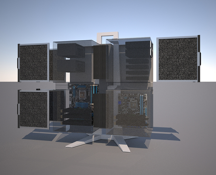
Here is a bit of an evolution on the design, with slide out dust filters and slide out cable store.
Also a crap rendered version with the cover in plastic to see the interior layout 1366 socket board left / 1155 socket right (render node) - Radiators centre.


-
I like it. SO it is almost the size of four PC cases? Lots of room for expansion and cooling.
-
Dear Richard,
Don't forget to look here for bits and pieces:
Regards,
Bob -
@dave r said:
I like it. SO it is almost the size of four PC cases? Lots of room for expansion and cooling.
Yes Dave it is BIG - not quite as big as 4 mids but not that far off!
-
@watkins said:
Dear Richard,
Don't forget to look here for bits and pieces:
Regards,
BobWow thanks Bob! That's a great resource! Rich
-
Why not perforations for the venting? So much easier to fabricate, thus reducing cost, and a cleaner look.
Looks good though

-
@richard said:
Mate I understand all you are saying!!
Here is a bit of an evolution on the design, with slide out dust filters and slide out cable store.
Also a crap rendered version with the cover in plastic to see the interior layout 1366 socket board left / 1155 socket right (render node) - Radiators centre.[attachment=1:wq8lzf6s]<!-- ia1 -->AutoSave_NEW-PC1.jpg<!-- ia1 -->[/attachment:wq8lzf6s][attachment=0:wq8lzf6s]<!-- ia0 -->CASE-explode.jpg<!-- ia0 -->[/attachment:wq8lzf6s]
Love your work, but just a suggestion raise or lower your view point to keep the horizon line from aligning with strong edges in your design. It really messes up the perception by "pulling" said elements bact to the horizon.
-
@unknownuser said:
Why not perforations for the venting? So much easier to fabricate, thus reducing cost, and a cleaner look.
Looks good though

Thanks mate! The vents are actually cheaper funnily enough, as they are both commonly done and the tooling permits them to be pressed in easy!
Perforating would required the drilling of each hole!
There are two reasons for going this way - one to get just that bit of industrial look to it and second to aim the vents in the direction of air flow dragging in cold from low and pushing out air from high with some added noise reduction effect in theory!
-
@roger said:
Love your work, but just a suggestion raise or lower your view point to keep the horizon line from aligning with strong edges in your design. It really messes up the perception by "pulling" said elements bact to the horizon.
Your spot on mate! Not such an exercise at producing a nice picture at this stage, just lazy - I should have set up a studio scene though couldn't be buggered really at this stage! Dam that lazy!
-
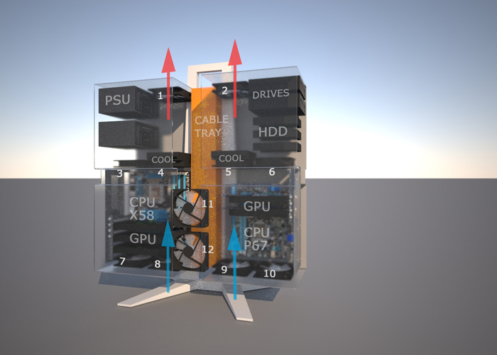
Here is that case a little more developed!
The concept is generally to maximise air flow, cooling and functionality of modular spaces to maximise opportunity for upgradeability! Also given each space is same sized, the option (with some clever considerations) to reorganise the layout or change use configurations might exist.

-
I ordered a new computer recently and while doing research I came across this case which might offer some ideas about arranging components:
http://www.slashgear.com/thermaltake-level-10-pc-case-with-bmw-designworks-0636768/
Hello! It looks like you're interested in this conversation, but you don't have an account yet.
Getting fed up of having to scroll through the same posts each visit? When you register for an account, you'll always come back to exactly where you were before, and choose to be notified of new replies (either via email, or push notification). You'll also be able to save bookmarks and upvote posts to show your appreciation to other community members.
With your input, this post could be even better 💗
Register LoginAdvertisement


