BauHaus
-
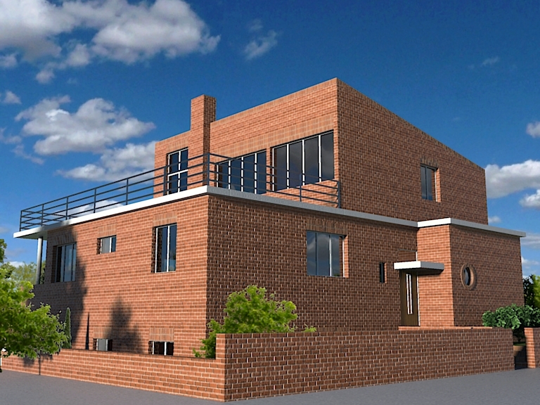
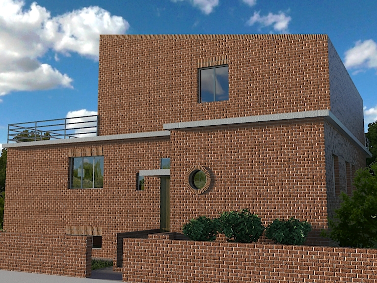
Gaieus, it is quite good render. My coment would be that window frames are never done in front of wall planes . They are always set back in the reveals. I would say 75 mm min. and maybe even 100mm. The only other thing is that kerbs read like ridge tiles. All in all nice render....believable.

-
Dear Gaieus,
What a good idea to initiate this architectural thread based on an extensive documentation.
We are surely going to take fun with some plans to elevate.+++simon
-
csaba,
please keep us posted on your progress with modeling and rendering this architecture. great stuff so far.
-
@sepo said:
My coment would be that window frames are never done in front of wall planes . They are always set back in the reveals. I would say 75 mm min. and maybe even 100mm.
@gaieus said:
(and of course, one big mistake I made that I should have "inset" the windows but as they are 4 different components only, this will be some 5 minutes to fix)
Will do...

@simon le bon said:We are surely going to take fun with some plans to elevate.
I think there is no much secret in these plans anyway so when I am done with them, I might even give away all the skippies, as well to the community to play around with them...
@edson said:
please keep us posted on your progress with modeling and rendering this architecture. great stuff so far.
I will, Edson, so all the architects here can "enjoy".

-
BauHaus and Le Corbusier were probably the most influential of the Modern architects in Europe and they continue to influence to this day. Arguments can be made for others, but these 2 are the most well known.
Enjoy the exhibit! Lucky you!
-
@sepo said:
Gaieus, it is quite good render. My coment would be that window frames are never done in front of wall planes . They are always set back in the reveals. I would say 75 mm min. and maybe even 100mm. The only other thing is that kerbs read like ridge tiles. All in all nice render....believable.

Well spotted Sid

-
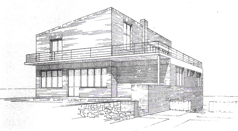
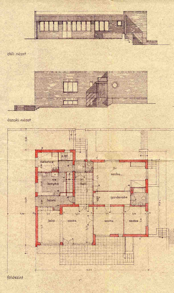
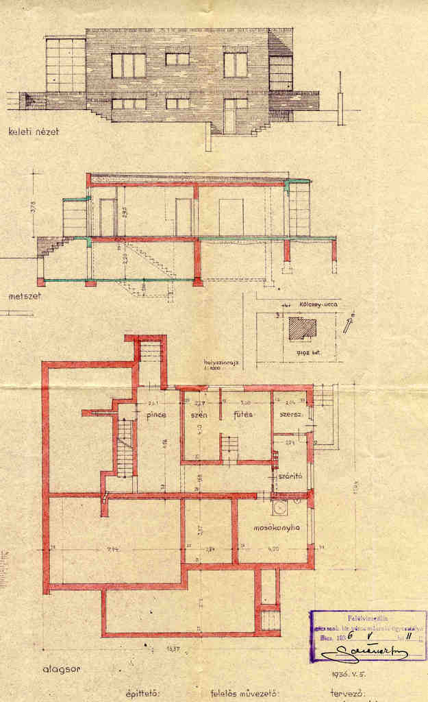
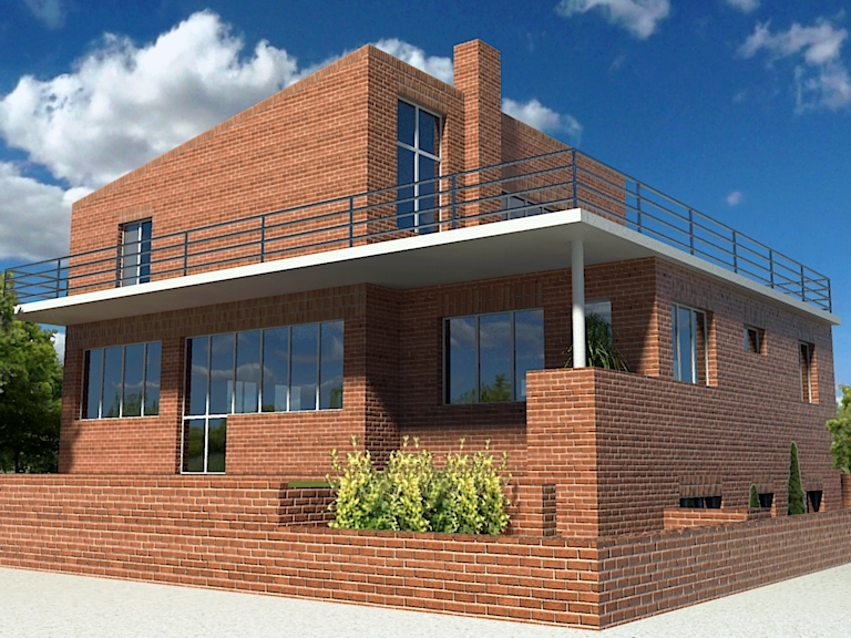
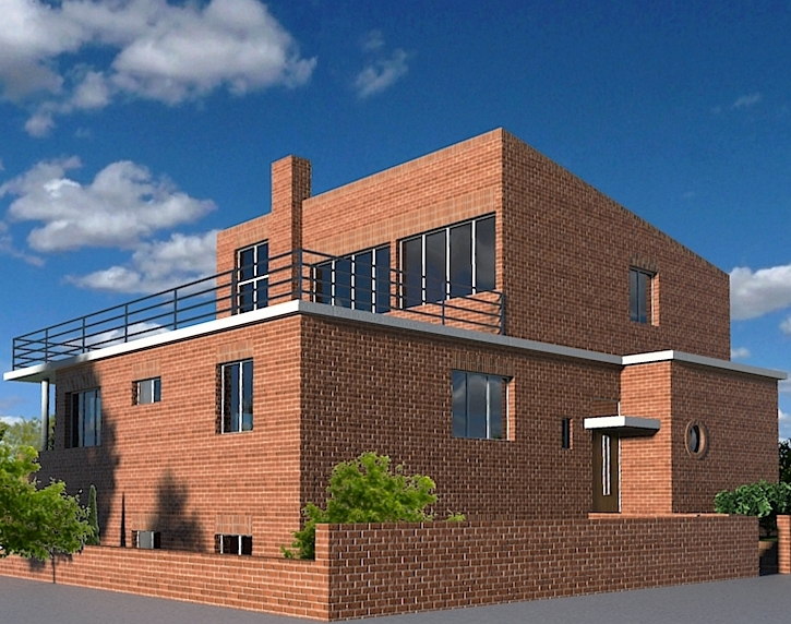
Another one - the so called "Zehmeister House" by Forbát again.
Even the two plan and elevation drawings do not perfectly match but what I really had to do was to combine those with a concept drawing that had one extra floor and a terrace on the flat roof.
The concept drawing
South and north elevation and ground floor plan
East elevation and basement plan
Some renders...
-
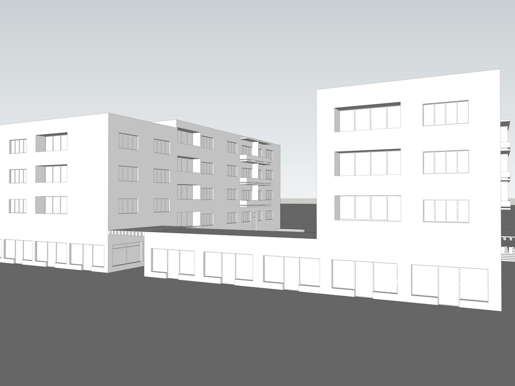
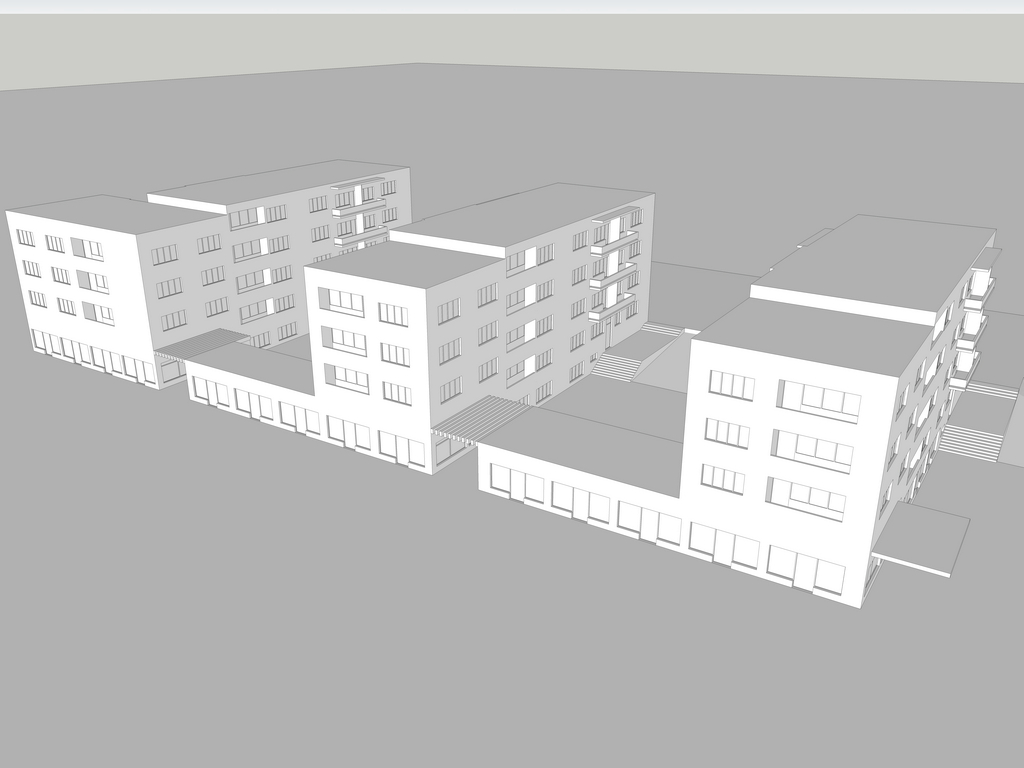
Another project - a whole block (also by Forbát). This has never been built however there are now similar "BauHaus-like" buildings on that corner.
No renders (yet). I really do not know what to do with this as it is right in the middle of the town and without its surroundings, it does not show too much.
-
Yet another one by Forbát. This was eventually built although not by his design but very similarly. The image is what it looks today, not my render...

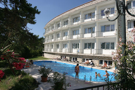
and the design by Forbát:
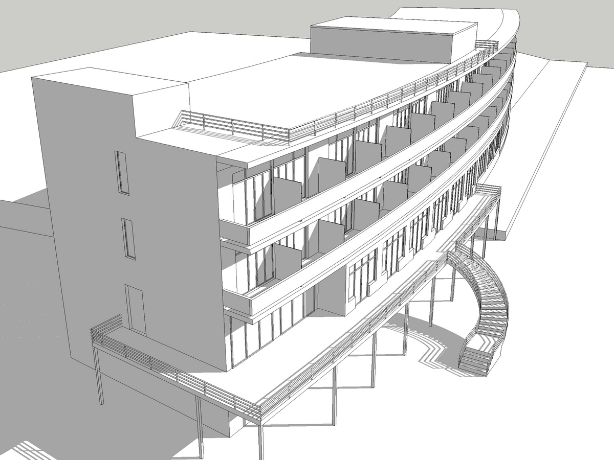
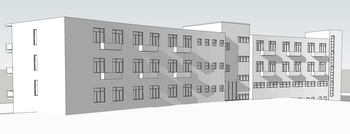
-
First rendered model looks much better now. I have just one comment regarding that model and it is thickness of the coping. In your model it looks like 150mmm or 200mm although in reality it is usually about 50mm thick.

-
@sepo said:
First rendered model looks much better now...
Thanks

@sepo said:
...I have just one comment regarding that model and it is thickness of the coping. In your model it looks like 150mmm or 200mm although in reality it is usually about 50mm thick.

What? I can see no problem with that!

Edit; just joking. Thanks for the crit; I have changed that coping

-
csaba,
keep an eye on those converging vertical lines. good photographers never allow them to happen.
-
Yes, I read these suggestions... But that's actually how perspective would work!
I could do two-point perspective (or at least lower the FOV) but the demand was to do the renders from street level (also there is nothing much in the background and I did not want that to be too apparent).
-
Reads correct now

-
if you make the observer look to a point exactly as high as his eyes tehre will be no convergence and the shot will still look natural. I do this by placing two equal edges as the point of view and the view. then I use the position camera tool, clicking on the first edge, keeping the mouse button pressed down and then release it over the second edge. I hope this helps in any way.
-
Gai I know that you can correct the perspective directly in SU, but if you are in hurry you could also try ShiftN a great, free little program to do that in post pro in just a couple of seconds.

-
Yes Edson but what I say was that first of all I had to do it from street level ten not from too far as there is nothing around the building. In this case you cannot do much else but look "up" which will create the perspective distortion. Of course thanks for these suggestions and whenever I can I do (and will) use them.
Massimo; interesting app and thanks for the link!

-
@gaieus said:
Yes Edson but what I say was that first of all I had to do it from street level ten not from too far as there is nothing around the building. In this case you cannot do much else but look "up" which will create the perspective distortion. Of course thanks for these suggestions and whenever I can I do (and will) use them.
gotcha. sometimes you are so close to the building that there is no disguising the perspective effect.
-
Yeah. And they were actually so much in a hurry that altogether I spent like two days effecting modelling-rendering them. So there was no time to add entourage and such - almost everything in there has the sole purpose to cover the missing backgrounds.

-
Gai, you might want to darken and perhaps desaturate the glow-in-the-dark plants on the shadow side of the building.
Hello! It looks like you're interested in this conversation, but you don't have an account yet.
Getting fed up of having to scroll through the same posts each visit? When you register for an account, you'll always come back to exactly where you were before, and choose to be notified of new replies (either via email, or push notification). You'll also be able to save bookmarks and upvote posts to show your appreciation to other community members.
With your input, this post could be even better 💗
Register LoginAdvertisement


