Rendering Workshop - Studio - still life
-
That's not fair, Chris. If I had been told that I can have too apples, maybe I'de've joined, too!

-
Just to make me feel better Chris!!
 - you go and get more apples and a drink - I hope thats vodka in that glass cos I'm ready for it right about now!!!!
 -
Thanks for the improved model Solo.

A 'render tip of the week' could be: no good renders without good models.Here's my entry:
Skindigo:
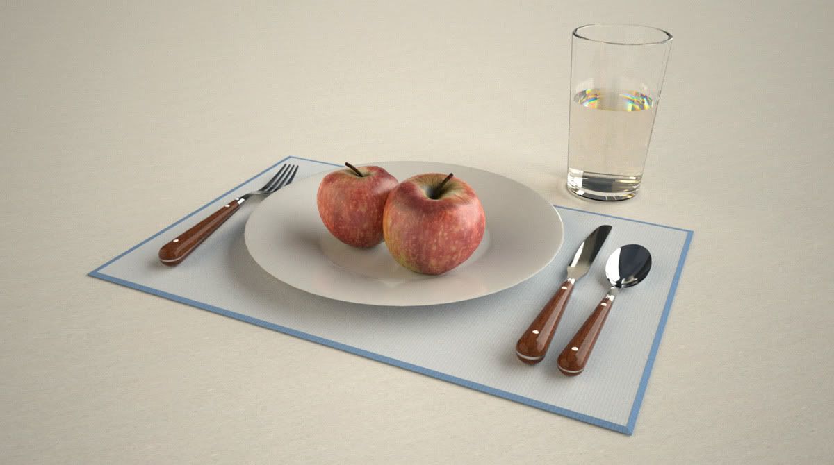
-
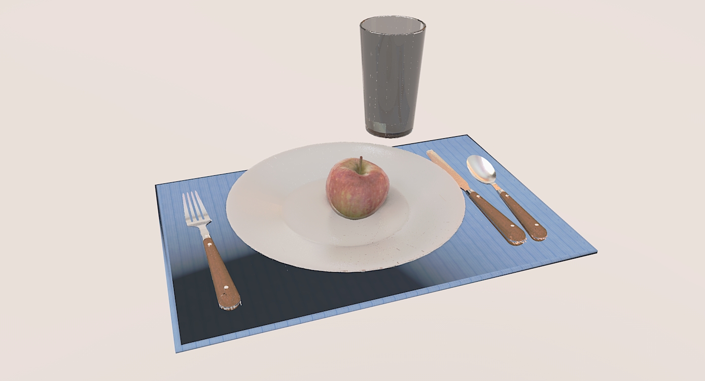
Okay - here is the second one with the studio back in - let me have it!!
Edit - just spotted the dark shadow to the bottom left of the placemat - there are not lights except for the HDRi image so I was wondering what was causing this?
-
Why is that black stain in the lower left corner of the napkin?
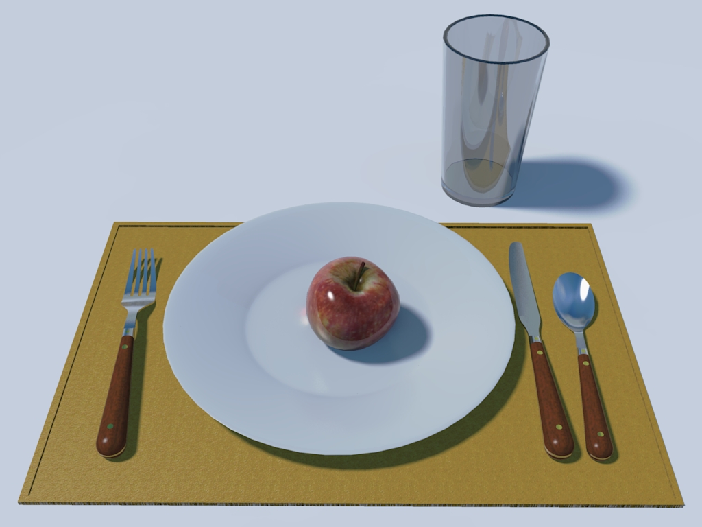
Otherwise, as you can see, when there is only the image background is giving light, there are no shadows at all. Yes, I suggested before to disable sunlight but maybe a little bit (just for some subtle shadows) is not bad. You can turn it down to 1-2 from the default 5. Like here (obviously I have polished the apple too much a bit but my mom told me to always carefully wash fruits before eating - also, the glass should not cast that crazy shadow)
-
Hi Dermot,
Have you set the place mat with a reflective surface?
I feel your pain on the 'Learning to Render' front. It's breaking my liathroidi

-
Cheers Gaieus
I havent a clue what that dark patch is - I thought it might be something to do with the still life sitting on the sudio set up but the 1st image doesnt have the studio and yet it is still there.
I am moving out of the dark already on this subject already thanks to you guys (pardon the pun) I must go away and practice with some simple modwls now just to see how they are affected by lights, positioning etc.
Thanks again

-
@dermotcoll said:
Just to make me feel better Chris!!
 - you go and get more apples and a drink - I hope thats vodka in that glass cos I'm ready for it right about now!!!!
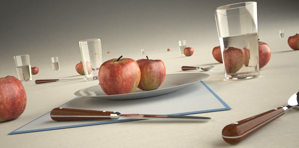
Not sure about the wodka, but here you go.

Bon appetit!
Skindigo:
-
@kwistenbiebel said:
Thanks for the improved model Solo.

A 'render tip of the week' could be: no good renders without good models.Here's my entry:
Wow! good work.
You were probably kidding about the rendering tip.
Actually, some of the tips are about how to make good renderings without good models.
We are assuming that sometimes you are given the model by someone else in the firm, and have to do the best you can with it. I suppose you could always modify it, to replace single face glass window with double face windows. But perhaps not.
-
Hi Rich
I dont think so - it is generic soft. Will play about with it and see what I can come up with - as for my liathroidi - they are totally deflated by now. I'm off to me bed to dream of apples and vodka - now theres an idea for a drink!!!!
-
Nice renders Chris, more apples more fun.

-
@dermotcoll said:
Hi Rich
I dont think so - it is generic soft. Will play about with it and see what I can come up with - as for my liathroidi - they are totally deflated by now. I'm off to me bed to dream of apples and vodka - now theres an idea for a drink!!!!
sorry to burst your bubble my friend!
pav
-
Pav - thanks for bursting my bubble- it now matches the state of my liathroidi!!!!
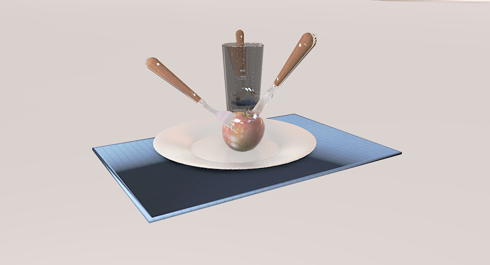
Here is the hird attempt with an omni light directed at the dark patch - as you can see it is still there so its not a shadow - anyone any ideas whats causing it?
-
dermotcoll, could that be a back-face issue. Looks like surface normals of that tabled are a bit messed.
-
It seems to be something else. The bright bit is the reflection of the studio setup 'bowl' thing, while the dark part is the top of the HDRI,which is dark at the top.
You might want to load a different HDR or maybe make the 'studio bowl' material darker....(Never use a colour lighter than RGB 220,220,220 for any material)
Also, did you put reflection on that place mat material? If yes, lower it down.(Could also be too much 'geometry smoothing' going on on that place mat --> lower down 'soften edges')
-
Solo
What render engine are you using?Vray? you're render looks too much CG for Vray. Is that with a sun source or a heri studio? -
Solo could you give me an idea of how long your last "apple study" took to cook? (great image by the way)
One of the most frustrating things about this process, beside the learning curve, is waiting for the end result. I am using KT on an AMD quad and it takes at least an hour, usually more to get a decent image.
Also where do I sign up for the Solo correspondence course in rendering!
thanks!
s -
I used Vue for all the renders in this thread, Vue has the tendency to make studio renders look very CG, but then again it's supposed to be a landscape app and not a studio renderer.
The render which was 2000 x 1000 took around 5 minutes to render (biased)As far as a correspondence course goes, I'd suggest sticking to SCF as there are so many talented folk here using a wide range of software that one will get a better cumulative knowledge than one technique from one person.
However if you are a Vue user then I may be able to help in many situations, especially if you use it for Archvis, there will be some new products coming in the future designed for the industry (I'm heading up a forum on E-on soon that will be focused for AEC professionals)
It's great news as Vue is an awesome app that needed some tailoring in order to appeal to this industry and they have finally noticed the potential and agreed to make a product with us in mind. -
IMO the guys at e-on will not mess too much with Vue as it is right now, they may give a few more terrain tools, eco painters, atmosphere advancements and render options, but not change the focus of the tool that leads in it's catagory. What I believe they may do is create an independant tool for architecture, engineering and construction professionals, using integrated tools like grid modeler, new UV tools, micro topography tools, intergation with more CAD apps, etc.
At this point all I know is they are interested in the industry and are doing a lot of research to find what the market really needs, I also believe animation will be a big part of the solution as the industry starts requiring them more and more. -
Hmm, i still couldn't find a good interior (or studio) render in vue. On the other hand there's not much competition in landscape rendering.
I'm curius to see how Vue will handle that scenes in the future, but i really doubt that would be able to touch vray (any one notice that renders now are appearing like mushrooms??lol), and after seeing the article where they show how vue is used in the terminator movie, i don't know if they shoudn't, instead, just concentrate in what they are really good. Better be great at something than one more in the crowd.To enter this workshops what's the limitations in terms of model editing, lights, and materials? Too much time without rendering just for fun...i'm missing it

Hello! It looks like you're interested in this conversation, but you don't have an account yet.
Getting fed up of having to scroll through the same posts each visit? When you register for an account, you'll always come back to exactly where you were before, and choose to be notified of new replies (either via email, or push notification). You'll also be able to save bookmarks and upvote posts to show your appreciation to other community members.
With your input, this post could be even better 💗
Register LoginAdvertisement


