@daniel said:
Very nicely done, Hector!
Thank you Daniel, this one was a quickie but not challenging enough when square footage is not an issue.
@daniel said:
Very nicely done, Hector!
Thank you Daniel, this one was a quickie but not challenging enough when square footage is not an issue.
In reference to the tittle, I wanted to do a modern dwelling but in warmer tones rather than the usual stark white.
Comments welcome.


@richard said:
Maybe put up your changes mate! BTW a plan is always a help to determine the workability of your solution! And not one of those ghastly 3D ones, urrrr!
Nah, once I posted I released it to its owner Daniel, it's time now to move on to the next design exercise.
@richard said:
@serrot said:
@omikron said:
Cute! Is this going to be built?
No, this was just a design exercise.
That's cool BUT a darn shame, the design in my eyes is a STUNNER!!!!
Big things are coming your way mate, that's certain.
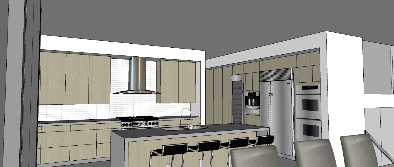
Though you mention the kitchen doesn't open to either the dining or living would be my only question, but I understand this is something Daniel imposed in the brief. And I also understand that this is one of those things that varies across cultures. Here is Australia it's almost a prerequisite.
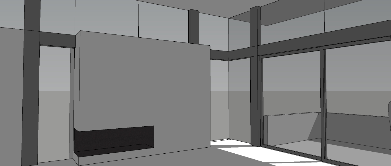
The only other thing might be the bulk feature wall that divides up spaces maybe being a bit overused or out of proportion. The division it's creating might sometimes not be warranted. I coined a phrase once that I suggest to clients who want to in my opinion "overuse" a feature - "A feature is not a feature unless it is a FEATURE". Takes a bit to get ones head around but you might get its meaning.
In the end mate, a stunning well planned and executed design!
If I was to do or re do it again I would eliminate the concrete wall dividing the entry/living space from the garage and also the concrete wall dividing the kitchen from the guest wing.
@cadmunkey said:
@pbacot said:
Very like working with clients. Next time add a wife to the exercise, and you can duke it out in front of him and see how that works.
Haha!! So very true.
Superb design, really like the scheme. I dream of having a large garage like that one day so I can work on my car undercover for a change!
Thank you.
@richard said:
Actually I'll retract my comment about the division wall! Just went back to review you images again, and suck up my thoughts there. It's probably only the birds eye view where it feels heavy!
Thank you Richard. Actually this process started about a year ago, I posted a request for someone in the group to "PLAY" Client to me playing Architect and Daniel responded.
From first draft to finished product the design morphed many times including a couple of two level options, many floor plan changes, and even one with colored textured exterior walls. All through Daniel kept pushing me further to achieve a higher level of rendering.
@daniel said:
:thumb:

All those architecture posters - looks like your client is a single-minded person. You should find more interesting clients.
He was, is , very difficult and extremely demanding.....very funny Daniel : )
Does anyone have any questions for Mr. Cooter?
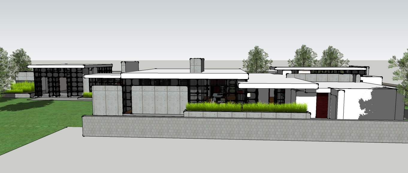
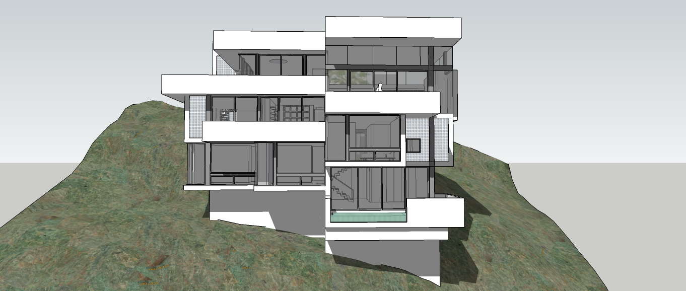
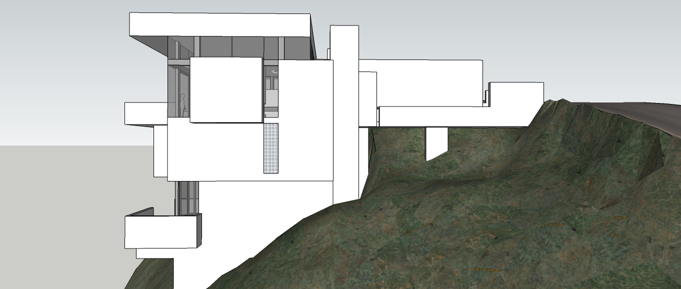
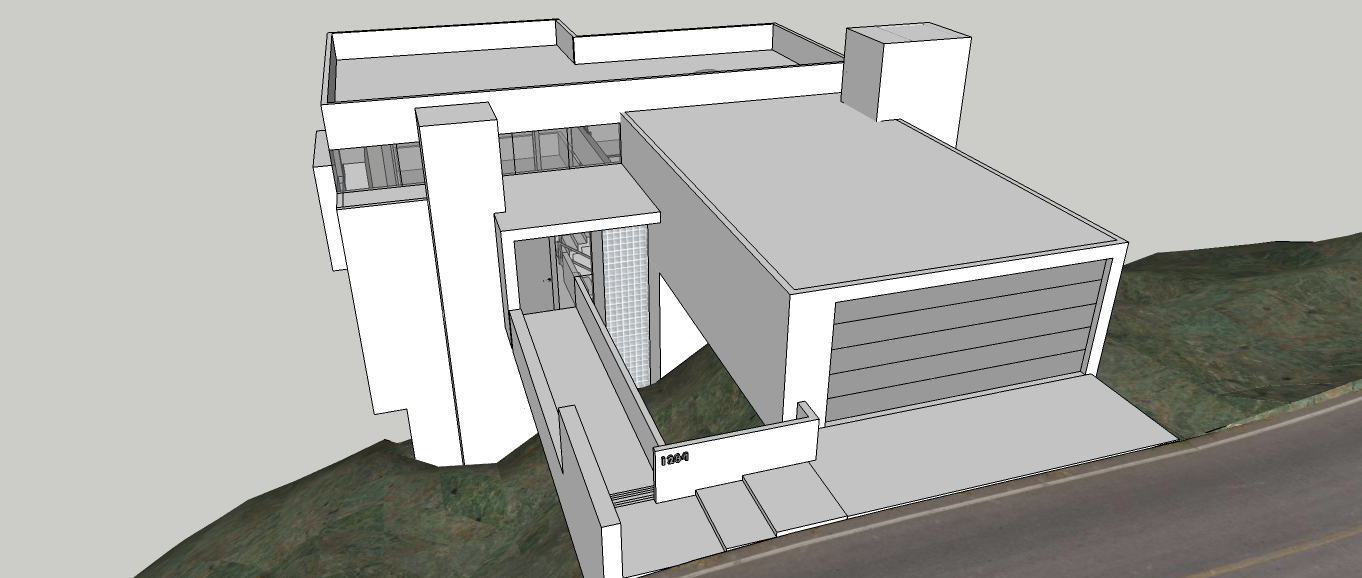
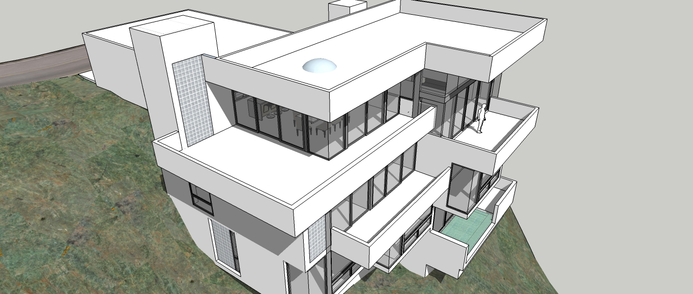
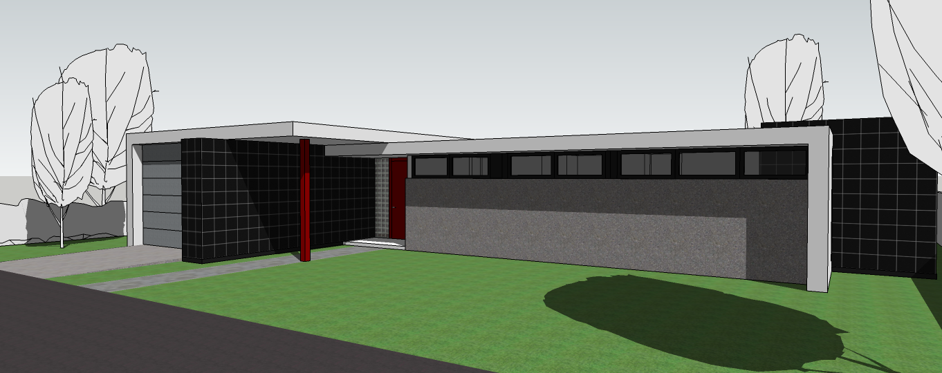
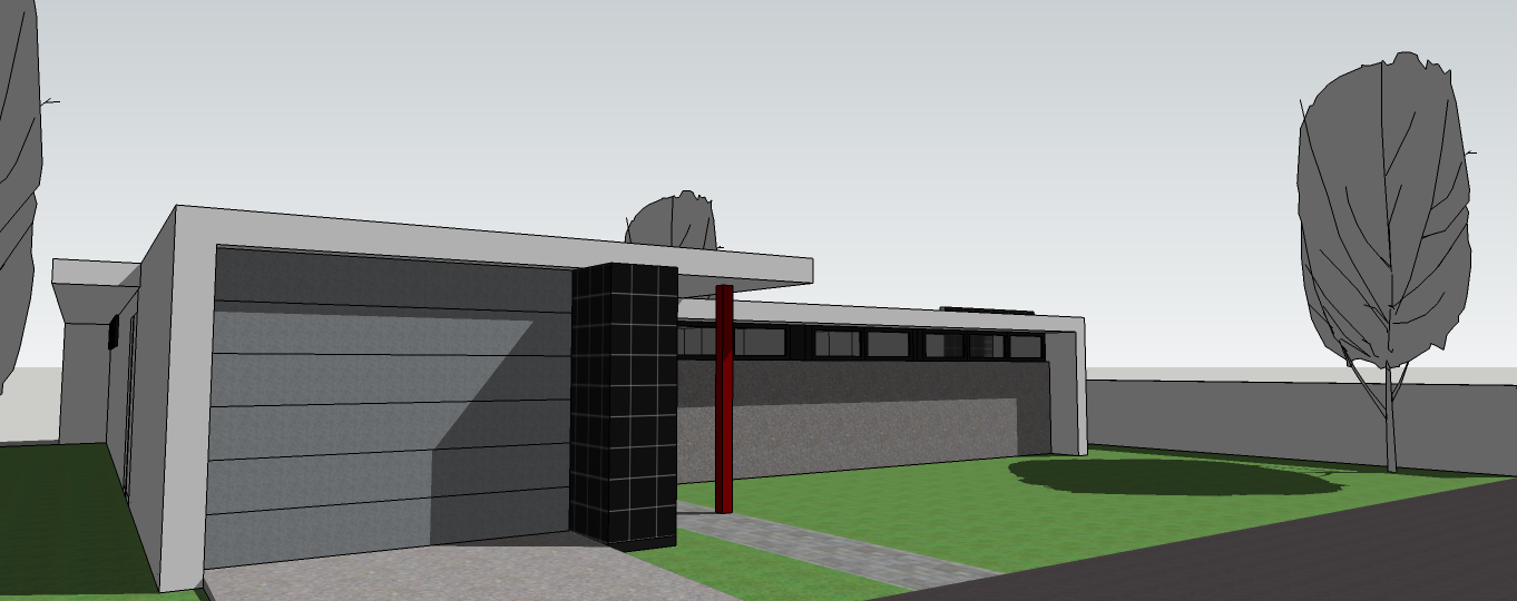
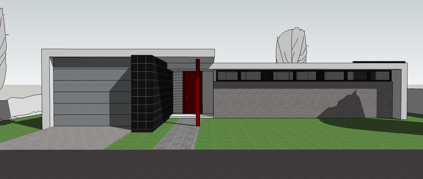
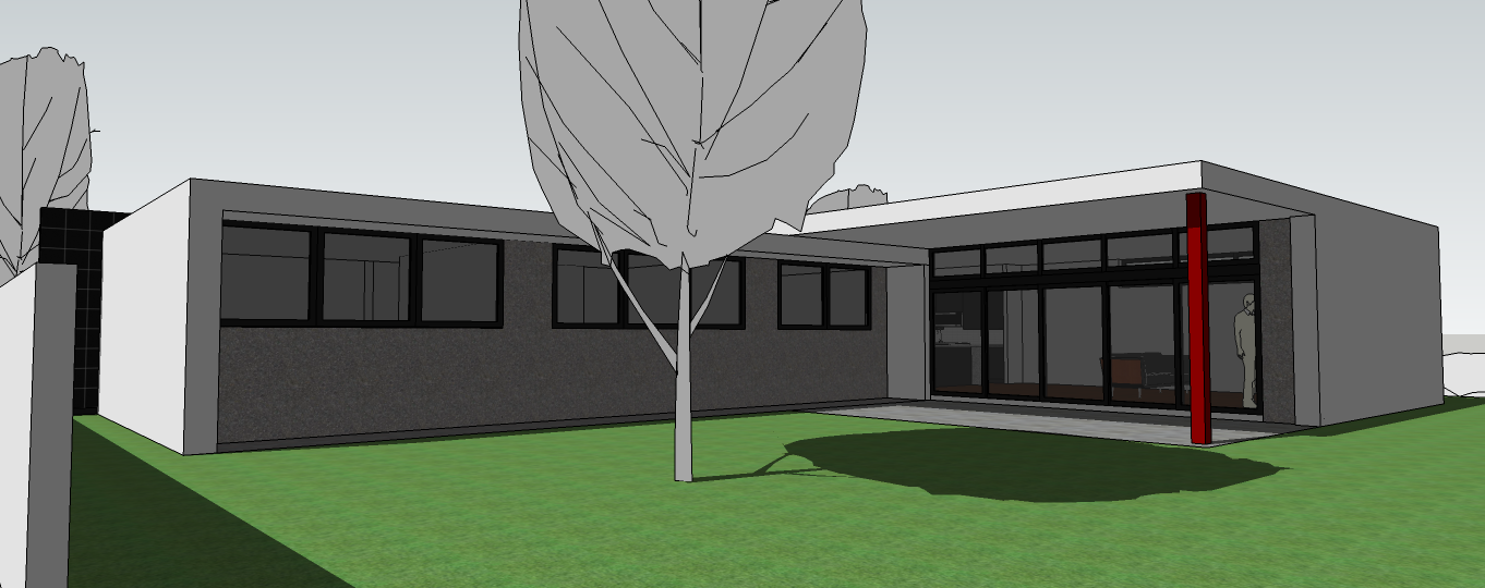
This residence was designed for architect Daniel Cooter as his virtual personal residence.
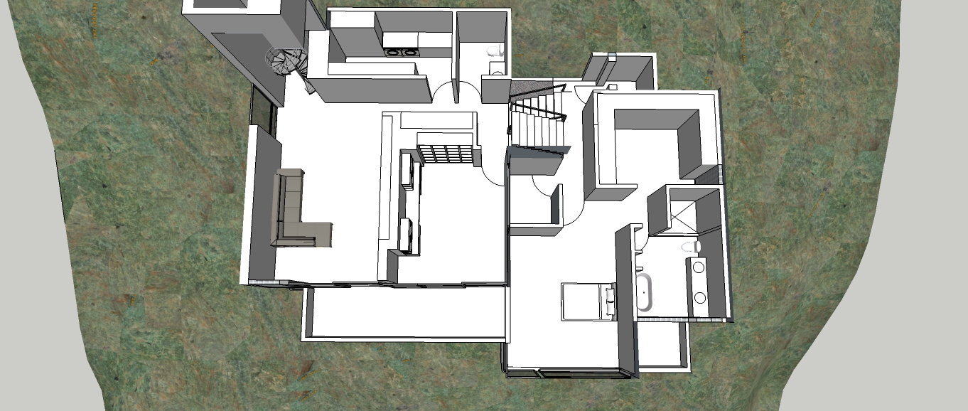
The Floor plan:
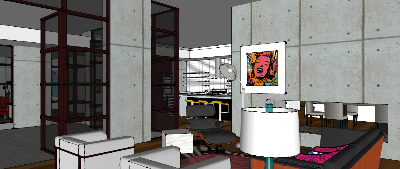
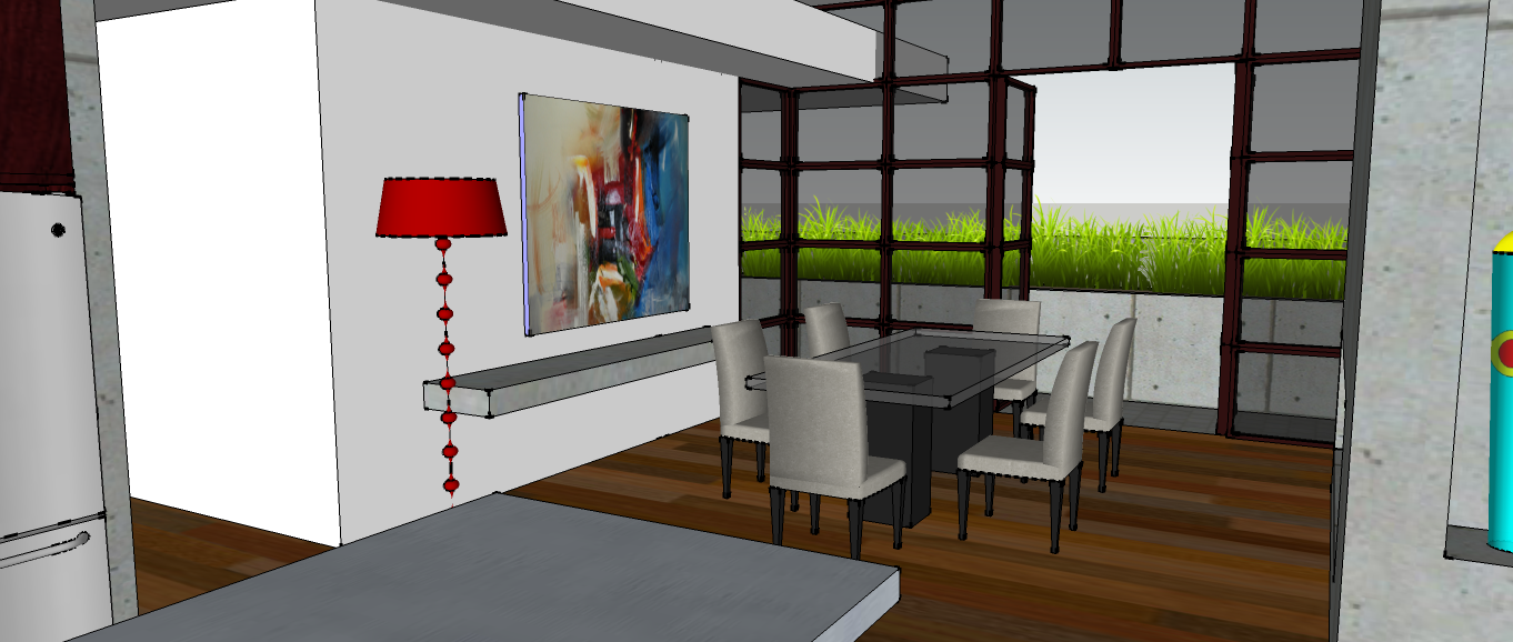
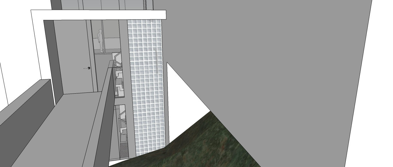
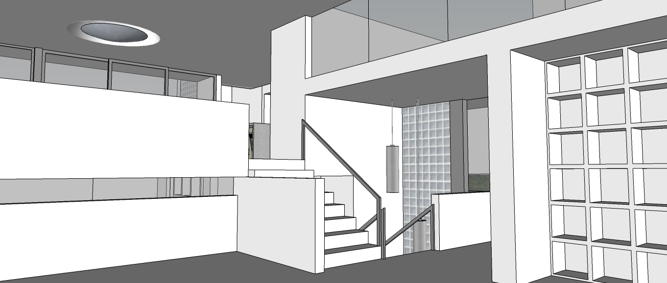
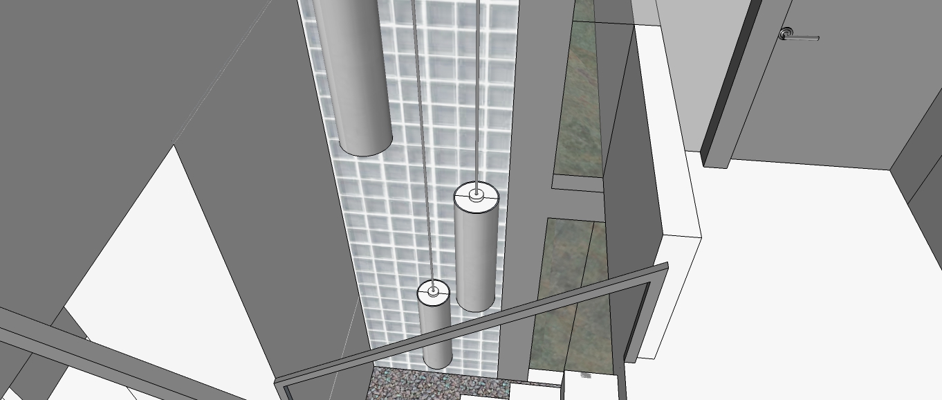
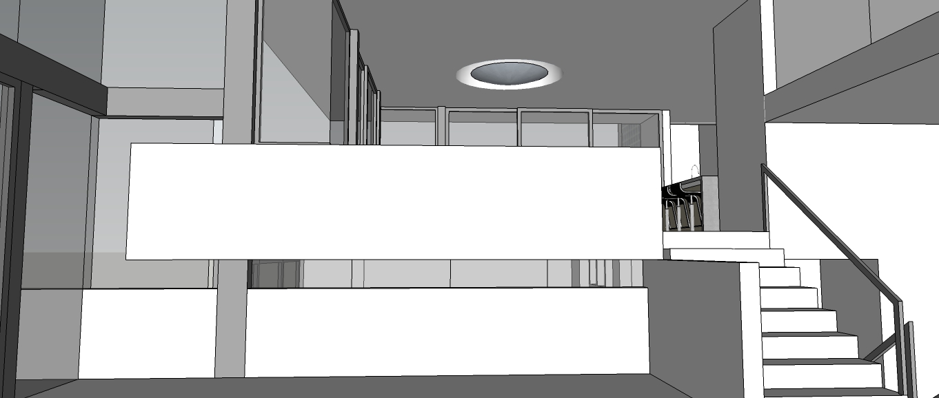
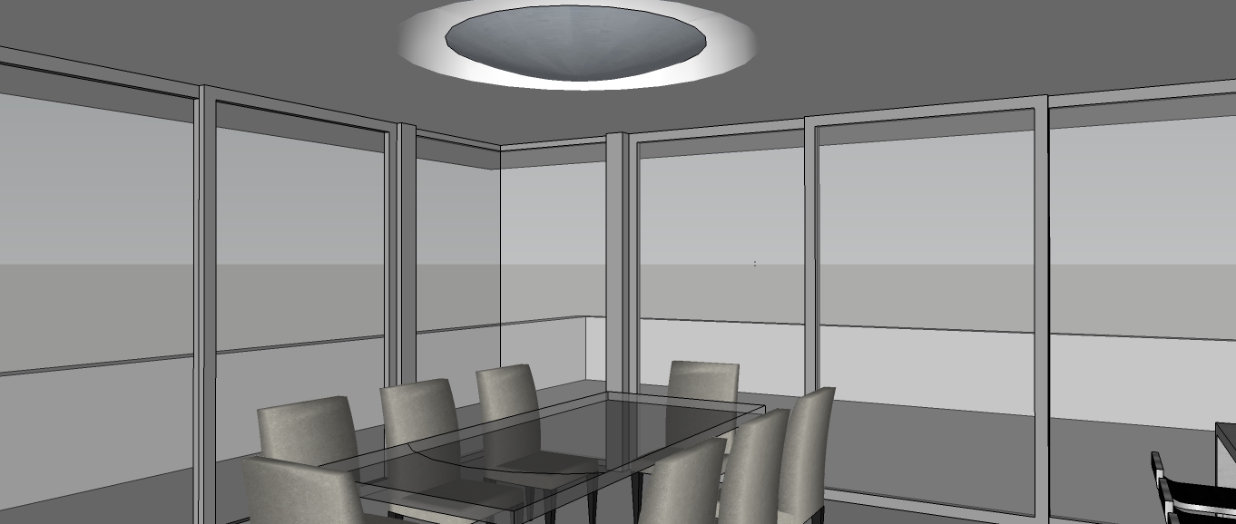
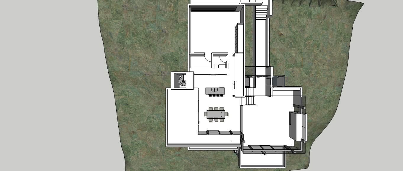
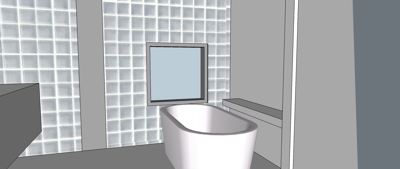
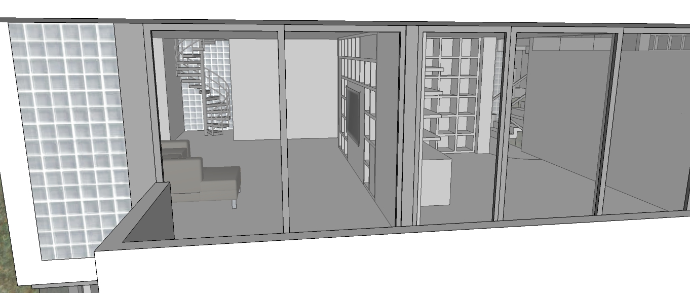
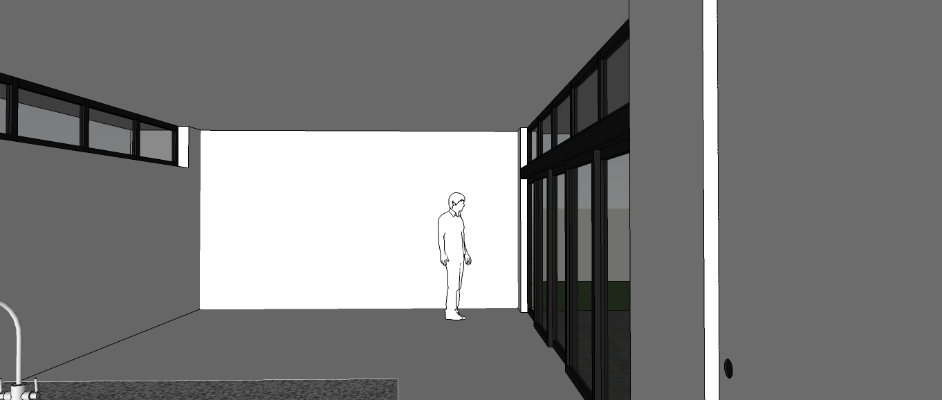
Aprox 3,221 SQ FT of live/work space divided into two rectangles connected to form a T. One rectangle contains the work studio, a storage room, library hall needed to contain the client's vast book collection, master bedroom with on suite. The other rectangle contains two guest bedrooms located at the far end and facing away from the master bedroom fro privacy. Living, dinning room, per Mr. Cooter the kitchen is not open to the dinning or living areas. Also a utility/laundry room and a one car garage with workshop space. The house is very private from street view with the exception of the large pane glass window in the living room used during the holidays to display a large Christmas tree. As for the library hallway, the client has a vast collection of books but refused the idea of a proper library room so instead the library was inverted placing the books on the outside of the walls and using the void space on the inside for a storage room and a on suite.
Many thanks to Daniel for guiding and teaching me through the duration of this design exercise.
Please feel free to comment,thanks.


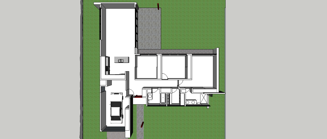
The house is split in the middle with the upper right levels containing a garage, utility, powder room, kitchen, dinning, TV room connected to the kitchen by a spiral staircase, office a bathroom and two guest bedrooms. The lower left levels contain the entrance bridge, elevator, stair core, living room, master bedroom / bath and the gym with a mechanical lap pool.
let me know what you think.
Thanks
@daniel said:
Looking great, Hector.
(and still working on your project)
Daniel, you're alive!!!...thank you, it was surprisingly difficult to do a compact plan but I used the disciplines I have learned from you.
This model has a simple compact floor plan. Two bathroom and a laundry/storage room are located on the front creating a street noise barrier for the living and sleeping areas.
The clerestory windows are operable to create a cross breeze. The room to the right of the kitchen has dual purpose as office/guest room.

For fun only. I am looking for someone from the group who would like to play "Client" I want to see if i can bring your vision and needs for a house for yourself to life with my sketchup drawings.
Forgive me if I have placed this in the wrong forum.
just check out my posts and lets see if you would like to play.
I am not a architect nor do I work in the field, I just love architecture.
Thanks,
Serrot
@daniel said:
Nice design, Serrot.
Your floor plan would red better if you turned the end points off. Likewise on the perspective images. The emphasized end points are creating ink blobs at your window corners, rather than showing the clean, crisp design you intended.
how and where do I go to turn the " end points" off??
The floor plan is in the form of the letter H with the right side housing the bedroom wing, family lounge, gallery hall and a separate art studio. The left side houses the garage UT room office, dinning and living room. In the center connecting both wings is the utility core housing the entry hall, laundry room, pantry and kitchen.
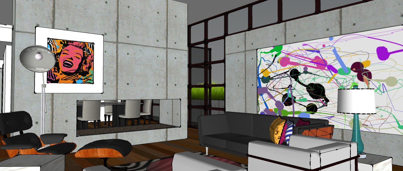
I decided to fully furnish this model just for fun and to see what could be done following pop art color schemes.
Hope you like it, I welcome comments.