don't forget the shortcut for selecting... it's spacebar, an extremely accessible key  and the "m" for move is just above it!
Posts
-
RE: The "Duh!" thread (aka the Doh! thread)
-
RE: Getting Started
@jan steinman said:
@remus said:
The exporters are the only difference between the free and pro versions.
And the ability to create dynamic components, which alone was reason enough for me to go through the considerable hassle of getting a higher ed license for pro.
don't forget Layout and Style builder which only come with Pro, and the ability to choose some other (higher) resolution for your JPG-output than "View Size". Does come in handy for printing stuff!
-
RE: A Welcome Message to New SketchUcation Members
right. so, I found the I-introduce-myself-thread.
I'm already being quite active around here, I think, but I thought I should properly introduce myself sometime.So here goes.
I'm Martha, I'm 26, I use SketchUp enthusiastically both for work and for fun. I work at Design8, the company that imports SketchUp Pro in the Netherlands. I teach SketchUp in single-day-trainings, mainly to architects, interior architects, city planners etcetera. Diverse model-making is also part of the job. From buildings for Google Earth to dynamic furniture.
Next to that, I study architecture at Delft University of Technology, but I'm not that good at it, so I'm basically focusing on my job instead. The knowledge learned there does come in rather handy though.
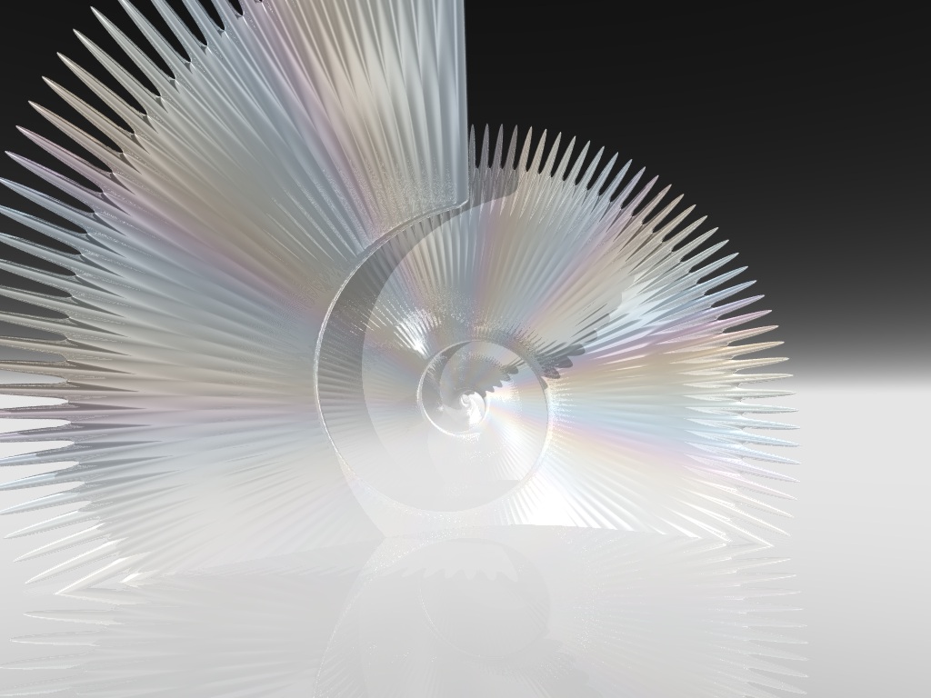
The things I am good at are basically anything that is graphic+computer; SketchUp (though not as good as some of you), Photoshop, Maya, Rhino, Mental Ray, V-Ray, Artlantis, well, I could go on. I will not. However I will share with you one of my very first renders. It was originally made in the year 1993 (or thereabouts) in POV-Ray. The code for this render was as follows:camera {location <0,0,-20> look_at <0,3,20>} light_source {<-5,50,-20> rgb 1 parallel point_at 0} background {rgb 0} global_settings{max_trace_level 4 radiosity{}} fog {fog_type 2 distance 7 rgbf <.9,.9,.9,.5> fog_alt 1 fog_offset -3 turbulence .5} light_source {<-4,-1,-20> rgb .3} plane {y, -5 pigment {rgb -.25} finish {reflection 1 phong 1}} blob{ #local a=0; #local c=0; #local b=0; #while (a<1800) cylinder {<0,6-b,0><0,19,-15>,.7,.8 pigment {rgb <abs(sin(c/10))/5+1.0, abs(sin((c+5)/10))/5+1.0, abs(sin((c+10)/10))/5+1.0>} finish {phong 10 reflection .5} rotate a*z translate a/20*z} #local a=a+3; #local b=b+.02; #local c=c+2.9; #end }This is the result:

ps, hockeyhead61. yes that's normal. if you wait a few seconds, the chairs will reappear. It will help to reduce this behaviour if you make your chairs very low-poly. (having few polygons)
-
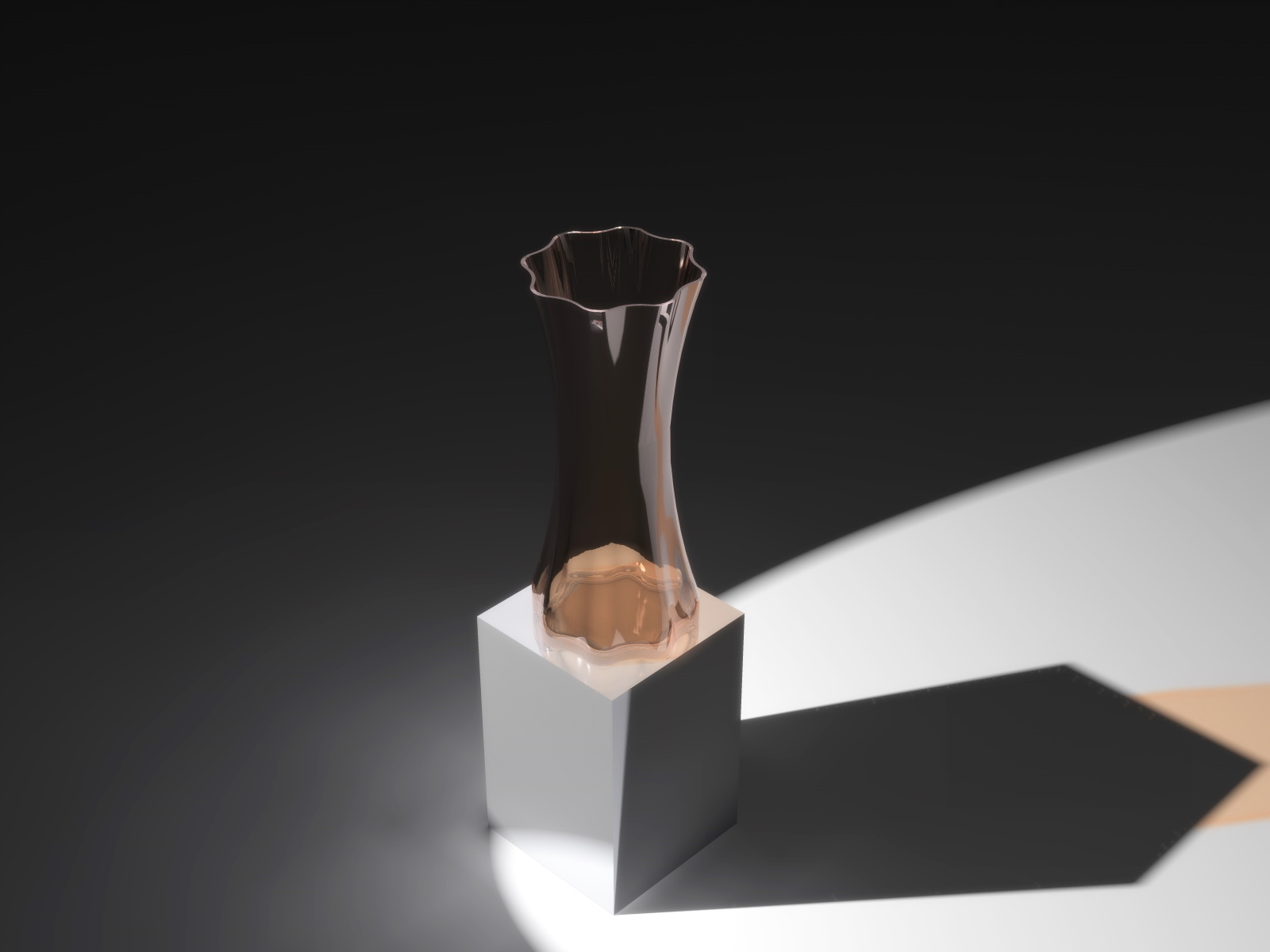
A vase
I was trying out a newly downloaded set of plugins (EEby...) and, combining it with roundcorners-plugin, made this vase... just wanted to show you guys
rendered in Artlantis, no post-pro

-
RE: Artlantis animation: design house
Quite nice
Are the stills also Artlantis? the stairway seems to have edges... I thought Artlantis couldn't do that?
Also, why is the water not moving? would be so easy, and it would add a little life.
And from me as well; cheers for the nightshots
How much post-pro did you use? -
RE: Artificial life???
Why do people always want to invent artificial life? Does it have benefits? You can't clone a human and then harvest his organs. A cloned human would be a human just as a regular-born human would.
What's wrong with natural life anyway? Is it not precious enough?
-
RE: Negative scaling/mirroring
Yay let's reply to a topic that is half a year old.
Ok so I was having the same problem, I wanted to make a component that would mirror when clicked on with the DCFinger. Eventually I solved it by duplicating the component, mirroring one copy, and hiding each alternately.
But it set me to thinking. Why Length? What does length matter? I don't care about length. Also, SU itself seems to calculate things not based on length, but on scale. Length is just a result. So, whereas negative Length doesn't make any sense, anyone can figure out that negative scale is the same as mirroring.
So why not use scale instead of length, Google guys? -
RE: New Post Production Technique try out ->
Briggs that render looks better- especially without the lensflare. I really like the furgrass!! Maybe try and use the same effects that TBD used
 might be a winner!
TBD: lol @ your graffiti

-
RE: Animation
Nice
 Has a smooth flow, I like that. Also the fact that you got it down to 3.7mb.
However, why don't you show off the interior? You could use a nice slow section cut to do so.
-
RE: 360VR test C&C welcome :)
Hey, real nice. I've been thinking of doing something similar ever since I saw this blog: http://blog.anti-limited.com/ but I never yet got round to it...
-
RE: Rooftop addition, my first render here
Hey I'm looking at your picture again...
and suddenly I wonder:
How did that lady get there? Where is the door? There's no door leading to the roof terrace! -
RE: New Post Production Technique try out ->
I think the first render benefits from the effects you describe. In conjunction with the dramatic angle it creates the wow-effect that might really make a picture jump out at you, which is a good thing when doing a competition.
The second picture however does not benefit. Maybe your original render did show some detail in the dark area in the middle - but the final version certainly does not. It has a big, black void, right in the center of your image, where instead ought to be a focus point.
Apart from that, I like the effects
-
RE: Re: Some Funny Pics.
that's a camel being dragged away for being parked in the wrong spot.
-
RE: Troy War with Sketchup in Junior High School [Final Version]
guzman I really like the project!
I still use highschool math every day when modelling in SketchUp. We had this 2d program when I was a kid, that was used for drawing mathematically, proving that certain corners were the same or 180-alpha... stuff like that. It would have been so much more fun with SketchUp!!
-
RE: Render in Artlantis
@ Anssi:
No I 'overexposed' on purpose. did that in Photoshop - it's hardly possible in Artlantis, since it adjusts exposure automatically. But I wanted the feel of a very sunny day, so I sort of exaggerated that.
@ flipya:
As for the round corners... yes I know the plugin. I sort of used it on the chair, but it resulted in self-intersecting surfaces if the radius was set too high... I concluded I should look for a better model but didn't want to spend the time searching, or I should buy the subdivide&smooth-plugin, but didn't have the money... Anyway, you're right ofcourse... -
RE: Posable Figure - FigureUp
Nice models, they're gonna come in really handy!
Nice drawings, too.
too bad I can't read Korean...
