see, that is the point! a lot of people not wanting the other apps probably would feel the same way you (or me for that matter) feel about layout. but i do agree..i would much prefer all the functionality within sketchup natively.
Posts
-
RE: Random thought.
-
Random thought.
while driving to work i had a random thought about sketchup 7. Imagine if, in the same way google has developed layout and style builder, they developed an 'organic modeller', 'uving', 'rendering' etc. This way they could keep the core simplicity of sketchup for everyone, and for those that want more...they just open the additional add on. and sorry if this idea has popped up somewhere else earlier. just wanted to put it out there.
-
RE: Craig Mullins - The best digital artist in the world?
he's awsome. here are some more great concept / digital artists
http://www.thomlab.com/
http://www.dermotpower.com/
http://www.grnr.com/
http://www.artpad.org/
http://www.ghull.com/news/news_main.php/
http://www.ryanchurch.com -
RE: Silvershadows eye candy 2 : BLACK HAWK
dont' worry about the criticism. its amazing work! I for one am excited each time you post...so ya, I am very glad you posted and will wait for the next!
-
RE: Silvershadows eye candy 2 : BLACK HAWK
so rad!
i have a question... between image #6 and #7 of your process - there is a huge jump in level of detail. how did you do it?
again, really inspirational work. sketchup needs someone to really push the boundaries of the app. and show others what it can do!
keep rockin' it!
-
RE: Google Chrome (Beta) Windows
i'm pretty sold. i like how simple and fast it is. its like the sketchup of web browsers.
-
RE: Work in progress
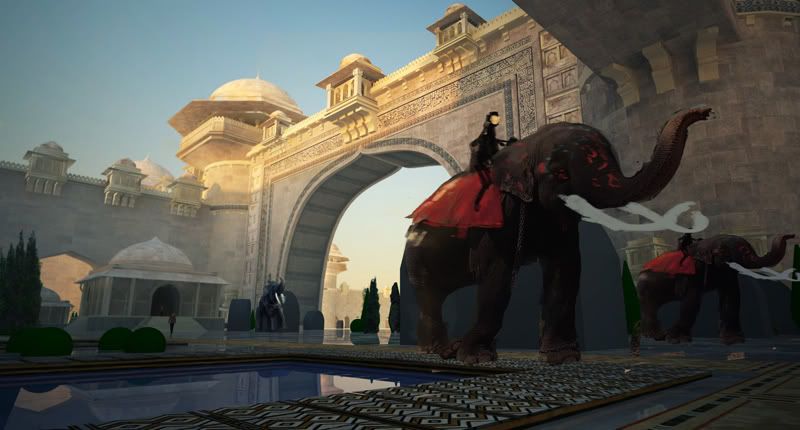
thanks again. I'll continue to work on it and show you when its all complete. The sketchup blob plants are just place holders - replacing them with photos/paintovers. same with the elephants and people. thanks again. if you see anything you would change don't hesitate to let me know.
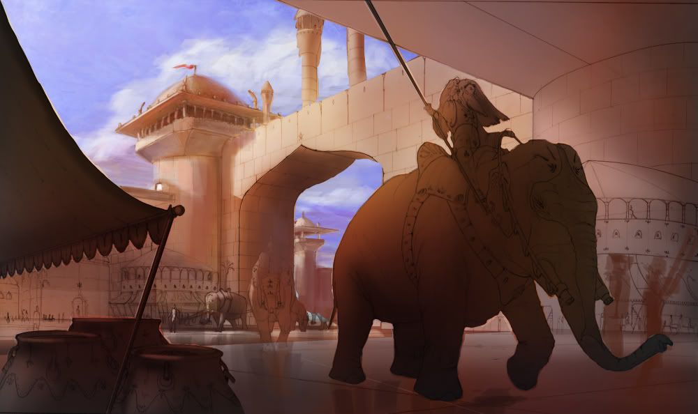
the second image was a quick photoshop painting using a wacom tablet and pen.
-
RE: Work in progress
thanks guys. I'll keep you posted on the final product.
the elephants are pictures with some sloppy painting over in photoshop. I will have them cleaned up and more resolved for the final.
-
RE: Work in progress
work flow:
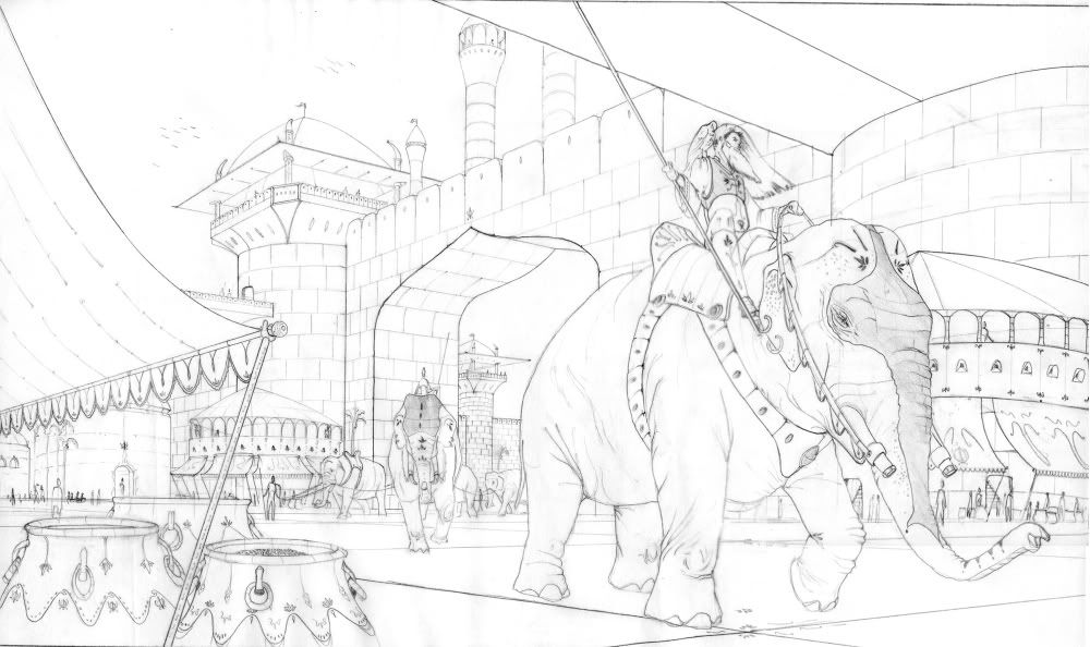
- quick idea sketches
- refined drawing
- scan into photoshop and do a quick tonal/color pass
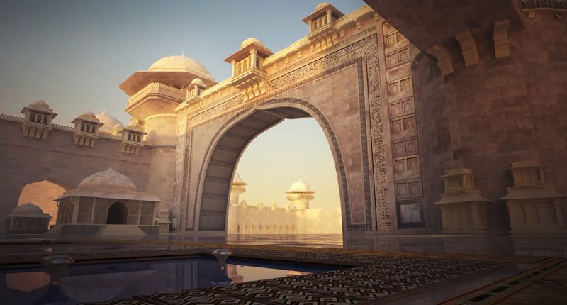
- bring into sketchup and use photomatch to set up basic shot.
- start building model based on photomatch - try and match lighting to sketch
- i play around at this stage a lot with new lighting and structure stuff.
- created some custom textures and apply
- vray render
- photoshop manipulation to match tonal arrangment.
- paint over in pshop to add detail, texture and populate.
i'm going for a 'matte painter' or photoreal look.
-
Work in progress
Here is an illustration / work in progress i'm working on.
initial sketches:


sketchup and vray work:


I'm goign to try and populate the scene as fully as I can. any feedback/thoughts are welcome.
thanks
-
RE: Inspiration
a good work out, chocolate covered almonds, an episode or few of arrested development.
-
RE: Sketchup clone
this is so funny:
" Comparison to SketchUp
Those who've seen BonZai can't help comparing it to another lightweight 3D modeler, Google SketchUp. In fact, some users in the SketchUp Community forum went so far as to refer to it as "a SketchUp clone." At [pushpullbar]2, an architecture and design forum, user Kurdi called it "a new sketch-oriented modeler." Another user greeted it with enthusiasm. "SketchUp with NURBS and solid-modeling? That would be a dream come true!" wrote Dsarch. " -
RE: Sketchup clone
good point on the nurbs

can you point me in the direction of the instructional dvds for silo? think i'm going to buy it...
-
RE: Sketchup clone
I agree.
On that note, has anyone worked in Silo to their work flow? I've been messing around with the trial, and its extemely intuitive and fun.
So far, i've manipulated some organic forms in silo (which is much faster and easier than using subsmooth), exported as an obj., imported into sketchup. It then comes in as a low poly model. I run two interations of subsmooth on it and then, relatively quickly, have my form in SU which i render with vray. So far i've only done some tests, but would be interested in how others integrate other apps into the work flow...
-
Sketchup clone
doesn't look like anything sketchup can't already do.....
-
RE: Latest WIP, using SketchyPhysics....
That is a really nice start. you have a lot of nice things going on in the painting and i love the idea. The shipping containers are great. they are a nice device to separate the two distinct areas of the painting.
from an illustration point of view i see a few things you could fix that would improve the piece.
-
Pick a consistent eyeline and make sure everything adheres to it. Right now, it appears that the horizon/eye line is right in the middle of the page (a little bland for such a cool idea, if the eyeline was lower the city in the distance would seem more looming) so the roofs of the shanty on the left would be visible. Also, if you look at the recession of the path in the middle of the frame it is receding to a different horizon line. In addition the buildings all seem to be inconsistent in terms of perspective. just use the transform tool for the building photos and paint over them. Maybe you could create an image from the point of view of someone in the shanty town...dropping the horizon line lower, thus putting you in the painting and the story even more.
-
I like the warm/cool seperation of the foreground and background. I think you could reduce the contrast of the city in the bg to create more distance and make it seem farther away. If you add some fog, mist between the layers of the foreground and background (on a new layer) it will help the separation even more. I think the fg is a little too yellow. the light color is extremely white, while the the light on the ground is extremely warm and yellow. try and even this out a bit. I would also desaturate the bg more.
-
The edges of the clouds are a little sharp. Run a Gaussian blur on the sky layer so the edges are not so sharp. The eye is drawn to hard edges, so use them selectively to guide the eye around the image.
-
the lighting on the shanty area is a little off. the light is coming from the right, but all the faces on the left side are dark and there is an intense highlight on the dirt ground. I would darken the ground value a tad and maybe show more light hitting the shanty structures on the left.
study some work form digital matte painters. a great guy to look at is dylan cole.

Dylan Cole Studio
Production Design - Matte Painting - Concept Art
Dylan Cole Studio (www.dylancolestudio.com)
i hope this helps and its coming along nicely.
-
-
RE: Need help: VRAY Techniques
have you spent any time at the ASGVIS site? there are great tips there. a few things i picked up
used irradience map for your main engine and light cache for your secondary. Mess with the max, min settings of your irradience map....never set the max above 0. Try -1 or -2 max and -4 min. Your light cache can be set to 600. this should speed things up. for grain set the qmc at .85
in a pinch, sign up for the asgivs forum. Search for 'Mado' and use his settings. he has some great results and is a good starting point.
-
RE: Call for models that cause problems for LightUp
i've been suffering in silence

where should we send you the model? i have one that is repeatedly causing a crash. still love the plugin!

-
Viewport question
Not sure if this is the right spot for this question, but is it possible to some how have a quad viewport? So while you're modelling having the top/side/front/ and 3/4 view of your model?
thanks