@tomankubik said:
thanks for opinion. well this should be the protoype of a bookstore for a big distributor of books in my country. The idea is to make the youth read again and have "cool"shop where they can find the book, to have there computers connected to online bookstore, to have place where they can meet and comunicate but not to stay for long /to read a book in store isnt very economical for seller/ also in my country lot of people use to buy things via internet but they are still looking for the store to have the feeling of a book /or anything else/. therefore the concept of such a bookstore should be something like fastfood for books and not the cofetery. the bathtub thing is the cashdesk and info place when you need to pay or have some question.
Please accept this criticism as constructive, (as that is how it is intended) as it may seem quite critical.
First of all I am a bookstore haunter. I go to bookstores in every city or country I travel to, whether or not I can read the language is no matter, bookstores have a fascination to me.
So when i first looked at your images, I thought that the intended market was younger children, and therefore their parents, not youth, and probably one that was intended to be in a department store or at least be aiming at a market similar to stores such as "Gap". This was just a first impression, before I read any text.
I would like to understand the context and program for the choices made re: colors and shapes in this design, that would make this design appeal to youth. Are the colors linked to wayfinding?
Is there a primary youth demographic that you are intending to appeal to? By this I mean that the youth niche market stems from Gap to Goth to Metal, and beyond. Has your client done any market research on their demographic and provided it to you?
I ask these because I think that their premise in the quote I attached is dead wrong, and I am going back to my bookstore haunting observations alone in this comment.
The bookstores that I see that have large youth components, nearly always have coffee shops. I am not referring to the North American chain bookstore combinations like Chapters and Starbucks, but the smaller owner run bookstores that have to compete against these. These quite often look like the coffee area may be run by a separate party on a leased basis, but the one thing that makes them seem appealing is there is no separation between these spaces.
If you sit in one of these spaces you will notice that the workers in both "stores" are young, and the clientele is usually also young. They usually are somewhat bohemian in design and decore, and are totally connected to youth culture with notice boards and posters connecting the clients to concerts, workshops, and other pertinent events.
They usually have their own workshops and readings.
And I am always amazed by the number of books I see leaving the store in their hands.
If I were you I would have your client re-think this approach by challenging them to do some market research. Present the images you have created, and one of one similar to the one I have described, and go to where the youth are and ask them which they would prefer.
Again this is written with the best intentions in mind, as I don't think that there is anything wrong with your design as such, I think that you have been given the wrong context. If you really want youth to read, as opposed to up the volume of sales, then give youth a place where they really want to be.
Cheers.


 But the fix was relatively easy.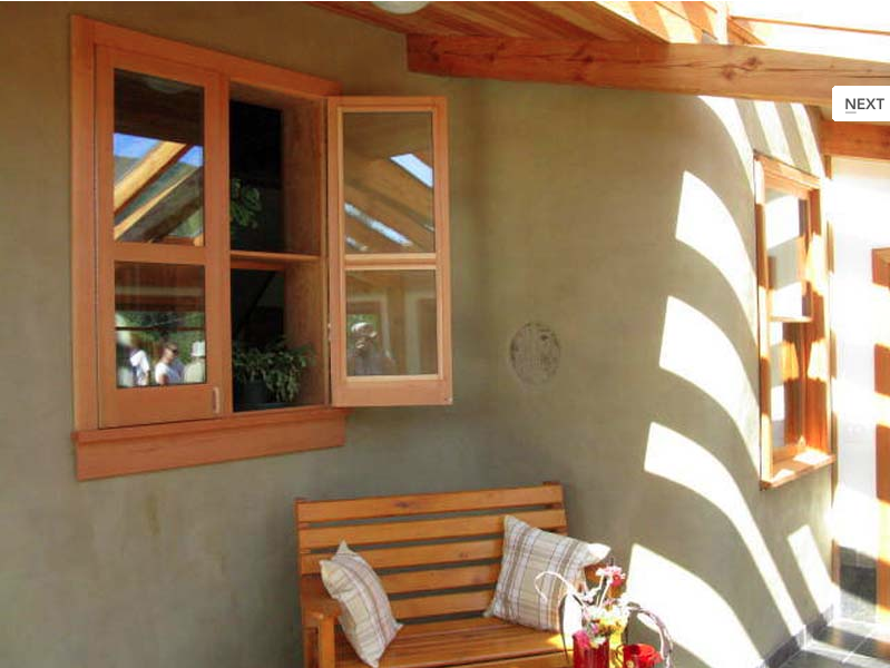




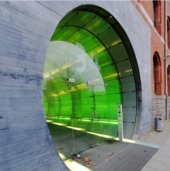
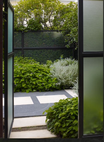
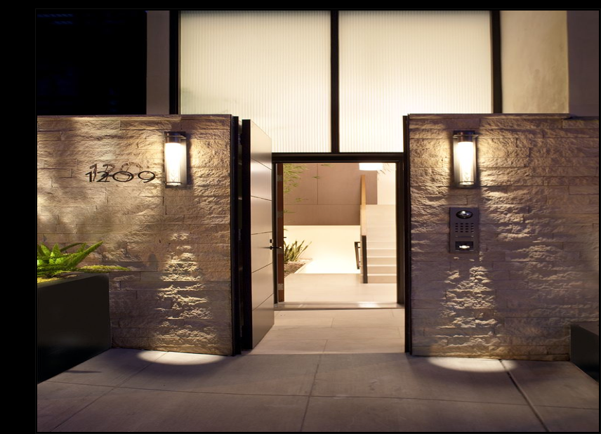 Another entrance of the same residence