SketchUcation Tools in 2017
-
@tig said:
This weird, it works OK for many of us...
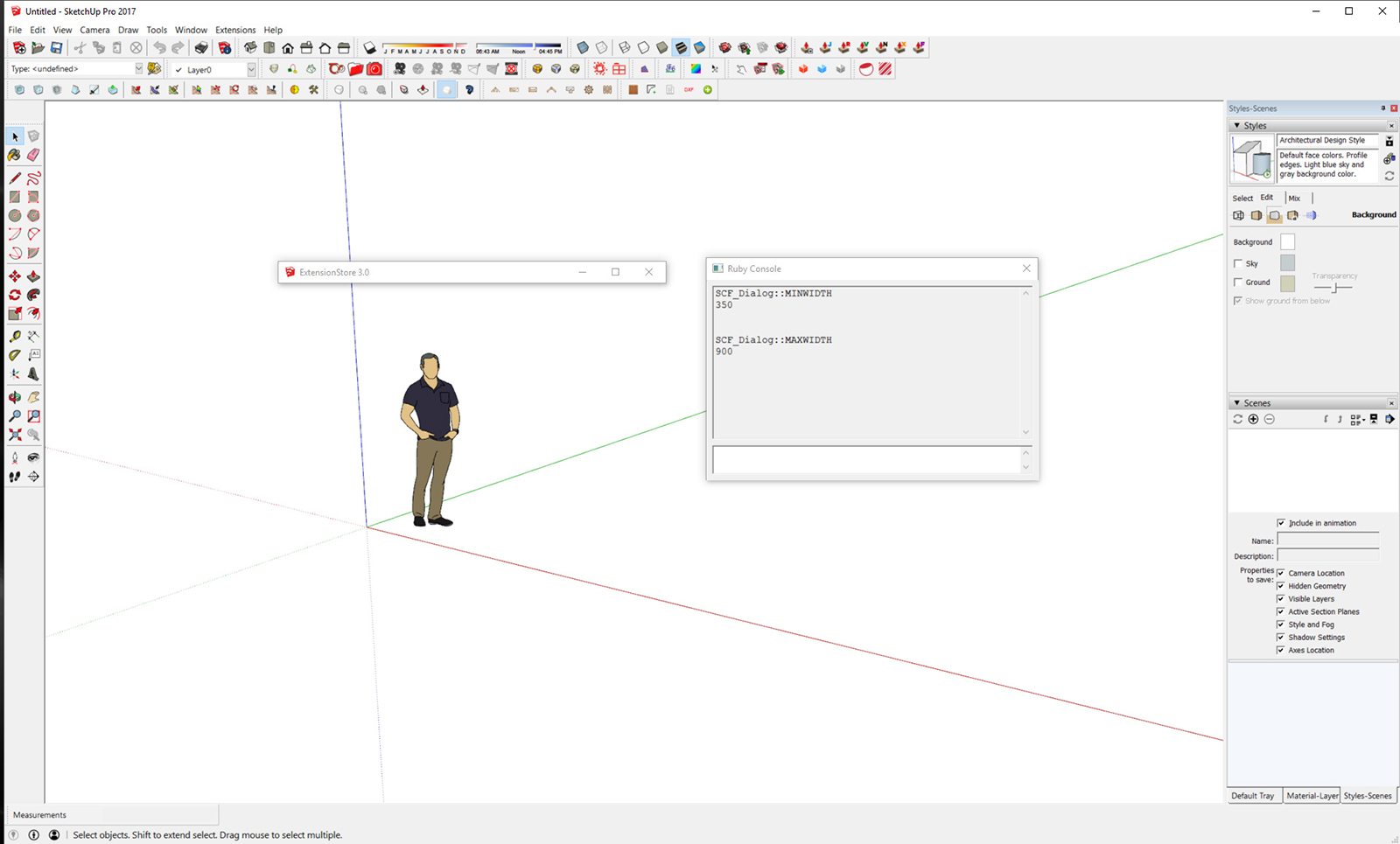
Please copy+paste+enter these in the Ruby Console.
SCF_Dialog::MINWIDTH350 ???
SCF_Dialog::MAXWIDTH900 ???
What do you get ?
Please see attached screen grab...

-
@tig said:
Can someone with this problem please try a slightly different approach...
Close SketchUp 2017.
Use Regedit again to reset the dialog's height to a reasonable number [say 500] in the Registry and then close.
Now select the SketchUp 2017 exe icon [or the equivalent desktop-shortcut] and...
right-click > context-menu > Run as administrator
this will launch SketchUp slightly differently with some subtle side-effects like diabling image drag-n-drop !Any improvement on the SCF dialog front ?
No difference. It still only displays the dialog's bar, and reverts the registry to a value of 25(hex) and 37(decimal)
-
I just tested it again and changed ALL reg values to 512.
This made SCF change the width of the bar and still don't display anything else.
Then I closed Sketchup and got back at the registry editor. Here's what I got:

-
Another possibility...
Somehow the dialog's min height is getting messed with in the v2017 API [but only for some !], so I have made a test RBS that restricts the min height of that dialog to 100 - which should then be enough to give some borders and let you grab an edge and resize, and perhaps then have it remembered for next time ?Please follow these steps...
Download the attached ZIP file:SCF_Dialog.rbs.zip
Extract the RBS file that's in it - to somewhere like your Desktop.
Close SketchUp 2017.
OpenC:\Users\YourUserName\AppData\Roaming\SketchUp\SketchUp 2017\SketchUp\Plugins\SketchUcation
Find the file namedSCF_Dialog.rbs
Select it and rename itSCF_Dialog.rbsxxxso it doesn't load.
Move the new fileSCF_Dialog.rbsinto that subfolder.
Restart SketchUp 2017, test the SCF dialog and report what happens...NOTE:
Because changing that RBS file then breaks the 'signing' hash you must use the Unrestricted Loading Policy.If it's unsuccessful...
Close SketchUp 2017.
Reset things - delete theSCF_Dialog.rbsfile and rename theSCF_Dialog.rbsxxxoriginal asSCF_Dialog.rbs.
When you restart SketchUp 2017 things will be as they were.If it's successful...
I'll prepare a new v3.0.3 to include this 'hack'...Let us know...
-
Hi TIG,
The MINWIDTH and MAXWIDTH do came back as 350 and 900.The Regedit followed by Run As Administrator makes no change.
-
Can't you grab the bottom edge and make it higher ?
-
OK, so the dialog is now taller, but I cannot change the height. I do get the double headed arrow at the dialog's bottom edge, but cannot drag it either up or down. And the scrollbar on the RHS of the dialog has no effect FWIW.
-
Sorry, we had crossing posts. No, I cannot drag it in either direction.
-
Cool hack:

I feel we're getting there... can't we have a minimum value bigger than 100
-
The RBS in the attached ZIP has a larger min height [500] so it might at least be usable, at least until I get to the bottom of this weirdness...
Please follow the earlier instructions and retest.
I can't see how the window is not resize-able for you !
It is for me and the code specifically makes it so...Anyway, thanks for the testing...
Please report back...
-
Nice this one is useable:

Nicelly done, Thanks!
-
I now have a scrollable area, and the scrollbar works. Still cannot resize vertically, but at least it's usable in this form.
Thanks, and good luck with finding the root cause. Post again if I can help further.
-
JQL
Your last three images are blank apart from a caption in the middle.
EDIT: ...four...
-
They are not images, they are gifs, Click on them. Sorry for that I usually say you have to click on them but I believe Tig has seen those before, so I assume he knows he has to click them already. My mistake...
-
Here's how they are done with Licecap:

-
@jql said:
They are not images, they are gifs, Click on them. Sorry for that I usually say you have to click on them but I believe Tig has seen those before, so I assume he knows he has to click them already. My mistake...
If I click on them I just get a popup window with the same, mostly black, image.
EDIT: AH, no, it just takes a little time to load. Sorry.

-
@nickw said:
@jql said:
They are not images, they are gifs, Click on them. Sorry for that I usually say you have to click on them but I believe Tig has seen those before, so I assume he knows he has to click them already. My mistake...
If I click on them I just get a popup window with the same, mostly black, image.
Damn... I'm not telling everything again. Click on them and wait 3 secs...
-
 Sorry JQL.
Good app that though, thanks for pointing it out.
-
Can you please try this alternative RBS in the attached ZIP.
As well as setting a min height [500] it also sets a max height [900] - which I hope might make the dialog see sense for those of you with the issue - it already works for me with no tweaks...Please report back asap...
I need to get this fixed...
-
@tig said:
Can you please try this alternative RBS in the attached ZIP.
As well as setting a min height [500] it also sets a max height [900] - which I hope might make the dialog see sense for those of you with the issue - it already works for me with no tweaks...Please report back asap...
I need to get this fixed...This worked flawlessly for me.
I had the weird box problem before.
-- it also remembers the size and location.
Hello! It looks like you're interested in this conversation, but you don't have an account yet.
Getting fed up of having to scroll through the same posts each visit? When you register for an account, you'll always come back to exactly where you were before, and choose to be notified of new replies (either via email, or push notification). You'll also be able to save bookmarks and upvote posts to show your appreciation to other community members.
With your input, this post could be even better 💗
Register LoginAdvertisement


