SketchUcation 3D Viewer (formerly the '[ignore]' thread)
-
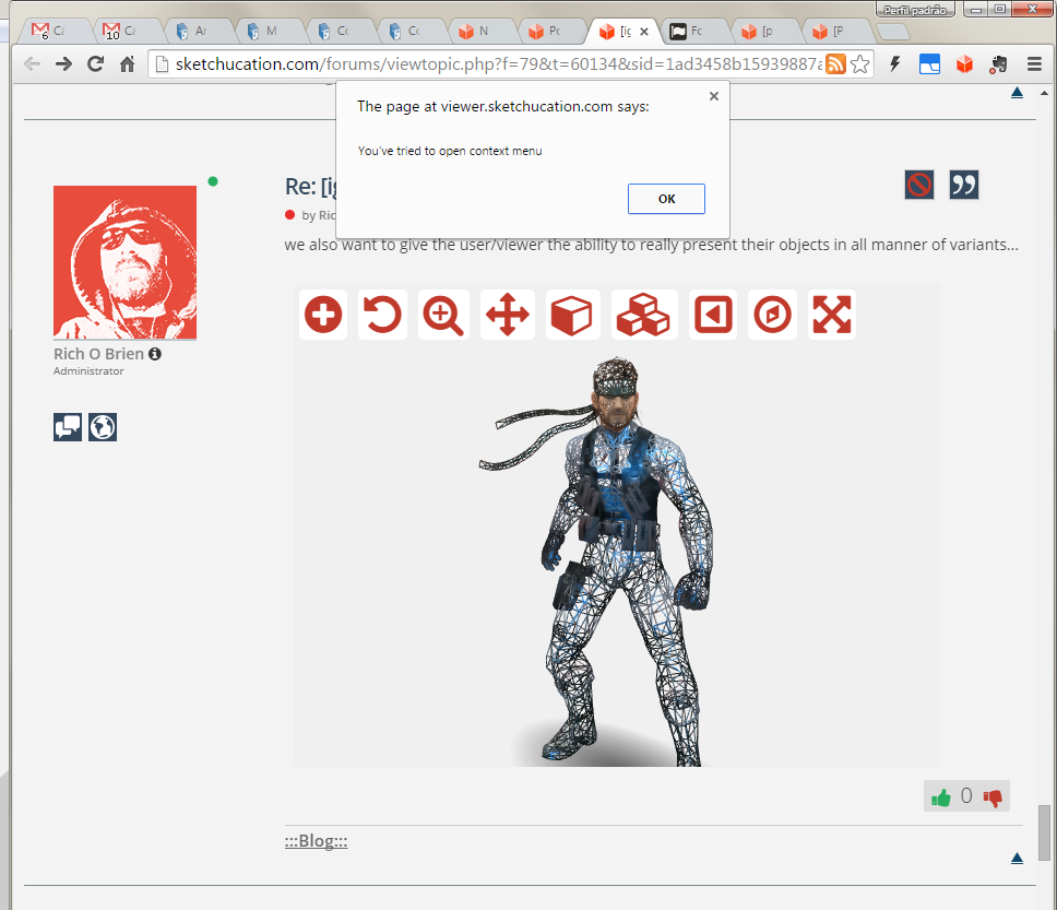
we also want to give the user/viewer the ability to really present their objects in all manner of variants...
[sw:ro3y753l]yZukpXbOgytkIvJ[/sw:ro3y753l]
-
This viewer will be local ? or can it be embedded inside another forum or websites?
-
-
Really like this one.......
I have to ask what software was used to create the figure and what format is it when you bring it into SU?
Really like what I have been seeing. Loading time has improved a lot.
-
...and we're back....
specular and enviromental reflection added....
[sw:107rbdo5]El6HXbNFffP1CM2[/sw:107rbdo5]
-
[sw:13kcgggh]z1cFGFx5RK3TG06[/sw:13kcgggh]
-
hi rich
what about clay mode when viewing geometry?
john
-
That's planned
-
[sw:3v8ml1cc]xJ46TKlqLsby8sk[/sw:3v8ml1cc]
I think the advantage of allowing users to be able to control highlights make for interesting results
We'll also have presets that you can apply to multiple materials at once.
-
This is getting very sophisticated while looking very simple. I like it a lot!
What do you mean with:
@rich o brien said:
@jql said:
The fullscreen icon can be confused with zoom extents and the playback button means what exactly? Zoom extents? It feels it has a different behaviour everytime I try it, probably because I didn't yet understood what to expect.
go knock yourself out and find something you like....

Does it mean we are able to choose the icons we want? That is unbelievable! I can already imagine embeding a 3d model of every project I have on my site!
Can we develop our own icons if we would like to?
Some more notes:
Now, when I click on the right button the model pan is much nicer but when I release it, this message shows up everytime (After a while it says I can disable it but I will not if you think this can be fixed.):

EDIT: This is what color edges by material looks like when used nicely? Congratulations on this one Rich!
-
No, you can't add your own icons.
I was saying that we use FontAwesome to deliver icons. If you can find icons that better represent the function then we can change them.
But we will likely move to our own icon set.
Re: Right Click
That is there because we had a feature that allowed you to use keys, M = move, O= orbit etc..., to make viewing less click related.
If you wanna test it let me know. We get you set up.
-
No Info when you move the cursor over an icon? (Move, Zoom etc...
-
@pilou said:
No Info when you move the cursor over an icon? (Move, Zoom etc...
Tooltips will come...
It is alpha-beta after all... -
#whattigsays
-
@rich o brien said:
#whattigsays
At first, I read "what is gay", but it didn't sound right. Then I read it again. Then I thought I would share this to the world as this is super-interesting.
Right? -
-
@jiminy-billy-bob said:
@rich o brien said:
#whattigsays
At first, I read "what is gay", but it didn't sound right. Then I read it again. Then I thought I would share this to the world as this is super-interesting.
Right?
Says something about your visual cortex processing...

-
@rich o brien said:
[sw:3piexoln]z1cFGFx5RK3TG06[/sw:3piexoln]
Had some intermittent problems with the zoom on this one.
Not sure if you mean to support the mouse wheel for zooming but it presented some erratic results. Also had some problems after clicking on the zoom icon. At times I had to move the mouse clear off to the side then approach it from the bottom of the image to get control of the zoom.
Not sure if this is something you are addressing at this point. If not, just ignore the post.
I do see other improvements though. In particular, after I click on the image and it is loaded in 3d view mode, it displays the image in its full color instead of the black image I was seeing before.
Looking forward to the progress on this viewer........
-
Thanks Dave.
Currently we need to decide object scale on load. We don't factor that at the moment.
It will be fixed
-
#notwhatjiminybillybobsays
Advertisement


