Shell chair - Hans Wegner
-
Really love Wegner's chairs.
 Almost finished this model. I used some photos as reference. For the textures of the curved plywood & back legs was used the Thomthom's UV toolkit plugin + Gai's suggestion on curved arch.
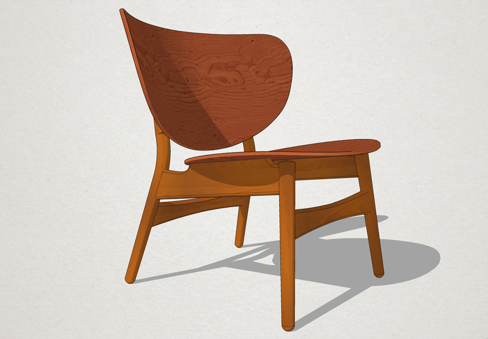
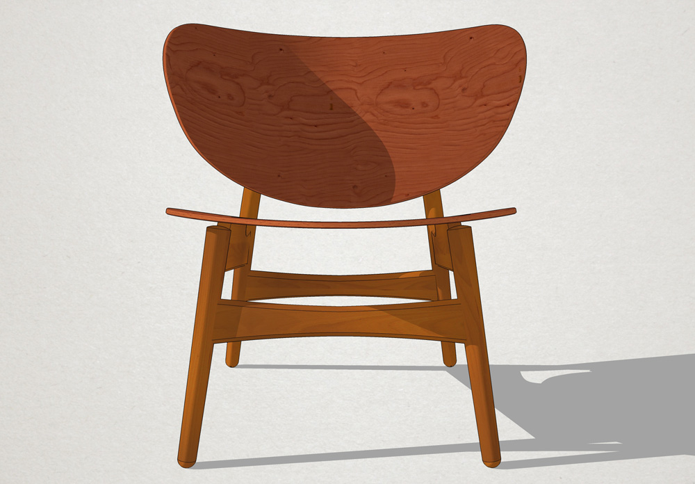
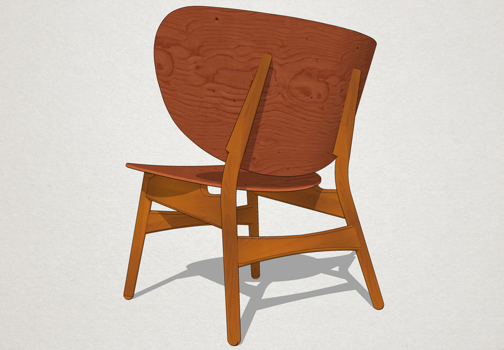
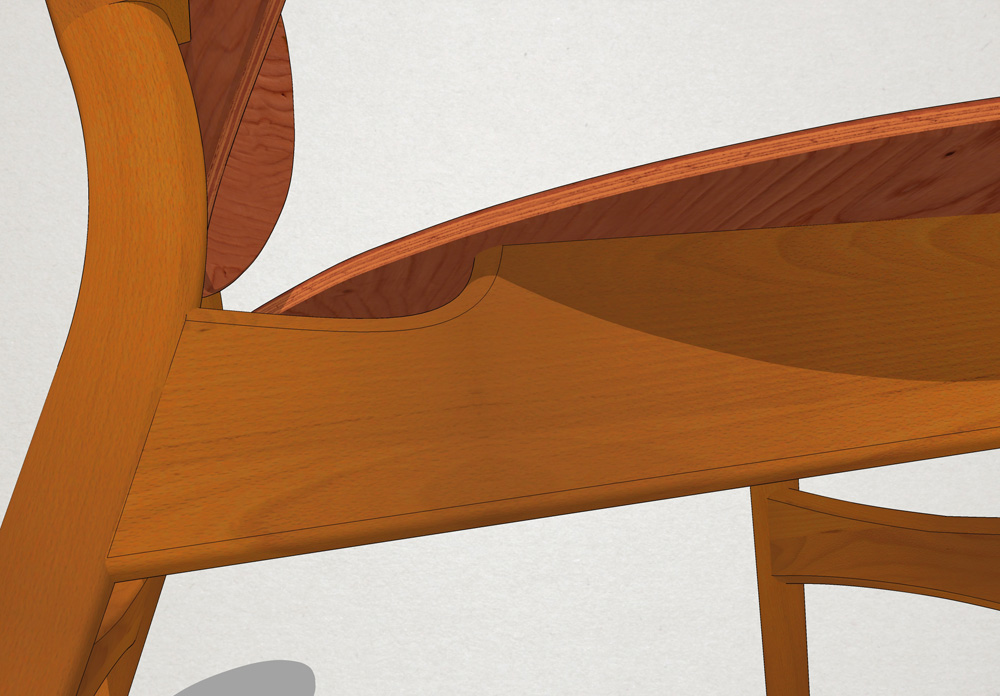
-
texturing looks nice. Why did you needed Thomthom's UV toolkit plugin? For edges? I'm thinking for plywood's faces you could project the texture.
I'm asking this because, if you used some ingenious texturing procedure, to share it with us
-
@unknownuser said:
Why did you needed Thomthom's UV toolkit plugin? For edges?
Exactly. You can apply the texture on the borders of a plain sheet and then, after bending, you can restore the UV as Gai explained in his tutorial on curved arcs.

-
@massimo said:
@unknownuser said:
Why did you needed Thomthom's UV toolkit plugin? For edges?
Exactly. You can apply the texture on the borders of a plain sheet and then, after bending, you can restore the UV as Gai explained in his tutorial on curved arcs.

Can you point me on that tutorial? thanks

-
-
Excellent modelling and texturing

Can we expect some Bertrand Benoit style renders?

-
Thanks David.

@unknownuser said:
Can we expect some Bertrand Benoit style renders?

Hehe, maybe I'll try some render.
-
A classic.
That's just straight SU?

-
Yeah.

-
That looks very nice. Good work.
-
Thank you Dave.

-
I have to ask. did you draw the joinery?

-
No joints, the pieces have just a bit of interpenetration.

-
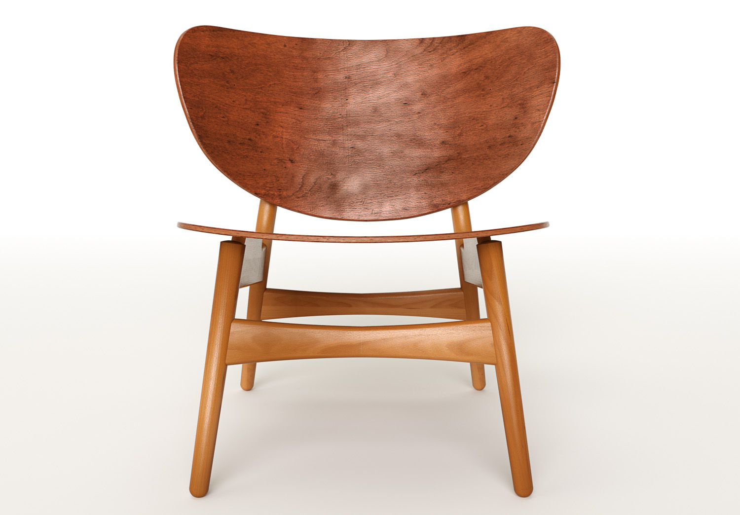
Here I've tried a first studio render with Thea. Changed the plywood texture. Only a slight high-pass filter in post pro. I wanted a "vintage" look...

-
Wow! That's very nice.
The only critiques I have, and most people probably wouldn't notice these things, is that the plywood texture on the seat back looks aged while the legs and stretchers don't have an aged look. The other thing is there appears to be a seam line in the texture on the right front leg. It looks like it runs parallel to the inside edge of the leg. If the leg were turned out of a laminated piece, the seam line would run straight down the leg on the axis./ That's mostly to prevent the glue line from showing as a parabolic curve on the side of the leg. Most likely the legs would be turned from several pieces.
As I said, most folks would never notice those things and you could leave them. It would pass as a photograph.
Excellent work.
-
Thanks for the constructive criticisms Dave and yes, maybe I have to add some subtle scratches and stains on the legs and stretchers.

-
I forgot to mention that I like those vertical lines in the seat back surface. They look like scratches that were there before the wood was re-varnished. And the color and texture just makes it look used. I think that used look is what is missing in a lot of renders. I'm sure it is difficult to get that look but for me, it's what tells me it's a computer generated thing and not a photograph. as I said, though, I don't think most folks would notice the things I pointed out.
-
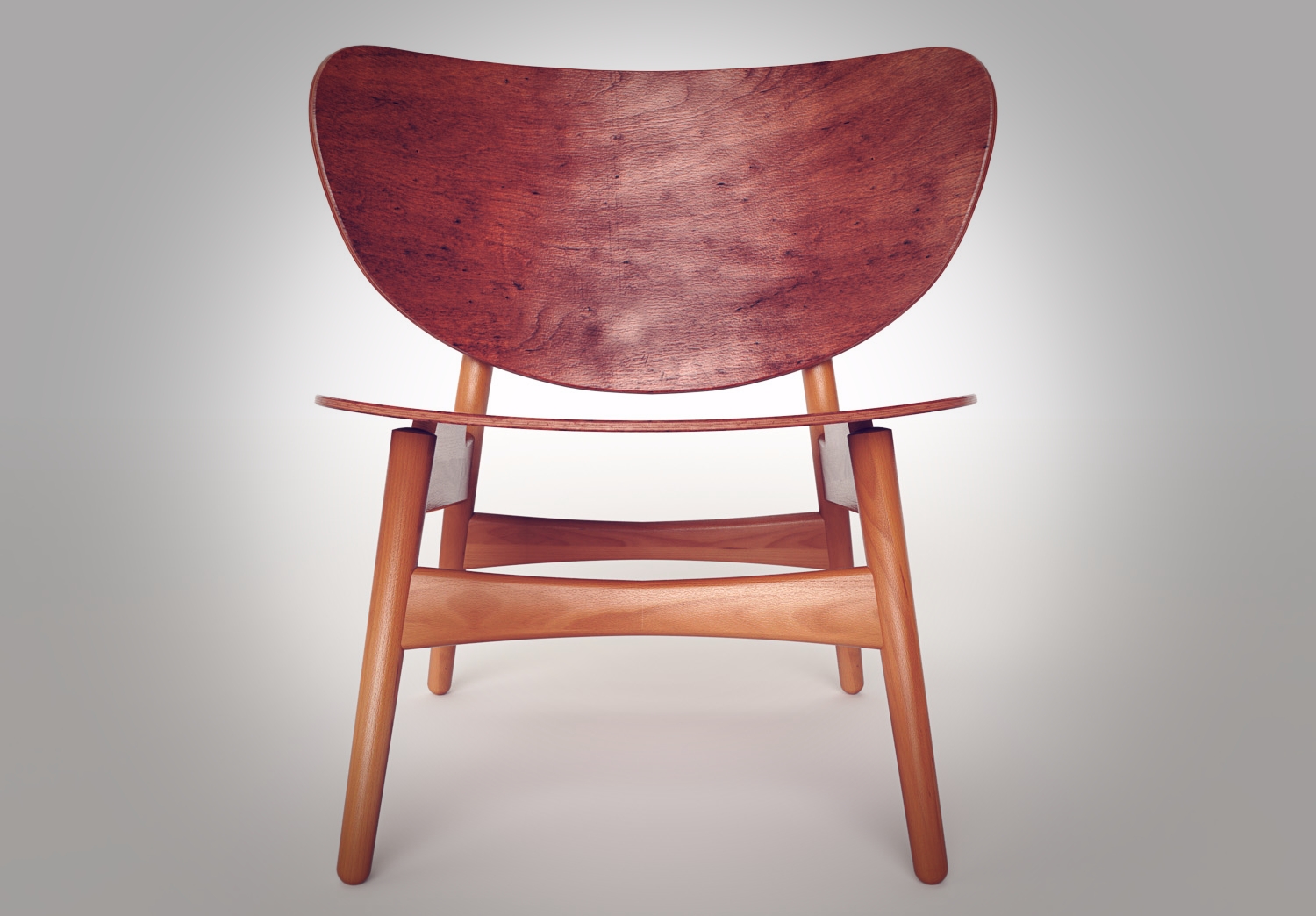
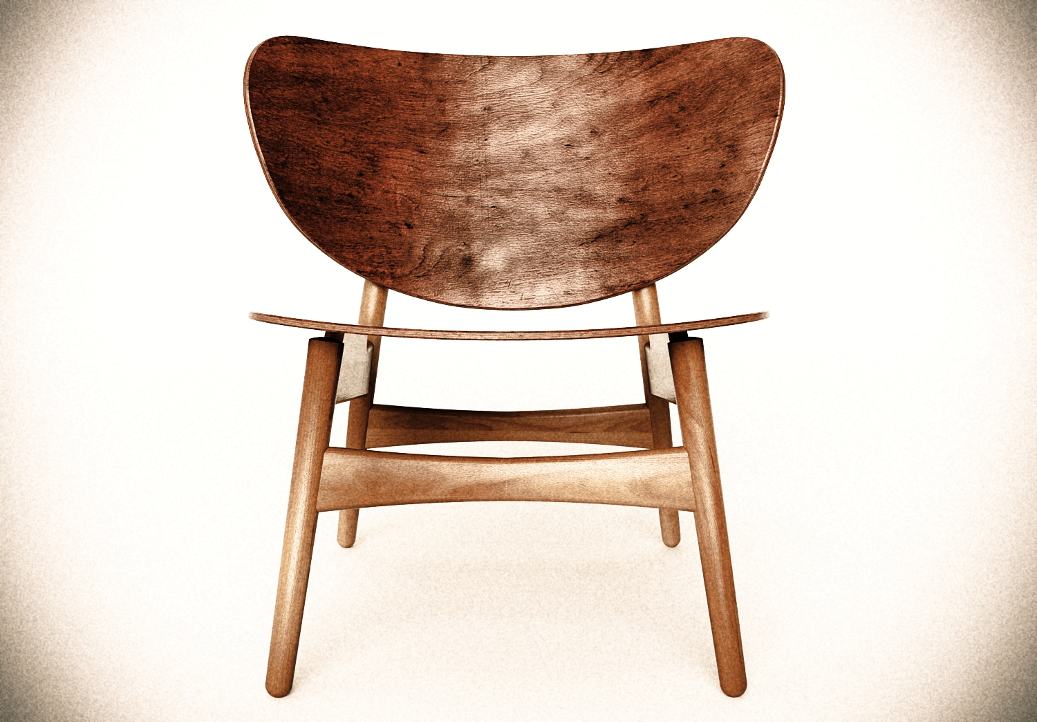
Great model and rendering, Massimo! I made some "more vintage" looks for your awesome image. I hope you don't mind...

Regards,
Stefan
-
Thanks Stefan, I don't mind at all and good work
 (maybe the vignetting is just a bit too strong).
Anyway I have to say that I prefer the "original" image as it looks more "natural" to my eyes.
-
An update, now also the legs and stretchers have an aged look.


Hello! It looks like you're interested in this conversation, but you don't have an account yet.
Getting fed up of having to scroll through the same posts each visit? When you register for an account, you'll always come back to exactly where you were before, and choose to be notified of new replies (either via email, or push notification). You'll also be able to save bookmarks and upvote posts to show your appreciation to other community members.
With your input, this post could be even better 💗
Register LoginAdvertisement


