Show Me Your SketchUp
-
I have found this thread very interesting as it shows work flow vs. real estate. Here is my real estate...
-
I know the shortcuts for all the stuff i use

-
This is after I opened SU > Pressed the "Display desktop" button in my tray before SU fully loaded then found SU with my toolbars completelymessed up and then I reset the toolbar positions. Still quite messy (and sorry for the OT post John, but this is also"My SketchUp")

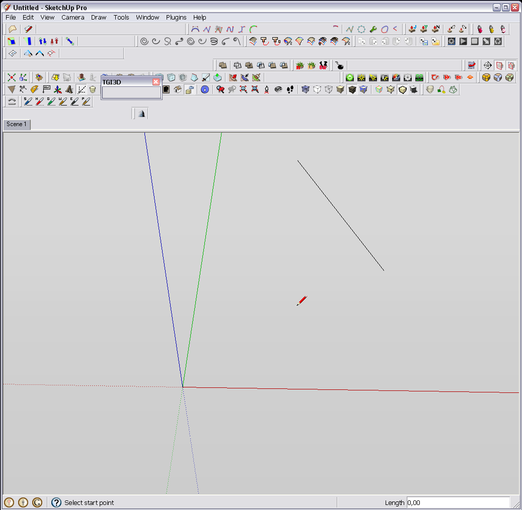
-
I use the various inspector as I need them but do not keep anything but these toolbars open "all the time".
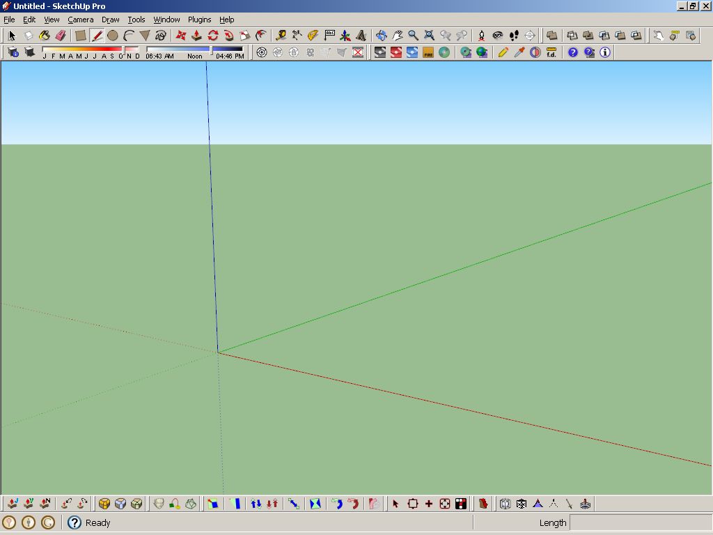
Best,
Jason. -
I suggest you guys also show up your "hotkeys" too. Having a good hotkey combination would speed up your progress a lot
-
Here's mine.
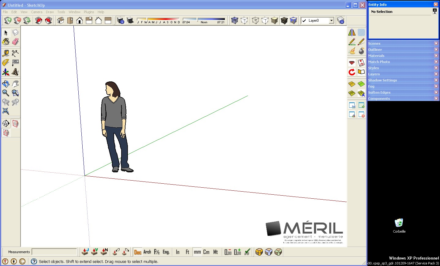
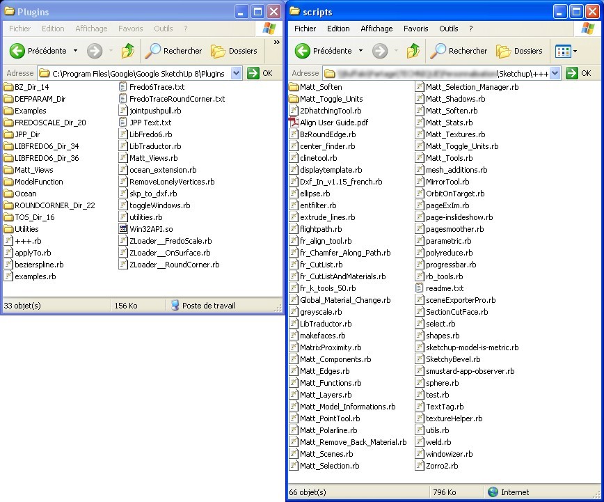
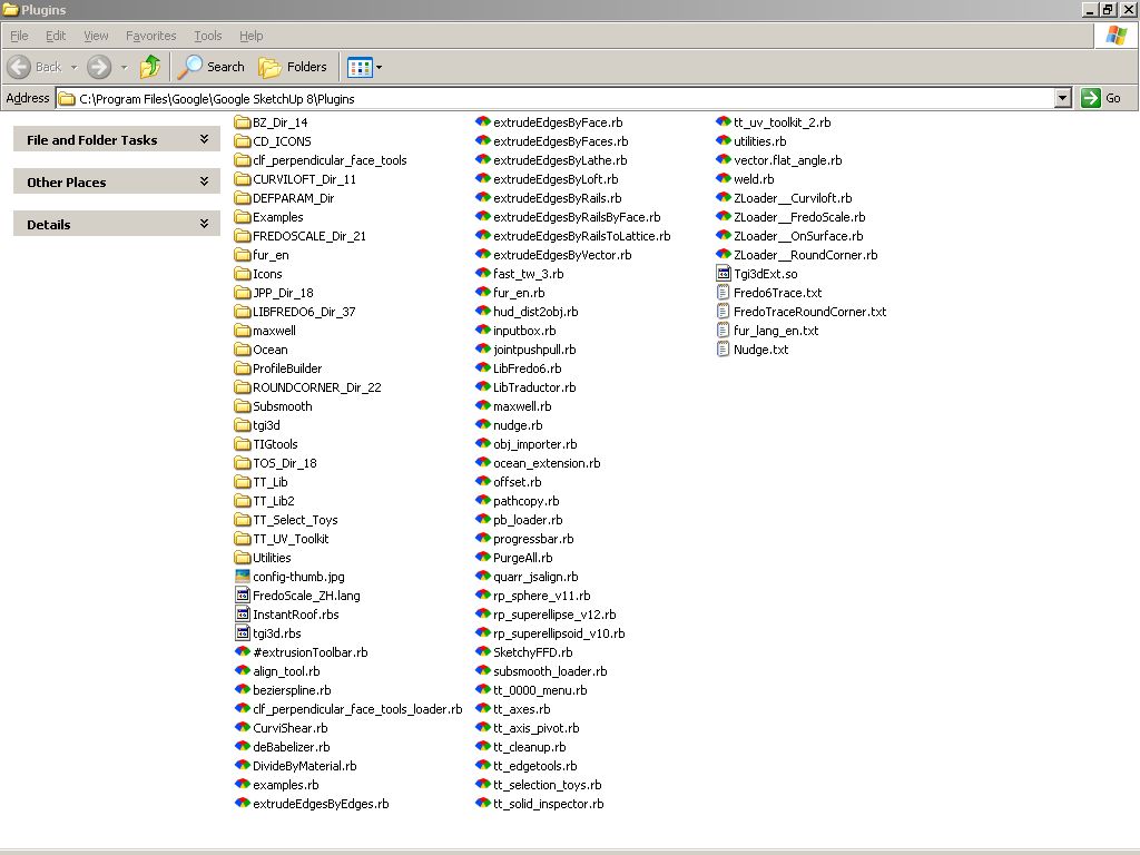
I have 2 plugins folders because I share some plugins with other computers at work. When I upgrade a plugin, everybody can use it. I use Native plugins folder for plugins I can't modify, and new plugins I test.

-
@unknownuser said:
here's my laptop setup.. i have a couple of more toolbars showing on the other computer.
[attachment=1:3i0a61fs]<!-- ia1 -->sketchupscreen_1.jpg<!-- ia1 -->[/attachment:3i0a61fs]
[attachment=0:3i0a61fs]<!-- ia0 -->screen 2011-06-04 at 1.41.46 AM.jpg<!-- ia0 -->[/attachment:3i0a61fs]
Hello Jeff, how you make possible to have all this toolbars rows in sketchup for mac?

-
@edson said:
[attachment=3:2wfwvcjp]<!-- ia3 -->edsons_screen.png<!-- ia3 -->[/attachment:2wfwvcjp]
[attachment=2:2wfwvcjp]<!-- ia2 -->plugins_edson_1.png<!-- ia2 -->[/attachment:2wfwvcjp]
[attachment=1:2wfwvcjp]<!-- ia1 -->plugins_edson_2.png<!-- ia1 -->[/attachment:2wfwvcjp]
[attachment=0:2wfwvcjp]<!-- ia0 -->plugins_edson_3.png<!-- ia0 -->[/attachment:2wfwvcjp]
Hi edson:
I am new in Sketchup for Mac osx and I want to know if is possible how you make toolbar rows in Sketchup for MAC OSX?
Thanks.
-
@kalu said:
@unknownuser said:
here's my laptop setup.. i have a couple of more toolbars showing on the other computer.
[attachment=1:32s2mpv9]<!-- ia1 -->sketchupscreen_1.jpg<!-- ia1 -->[/attachment:32s2mpv9]
[attachment=0:32s2mpv9]<!-- ia0 -->screen 2011-06-04 at 1.41.46 AM.jpg<!-- ia0 -->[/attachment:32s2mpv9]
Hello Jeff, how you make possible to have all this toolbars rows in sketchup for mac?

all the toolbars on mac except for the custom toolbar along the top of the window are floating.. you just arrange (drag them around) the various toolbars where you'd like them to be..
how is yours set up? where are the toolbars?
-
My SKP-screen and plugin directory
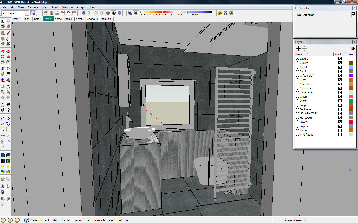
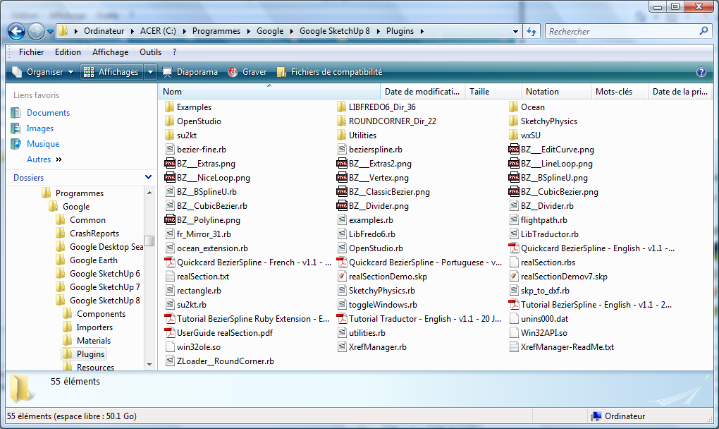
-
So John, have you made yourself any thoughts on the screenshots you're seeing?
-
@thomthom said:
So John, have you made yourself any thoughts on the screenshots you're seeing?
I've done studies like this a few times in the past and always found the results interesting. I don't have any particular thing I'm looking for. What do you see when you look at these screenshots?
john
. -
John, you sound like a psychiatrist....throwing back a question with "Well, what do YOU think....?"
Personally, I'm quite surprised at the uniformity of the layouts. Most people...myself included...go for toolbars top and left with a selection of inspectors on the right. Sure, some others have extra toolbars on the other 2 sides, but the first layout forms the basis for just about everyone.There might be a case for making a Jumbo Standard set of icons, something like mine on P2. The left hand edge is reserved for default functions like drawing, navigation, face styles and sections (apart from the Search FormFonts button at the bottom
 . Other than a few bars like shadows and layers, i keep the the top edge free for 3rd party stuff. A jumbo set of standard icons would certainly take some of the pain out of a toolbar scramble. It would require a certain minimum screen size of course...no good for a Netbook; but it would be useful as an option.
 -
@jbacus said:
@thomthom said:
So John, have you made yourself any thoughts on the screenshots you're seeing?
I've done studies like this a few times in the past and always found the results interesting. I don't have any particular thing I'm looking for. What do you see when you look at these screenshots?
john
.I guess placing GUI elements on the left\right sides VERTICALLY shaped would be a wise strategy. The Autodesk-like
horizontal ribbons tend to squash already wide sreen monitors
-
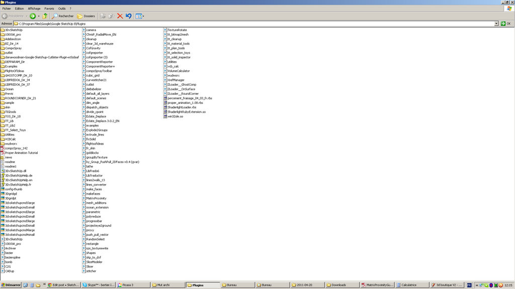
hi this is my set up
I used to have 2 monitors, wich is definitly the best way to work around with all these needed windows

I'll get back to that set up soon !
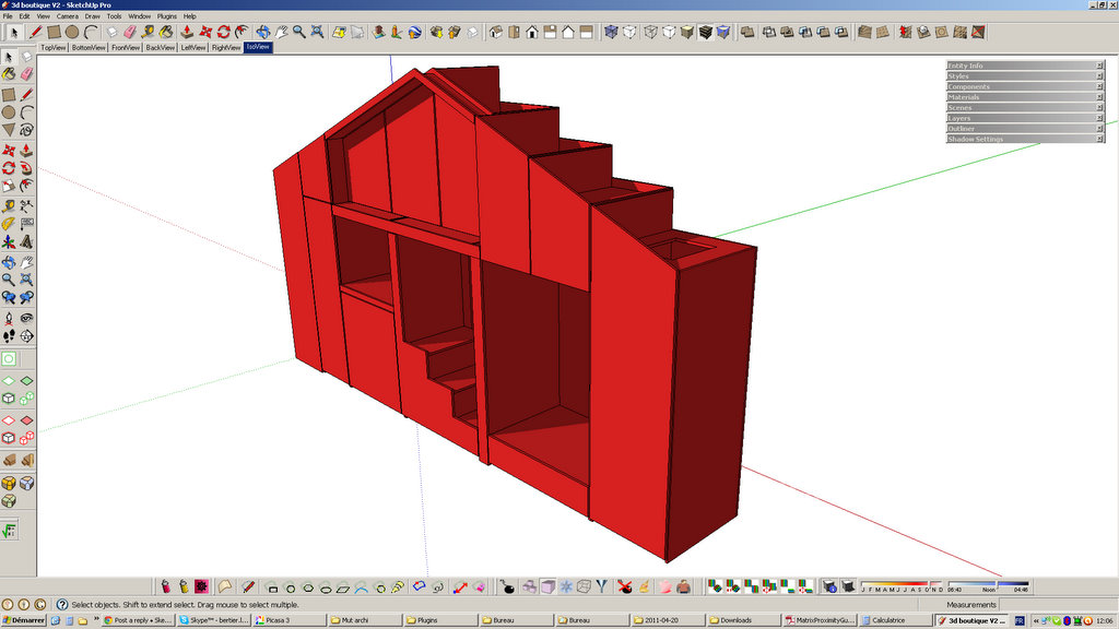
-
@jbacus said:
@thomthom said:
So John, have you made yourself any thoughts on the screenshots you're seeing?
I've done studies like this a few times in the past and always found the results interesting. I don't have any particular thing I'm looking for. What do you see when you look at these screenshots?
john
.I'll go the other way from Alan. I see what he's saying about the layout, but what strikes me is the diversity. Everyone uses a very different set of plugins, a different set of icons, and since SU allows you to place the toolbars all over the place - people have them in many locations. No two have been alike. Contrast that with something like AutoCAD or 3ds Max where most UI's will look pretty similar.
In terms of potential changes, I see a couple things. Many people use LOTS of toolbars which means if you ever change your window size things go crazy. A more intuitive system that can better auto-arrange toolbars based on window size (in conjunction with the save location feature) could help a lot. I have in mind something like AutoCAD.
Also, I notice a lot of people use 1 monitor. Those floating toolbars get in the way a lot with one monitor so some sort of docking system (again, like AutoCAD or 3ds Max) could relieve some of those issues.
-Brodie
-
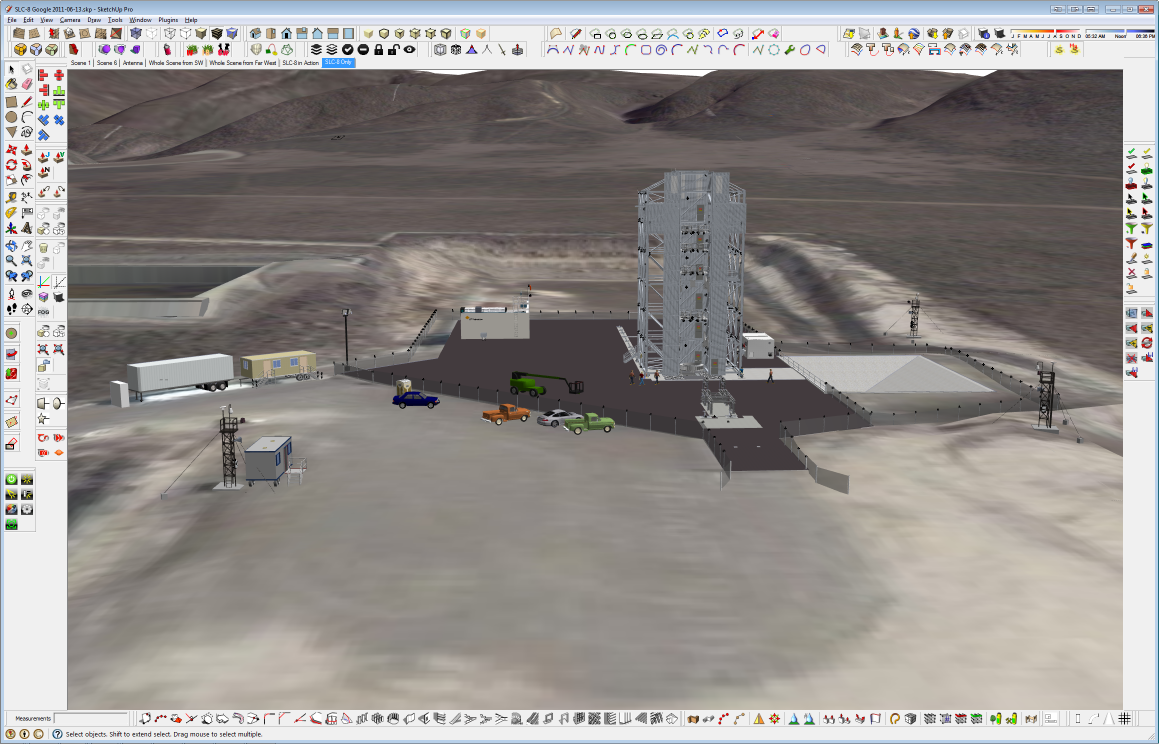
My Plugins as shown on one of my 30" screens

-

MY ui just nothing on it just use shotcut to lanchit
but i thing is it better to make all the icon synchrony? -
-
Don't make the thread public. Sketchup starts to loose the simpleness when people see all those toolbars.
Time for a new UI and a better integrated workflow for all the Plugins.
Seriously, you can't really change the UI differently from others. Mostly it depends on what people like to have on plugins and what Monitors are used. It just shows a full of Icon application.
Hello! It looks like you're interested in this conversation, but you don't have an account yet.
Getting fed up of having to scroll through the same posts each visit? When you register for an account, you'll always come back to exactly where you were before, and choose to be notified of new replies (either via email, or push notification). You'll also be able to save bookmarks and upvote posts to show your appreciation to other community members.
With your input, this post could be even better 💗
Register LoginAdvertisement


