Show Me Your SketchUp
-
Better late than never.

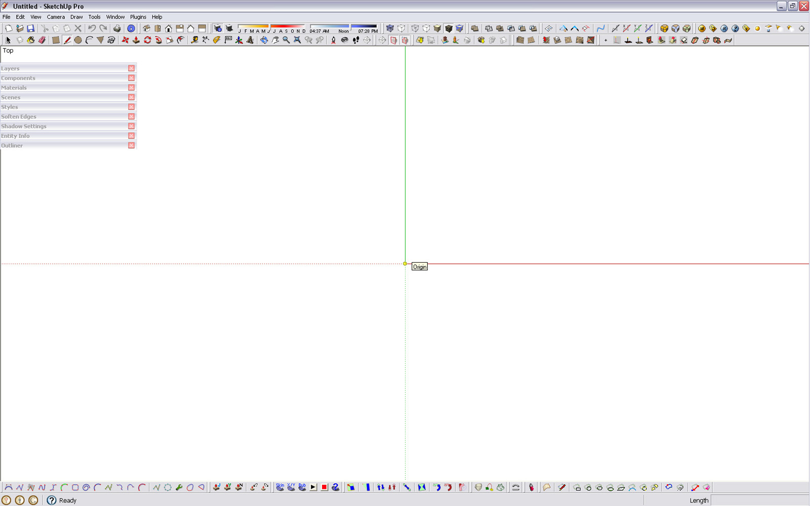
-
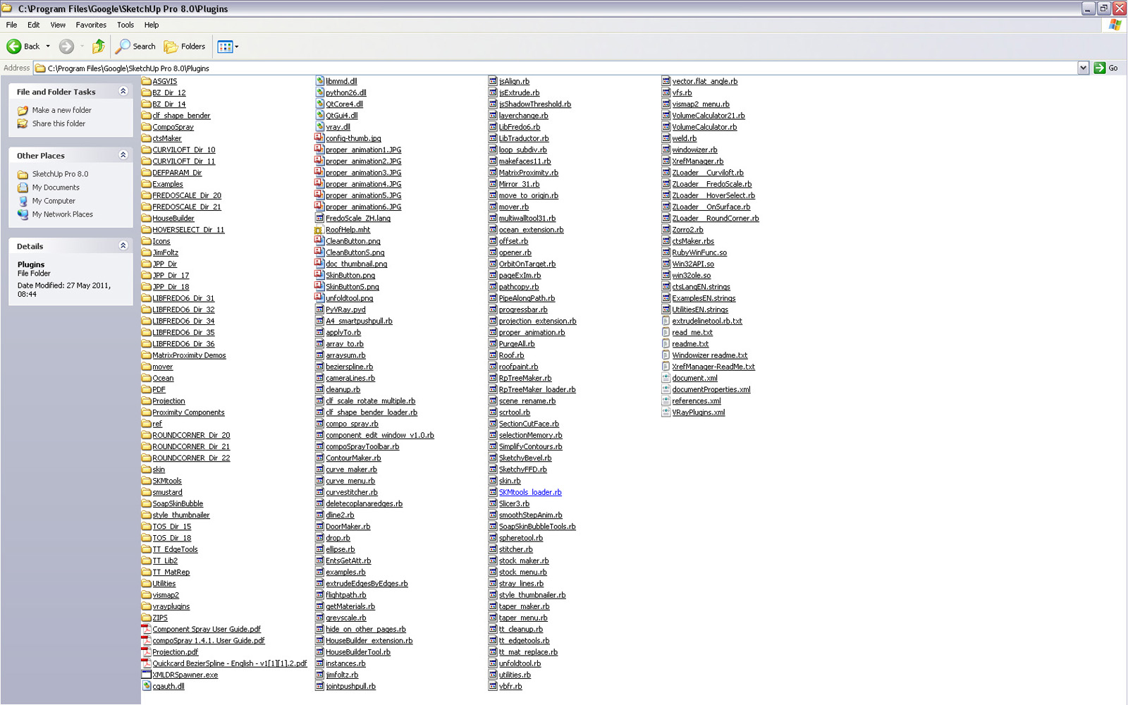
@Tobobo: It looks like you have some stray files in your plugin folder that are not located where they should. In particular there seems to be files related to VfSU scattered.
With the latest version, 1.49.01, only vfs.rb is located in the Plugins folder.
(Plus you have many redundant folders of older versions of Fredo's plugins.)
-
@thomthom said:
(Plus you have many redundant folders of older versions of Fredo's plugins.)
Yeah I know that but I'm dont want to go deleting the wrong ones.
If you can help in pointing out the redundant ones I would be very grateful.@thomthom said:
@Tobobo: It looks like you have some stray files in your plugin folder that are not located where they should. In particular there seems to be files related to VfSU scattered.
With the latest version, 1.49.01, only vfs.rb is located in the Plugins folder.
I'm having some real problems with VRay at the moment. IT are being slow in resolving online validation problems.

-
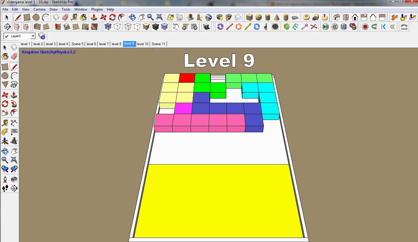
this is my desktop i working on a game
-
John's minimalistic UI is my dream, but I'm not quite there yet. I have dual monitors at 1920x1080 so I had to reduce the resolution of the screenshot. The only icons most people won't recognize are the last several icons which consist of my Maxwell Render toolbar.
As you can see I have a number of plugins (I pare this down periodically so most of the ones on there I use on a regular basis) but I prefer to use keyboard shortcuts. I'd use shortcuts for the remaining toolbars but at this point I'd have to use keyboard combos that wouldn't make much sense and would end up wasting time trying to figure out what the combo is.
I'm surprised by how many people here use one monitor (so the menus get in the way) and have TONS of icons. That sort of setup would drive my crazy.
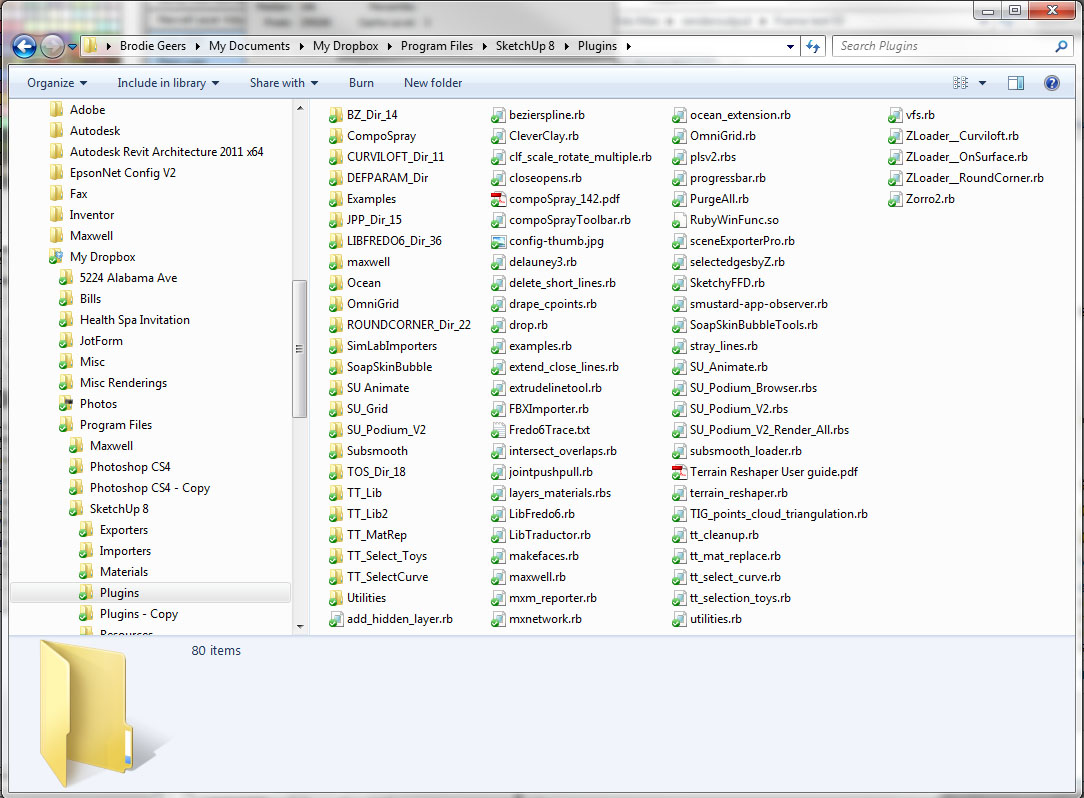
You'll also notice if you look real close, that I have my plugins folder in Dropbox so my plugins are synced between my computers.
-Brodie

-
...and mine.
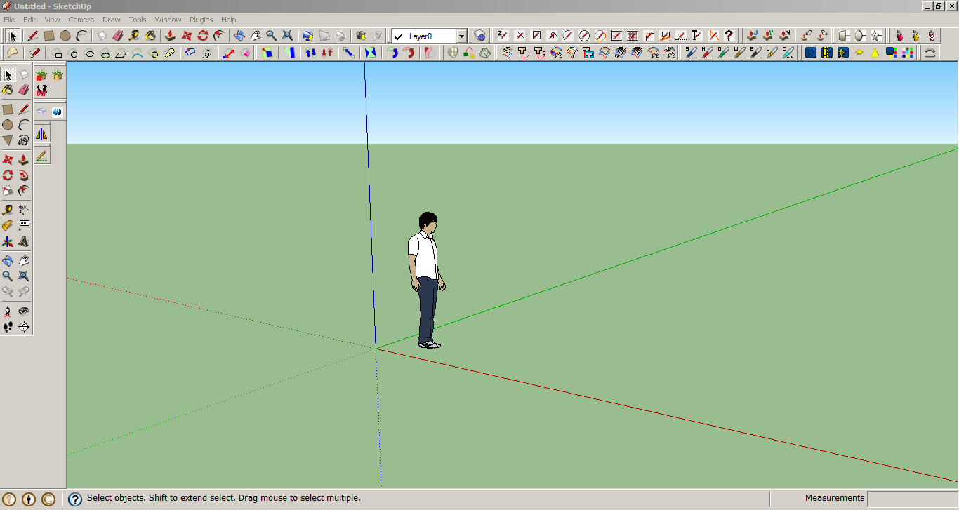
-
Greetings all only fair i post My Sketchup as per request
Sorry mis clicked didnt up load it
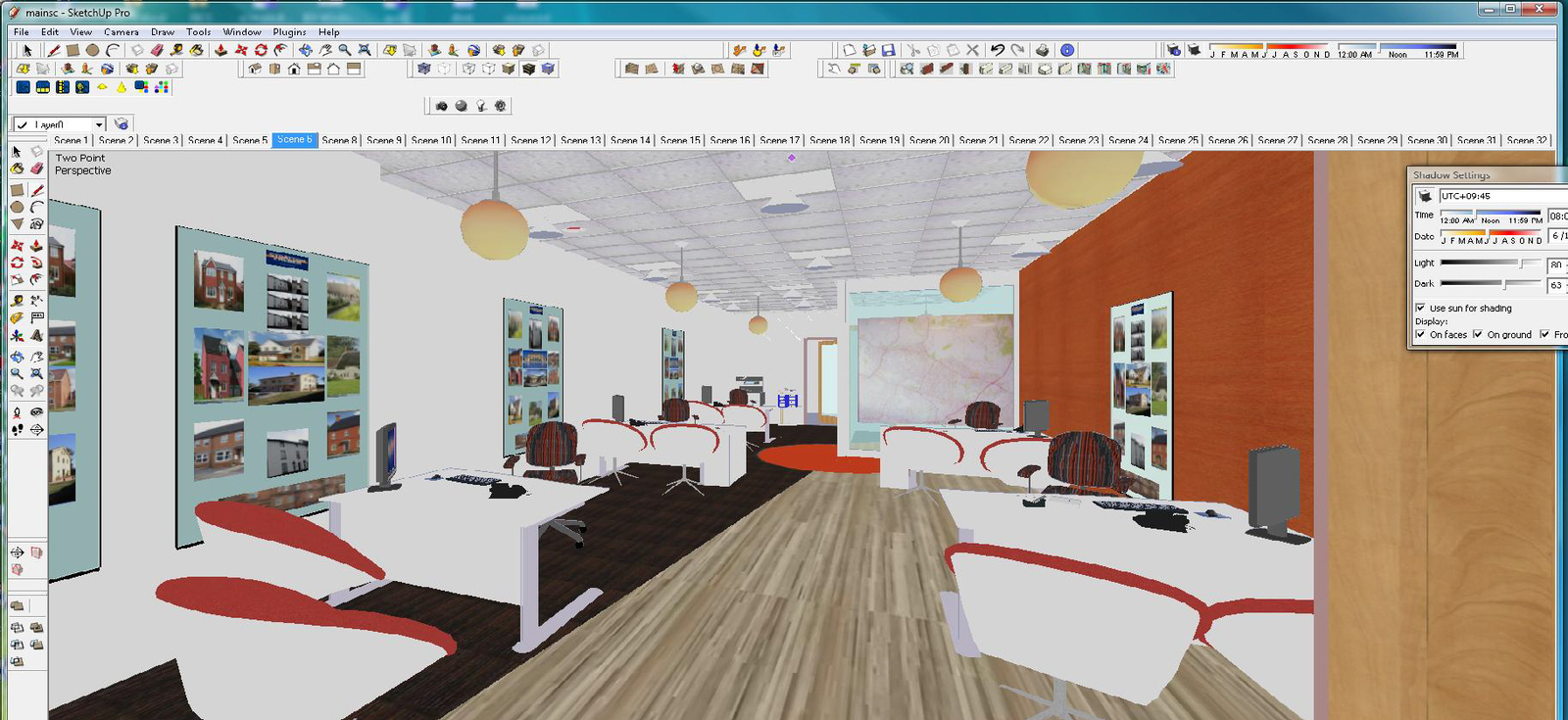
-
Compared to some of the others mine is positively barren. But I very much doubt I would need or use all of those plug ins anyway.

-
I have found this thread very interesting as it shows work flow vs. real estate. Here is my real estate...
-
I know the shortcuts for all the stuff i use

-
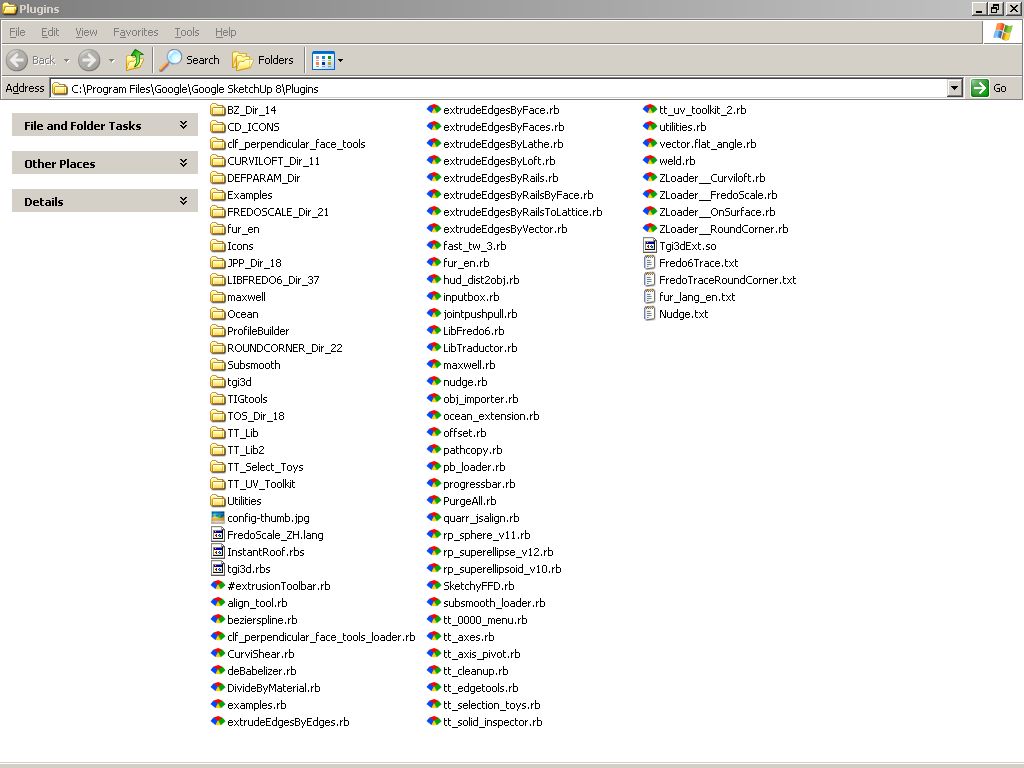
This is after I opened SU > Pressed the "Display desktop" button in my tray before SU fully loaded then found SU with my toolbars completelymessed up and then I reset the toolbar positions. Still quite messy (and sorry for the OT post John, but this is also"My SketchUp")

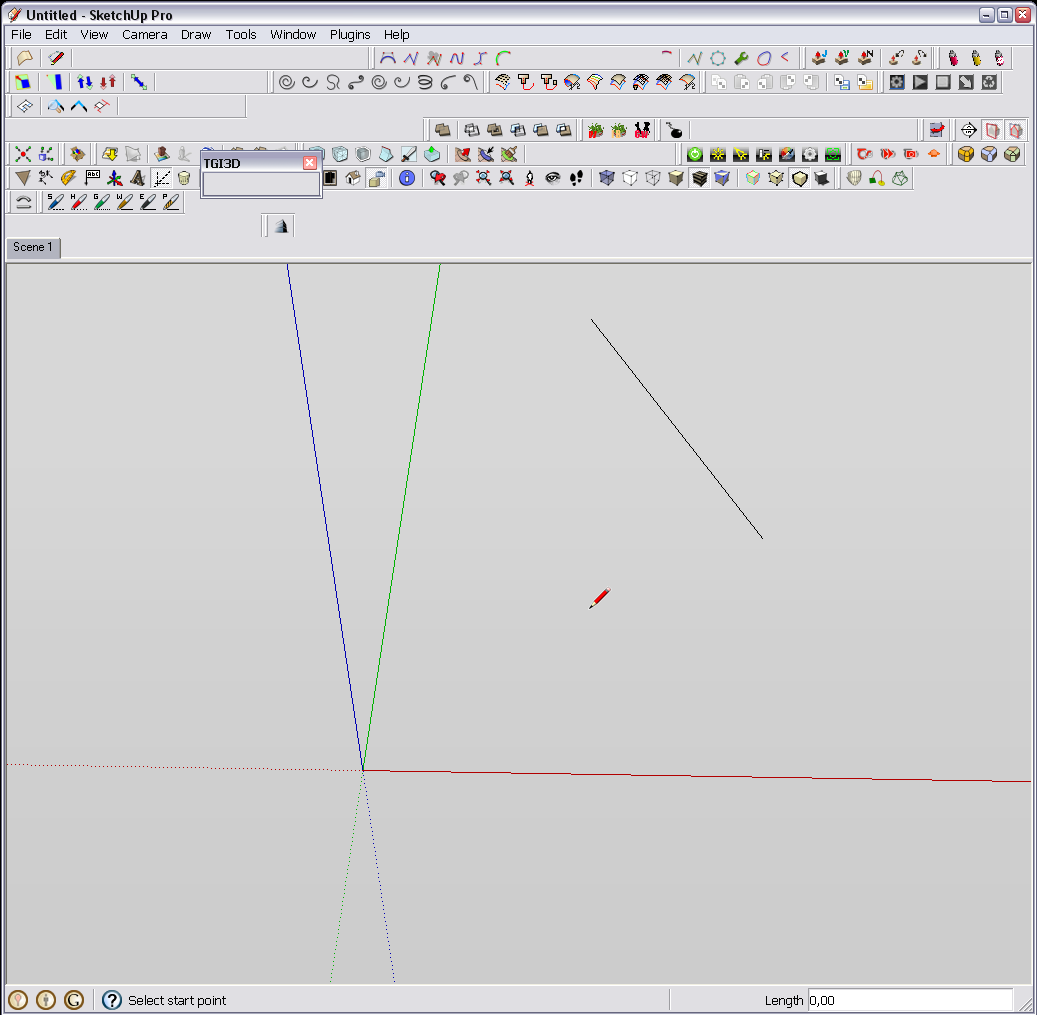
-
I use the various inspector as I need them but do not keep anything but these toolbars open "all the time".
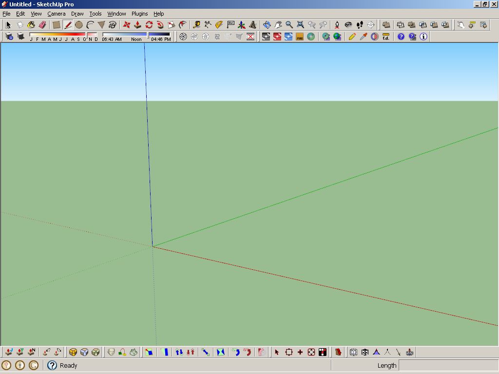
Best,
Jason. -
I suggest you guys also show up your "hotkeys" too. Having a good hotkey combination would speed up your progress a lot
-
Here's mine.
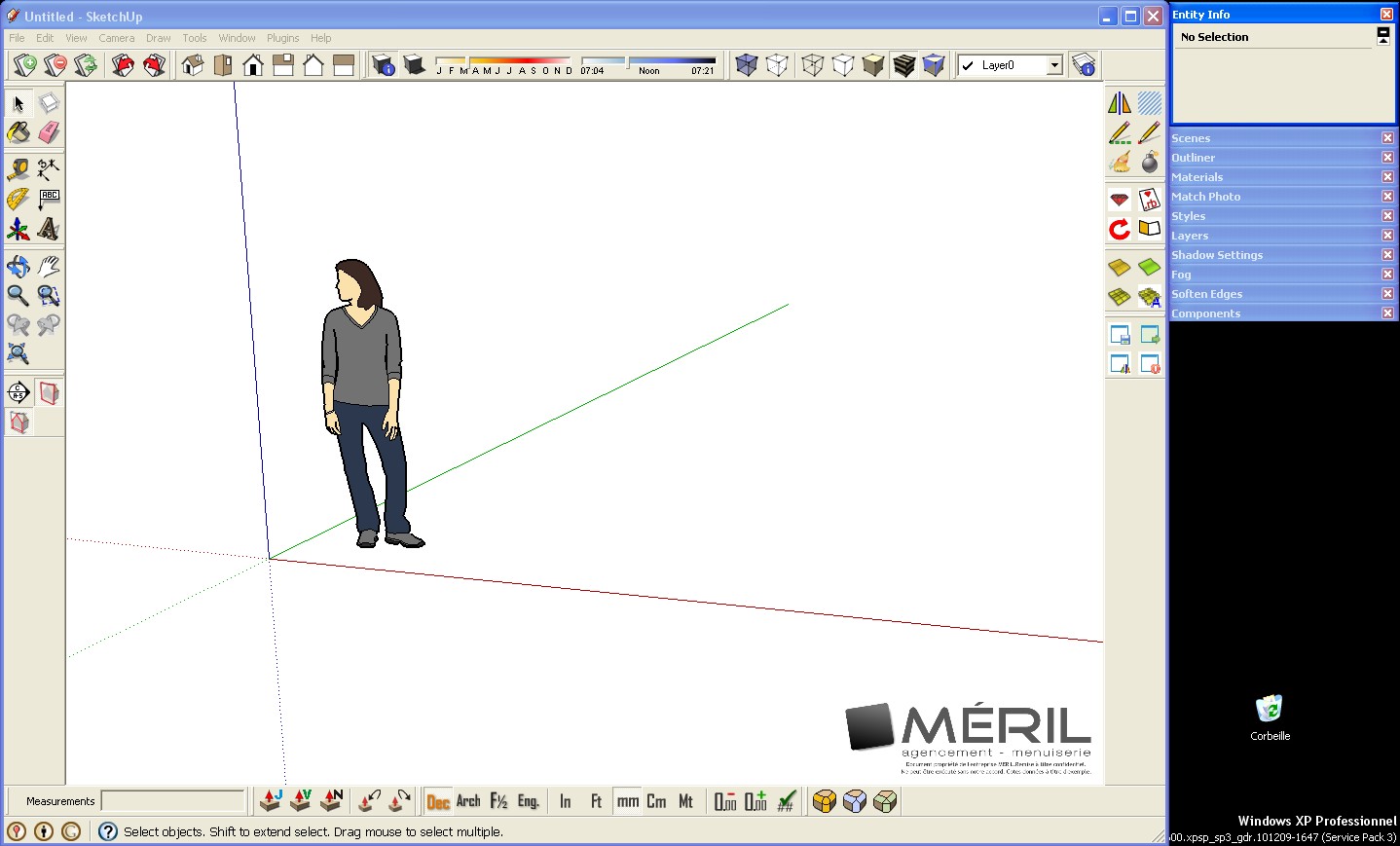
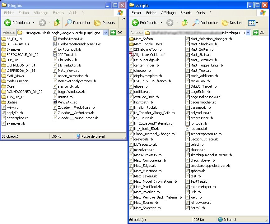
I have 2 plugins folders because I share some plugins with other computers at work. When I upgrade a plugin, everybody can use it. I use Native plugins folder for plugins I can't modify, and new plugins I test.

-
@unknownuser said:
here's my laptop setup.. i have a couple of more toolbars showing on the other computer.
[attachment=1:3i0a61fs]<!-- ia1 -->sketchupscreen_1.jpg<!-- ia1 -->[/attachment:3i0a61fs]
[attachment=0:3i0a61fs]<!-- ia0 -->screen 2011-06-04 at 1.41.46 AM.jpg<!-- ia0 -->[/attachment:3i0a61fs]
Hello Jeff, how you make possible to have all this toolbars rows in sketchup for mac?

-
@edson said:
[attachment=3:2wfwvcjp]<!-- ia3 -->edsons_screen.png<!-- ia3 -->[/attachment:2wfwvcjp]
[attachment=2:2wfwvcjp]<!-- ia2 -->plugins_edson_1.png<!-- ia2 -->[/attachment:2wfwvcjp]
[attachment=1:2wfwvcjp]<!-- ia1 -->plugins_edson_2.png<!-- ia1 -->[/attachment:2wfwvcjp]
[attachment=0:2wfwvcjp]<!-- ia0 -->plugins_edson_3.png<!-- ia0 -->[/attachment:2wfwvcjp]
Hi edson:
I am new in Sketchup for Mac osx and I want to know if is possible how you make toolbar rows in Sketchup for MAC OSX?
Thanks.
-
@kalu said:
@unknownuser said:
here's my laptop setup.. i have a couple of more toolbars showing on the other computer.
[attachment=1:32s2mpv9]<!-- ia1 -->sketchupscreen_1.jpg<!-- ia1 -->[/attachment:32s2mpv9]
[attachment=0:32s2mpv9]<!-- ia0 -->screen 2011-06-04 at 1.41.46 AM.jpg<!-- ia0 -->[/attachment:32s2mpv9]
Hello Jeff, how you make possible to have all this toolbars rows in sketchup for mac?

all the toolbars on mac except for the custom toolbar along the top of the window are floating.. you just arrange (drag them around) the various toolbars where you'd like them to be..
how is yours set up? where are the toolbars?
-
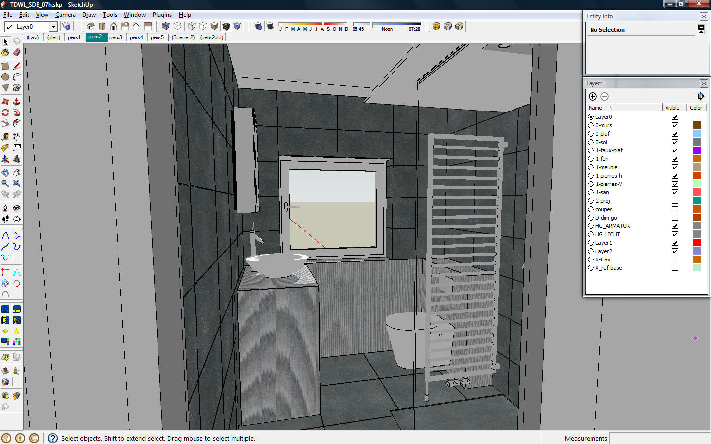
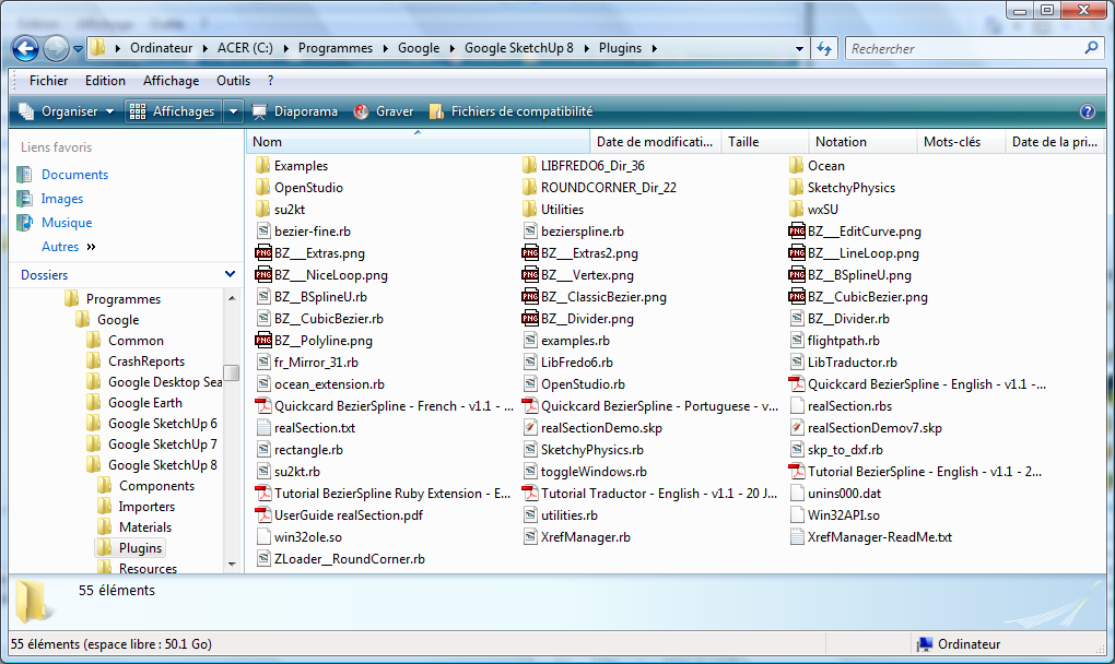
My SKP-screen and plugin directory
-
So John, have you made yourself any thoughts on the screenshots you're seeing?
-
@thomthom said:
So John, have you made yourself any thoughts on the screenshots you're seeing?
I've done studies like this a few times in the past and always found the results interesting. I don't have any particular thing I'm looking for. What do you see when you look at these screenshots?
john
.
Hello! It looks like you're interested in this conversation, but you don't have an account yet.
Getting fed up of having to scroll through the same posts each visit? When you register for an account, you'll always come back to exactly where you were before, and choose to be notified of new replies (either via email, or push notification). You'll also be able to save bookmarks and upvote posts to show your appreciation to other community members.
With your input, this post could be even better 💗
Register LoginAdvertisement


